Willkommen bei den Top‑Schriften – hier treffen Beliebtheit und Qualität aufeinander. Das sind die in diesem Jahr am häufigsten heruntergeladenen und genutzten Fonts. Wenn Sie sichere Optionen für Logo, Web oder Social suchen, starten Sie hier.
Jeder Top‑Font überzeugt durch Balance, Lesbarkeit und Vielseitigkeit. Sie finden moderne Sans‑Serifs, elegante Scripts, Vintage‑Serifs und minimalistische Displays.
-
( Fonts by Apostrophic Lab )
A bold, modern font with geometric shapes and rounded corners.
 Herunterladen 342 Downloads@WebFont
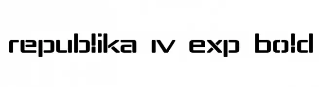
 -
( Fonts by Daniel Zadorozny - www.iconian.com )
A bold, gothic-inspired font with sharp, angular lines and dramatic serifs.
![Xiphos Frei Schriftart Herunterladen]() Herunterladen 342 Downloads@WebFont
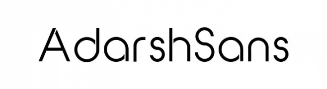
Herunterladen 342 Downloads@WebFont -
( Fonts by Adarsh S - Personal-use only. For commercial use please contact owner. )
A modern, geometric sans-serif font with clean lines and uniform strokes.
![Adarsh Sans Frei Schriftart Herunterladen]() Herunterladen 342 Downloads@WebFont
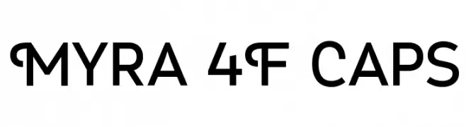
Herunterladen 342 Downloads@WebFont -
( Fonts by a www.fontfabric.com. Personal-use only. For commercial use please contact owner. )
A modern sans-serif font with clean lines and unique curved terminals.
![Myra 4F Caps Frei Schriftart Herunterladen]() Herunterladen 342 Downloads@WebFont
Herunterladen 342 Downloads@WebFont -
![Wintermute Frei Schriftart Herunterladen]() Herunterladen 342 Downloads@WebFont
Herunterladen 342 Downloads@WebFont -
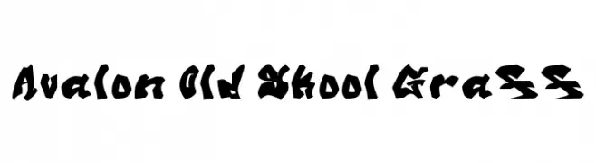
![Avalon Old Skool Graff Frei Schriftart Herunterladen]() Herunterladen 342 Downloads@WebFont
Herunterladen 342 Downloads@WebFont -
( imagex - www.imagex-fonts.com )
A decorative font with a stitched, handcrafted appearance.
![Stitch'n School Frei Schriftart Herunterladen]() Herunterladen 342 Downloads@WebFont
Herunterladen 342 Downloads@WebFont -
( Fonts by Woodcutter )
A bold, decorative font with thick outlines and hollow interiors, perfect for striking headlines.
![Graphic Dictatorship Frei Schriftart Herunterladen]() Herunterladen 342 Downloads@WebFont
Herunterladen 342 Downloads@WebFont -
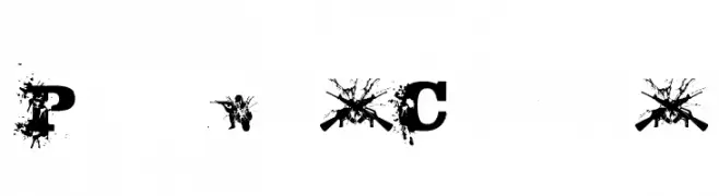
![Policia Corrupta Frei Schriftart Herunterladen]() Herunterladen 342 Downloads@WebFont
Herunterladen 342 Downloads@WebFont -
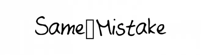
![Same_Mistake Frei Schriftart Herunterladen]() Herunterladen 342 Downloads@WebFont
Herunterladen 342 Downloads@WebFont -
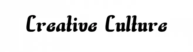
![Creative Culture Frei Schriftart Herunterladen]() Herunterladen 342 Downloads@WebFont
Herunterladen 342 Downloads@WebFont -
![whirlygigs Frei Schriftart Herunterladen]() Herunterladen 342 Downloads@WebFont
Herunterladen 342 Downloads@WebFont -
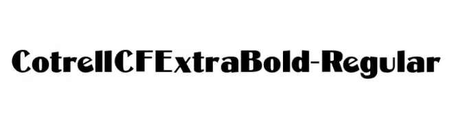
( Fonts by Chuck Mountain - Chuck`s Fonts - Personal-use only. For commercial use please contact owner. )
A bold, modern font with thick strokes and a strong visual impact.
![CotrellCFExtraBold-Regular Frei Schriftart Herunterladen]() Herunterladen 342 Downloads@WebFont
Herunterladen 342 Downloads@WebFont -
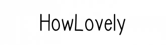
( Fonts by Md Shohail Bhuian )
A playful, rounded font with a hand-drawn feel, perfect for casual designs.
![How Lovely Frei Schriftart Herunterladen]() Herunterladen 342 Downloads@WebFont
Herunterladen 342 Downloads@WebFont -
![Asman Frei Schriftart Herunterladen]() Herunterladen 342 Downloads@WebFont
Herunterladen 342 Downloads@WebFont -
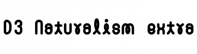
( Fonts by www.DigitalDreamDesign.net )
A bold, rounded font with a playful and modern style.
![D3 Naturalism extra Frei Schriftart Herunterladen]() Herunterladen 342 Downloads@WebFont
Herunterladen 342 Downloads@WebFont -
![Sakatrvelo-ITV Frei Schriftart Herunterladen]() Herunterladen 342 Downloads
Herunterladen 342 Downloads -
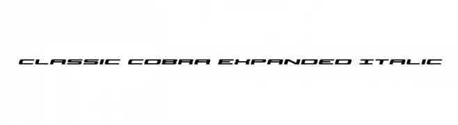
( Iconian Fonts - Daniel Zadorozny - www.iconian.com )
A bold, expanded italic font with a modern and dynamic style.
![Classic Cobra Expanded Italic Frei Schriftart Herunterladen]() Herunterladen 342 Downloads@WebFont
Herunterladen 342 Downloads@WebFont -
( Måns Grebäck - www.mansgreback.com )
A modern, light sans-serif font with tall, narrow characters.
![Saker Sans Light PERSONAL USE Frei Schriftart Herunterladen]() Herunterladen 342 Downloads@WebFont
Herunterladen 342 Downloads@WebFont -
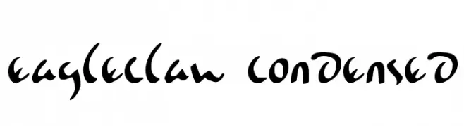
( Fonts by Daniel Zadorozny - www.iconian.com )
A dynamic, brush-like condensed font with expressive strokes and a modern calligraphic style.
![Eagleclaw Condensed Frei Schriftart Herunterladen]() Herunterladen 342 Downloads@WebFont
Herunterladen 342 Downloads@WebFont -
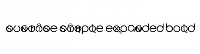
![Sunrise Simple Expanded Bold Frei Schriftart Herunterladen]() Herunterladen 342 Downloads@WebFont
Herunterladen 342 Downloads@WebFont -
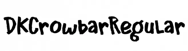
( Fonts by Hanoded )
A bold, hand-drawn font with a rough, expressive style.
![DK Crowbar Regular Frei Schriftart Herunterladen]() Herunterladen 342 Downloads@WebFont
Herunterladen 342 Downloads@WebFont -
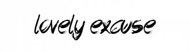
( Font by Jonathan Harris - www.tattoowoo.com )
A bold, expressive brush script font with dynamic strokes and artistic flair.
![Lovely Excuse Frei Schriftart Herunterladen]() Herunterladen 342 Downloads@WebFont
Herunterladen 342 Downloads@WebFont -
( Paul Lloyd Fonts )
An elegant and artistic font with flowing curves and decorative elements.
![Larkin Capitals Frei Schriftart Herunterladen]() Herunterladen 342 Downloads@WebFont
Herunterladen 342 Downloads@WebFont -
( Fonts by Diego ChenBrimac )
An ultra-thin, elongated font with a modern and artistic style.
![LaPiedrita Frei Schriftart Herunterladen]() Herunterladen 342 Downloads@WebFont
Herunterladen 342 Downloads@WebFont -
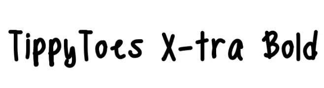
( Fonts by a Emily Spadoni - http://creativemarket.com/emilyspadoni/. Personal-use only. For commercial use please contact owner. )
A bold, playful handwritten font with thick strokes and a casual style.
![TippyToes X-tra Bold Frei Schriftart Herunterladen]() Herunterladen 342 Downloads@WebFont
Herunterladen 342 Downloads@WebFont -
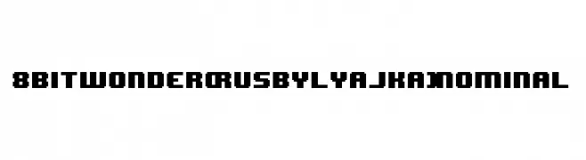
( Fonts by FONTS BY LYAJKA - Personal-use only. For commercial use please contact owner. )
A retro, pixelated font with a bold, blocky design ideal for vintage digital themes.
![8BIT WONDER(RUS BY LYAJKA) Nominal Frei Schriftart Herunterladen]() Herunterladen 342 Downloads@WebFont
Herunterladen 342 Downloads@WebFont -
( Fonts by Chequered Ink - chequered.ink - Personal-use only. For commercial use please contact owner. )
A dynamic, angular font with a modern, energetic style.
![Ominus Frei Schriftart Herunterladen]() Herunterladen 342 Downloads@WebFont
Herunterladen 342 Downloads@WebFont -
![A-Maze Frei Schriftart Herunterladen]() Herunterladen 342 Downloads@WebFont
Herunterladen 342 Downloads@WebFont -
( گالری فانت فارسی پژوهش آريانا - only compatible with Farsi and Arabic )
A bold, modern font with geometric lines and balanced spacing.
![Raaz Frei Schriftart Herunterladen]() Herunterladen 342 Downloads@WebFont
Herunterladen 342 Downloads@WebFont -
( Fonts by Daniel Zadorozny - www.iconian.com )
A bold, italicized font with a futuristic, angular design.
![4114 Blaster Bold Italic Frei Schriftart Herunterladen]() Herunterladen 342 Downloads@WebFont
Herunterladen 342 Downloads@WebFont -
( Fonts by Mr Fisk - Mike Larsson - fontorama.net )
A bold, playful font with irregular, hand-drawn outlines.
![PeepShow Frei Schriftart Herunterladen]() Herunterladen 342 Downloads@WebFont
Herunterladen 342 Downloads@WebFont -
( Fonts by www.fontalicious.com )
A bold, geometric font with playful circular cutouts.
![Velcro Frei Schriftart Herunterladen]() Herunterladen 342 Downloads@WebFont
Herunterladen 342 Downloads@WebFont -
( Fonts by CannotIntoSpaceFonts - KineticPlasma Fonts - Personal-use only. For commercial use please contact owner. )
A bold, modern font with a slightly condensed style and clean lines.
![Give A Hoot Frei Schriftart Herunterladen]() Herunterladen 342 Downloads@WebFont
Herunterladen 342 Downloads@WebFont -
( Fonts by Chequered Ink )
A bold, geometric font with sharp angles and a strong, modern presence.
![Lovesauce Frei Schriftart Herunterladen]() Herunterladen 342 Downloads@WebFont
Herunterladen 342 Downloads@WebFont


Welche Schriften sind gerade am populärsten?
Poppins, Roboto, Montserrat, Open Sans und Lato sind wegen ihrer klaren Formen und breiten Einsetzbarkeit sehr gefragt – von Markenauftritt über Landingpages bis hin zu Postern.
Welche Fonts eignen sich für Logos?
Geometrische Sans‑Serifs (z. B. Poppins, Familien im Gotham‑Stil) sind ein häufiger Griff für sauberes, skalierbares Branding. Für eine persönlichere Note bleiben Scripts und Handschrift‑Stile beliebt. Kombinieren Sie einen prägnanten Headline‑Font mit einer neutralen Brotschrift für Wiedererkennung und Harmonie.
Wie oft wird die Top‑Liste aktualisiert?
Regelmäßig – basierend auf realen Downloads und Interaktionen. Schauen Sie öfter vorbei, um aufstrebende Favoriten früh zu entdecken.
💡 Tipp: Seite bookmarken – Trends wechseln schnell, und heutige Top‑Schriften inspirieren morgen vielleicht das Rebranding.