Willkommen bei den Top‑Schriften – hier treffen Beliebtheit und Qualität aufeinander. Das sind die in diesem Jahr am häufigsten heruntergeladenen und genutzten Fonts. Wenn Sie sichere Optionen für Logo, Web oder Social suchen, starten Sie hier.
Jeder Top‑Font überzeugt durch Balance, Lesbarkeit und Vielseitigkeit. Sie finden moderne Sans‑Serifs, elegante Scripts, Vintage‑Serifs und minimalistische Displays.
-
 Herunterladen 341 Downloads@WebFont
 -
![The Blob Demo Frei Schriftart Herunterladen]() Herunterladen 341 Downloads@WebFont
Herunterladen 341 Downloads@WebFont -
( Free for a personal use. For a commercial use please visit www.kevinandamanda.com )
A playful, handwritten font with a casual and dynamic style.
![Pea Jia Frei Schriftart Herunterladen]() Herunterladen 341 Downloads@WebFont
Herunterladen 341 Downloads@WebFont -
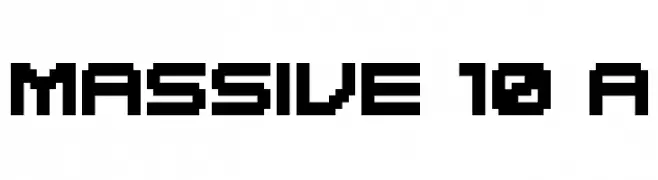
![MASSIVE 10 A Frei Schriftart Herunterladen]() Herunterladen 341 Downloads@WebFont
Herunterladen 341 Downloads@WebFont -
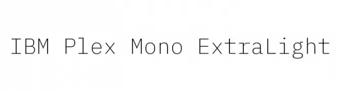
( Copyright © 2017 IBM Corp. with Reserved Font Name "Plex" )
A clean, monospaced typeface with a minimalist and modern design.
![IBM Plex Mono ExtraLight Frei Schriftart Herunterladen]() Herunterladen 341 Downloads@WebFont
Herunterladen 341 Downloads@WebFont -
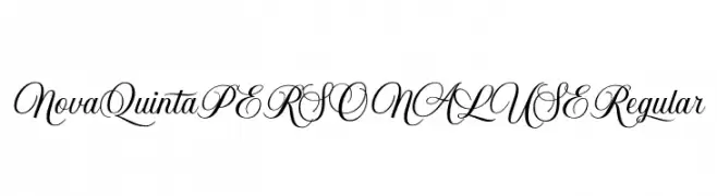
( Fonts by Mans Greback - www.mansgreback.com - Personal-use only. For commercial use please contact owner. )
An elegant script font with flowing, ornate cursive letters.
![Nova Quinta PERSONAL USE Regular Frei Schriftart Herunterladen]() Herunterladen 341 Downloads@WebFont
Herunterladen 341 Downloads@WebFont -
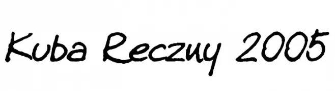
( www.bbuoy.com )
A casual, handwritten font with a dynamic and organic style.
![Kuba Reczny 2005 Frei Schriftart Herunterladen]() Herunterladen 341 Downloads@WebFont
Herunterladen 341 Downloads@WebFont -
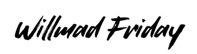
( Fonts by Muhammad Sirojuddin - lettersiro.com - Personal-use only. For commercial use please contact owner. )
A bold, brush-style font with dynamic and expressive strokes.
![Willmad Friday Frei Schriftart Herunterladen]() Herunterladen 341 Downloads@WebFont
Herunterladen 341 Downloads@WebFont -
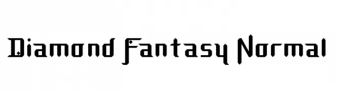
![Diamond Fantasy Normal Frei Schriftart Herunterladen]() Herunterladen 341 Downloads@WebFont
Herunterladen 341 Downloads@WebFont -
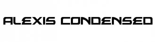
( Fonts by Daniel Zadorozny - www.iconian.com - Free for personal use )
A futuristic, geometric font with sharp angles and a condensed style.
![Alexis Condensed Frei Schriftart Herunterladen]() Herunterladen 341 Downloads@WebFont
Herunterladen 341 Downloads@WebFont -
( Fonts by www.typodermicfonts.com - Ray Larabie )
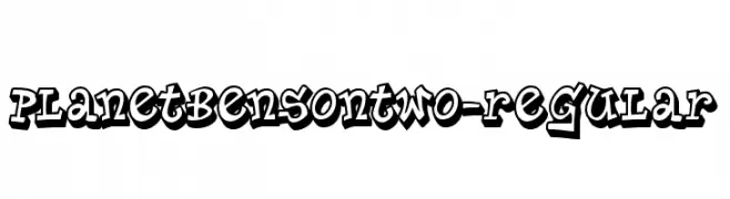
A bold, graffiti-inspired font with a playful, three-dimensional style.
![PlanetBensonTwo-Regular Frei Schriftart Herunterladen]() Herunterladen 341 Downloads@WebFont
Herunterladen 341 Downloads@WebFont -
![thick Frei Schriftart Herunterladen]() Herunterladen 341 Downloads@WebFont
Herunterladen 341 Downloads@WebFont -
( Fonts by Lettering Mom )
A playful, bold font with rounded, bubbly characters.
![Beezybee Frei Schriftart Herunterladen]() Herunterladen 341 Downloads@WebFont
Herunterladen 341 Downloads@WebFont -
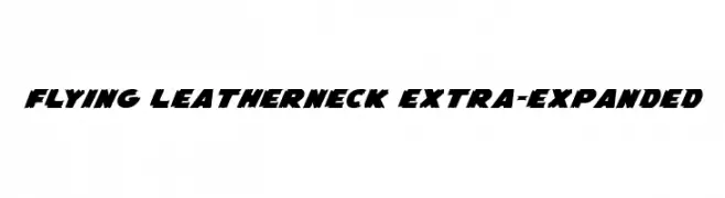
( Fonts by Daniel Zadorozny - www.iconian.com - Free for personal use )
A bold, dynamic font with a rugged, distressed style and strong presence.
![Flying Leatherneck Extra-expanded Frei Schriftart Herunterladen]() Herunterladen 341 Downloads@WebFont
Herunterladen 341 Downloads@WebFont -
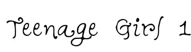
![Teenage Girl 1 Frei Schriftart Herunterladen]() Herunterladen 341 Downloads@WebFont
Herunterladen 341 Downloads@WebFont -
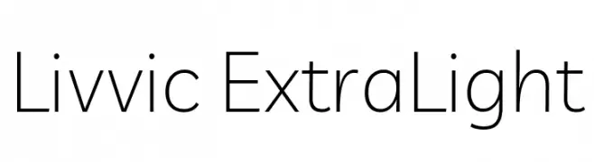
( Copyright 2019 The Livvic Project Authors (https://github.com/Fonthausen/Livvic) )
A clean, modern typeface with thin strokes and geometric influences.
![Livvic ExtraLight Frei Schriftart Herunterladen]() Herunterladen 341 Downloads@WebFont
Herunterladen 341 Downloads@WebFont -
( Fonts by da_only_aan )
A bold, fragmented font with a strong, impactful design.
![Pieces Frei Schriftart Herunterladen]() Herunterladen 341 Downloads@WebFont
Herunterladen 341 Downloads@WebFont -
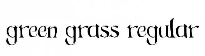
![Green Grass Regular Frei Schriftart Herunterladen]() Herunterladen 341 Downloads@WebFont
Herunterladen 341 Downloads@WebFont -
![Baljit Medium Frei Schriftart Herunterladen]() Herunterladen 341 Downloads
Herunterladen 341 Downloads -
( Fonts by Thirtypath - Personal-use only. For commercial use please contact owner. )
A lively handwritten font with flowing, interconnected letterforms.
![Stamford Bridge Frei Schriftart Herunterladen]() Herunterladen 341 Downloads@WebFont
Herunterladen 341 Downloads@WebFont -
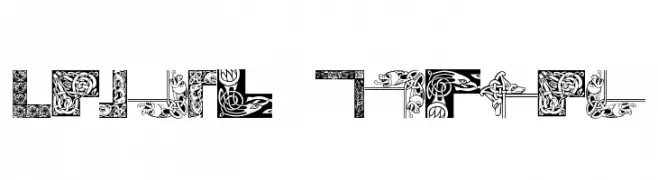
( Fonts by Dieter Steffmann )
Ornate, Celtic-inspired decorative font with elaborate borders.
![Celtic Frames Frei Schriftart Herunterladen]() Herunterladen 341 Downloads@WebFont
Herunterladen 341 Downloads@WebFont -
![Salmiak College Frei Schriftart Herunterladen]() Herunterladen 341 Downloads@WebFont
Herunterladen 341 Downloads@WebFont -
![BubbleMan Frei Schriftart Herunterladen]() Herunterladen 341 Downloads@WebFont
Herunterladen 341 Downloads@WebFont -
![LittleBerry Frei Schriftart Herunterladen]() Herunterladen 341 Downloads@WebFont
Herunterladen 341 Downloads@WebFont -
( Fonts by Khrys Bosland )
A playful handwritten font with rounded edges and a casual, friendly style.
![KBGobbleDay Frei Schriftart Herunterladen]() Herunterladen 341 Downloads@WebFont
Herunterladen 341 Downloads@WebFont -
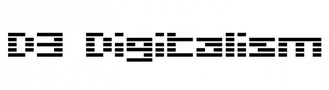
( Fonts by www.DigitalDreamDesign.net )
A pixelated, digital-style font inspired by LED displays.
![D3 Digitalism Frei Schriftart Herunterladen]() Herunterladen 341 Downloads@WebFont
Herunterladen 341 Downloads@WebFont -
( Fonts by Masa Aska Sanurumi )
A playful, bold, and hand-drawn font with rounded, irregular characters.
![Spooky Lucky Solid Frei Schriftart Herunterladen]() Herunterladen 341 Downloads@WebFont
Herunterladen 341 Downloads@WebFont -
( Fonts by Daniel Zadorozny - www.iconian.com - Free for personal use )
A bold, shadowed Blackletter style font with dramatic, angular lines.
![Biergärten Shadow Frei Schriftart Herunterladen]() Herunterladen 341 Downloads@WebFont
Herunterladen 341 Downloads@WebFont -
( Fonts by Origin Type )
A playful, bold font with rounded, thick strokes and a whimsical touch.
![Inter Mush Frei Schriftart Herunterladen]() Herunterladen 341 Downloads@WebFont
Herunterladen 341 Downloads@WebFont -
( Fonts by Jacob Fisher - www.pizzadude.dk )
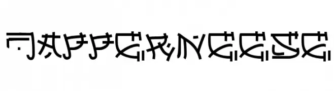
A bold, geometric font with a futuristic and tribal aesthetic.
![Japperneese Frei Schriftart Herunterladen]() Herunterladen 341 Downloads@WebFont
Herunterladen 341 Downloads@WebFont -
![Sepetiba Personal Use Regular Frei Schriftart Herunterladen]() Herunterladen 341 Downloads@WebFont
Herunterladen 341 Downloads@WebFont -
![Sexy MF Frei Schriftart Herunterladen]() Herunterladen 341 Downloads@WebFont
Herunterladen 341 Downloads@WebFont -
( André Harabara - harabara.carbonmade.com/ )
A bold, futuristic font with angular, geometric characters.
![KIQ Bold Demo Frei Schriftart Herunterladen]() Herunterladen 341 Downloads@WebFont
Herunterladen 341 Downloads@WebFont -
( Noto is a trademark of Google Inc. Noto fonts are open source. All Noto fonts are published under the SIL Open Font License, Version 1.1 )
The image contains placeholder symbols instead of a valid font.
![Noto Kufi Arabic Bold Frei Schriftart Herunterladen]() Herunterladen 341 Downloads@WebFont
Herunterladen 341 Downloads@WebFont -
( Fonts by Apostrophic Lab )
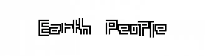
A geometric, maze-like font with a futuristic and digital aesthetic.
![Earth People Frei Schriftart Herunterladen]() Herunterladen 340 Downloads@WebFont
Herunterladen 340 Downloads@WebFont


Welche Schriften sind gerade am populärsten?
Poppins, Roboto, Montserrat, Open Sans und Lato sind wegen ihrer klaren Formen und breiten Einsetzbarkeit sehr gefragt – von Markenauftritt über Landingpages bis hin zu Postern.
Welche Fonts eignen sich für Logos?
Geometrische Sans‑Serifs (z. B. Poppins, Familien im Gotham‑Stil) sind ein häufiger Griff für sauberes, skalierbares Branding. Für eine persönlichere Note bleiben Scripts und Handschrift‑Stile beliebt. Kombinieren Sie einen prägnanten Headline‑Font mit einer neutralen Brotschrift für Wiedererkennung und Harmonie.
Wie oft wird die Top‑Liste aktualisiert?
Regelmäßig – basierend auf realen Downloads und Interaktionen. Schauen Sie öfter vorbei, um aufstrebende Favoriten früh zu entdecken.
💡 Tipp: Seite bookmarken – Trends wechseln schnell, und heutige Top‑Schriften inspirieren morgen vielleicht das Rebranding.