Willkommen bei den Top‑Schriften – hier treffen Beliebtheit und Qualität aufeinander. Das sind die in diesem Jahr am häufigsten heruntergeladenen und genutzten Fonts. Wenn Sie sichere Optionen für Logo, Web oder Social suchen, starten Sie hier.
Jeder Top‑Font überzeugt durch Balance, Lesbarkeit und Vielseitigkeit. Sie finden moderne Sans‑Serifs, elegante Scripts, Vintage‑Serifs und minimalistische Displays.
-
( a.i - ai.kobe.com )
A modern sans-serif font with clean lines and excellent readability.
 Herunterladen 340 Downloads@WebFont
 -
( Fonts by Spork Thug Typography - Josh Wilhelm - www.lifewithouttaffy.com/taffy/blog )
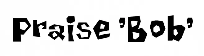
A bold, playful font with an irregular, jagged design.
![Praise 'Bob' Frei Schriftart Herunterladen]() Herunterladen 340 Downloads@WebFont
Herunterladen 340 Downloads@WebFont -
( Fonts by Grzegorz l - www.glukfonts.pl )
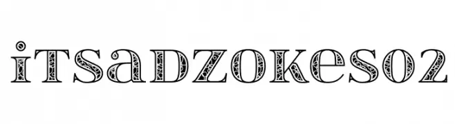
An ornate, decorative serif font with intricate interior patterns.
![itsadzokeS02 Frei Schriftart Herunterladen]() Herunterladen 340 Downloads@WebFont
Herunterladen 340 Downloads@WebFont -
( Fonts by Scratchones )
A graceful script font with flowing, interconnected letters and high contrast strokes.
![Badgers Frei Schriftart Herunterladen]() Herunterladen 340 Downloads@WebFont
Herunterladen 340 Downloads@WebFont -
( Fonts by a kmzero font foundry - www.zetafonts.com. Personal-use only. For commercial use please contact owner. )
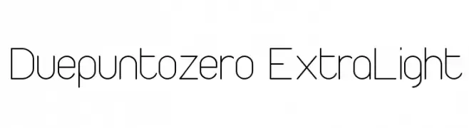
A sleek, modern extra-light font with geometric and minimalist design.
![Duepuntozero ExtraLight Frei Schriftart Herunterladen]() Herunterladen 340 Downloads@WebFont
Herunterladen 340 Downloads@WebFont -
( Fonts by FONTS BY LYAJKA - Personal-use only. For commercial use please contact owner. )
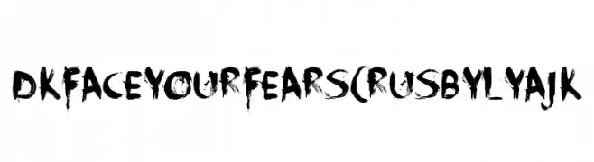
A bold, distressed brushstroke font with an edgy, dramatic style.
![DK Face Your Fears(RUS BY LYAJK Frei Schriftart Herunterladen]() Herunterladen 340 Downloads@WebFont
Herunterladen 340 Downloads@WebFont -
( Free for a personal use. For a commercial use please visit www.kevinandamanda.com )
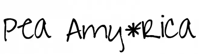
A playful, handwritten font with irregular strokes and a casual vibe.
![Pea Amy*Rica Frei Schriftart Herunterladen]() Herunterladen 340 Downloads@WebFont
Herunterladen 340 Downloads@WebFont -
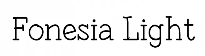
![Fonesia Light Frei Schriftart Herunterladen]() Herunterladen 340 Downloads@WebFont
Herunterladen 340 Downloads@WebFont -
( André Harabara - harabara.carbonmade.com/ )
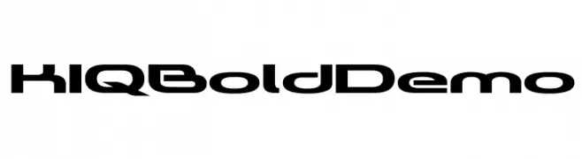
A bold, futuristic font with angular, geometric characters.
![KIQ Bold Demo Frei Schriftart Herunterladen]() Herunterladen 340 Downloads@WebFont
Herunterladen 340 Downloads@WebFont -
![Venera100 Frei Schriftart Herunterladen]() Herunterladen 340 Downloads@WebFont
Herunterladen 340 Downloads@WebFont -
( Rob Ashcroft - www.facebook.com/pages/Teacher-Resources/130918280284678 )
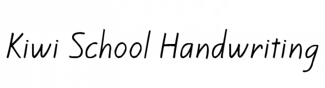
A casual, handwritten-style font with a school-inspired aesthetic.
![Kiwi School Handwriting Frei Schriftart Herunterladen]() Herunterladen 339 Downloads@WebFont
Herunterladen 339 Downloads@WebFont -
( Free for a personal use. For a commercial use please visit www.kevinandamanda.com )
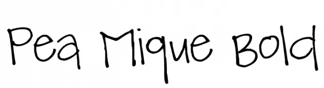
A playful, handwritten font with a casual and friendly appearance.
![Pea Mique Bold Frei Schriftart Herunterladen]() Herunterladen 339 Downloads@WebFont
Herunterladen 339 Downloads@WebFont -
( www.woodcutter.es )
A modern, bilingual font combining sans-serif Roman and Japanese characters.
![Apple Japanese Keyboard Frei Schriftart Herunterladen]() Herunterladen 339 Downloads@WebFont
Herunterladen 339 Downloads@WebFont -
( Fonts by deFharo - Personal-use only. For commercial use please contact owner. )
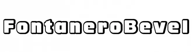
A bold, beveled font with a three-dimensional, geometric style.
![FontaneroBevel Frei Schriftart Herunterladen]() Herunterladen 339 Downloads@WebFont
Herunterladen 339 Downloads@WebFont -
( Fonts by www.blambot.com )
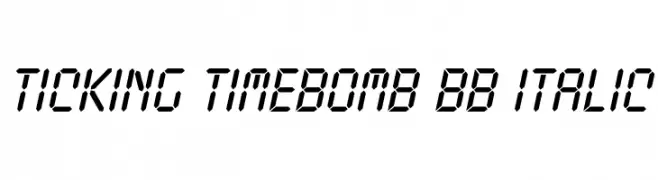
A digital, segmented font with an italic slant, inspired by LED displays.
![Ticking Timebomb BB Italic Frei Schriftart Herunterladen]() Herunterladen 339 Downloads@WebFont
Herunterladen 339 Downloads@WebFont -
( Fonts by Figs - Personal-use only. For commercial use please contact owner. )
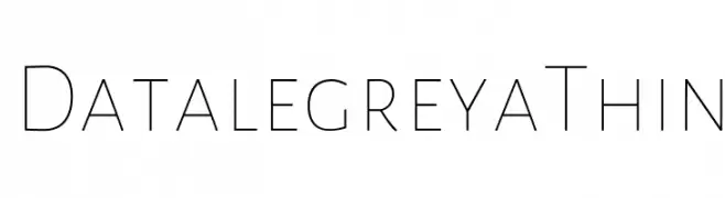
A sleek, modern font with thin, elegant lines and a minimalist aesthetic.
![Datalegreya Thin Frei Schriftart Herunterladen]() Herunterladen 339 Downloads@WebFont
Herunterladen 339 Downloads@WebFont -
![American Kestrel Semi-Straight Frei Schriftart Herunterladen]() Herunterladen 339 Downloads@WebFont
Herunterladen 339 Downloads@WebFont -
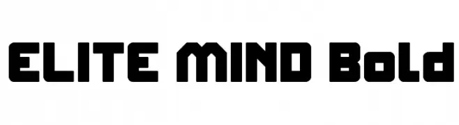
![ELITE MIND Bold Frei Schriftart Herunterladen]() Herunterladen 339 Downloads@WebFont
Herunterladen 339 Downloads@WebFont -
![CheGuevara ChocolateFactory Regular Frei Schriftart Herunterladen]() Herunterladen 339 Downloads@WebFont
Herunterladen 339 Downloads@WebFont -
( Fonts by www.aenigmafonts.com )
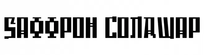
A bold, geometric font with sharp angles and a blocky, industrial style.
![Saffron ColdWar Frei Schriftart Herunterladen]() Herunterladen 339 Downloads@WebFont
Herunterladen 339 Downloads@WebFont -
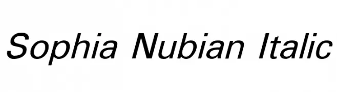
![Sophia Nubian Italic Frei Schriftart Herunterladen]() Herunterladen 339 Downloads@WebFont
Herunterladen 339 Downloads@WebFont -
( PutraCetol Studio - Putra Novembria Candra Kusuma - creativemarket.com/putracetol )
A bold, elegant serif font with a classic and sophisticated style.
![Nuri Free Frei Schriftart Herunterladen]() Herunterladen 339 Downloads@WebFont
Herunterladen 339 Downloads@WebFont -
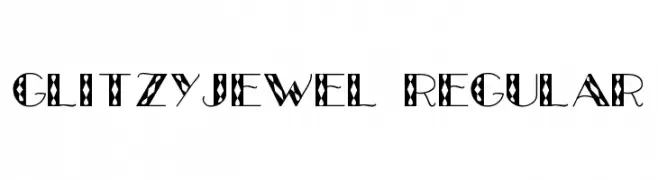
![GlitzyJewel Regular Frei Schriftart Herunterladen]() Herunterladen 339 Downloads@WebFont
Herunterladen 339 Downloads@WebFont -
( Fonts by Dieter Steffmann )
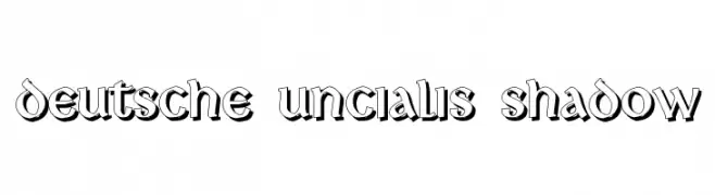
A bold, shadowed font with a vintage decorative style.
![Deutsche Uncialis Shadow Frei Schriftart Herunterladen]() Herunterladen 339 Downloads@WebFont
Herunterladen 339 Downloads@WebFont -
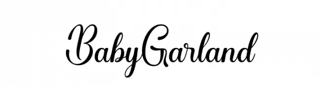
( Fonts by Sidiq Fahmi - Personal-use only. For commercial use please contact owner. )
A cursive, elegant script font with flowing loops and swashes.
![BabyGarland Frei Schriftart Herunterladen]() Herunterladen 339 Downloads@WebFont
Herunterladen 339 Downloads@WebFont -
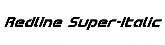
( Fonts by Iconian Fonts )
A bold, italic font with a modern, dynamic style and sharp angles.
![Redline Super-Italic Frei Schriftart Herunterladen]() Herunterladen 339 Downloads@WebFont
Herunterladen 339 Downloads@WebFont -
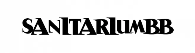
( Fonts by www.blambot.com )
A bold, angular serif font with a dramatic and modern twist.
![SanitariumBB Frei Schriftart Herunterladen]() Herunterladen 339 Downloads@WebFont
Herunterladen 339 Downloads@WebFont -
( Skyhaven Fonts - fonts.plph.co )
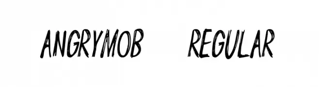
A bold, hand-drawn font with dynamic, angular strokes.
![AngryMob-Regular Frei Schriftart Herunterladen]() Herunterladen 339 Downloads@WebFont
Herunterladen 339 Downloads@WebFont -
( Fonts by Des Gomez )
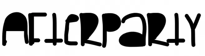
A playful, bold font with a hand-drawn, whimsical style.
![Afterparty Frei Schriftart Herunterladen]() Herunterladen 339 Downloads@WebFont
Herunterladen 339 Downloads@WebFont -
![Raider Crusader Bevel Frei Schriftart Herunterladen]() Herunterladen 339 Downloads@WebFont
Herunterladen 339 Downloads@WebFont -
Schriftart von inGeniousGuru. For commercial use please contact the owner.
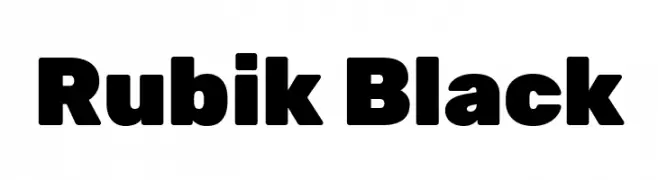
( Rubik font )
A bold, geometric font with a strong, modern presence.
![Rubik Black Frei Schriftart Herunterladen]() Herunterladen 339 Downloads@WebFont
Herunterladen 339 Downloads@WebFont -
( Fonts by www.fontpanda.com. Personal-use only. For commercial use please contact owner. )
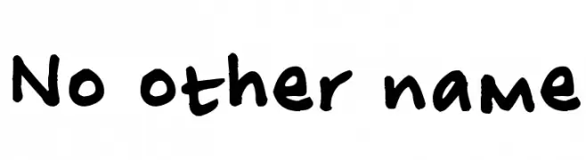
A playful, bold handwritten font with a casual and friendly style.
![No other name Frei Schriftart Herunterladen]() Herunterladen 339 Downloads@WebFont
Herunterladen 339 Downloads@WebFont -
( Fonts by a Max Infeld - XEROGRAPHER FONTS - xerographer.blogspot.com . Personal-use only. For commercial use please contact owner. )
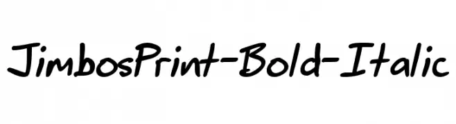
A bold, italicized handwritten font with dynamic and fluid strokes.
![JimbosPrint-Bold-Italic Frei Schriftart Herunterladen]() Herunterladen 339 Downloads@WebFont
Herunterladen 339 Downloads@WebFont -
( Fonts by Hanoded )
A textured, hand-drawn font with a rustic and organic appearance.
![DKBorrowdale Frei Schriftart Herunterladen]() Herunterladen 339 Downloads@WebFont
Herunterladen 339 Downloads@WebFont -
( Fonts by Khurasan )
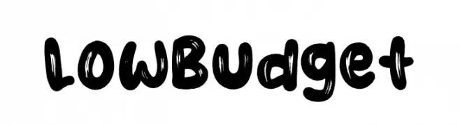
A bold, brush-style font with a playful and artistic appearance.
![Low Budget Frei Schriftart Herunterladen]() Herunterladen 339 Downloads@WebFont
Herunterladen 339 Downloads@WebFont


Welche Schriften sind gerade am populärsten?
Poppins, Roboto, Montserrat, Open Sans und Lato sind wegen ihrer klaren Formen und breiten Einsetzbarkeit sehr gefragt – von Markenauftritt über Landingpages bis hin zu Postern.
Welche Fonts eignen sich für Logos?
Geometrische Sans‑Serifs (z. B. Poppins, Familien im Gotham‑Stil) sind ein häufiger Griff für sauberes, skalierbares Branding. Für eine persönlichere Note bleiben Scripts und Handschrift‑Stile beliebt. Kombinieren Sie einen prägnanten Headline‑Font mit einer neutralen Brotschrift für Wiedererkennung und Harmonie.
Wie oft wird die Top‑Liste aktualisiert?
Regelmäßig – basierend auf realen Downloads und Interaktionen. Schauen Sie öfter vorbei, um aufstrebende Favoriten früh zu entdecken.
💡 Tipp: Seite bookmarken – Trends wechseln schnell, und heutige Top‑Schriften inspirieren morgen vielleicht das Rebranding.