Willkommen bei den Top‑Schriften – hier treffen Beliebtheit und Qualität aufeinander. Das sind die in diesem Jahr am häufigsten heruntergeladenen und genutzten Fonts. Wenn Sie sichere Optionen für Logo, Web oder Social suchen, starten Sie hier.
Jeder Top‑Font überzeugt durch Balance, Lesbarkeit und Vielseitigkeit. Sie finden moderne Sans‑Serifs, elegante Scripts, Vintage‑Serifs und minimalistische Displays.
-
 Herunterladen 340 Downloads@WebFont
 -
![Cisco Cisco Frei Schriftart Herunterladen]() Herunterladen 340 Downloads@WebFont
Herunterladen 340 Downloads@WebFont -
( Fonts by Apostrophic Lab )
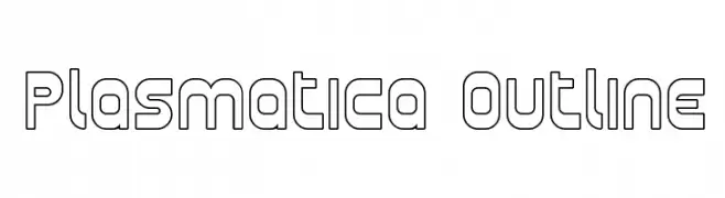
A modern, geometric outline font with clean lines and rounded edges.
![Plasmatica Outline Frei Schriftart Herunterladen]() Herunterladen 340 Downloads@WebFont
Herunterladen 340 Downloads@WebFont -
![Bionic Comic Exp Italic Frei Schriftart Herunterladen]() Herunterladen 340 Downloads
Herunterladen 340 Downloads -
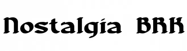
![Nostalgia BRK Frei Schriftart Herunterladen]() Herunterladen 340 Downloads@WebFont
Herunterladen 340 Downloads@WebFont -
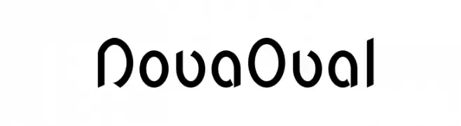
![NovaOval Frei Schriftart Herunterladen]() Herunterladen 340 Downloads@WebFont
Herunterladen 340 Downloads@WebFont -
( Fonts by Ben Nathan )
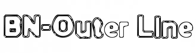
A bold, playful outline font with bubble-like characters and rounded edges.
![BN-Outer Line Frei Schriftart Herunterladen]() Herunterladen 340 Downloads@WebFont
Herunterladen 340 Downloads@WebFont -
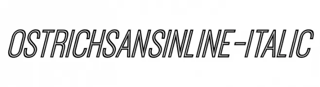
![OstrichSansInline-Italic Frei Schriftart Herunterladen]() Herunterladen 340 Downloads@WebFont
Herunterladen 340 Downloads@WebFont -
( Fonts by www.peter-wiegel.de. Personal-use only. For commercial use please contact owner. )
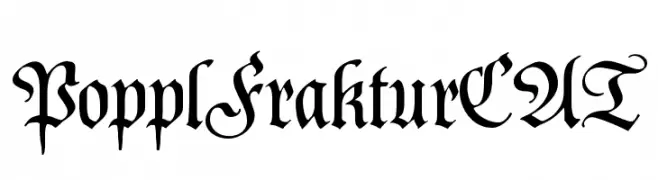
A classic Gothic-style font with ornate and intricate letterforms.
![PopplFrakturCAT Frei Schriftart Herunterladen]() Herunterladen 340 Downloads@WebFont
Herunterladen 340 Downloads@WebFont -
( Fonts by Great Studio - Mulkan Nazir - Personal-use only. For commercial use please contact owner. )
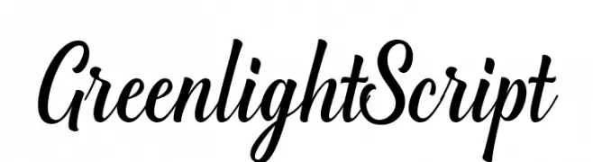
A lively, cursive script font with smooth, connected strokes and medium contrast.
![GreenlightScript Frei Schriftart Herunterladen]() Herunterladen 340 Downloads@WebFont
Herunterladen 340 Downloads@WebFont -
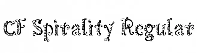
( Fonts by Steve Cloutier - www.cloutierfontes.ca )
A whimsical, decorative font with intricate spirals and curls.
![CF Spirality Regular Frei Schriftart Herunterladen]() Herunterladen 340 Downloads@WebFont
Herunterladen 340 Downloads@WebFont -
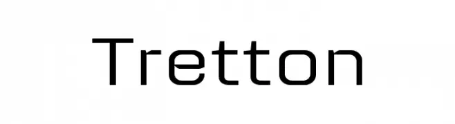
![Tretton Frei Schriftart Herunterladen]() Herunterladen 340 Downloads@WebFont
Herunterladen 340 Downloads@WebFont -
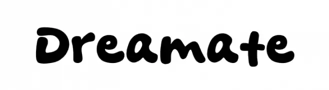
( Fonts by Khurasan )
A playful, bold font with rounded, thick strokes and a whimsical touch.
![Dreamate Frei Schriftart Herunterladen]() Herunterladen 340 Downloads@WebFont
Herunterladen 340 Downloads@WebFont -
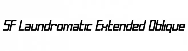
![SF Laundromatic Extended Oblique Frei Schriftart Herunterladen]() Herunterladen 340 Downloads@WebFont
Herunterladen 340 Downloads@WebFont -
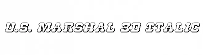
( Fonts by Daniel Zadorozny - www.iconian.com - Free for personal use )
A bold, 3D italic font with a retro flair and thick outlines.
![U.S. Marshal 3D Italic Frei Schriftart Herunterladen]() Herunterladen 340 Downloads@WebFont
Herunterladen 340 Downloads@WebFont -
( Fonts by Nick Curtis - www.nicksfonts.com )
A bold, three-dimensional font with a vintage poster style.
![Franken's-SteinA Frei Schriftart Herunterladen]() Herunterladen 340 Downloads
Herunterladen 340 Downloads -
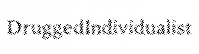
![DruggedIndividualist Frei Schriftart Herunterladen]() Herunterladen 340 Downloads@WebFont
Herunterladen 340 Downloads@WebFont -
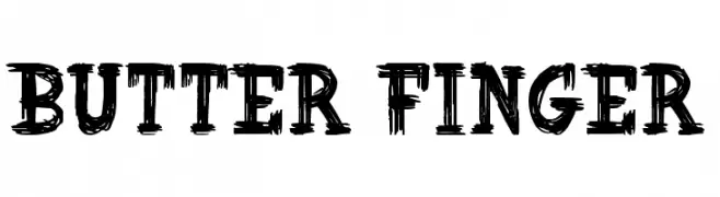
![Butter Finger Frei Schriftart Herunterladen]() Herunterladen 340 Downloads@WebFont
Herunterladen 340 Downloads@WebFont -
![NADC- You Know It Frei Schriftart Herunterladen]() Herunterladen 340 Downloads@WebFont
Herunterladen 340 Downloads@WebFont -
( Fonts by Daniel Zadorozny - www.iconian.com )
A bold, distressed font with jagged edges and a rugged, energetic style.
![Dire Wolf Condensed Frei Schriftart Herunterladen]() Herunterladen 340 Downloads@WebFont
Herunterladen 340 Downloads@WebFont -
( Fonts by wep )
A bold, playful handwritten font with thick strokes and rounded edges.
![Istime Frei Schriftart Herunterladen]() Herunterladen 340 Downloads@WebFont
Herunterladen 340 Downloads@WebFont -
( Fonts by Daniel Zadorozny - www.iconian.com - Free for personal use )
A bold, dynamic font with rounded strokes and a playful slant.
![Masked Marvel Bold Frei Schriftart Herunterladen]() Herunterladen 340 Downloads@WebFont
Herunterladen 340 Downloads@WebFont -
( Copyright (c) 2014, Indian Type Foundry (info@indiantypefoundry.com). )
A lively and dynamic semi-bold script font with smooth curves and a playful appearance.
![Tillana SemiBold Frei Schriftart Herunterladen]() Herunterladen 340 Downloads@WebFont
Herunterladen 340 Downloads@WebFont -
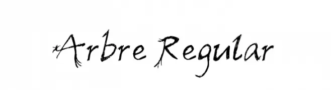
![Arbre Regular Frei Schriftart Herunterladen]() Herunterladen 340 Downloads@WebFont
Herunterladen 340 Downloads@WebFont -
( Fonts by Spork Thug Typography - Josh Wilhelm - www.lifewithouttaffy.com/taffy/blog )
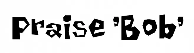
A bold, playful font with an irregular, jagged design.
![Praise 'Bob' Frei Schriftart Herunterladen]() Herunterladen 340 Downloads@WebFont
Herunterladen 340 Downloads@WebFont -
( Fonts by Scratchones )
A graceful script font with flowing, interconnected letters and high contrast strokes.
![Badgers Frei Schriftart Herunterladen]() Herunterladen 340 Downloads@WebFont
Herunterladen 340 Downloads@WebFont -
( Fonts by a kmzero font foundry - www.zetafonts.com. Personal-use only. For commercial use please contact owner. )
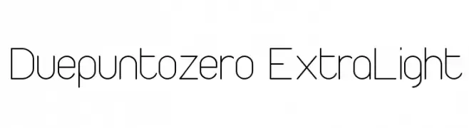
A sleek, modern extra-light font with geometric and minimalist design.
![Duepuntozero ExtraLight Frei Schriftart Herunterladen]() Herunterladen 340 Downloads@WebFont
Herunterladen 340 Downloads@WebFont -
( Fonts by FONTS BY LYAJKA - Personal-use only. For commercial use please contact owner. )
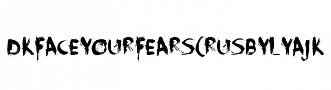
A bold, distressed brushstroke font with an edgy, dramatic style.
![DK Face Your Fears(RUS BY LYAJK Frei Schriftart Herunterladen]() Herunterladen 340 Downloads@WebFont
Herunterladen 340 Downloads@WebFont -
( Fonts by Anton Moglia - Personal-use only. For commercial use please contact owner. )
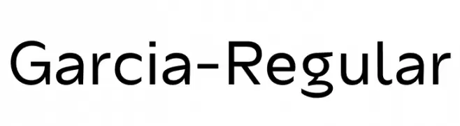
A modern, geometric sans-serif font with clean lines and balanced proportions.
![Garcia-Regular Frei Schriftart Herunterladen]() Herunterladen 340 Downloads@WebFont
Herunterladen 340 Downloads@WebFont -
( Fonts by Geronimo )
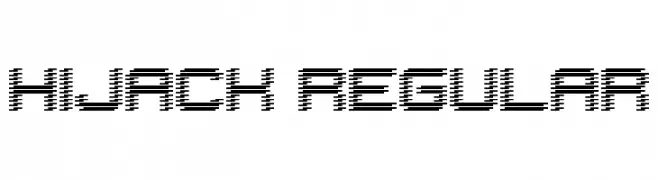
A futuristic, pixelated font with a high-tech aesthetic.
![Hijack Regular Frei Schriftart Herunterladen]() Herunterladen 340 Downloads@WebFont
Herunterladen 340 Downloads@WebFont -
![Morning Font Frei Schriftart Herunterladen]() Herunterladen 340 Downloads@WebFont
Herunterladen 340 Downloads@WebFont -
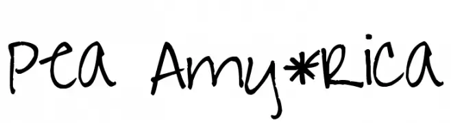
( Free for a personal use. For a commercial use please visit www.kevinandamanda.com )
A playful, handwritten font with irregular strokes and a casual vibe.
![Pea Amy*Rica Frei Schriftart Herunterladen]() Herunterladen 340 Downloads@WebFont
Herunterladen 340 Downloads@WebFont -
![Venera100 Frei Schriftart Herunterladen]() Herunterladen 340 Downloads@WebFont
Herunterladen 340 Downloads@WebFont -
Schriftart von davalignllc. For commercial use please contact the owner.
![DBE-Rigil Kentaurus Frei Schriftart Herunterladen]() Herunterladen 340 Downloads@WebFont
Herunterladen 340 Downloads@WebFont -
( Fonts by Wolve Fonts - https://www.deviantart.com/wolves-fonts - Personal-use only. For commercial use please contact owner. )
A bold, italicized sans-serif font with a modern and impactful style.
![Galyon Bold Italic Frei Schriftart Herunterladen]() Herunterladen 340 Downloads@WebFont
Herunterladen 340 Downloads@WebFont


Welche Schriften sind gerade am populärsten?
Poppins, Roboto, Montserrat, Open Sans und Lato sind wegen ihrer klaren Formen und breiten Einsetzbarkeit sehr gefragt – von Markenauftritt über Landingpages bis hin zu Postern.
Welche Fonts eignen sich für Logos?
Geometrische Sans‑Serifs (z. B. Poppins, Familien im Gotham‑Stil) sind ein häufiger Griff für sauberes, skalierbares Branding. Für eine persönlichere Note bleiben Scripts und Handschrift‑Stile beliebt. Kombinieren Sie einen prägnanten Headline‑Font mit einer neutralen Brotschrift für Wiedererkennung und Harmonie.
Wie oft wird die Top‑Liste aktualisiert?
Regelmäßig – basierend auf realen Downloads und Interaktionen. Schauen Sie öfter vorbei, um aufstrebende Favoriten früh zu entdecken.
💡 Tipp: Seite bookmarken – Trends wechseln schnell, und heutige Top‑Schriften inspirieren morgen vielleicht das Rebranding.