Willkommen bei den Top‑Schriften – hier treffen Beliebtheit und Qualität aufeinander. Das sind die in diesem Jahr am häufigsten heruntergeladenen und genutzten Fonts. Wenn Sie sichere Optionen für Logo, Web oder Social suchen, starten Sie hier.
Jeder Top‑Font überzeugt durch Balance, Lesbarkeit und Vielseitigkeit. Sie finden moderne Sans‑Serifs, elegante Scripts, Vintage‑Serifs und minimalistische Displays.
-
( Fonts by Letter Art Studio )
A playful, hand-drawn font with a whimsical and quirky style.
 Herunterladen 333 Downloads@WebFont
 -
( Fonts by Des Gomez )
A playful, hand-drawn font with bold, uneven strokes and a whimsical style.
![Goons Frei Schriftart Herunterladen]() Herunterladen 333 Downloads@WebFont
Herunterladen 333 Downloads@WebFont -
( Copyright (c) 2015, Christian Thalmann and the Cormorant Project Authors (github.com/CatharsisFonts/Cormorant) )
A bold, italic serif font with classic elegance and strong visibility.
![Cormorant Infant Bold Italic Frei Schriftart Herunterladen]() Herunterladen 333 Downloads@WebFont
Herunterladen 333 Downloads@WebFont -
( Fonts by Almarkhatype - Abdul Malik Wisnu - Personal-use only. For commercial use please contact owner. )
A playful and expressive handwritten font with fluid strokes.
![Lovely Sweetie Frei Schriftart Herunterladen]() Herunterladen 333 Downloads@WebFont
Herunterladen 333 Downloads@WebFont -
( Fonts by Skiiller Studio )
A bold, handwritten font with a playful and energetic style.
![Amsyong Frei Schriftart Herunterladen]() Herunterladen 333 Downloads@WebFont
Herunterladen 333 Downloads@WebFont -
![Puente Bueno St Frei Schriftart Herunterladen]() Herunterladen 333 Downloads@WebFont
Herunterladen 333 Downloads@WebFont -
( Fonts by www.woodcutter.es - woodcutter Manero - Personal-use only. For commercial use please contact owner. )
A bold, geometric font with high contrast and blocky characters.
![fifth avenue Bold Frei Schriftart Herunterladen]() Herunterladen 333 Downloads@WebFont
Herunterladen 333 Downloads@WebFont -
( Thor Christopher Arisland - www.tcarisland.com )
A bold, geometric sans-serif font with a modern and clean style.
![SolidSans Frei Schriftart Herunterladen]() Herunterladen 333 Downloads@WebFont
Herunterladen 333 Downloads@WebFont -
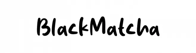
( Fonts by Origin Type )
Bold, playful handwritten font.
![Black Matcha Frei Schriftart Herunterladen]() Herunterladen 333 Downloads@WebFont
Herunterladen 333 Downloads@WebFont -
( Fonts by Mans Greback - www.mawns.com )
A sleek, modern font with thin, elongated strokes and geometric precision.
![Denigan Frei Schriftart Herunterladen]() Herunterladen 333 Downloads@WebFont
Herunterladen 333 Downloads@WebFont -
![ALLined Frei Schriftart Herunterladen]() Herunterladen 333 Downloads@WebFont
Herunterladen 333 Downloads@WebFont -
( Fonts by Roman Paslavskiy )
A bold, vintage-style font with strong serifs and a classic Western feel.
![Goldfather Frei Schriftart Herunterladen]() Herunterladen 333 Downloads@WebFont
Herunterladen 333 Downloads@WebFont -
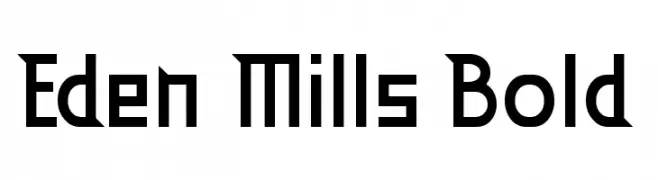
![Eden Mills Bold Frei Schriftart Herunterladen]() Herunterladen 333 Downloads@WebFont
Herunterladen 333 Downloads@WebFont -
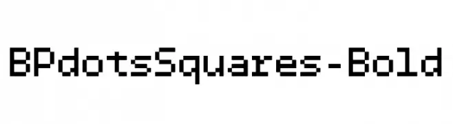
( Fonts by backpacker.gr )
A pixelated, bold font with a retro digital aesthetic.
![BPdotsSquares-Bold Frei Schriftart Herunterladen]() Herunterladen 333 Downloads@WebFont
Herunterladen 333 Downloads@WebFont -
( Free - www.ingofonts.com )
A dynamic brush-style font with expressive, fluid strokes and artistic flair.
![DeBorstelBrushReduced Frei Schriftart Herunterladen]() Herunterladen 333 Downloads@WebFont
Herunterladen 333 Downloads@WebFont -
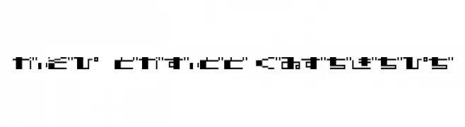
( Fonts by Baka - Kyakirun - bakafonts.kyakirun.com )
A bold, pixelated font with a geometric, digital aesthetic.
![TECNO STRESS HIRAGANA Frei Schriftart Herunterladen]() Herunterladen 333 Downloads@WebFont
Herunterladen 333 Downloads@WebFont -
( K-Type - Keith Bates - www.k-type.com/ )
A modern sans-serif font with clean lines and balanced proportions.
![Romanica Frei Schriftart Herunterladen]() Herunterladen 333 Downloads@WebFont
Herunterladen 333 Downloads@WebFont -
![Gold Plated Frei Schriftart Herunterladen]() Herunterladen 333 Downloads@WebFont
Herunterladen 333 Downloads@WebFont -
![RedouraDEMO Frei Schriftart Herunterladen]() Herunterladen 333 Downloads@WebFont
Herunterladen 333 Downloads@WebFont -
( Zetafonts - www.zetafonts.com )
A bold and italicized font with strong, slanted strokes and a dynamic presence.
![AnaphoraTrial-BoldItalic Frei Schriftart Herunterladen]() Herunterladen 333 Downloads@WebFont
Herunterladen 333 Downloads@WebFont -
![Astral Frei Schriftart Herunterladen]() Herunterladen 333 Downloads@WebFont
Herunterladen 333 Downloads@WebFont -
![Felicitation_Arabic Feasts Frei Schriftart Herunterladen]() Herunterladen 333 Downloads@WebFont
Herunterladen 333 Downloads@WebFont -
( Fonts by Bangkit Tri Setiadi - Personal-use only. For commercial use please contact owner. )
A bold, blackletter-style font with intricate detailing and strong vertical strokes.
![Cristone Regular Frei Schriftart Herunterladen]() Herunterladen 333 Downloads@WebFont
Herunterladen 333 Downloads@WebFont -
( Fonts by a Max Infeld - XEROGRAPHER FONTS - xerographer.blogspot.com . Personal-use only. For commercial use please contact owner. )
A bold, playful, hand-drawn font with dynamic and irregular characters.
![MadCaps Frei Schriftart Herunterladen]() Herunterladen 333 Downloads@WebFont
Herunterladen 333 Downloads@WebFont -
( Fonts by junkohanhero - Personal-use only. For commercial use please contact owner. )
A bold, distressed font with a rugged, weathered appearance.
![Examples of erosion Frei Schriftart Herunterladen]() Herunterladen 333 Downloads@WebFont
Herunterladen 333 Downloads@WebFont -
( Fonts by HENRIavecunK )
A classic serif font with elegant, slender characters and distinct serifs.
![Camargue Serif Regular Frei Schriftart Herunterladen]() Herunterladen 333 Downloads@WebFont
Herunterladen 333 Downloads@WebFont -
![Chiseled Open Frei Schriftart Herunterladen]() Herunterladen 333 Downloads@WebFont
Herunterladen 333 Downloads@WebFont -
![Bands & Artists Frei Schriftart Herunterladen]() Herunterladen 333 Downloads@WebFont
Herunterladen 333 Downloads@WebFont -
( Fonts by a Adrian Candela - http://www.behance.net/takuminokami . Personal-use only. For commercial use please contact owner. )
A geometric, layered outline font with a modern, futuristic style.
![Newsense Frei Schriftart Herunterladen]() Herunterladen 333 Downloads@WebFont
Herunterladen 333 Downloads@WebFont -
( Fonts by Dan P. Lyons - Personal-use only. For commercial use please contact owner. )
A playful, handwritten font with rounded edges and consistent stroke width.
![Handpower Frei Schriftart Herunterladen]() Herunterladen 333 Downloads@WebFont
Herunterladen 333 Downloads@WebFont -
( Fonts by www.fontalicious.com )
A bold, geometric font with a modern, futuristic style.
![Sanka Frei Schriftart Herunterladen]() Herunterladen 333 Downloads@WebFont
Herunterladen 333 Downloads@WebFont -
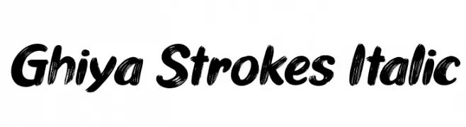
( Fonts by Tan Cundrawan - cove703 - creativemarket.com/cove703 - Personal-use only. For commercial use please contact owner. )
A bold, italic brushstroke font with dynamic, textured letters.
![Ghiya Strokes Italic Frei Schriftart Herunterladen]() Herunterladen 333 Downloads@WebFont
Herunterladen 333 Downloads@WebFont -
( 7NTypes - Situjuh Nazara - 7ntypes.com )
A playful, hand-drawn font with a whimsical and casual style.
![Sri Muliyo Frei Schriftart Herunterladen]() Herunterladen 333 Downloads@WebFont
Herunterladen 333 Downloads@WebFont -
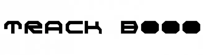
![TRACK Bold Frei Schriftart Herunterladen]() Herunterladen 333 Downloads@WebFont
Herunterladen 333 Downloads@WebFont -
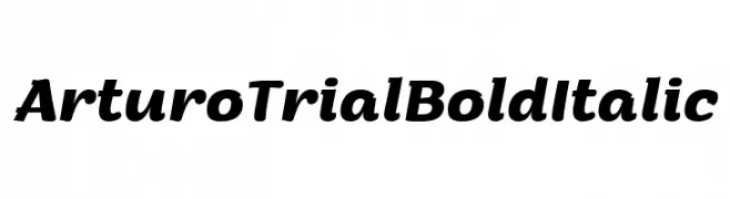
( Zetafonts - www.zetafonts.com )
A bold, italic font with dynamic and flowing letterforms, ideal for impactful designs.
![Arturo Trial Bold Italic Frei Schriftart Herunterladen]() Herunterladen 333 Downloads@WebFont
Herunterladen 333 Downloads@WebFont


Welche Schriften sind gerade am populärsten?
Poppins, Roboto, Montserrat, Open Sans und Lato sind wegen ihrer klaren Formen und breiten Einsetzbarkeit sehr gefragt – von Markenauftritt über Landingpages bis hin zu Postern.
Welche Fonts eignen sich für Logos?
Geometrische Sans‑Serifs (z. B. Poppins, Familien im Gotham‑Stil) sind ein häufiger Griff für sauberes, skalierbares Branding. Für eine persönlichere Note bleiben Scripts und Handschrift‑Stile beliebt. Kombinieren Sie einen prägnanten Headline‑Font mit einer neutralen Brotschrift für Wiedererkennung und Harmonie.
Wie oft wird die Top‑Liste aktualisiert?
Regelmäßig – basierend auf realen Downloads und Interaktionen. Schauen Sie öfter vorbei, um aufstrebende Favoriten früh zu entdecken.
💡 Tipp: Seite bookmarken – Trends wechseln schnell, und heutige Top‑Schriften inspirieren morgen vielleicht das Rebranding.