Willkommen bei den Top‑Schriften – hier treffen Beliebtheit und Qualität aufeinander. Das sind die in diesem Jahr am häufigsten heruntergeladenen und genutzten Fonts. Wenn Sie sichere Optionen für Logo, Web oder Social suchen, starten Sie hier.
Jeder Top‑Font überzeugt durch Balance, Lesbarkeit und Vielseitigkeit. Sie finden moderne Sans‑Serifs, elegante Scripts, Vintage‑Serifs und minimalistische Displays.
-
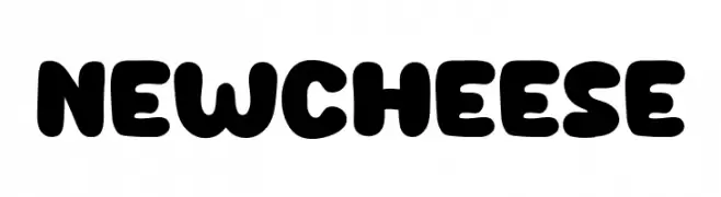
( Fonts by Khurasan )
A bold, rounded font with a playful and whimsical style.
 Herunterladen 330 Downloads@WebFont
 -
( Fonts by Daniel Zadorozny - www.iconian.com - Free for personal use )
A bold, decorative font with sharp edges and rounded curves, blending modern and vintage styles.
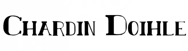
![Chardin Doihle Frei Schriftart Herunterladen]() Herunterladen 330 Downloads@WebFont
Herunterladen 330 Downloads@WebFont -
( Fonts by Dieter Steffmann )
A traditional Blackletter font with ornate, angular letterforms and a vintage aesthetic.
![WieynkFraktur Frei Schriftart Herunterladen]() Herunterladen 330 Downloads@WebFont
Herunterladen 330 Downloads@WebFont -
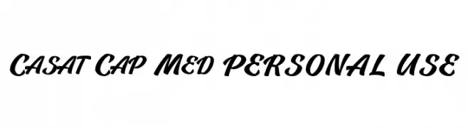
( Måns Grebäck - www.mansgreback.com )
A bold, cursive font with dynamic, flowing strokes and a lively appearance.
![Casat Cap Med PERSONAL USE Frei Schriftart Herunterladen]() Herunterladen 330 Downloads@WebFont
Herunterladen 330 Downloads@WebFont -
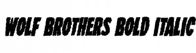
( Fonts by Iconian Fonts )
A bold, italicized font with a rugged, dynamic style.
![Wolf Brothers Bold Italic Frei Schriftart Herunterladen]() Herunterladen 330 Downloads@WebFont
Herunterladen 330 Downloads@WebFont -
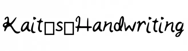
( Fonts by Kaitlyn Russo )
A playful, casual handwritten font with fluid strokes and a whimsical charm.
![Kait_s_Handwriting Frei Schriftart Herunterladen]() Herunterladen 330 Downloads@WebFont
Herunterladen 330 Downloads@WebFont -
( Fonts by Jonathan S. Harris - www.tattoowoo.com. Personal-use only. For commercial use please contact owner. )
A bold, brush-style font with high contrast and a hand-drawn, artistic feel.
![Air Heads Frei Schriftart Herunterladen]() Herunterladen 330 Downloads@WebFont
Herunterladen 330 Downloads@WebFont -
![Happy Day Frei Schriftart Herunterladen]() Herunterladen 330 Downloads@WebFont
Herunterladen 330 Downloads@WebFont -
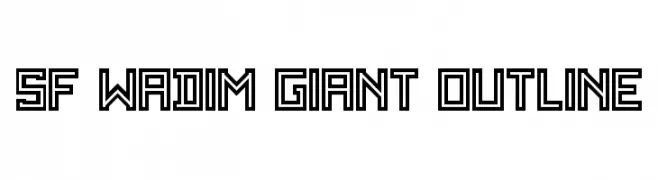
![SF WADIM GIANT OUTLINE Frei Schriftart Herunterladen]() Herunterladen 330 Downloads@WebFont
Herunterladen 330 Downloads@WebFont -
![Retro60 Frei Schriftart Herunterladen]() Herunterladen 330 Downloads@WebFont
Herunterladen 330 Downloads@WebFont -
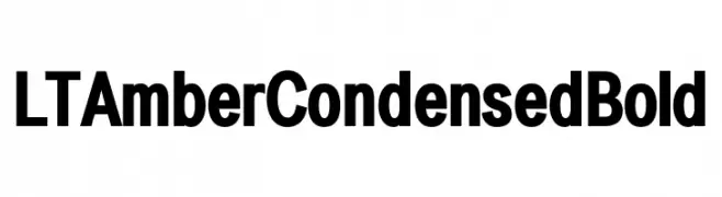
( Fonts by LyonsType - Daniel Lyons - Personal-use only. For commercial use please contact owner. )
A bold, condensed font with a modern and impactful style.
![LT Amber Condensed Bold Frei Schriftart Herunterladen]() Herunterladen 330 Downloads@WebFont
Herunterladen 330 Downloads@WebFont -
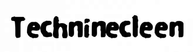
![Techninecleen Frei Schriftart Herunterladen]() Herunterladen 330 Downloads@WebFont
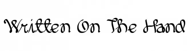
Herunterladen 330 Downloads@WebFont -
![Written On The Hand Frei Schriftart Herunterladen]() Herunterladen 330 Downloads@WebFont
Herunterladen 330 Downloads@WebFont -
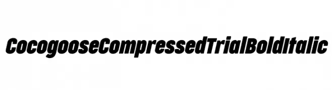
( Fonts by Zetafonts - Personal-use only. For commercial use please contact owner. )
A bold, italic, and compressed font with a modern and dynamic style.
![Cocogoose Compressed Trial Bold Italic Frei Schriftart Herunterladen]() Herunterladen 330 Downloads@WebFont
Herunterladen 330 Downloads@WebFont -
( Woodcutter - woodcutter Manero - www.woodcutter.es )
Bold, geometric e-commerce icon set with high clarity.
![E-commerce Frei Schriftart Herunterladen]() Herunterladen 330 Downloads@WebFont
Herunterladen 330 Downloads@WebFont -
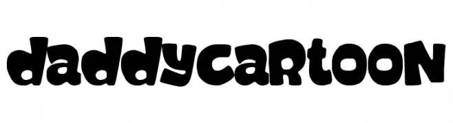
( Fonts by Woodcutter )
A bold, playful font with rounded, cartoonish characters.
![Daddy Cartoon Frei Schriftart Herunterladen]() Herunterladen 330 Downloads@WebFont
Herunterladen 330 Downloads@WebFont -
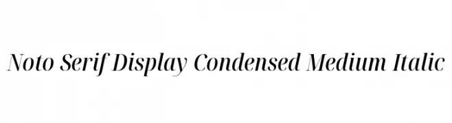
( Noto is a trademark of Google Inc. Noto fonts are open source. All Noto fonts are published under the SIL Open Font License, Version 1.1 )
Elegant serif font with italic style and high contrast, ideal for modern and sophisticated designs.
![Noto Serif Display Condensed Medium Italic Frei Schriftart Herunterladen]() Herunterladen 330 Downloads@WebFont
Herunterladen 330 Downloads@WebFont -
( Fonts by Manfred Klein. Free for private and charity use. Free for commercial with donation to organizations )
A classic italic serif font with elegant, flowing strokes and moderate contrast.
![Cock-Italic Frei Schriftart Herunterladen]() Herunterladen 330 Downloads@WebFont
Herunterladen 330 Downloads@WebFont -
![Strawberry Cocktail Regular Frei Schriftart Herunterladen]() Herunterladen 330 Downloads@WebFont
Herunterladen 330 Downloads@WebFont -
( Free for a personal use. For a commercial use please visit www.kevinandamanda.com )
A playful, handwritten font with bold, rounded strokes and a casual style.
![Pea Paula Frei Schriftart Herunterladen]() Herunterladen 330 Downloads@WebFont
Herunterladen 330 Downloads@WebFont -
( Fonts by Woodcutter )
A collection of diverse, custom-designed brand logos with varied typographic styles.
![the world's best logos Frei Schriftart Herunterladen]() Herunterladen 330 Downloads@WebFont
Herunterladen 330 Downloads@WebFont -
( Fonts by Manjali Studio - Personal-use only. For commercial use please contact owner. )
A playful and elegant script font with a handwritten feel.
![Donalia Frei Schriftart Herunterladen]() Herunterladen 330 Downloads@WebFont
Herunterladen 330 Downloads@WebFont -
![Canidae Hand Frei Schriftart Herunterladen]() Herunterladen 330 Downloads@WebFont
Herunterladen 330 Downloads@WebFont -
( Fonts by Bandit handmade )
A playful, bold, and hand-drawn font with rounded strokes and a dynamic slant.
![Hellokids Frei Schriftart Herunterladen]() Herunterladen 330 Downloads@WebFont
Herunterladen 330 Downloads@WebFont -
( Fonts by Jacob Fisher - www.pizzadude.dk )
A bold, decorative font with jagged, leaf-like edges for an organic look.
![Extra virgin Frei Schriftart Herunterladen]() Herunterladen 330 Downloads@WebFont
Herunterladen 330 Downloads@WebFont -
( Fonts by Kat`s Fun Fonts - Personal-use only. For commercial use please contact owner. )
A bold, playful display font with football-themed embellishments.
![KR Football Fun Frei Schriftart Herunterladen]() Herunterladen 330 Downloads@WebFont
Herunterladen 330 Downloads@WebFont -
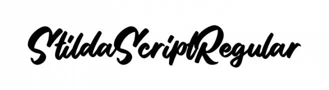
( Fonts by StringLabs - stringlabscreative.com - Personal-use only. For commercial use please contact owner. )
A bold, flowing script font with a natural handwriting style.
![Stilda Script Regular Frei Schriftart Herunterladen]() Herunterladen 330 Downloads@WebFont
Herunterladen 330 Downloads@WebFont -
![Aerolite Sky Italic Frei Schriftart Herunterladen]() Herunterladen 330 Downloads@WebFont
Herunterladen 330 Downloads@WebFont -
![DK Mysterious Regular Frei Schriftart Herunterladen]() Herunterladen 330 Downloads@WebFont
Herunterladen 330 Downloads@WebFont -
![Quacksalver BRK Frei Schriftart Herunterladen]() Herunterladen 330 Downloads@WebFont
Herunterladen 330 Downloads@WebFont -
( Fonts by Levi Halmos )
A pixelated, retro-style font with a digital, blocky appearance.
![Haiku Frei Schriftart Herunterladen]() Herunterladen 330 Downloads@WebFont
Herunterladen 330 Downloads@WebFont -
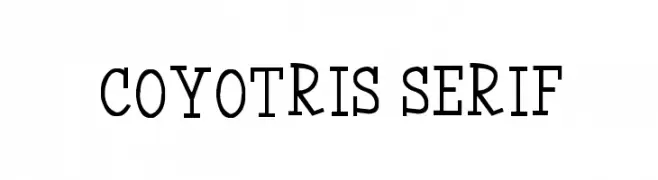
( Font by Jayvee D. Enaguas - grandchaos9000.deviantart.com )
A modern serif font with bold, balanced characters and elegant serifs.
![Coyotris Serif Frei Schriftart Herunterladen]() Herunterladen 330 Downloads@WebFont
Herunterladen 330 Downloads@WebFont -
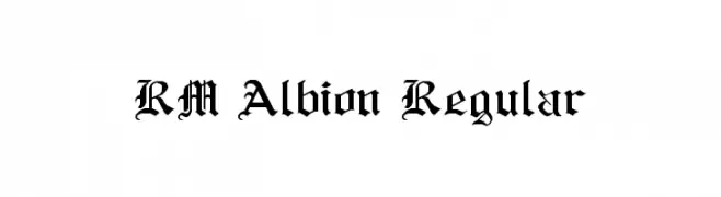
( Fonts by p2pnut - Personal-use only. For commercial use please contact owner. )
A classic Gothic-style font with ornate, angular characters and decorative serifs.
![RM Albion Regular Frei Schriftart Herunterladen]() Herunterladen 330 Downloads@WebFont
Herunterladen 330 Downloads@WebFont -
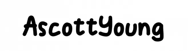
( Fonts by Denny Sutanto )
A playful, bold, and hand-drawn font with rounded edges and a whimsical style.
![AscottYoung Frei Schriftart Herunterladen]() Herunterladen 330 Downloads@WebFont
Herunterladen 330 Downloads@WebFont -
( Fonts by a Max Infeld - XEROGRAPHER FONTS - xerographer.blogspot.com . Personal-use only. For commercial use please contact owner. )
A bold, playful font with a double outline and rounded characters.
![Educated Frei Schriftart Herunterladen]() Herunterladen 330 Downloads@WebFont
Herunterladen 330 Downloads@WebFont


Welche Schriften sind gerade am populärsten?
Poppins, Roboto, Montserrat, Open Sans und Lato sind wegen ihrer klaren Formen und breiten Einsetzbarkeit sehr gefragt – von Markenauftritt über Landingpages bis hin zu Postern.
Welche Fonts eignen sich für Logos?
Geometrische Sans‑Serifs (z. B. Poppins, Familien im Gotham‑Stil) sind ein häufiger Griff für sauberes, skalierbares Branding. Für eine persönlichere Note bleiben Scripts und Handschrift‑Stile beliebt. Kombinieren Sie einen prägnanten Headline‑Font mit einer neutralen Brotschrift für Wiedererkennung und Harmonie.
Wie oft wird die Top‑Liste aktualisiert?
Regelmäßig – basierend auf realen Downloads und Interaktionen. Schauen Sie öfter vorbei, um aufstrebende Favoriten früh zu entdecken.
💡 Tipp: Seite bookmarken – Trends wechseln schnell, und heutige Top‑Schriften inspirieren morgen vielleicht das Rebranding.