Willkommen bei den Top‑Schriften – hier treffen Beliebtheit und Qualität aufeinander. Das sind die in diesem Jahr am häufigsten heruntergeladenen und genutzten Fonts. Wenn Sie sichere Optionen für Logo, Web oder Social suchen, starten Sie hier.
Jeder Top‑Font überzeugt durch Balance, Lesbarkeit und Vielseitigkeit. Sie finden moderne Sans‑Serifs, elegante Scripts, Vintage‑Serifs und minimalistische Displays.
-
( Intellecta Design - Paulo W - new.myfonts.com/foundry/Intellecta_Design/?refby=paulow )
A bold, flowing script font with a dynamic and energetic style.
 Herunterladen 325 Downloads@WebFont
 -
( Fonts by GLUK fonts )
A modern, geometric font with clean lines and a structured, professional appearance.
![Gputeks Bold Frei Schriftart Herunterladen]() Herunterladen 325 Downloads@WebFont
Herunterladen 325 Downloads@WebFont -
( Fonts by Tup Wanders )
A bold, geometric font with thick strokes and a modern aesthetic.
![FORQUE Frei Schriftart Herunterladen]() Herunterladen 325 Downloads@WebFont
Herunterladen 325 Downloads@WebFont -
![ReafFont Frei Schriftart Herunterladen]() Herunterladen 325 Downloads@WebFont
Herunterladen 325 Downloads@WebFont -
![EinzigSans Frei Schriftart Herunterladen]() Herunterladen 325 Downloads@WebFont
Herunterladen 325 Downloads@WebFont -
( Fonts by GLUK fonts )
A modern, geometric sans-serif font with clean lines and balanced proportions.
![RawengulkSans Frei Schriftart Herunterladen]() Herunterladen 325 Downloads@WebFont
Herunterladen 325 Downloads@WebFont -
![Verminoriko Aki Frei Schriftart Herunterladen]() Herunterladen 325 Downloads@WebFont
Herunterladen 325 Downloads@WebFont -
( Roulette Studios - www.roulettestudios.com )
A bold, dramatic Blackletter-inspired font with sharp serifs and thick strokes.
![BlackBeard Frei Schriftart Herunterladen]() Herunterladen 325 Downloads@WebFont
Herunterladen 325 Downloads@WebFont -
( Fonts by Anita Jürgeleit - Personal-use only. For commercial use please contact owner. )
A bold, rounded font with a modern and friendly style.
![Umba Soft SC Bold Demo Frei Schriftart Herunterladen]() Herunterladen 325 Downloads@WebFont
Herunterladen 325 Downloads@WebFont -
( Roulette Studios - www.roulettestudios.com )
A bold, decorative font with intricate curves and flourishes.
![Caribbean Caps Frei Schriftart Herunterladen]() Herunterladen 325 Downloads@WebFont
Herunterladen 325 Downloads@WebFont -
![Japanese Designs Frei Schriftart Herunterladen]() Herunterladen 325 Downloads@WebFont
Herunterladen 325 Downloads@WebFont -
( Fonts by Mans Greback - www.mansgreback.com - Personal-use only. For commercial use please contact owner. )
An elegant script font with decorative flourishes and sophisticated style.
![Last Christmas PERSONAL USE Regular Frei Schriftart Herunterladen]() Herunterladen 325 Downloads@WebFont
Herunterladen 325 Downloads@WebFont -
![What's My Age Again Frei Schriftart Herunterladen]() Herunterladen 325 Downloads@WebFont
Herunterladen 325 Downloads@WebFont -
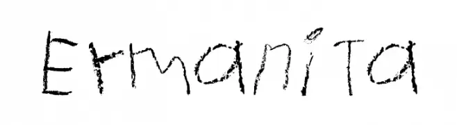
![Ermanita Frei Schriftart Herunterladen]() Herunterladen 325 Downloads@WebFont
Herunterladen 325 Downloads@WebFont -
( Fonts by Edric Studio - Personal-use only. For commercial use please contact owner. )
A playful, rounded font with a casual and friendly style.
![Cool Glasses Demo Frei Schriftart Herunterladen]() Herunterladen 325 Downloads@WebFont
Herunterladen 325 Downloads@WebFont -
![Starlight Regular Frei Schriftart Herunterladen]() Herunterladen 325 Downloads@WebFont
Herunterladen 325 Downloads@WebFont -
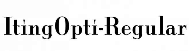
( Fonts by Castcraft Software - opti.netii.net - check the website before use )
A classic serif typeface with high contrast and sharp serifs, exuding elegance and sophistication.
![ItingOpti-Regular Frei Schriftart Herunterladen]() Herunterladen 325 Downloads@WebFont
Herunterladen 325 Downloads@WebFont -
( Fonts by Daniel Zadorozny - www.iconian.com - Free for personal use )
A bold, italicized font with a futuristic, geometric style and double outline effect.
![Starduster Academy Italic Frei Schriftart Herunterladen]() Herunterladen 325 Downloads@WebFont
Herunterladen 325 Downloads@WebFont -
![Mariano Frei Schriftart Herunterladen]() Herunterladen 325 Downloads@WebFont
Herunterladen 325 Downloads@WebFont -
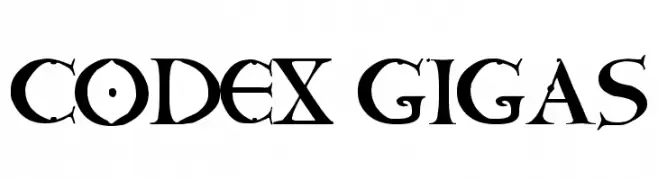
( Carles Garrigues Ubeda - www.trymedesign.es )
A medieval gothic font with sharp serifs and dramatic contrast.
![CODEX GIGAS Frei Schriftart Herunterladen]() Herunterladen 325 Downloads@WebFont
Herunterladen 325 Downloads@WebFont -
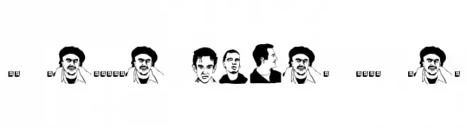
( Fonts by www.fenotype.com )
A collection of illustrated male faces replacing traditional characters.
![FT Fenotype faces DEMO men Frei Schriftart Herunterladen]() Herunterladen 325 Downloads@WebFont
Herunterladen 325 Downloads@WebFont -
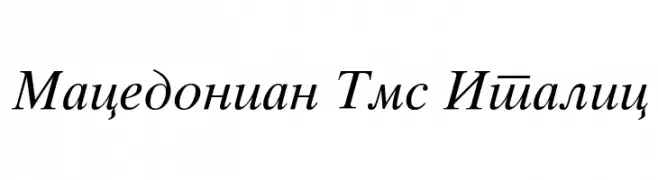
![Macedonian Tms Italic Frei Schriftart Herunterladen]() Herunterladen 325 Downloads@WebFont
Herunterladen 325 Downloads@WebFont -
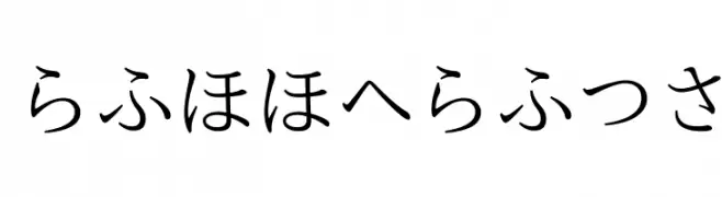
( otg.sokowonantoka.com/ )
A traditional Japanese calligraphic font with elegant, flowing strokes.
![nipponica Frei Schriftart Herunterladen]() Herunterladen 325 Downloads@WebFont
Herunterladen 325 Downloads@WebFont -
( Fonts by ShyFonts )
A bold, geometric font with a futuristic and striking design.
![SF Groove Machine ExtUpright Frei Schriftart Herunterladen]() Herunterladen 325 Downloads@WebFont
Herunterladen 325 Downloads@WebFont -
( Fonts by Daniel Zadorozny - www.iconian.com )
A bold, italicized font with angular, geometric shapes and a futuristic style.
![Realpolitik Italic Frei Schriftart Herunterladen]() Herunterladen 325 Downloads@WebFont
Herunterladen 325 Downloads@WebFont -
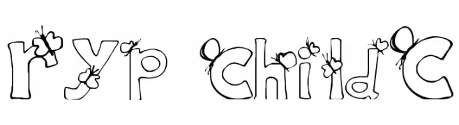
![Ryp childC Frei Schriftart Herunterladen]() Herunterladen 325 Downloads@WebFont
Herunterladen 325 Downloads@WebFont -
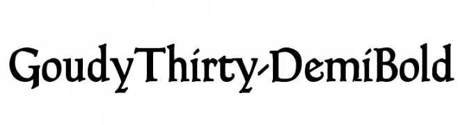
( Fonts by Dieter Steffmann )
A classic and elegant serif font with vintage charm and strong presence.
![GoudyThirty-DemiBold Frei Schriftart Herunterladen]() Herunterladen 325 Downloads@WebFont
Herunterladen 325 Downloads@WebFont -
( Fonts by Karolina Lach )
A bold, rugged font with sharp edges and pronounced serifs.
![Arbutus Frei Schriftart Herunterladen]() Herunterladen 325 Downloads@WebFont
Herunterladen 325 Downloads@WebFont -
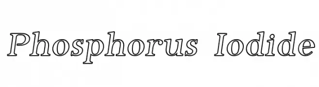
( Fonts by Apostrophic Lab )
A bold, outlined serif font with high contrast and classic elegance.
![Phosphorus Iodide Frei Schriftart Herunterladen]() Herunterladen 325 Downloads@WebFont
Herunterladen 325 Downloads@WebFont -
( Fonts by Nirmana Visual )
A playful, hand-drawn font with bold, rounded characters and a whimsical style.
![Crafter Frei Schriftart Herunterladen]() Herunterladen 325 Downloads@WebFont
Herunterladen 325 Downloads@WebFont -
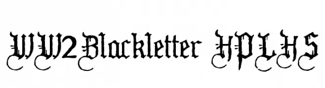
( Fonts by HPLHS Prop Fonts - Andrew H. Leman http://www.cthulhulives.org/toybox/propdocs/propfonts.html )
An intricate blackletter font with a medieval, gothic style.
![WW2Blackletter HPLHS Frei Schriftart Herunterladen]() Herunterladen 325 Downloads@WebFont
Herunterladen 325 Downloads@WebFont -
( Fonts by Jasleen Kalirai )
A playful, hand-drawn font with rounded, uniform strokes and a whimsical touch.
![Jasleens Jassy Font Regular Frei Schriftart Herunterladen]() Herunterladen 325 Downloads@WebFont
Herunterladen 325 Downloads@WebFont -
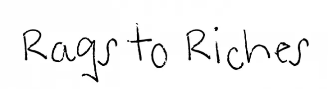
( Fonts by www.fontpanda.com. Personal-use only. For commercial use please contact owner. )
A casual, handwritten font with an organic and lively appearance.
![Rags to Riches Frei Schriftart Herunterladen]() Herunterladen 325 Downloads@WebFont
Herunterladen 325 Downloads@WebFont -
![DJ Football Frei Schriftart Herunterladen]() Herunterladen 325 Downloads@WebFont
Herunterladen 325 Downloads@WebFont -
( Paul Lloyd Fonts )
A classic, calligraphic font with elegant, flowing characters and sharp serifs.
![QuillCapitals Frei Schriftart Herunterladen]() Herunterladen 325 Downloads
Herunterladen 325 Downloads


Welche Schriften sind gerade am populärsten?
Poppins, Roboto, Montserrat, Open Sans und Lato sind wegen ihrer klaren Formen und breiten Einsetzbarkeit sehr gefragt – von Markenauftritt über Landingpages bis hin zu Postern.
Welche Fonts eignen sich für Logos?
Geometrische Sans‑Serifs (z. B. Poppins, Familien im Gotham‑Stil) sind ein häufiger Griff für sauberes, skalierbares Branding. Für eine persönlichere Note bleiben Scripts und Handschrift‑Stile beliebt. Kombinieren Sie einen prägnanten Headline‑Font mit einer neutralen Brotschrift für Wiedererkennung und Harmonie.
Wie oft wird die Top‑Liste aktualisiert?
Regelmäßig – basierend auf realen Downloads und Interaktionen. Schauen Sie öfter vorbei, um aufstrebende Favoriten früh zu entdecken.
💡 Tipp: Seite bookmarken – Trends wechseln schnell, und heutige Top‑Schriften inspirieren morgen vielleicht das Rebranding.