Willkommen bei den Top‑Schriften – hier treffen Beliebtheit und Qualität aufeinander. Das sind die in diesem Jahr am häufigsten heruntergeladenen und genutzten Fonts. Wenn Sie sichere Optionen für Logo, Web oder Social suchen, starten Sie hier.
Jeder Top‑Font überzeugt durch Balance, Lesbarkeit und Vielseitigkeit. Sie finden moderne Sans‑Serifs, elegante Scripts, Vintage‑Serifs und minimalistische Displays.
-
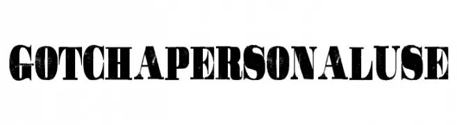
( Billy Argel - billyargel.com/ )
A bold, distressed font with a vintage, rugged aesthetic.
 Herunterladen 324 Downloads@WebFont
 -
![DERNIER Frei Schriftart Herunterladen]() Herunterladen 324 Downloads@WebFont
Herunterladen 324 Downloads@WebFont -
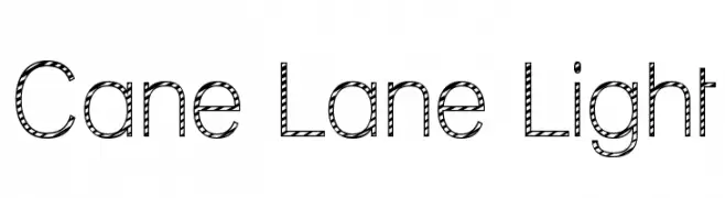
![Cane Lane Light Frei Schriftart Herunterladen]() Herunterladen 324 Downloads@WebFont
Herunterladen 324 Downloads@WebFont -
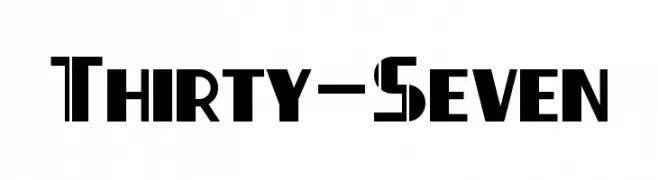
( Fonts by a Neale Davidson - www.pixelsagas.com. Personal-use only. For commercial use please contact owner. )
A bold, geometric font with sharp angles and a modern aesthetic.
![Thirty-Seven Frei Schriftart Herunterladen]() Herunterladen 324 Downloads@WebFont
Herunterladen 324 Downloads@WebFont -
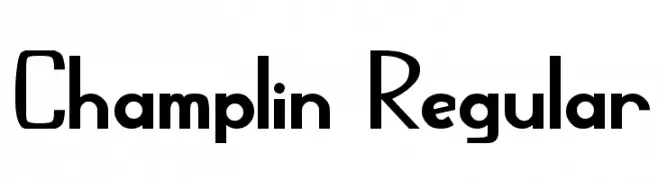
![Champlin Regular Frei Schriftart Herunterladen]() Herunterladen 324 Downloads@WebFont
Herunterladen 324 Downloads@WebFont -
( Fonts by http://perso.calixo.net/~uzim/ )
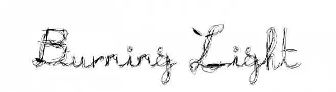
A decorative, hand-drawn font with swirling, chaotic lines and varying stroke thickness.
![Burning Light Frei Schriftart Herunterladen]() Herunterladen 324 Downloads@WebFont
Herunterladen 324 Downloads@WebFont -
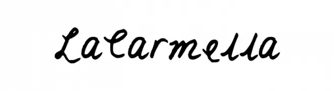
![LaCarmella Frei Schriftart Herunterladen]() Herunterladen 324 Downloads@WebFont
Herunterladen 324 Downloads@WebFont -
( Fonts by Maulana Creative )
A bold, playful font with a hand-drawn, whimsical style.
![Gerbersllo Frei Schriftart Herunterladen]() Herunterladen 324 Downloads@WebFont
Herunterladen 324 Downloads@WebFont -
( Fonts by a Max Infeld - XEROGRAPHER FONTS - xerographer.blogspot.com . Personal-use only. For commercial use please contact owner. )
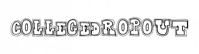
A bold, playful font with a three-dimensional outlined style.
![CollegeDropout Frei Schriftart Herunterladen]() Herunterladen 324 Downloads@WebFont
Herunterladen 324 Downloads@WebFont -
( Fonts by www.blambot.com )
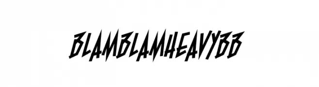
A bold, angular font with sharp edges and a dynamic, energetic style.
![BlamBlamHeavyBB Frei Schriftart Herunterladen]() Herunterladen 324 Downloads@WebFont
Herunterladen 324 Downloads@WebFont -
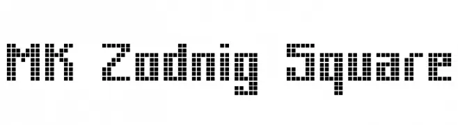
![MK Zodnig Square Frei Schriftart Herunterladen]() Herunterladen 324 Downloads@WebFont
Herunterladen 324 Downloads@WebFont -
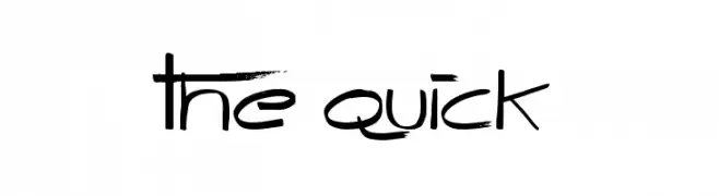
( Font by Jonathan Harris - www.tattoowoo.com )
A playful, hand-drawn font with sketch-like strokes and artistic flair.
![The Quick Frei Schriftart Herunterladen]() Herunterladen 324 Downloads@WebFont
Herunterladen 324 Downloads@WebFont -
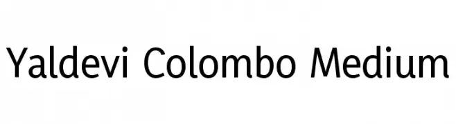
( Copyright (c) 1996-2016 Yaldevi Project Authors (https://github.com/mooniak/yaldevi-fonts) )
A modern sans-serif font with medium weight and excellent readability.
![Yaldevi Colombo Medium Frei Schriftart Herunterladen]() Herunterladen 324 Downloads@WebFont
Herunterladen 324 Downloads@WebFont -
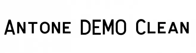
( Fonts by Letterhend Studio - Hendry Juanda - Personal-use only. For commercial use please contact owner. )
A clean, modern sans-serif font with bold, uniform strokes and geometric structure.
![Antone DEMO Clean Frei Schriftart Herunterladen]() Herunterladen 324 Downloads@WebFont
Herunterladen 324 Downloads@WebFont -
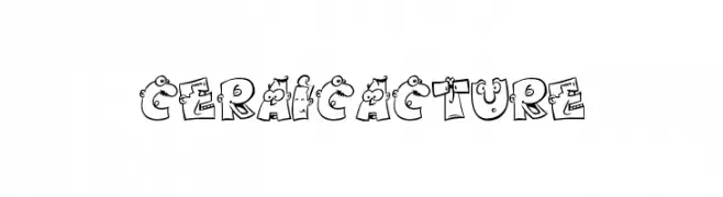
Schriftart von danny91194. For commercial use please contact the owner.
![ceraicacture Frei Schriftart Herunterladen]() Herunterladen 324 Downloads@WebFont
Herunterladen 324 Downloads@WebFont -
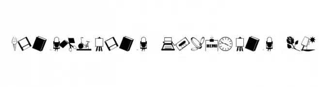
( Fonts by Jeff Levine. FREEWARE )
A decorative dingbat font featuring assorted icons and pictograms.
![ArtsyParts Dingbats JL Frei Schriftart Herunterladen]() Herunterladen 324 Downloads@WebFont
Herunterladen 324 Downloads@WebFont -
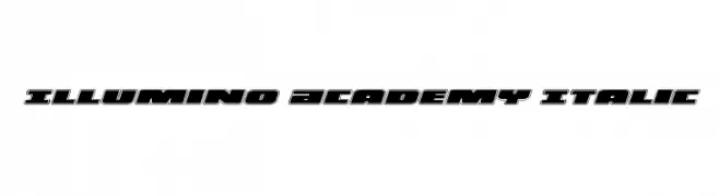
( Fonts by Iconian Fonts )
A bold, italicized font with a futuristic, geometric design.
![Illumino Academy Italic Frei Schriftart Herunterladen]() Herunterladen 324 Downloads@WebFont
Herunterladen 324 Downloads@WebFont -
( Fonts by K26 Fonts )
A playful, 3D block-style font perfect for children's designs.
![K26ToyBlocks123 Frei Schriftart Herunterladen]() Herunterladen 324 Downloads@WebFont
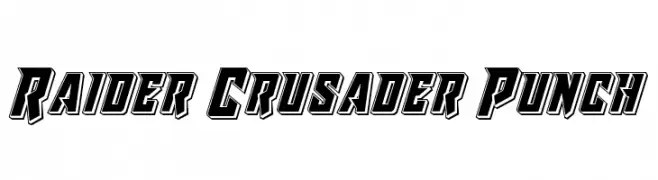
Herunterladen 324 Downloads@WebFont -
![Raider Crusader Punch Frei Schriftart Herunterladen]() Herunterladen 324 Downloads@WebFont
Herunterladen 324 Downloads@WebFont -
( Fonts by a Colm Clafferty - colmfonts.hol.es. Personal-use only. For commercial use please contact owner. )
Bold, three-dimensional font with a modern, industrial look.
![ODEON-DROP Frei Schriftart Herunterladen]() Herunterladen 324 Downloads@WebFont
Herunterladen 324 Downloads@WebFont -
( Fonts by Miffies - mfs.jp.org - Personal-use only. For commercial use please contact owner. )
A bold, pixelated font with a retro, digital aesthetic.
![M41_LOVEBIT Frei Schriftart Herunterladen]() Herunterladen 324 Downloads@WebFont
Herunterladen 324 Downloads@WebFont -
( Fonts by Eknoji Studio - www.eknojistudio.com - Personal-use only. For commercial use please contact owner. )
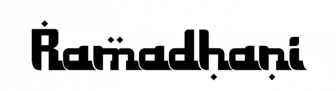
A bold, geometric font with unique diacritical marks and a modern aesthetic.
![Ramadhani Frei Schriftart Herunterladen]() Herunterladen 324 Downloads@WebFont
Herunterladen 324 Downloads@WebFont -
( Fonts by Thomas Ledin - tomledin.com )
A bold, playful font with a three-dimensional effect and rounded, irregular characters.
![Griswold Frei Schriftart Herunterladen]() Herunterladen 324 Downloads@WebFont
Herunterladen 324 Downloads@WebFont -
( Fonts by Zetafonts )
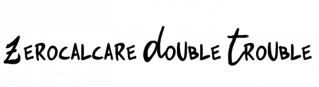
A bold, playful handwritten font with a comic book flair.
![Zerocalcare Double Trouble Frei Schriftart Herunterladen]() Herunterladen 324 Downloads@WebFont
Herunterladen 324 Downloads@WebFont -
( Fonts by Darcy Baldwin - darcybaldwin.com. Free for personal use only )
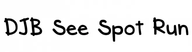
A playful, handwritten font with a casual and friendly style.
![DJB See Spot Run Frei Schriftart Herunterladen]() Herunterladen 324 Downloads@WebFont
Herunterladen 324 Downloads@WebFont -
( Fonts by dcoxy | Greg Medina )
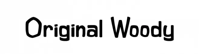
A playful, hand-drawn font with bold, rounded characters and a whimsical style.
![Original Woody Frei Schriftart Herunterladen]() Herunterladen 324 Downloads@WebFont
Herunterladen 324 Downloads@WebFont -
( Fonts by Mocha Frappuccino - Personal-use only. For commercial use please contact owner. )
A bold, narrow font with tall characters and a modern aesthetic.
![Assen Demo Frei Schriftart Herunterladen]() Herunterladen 324 Downloads@WebFont
Herunterladen 324 Downloads@WebFont -
![Commonwealth Frei Schriftart Herunterladen]() Herunterladen 324 Downloads
Herunterladen 324 Downloads -
![Byom Thin Frei Schriftart Herunterladen]() Herunterladen 324 Downloads@WebFont
Herunterladen 324 Downloads@WebFont -
![Digitalism Frei Schriftart Herunterladen]() Herunterladen 324 Downloads@WebFont
Herunterladen 324 Downloads@WebFont -
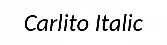
( Fonts by Lukasz Dziedzic - Personal-use only. For commercial use please contact owner. )
A modern sans-serif italic font with smooth curves and consistent stroke width.
![Carlito Italic Frei Schriftart Herunterladen]() Herunterladen 324 Downloads@WebFont
Herunterladen 324 Downloads@WebFont -
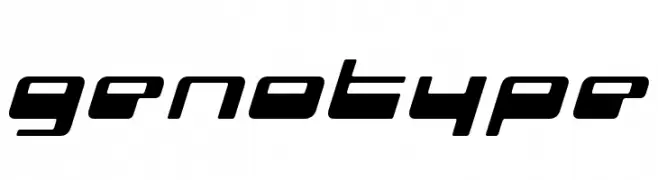
( Fonts by www.fenotype.com )
A futuristic, geometric font with a sleek, slanted design.
![genotype Frei Schriftart Herunterladen]() Herunterladen 324 Downloads@WebFont
Herunterladen 324 Downloads@WebFont -
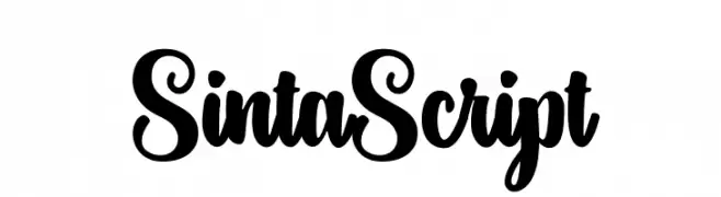
( Fonts by Aqeela Studio - Muhammad Nasir - Personal-use only. For commercial use please contact owner. )
A bold, expressive script font with flowing, cursive design.
![SintaScript Frei Schriftart Herunterladen]() Herunterladen 324 Downloads@WebFont
Herunterladen 324 Downloads@WebFont -
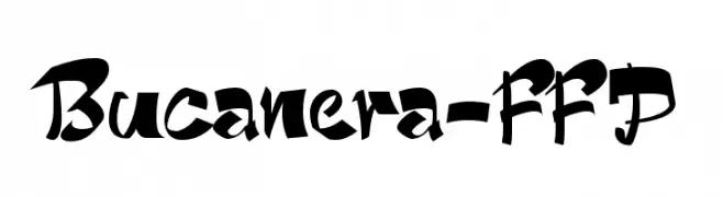
Schriftart von defharo. For commercial use please contact the owner.
![Bucanera-FFP Frei Schriftart Herunterladen]() Herunterladen 324 Downloads@WebFont
Herunterladen 324 Downloads@WebFont -
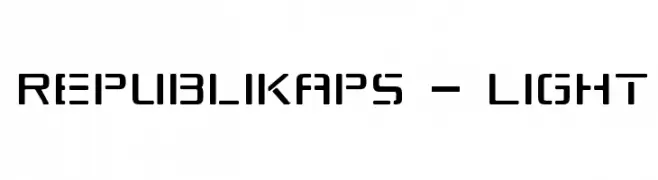
( Fonts by Apostrophic Lab )
A modern, geometric font with rounded edges and consistent character width.
![Republikaps - Light Frei Schriftart Herunterladen]() Herunterladen 324 Downloads@WebFont
Herunterladen 324 Downloads@WebFont


Welche Schriften sind gerade am populärsten?
Poppins, Roboto, Montserrat, Open Sans und Lato sind wegen ihrer klaren Formen und breiten Einsetzbarkeit sehr gefragt – von Markenauftritt über Landingpages bis hin zu Postern.
Welche Fonts eignen sich für Logos?
Geometrische Sans‑Serifs (z. B. Poppins, Familien im Gotham‑Stil) sind ein häufiger Griff für sauberes, skalierbares Branding. Für eine persönlichere Note bleiben Scripts und Handschrift‑Stile beliebt. Kombinieren Sie einen prägnanten Headline‑Font mit einer neutralen Brotschrift für Wiedererkennung und Harmonie.
Wie oft wird die Top‑Liste aktualisiert?
Regelmäßig – basierend auf realen Downloads und Interaktionen. Schauen Sie öfter vorbei, um aufstrebende Favoriten früh zu entdecken.
💡 Tipp: Seite bookmarken – Trends wechseln schnell, und heutige Top‑Schriften inspirieren morgen vielleicht das Rebranding.