Willkommen bei den Top‑Schriften – hier treffen Beliebtheit und Qualität aufeinander. Das sind die in diesem Jahr am häufigsten heruntergeladenen und genutzten Fonts. Wenn Sie sichere Optionen für Logo, Web oder Social suchen, starten Sie hier.
Jeder Top‑Font überzeugt durch Balance, Lesbarkeit und Vielseitigkeit. Sie finden moderne Sans‑Serifs, elegante Scripts, Vintage‑Serifs und minimalistische Displays.
-
 Herunterladen 322 Downloads@WebFont
 -
( Fonts by Kevin Christopher - www.kcfonts.com )
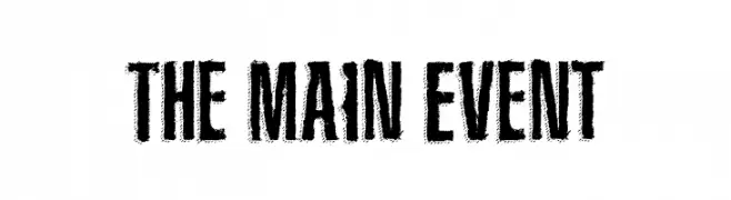
A bold, distressed font with a vintage, rugged appearance.
![The Main Event Frei Schriftart Herunterladen]() Herunterladen 322 Downloads@WebFont
Herunterladen 322 Downloads@WebFont -
( Fonts by David Rakowski )
Ornate decorative dingbats and borders with vintage flair.
![Davys Regular Frei Schriftart Herunterladen]() Herunterladen 322 Downloads@WebFont
Herunterladen 322 Downloads@WebFont -
( Fonts by Rick Mueller )
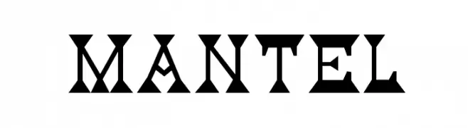
A bold, geometric font with unique cut-out shapes and sharp edges.
![Mantel Frei Schriftart Herunterladen]() Herunterladen 322 Downloads@WebFont
Herunterladen 322 Downloads@WebFont -
( Fonts by Kurnia Setyadi )
A bold, playful font with rounded, hand-drawn characters.
![Dutch Croquettes Frei Schriftart Herunterladen]() Herunterladen 322 Downloads@WebFont
Herunterladen 322 Downloads@WebFont -
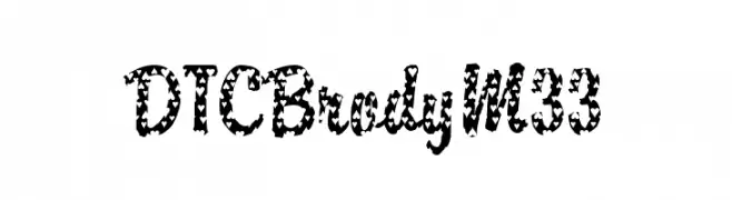
![DTCBrodyM33 Frei Schriftart Herunterladen]() Herunterladen 322 Downloads@WebFont
Herunterladen 322 Downloads@WebFont -
( niram.org )
A playful, bold outline font with a hand-drawn appearance.
![Verumai Frei Schriftart Herunterladen]() Herunterladen 322 Downloads@WebFont
Herunterladen 322 Downloads@WebFont -
( Font by http://home.luna.nl/~xino/ )
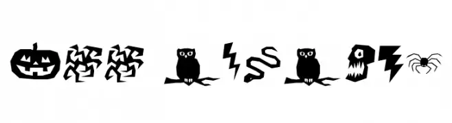
A bold, jagged Halloween-themed decorative font with spooky icons.
![ILL oCtoBer Frei Schriftart Herunterladen]() Herunterladen 322 Downloads@WebFont
Herunterladen 322 Downloads@WebFont -
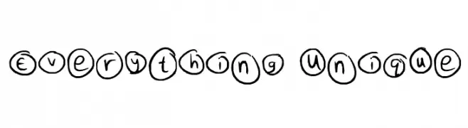
![Everything Unique Frei Schriftart Herunterladen]() Herunterladen 322 Downloads@WebFont
Herunterladen 322 Downloads@WebFont -
![VN-TienGiang Bold Frei Schriftart Herunterladen]() Herunterladen 322 Downloads@WebFont
Herunterladen 322 Downloads@WebFont -
( Fonts by Khurasan )
A bold, dynamic script font with smooth, connected letterforms.
![Hypeday Frei Schriftart Herunterladen]() Herunterladen 322 Downloads@WebFont
Herunterladen 322 Downloads@WebFont -
( Fonts by EK Type )
A bold, playful font with rounded, thick strokes and a friendly appearance.
![Modak Frei Schriftart Herunterladen]() Herunterladen 322 Downloads@WebFont
Herunterladen 322 Downloads@WebFont -
( Fonts by Objets Dart )
A modern serif font with playful curves and sharp edges.
![Water Street Detour Regular Frei Schriftart Herunterladen]() Herunterladen 322 Downloads@WebFont
Herunterladen 322 Downloads@WebFont -
![Keep Scrolling Regular Frei Schriftart Herunterladen]() Herunterladen 322 Downloads@WebFont
Herunterladen 322 Downloads@WebFont -
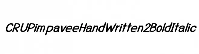
![CRUPimpaveeHandWritten2BoldItalic Frei Schriftart Herunterladen]() Herunterladen 322 Downloads@WebFont
Herunterladen 322 Downloads@WebFont -
( Fonts by www.kimberlygeswein.com - Kimberly Geswein )
A whimsical, handwritten font with playful curls and loops.
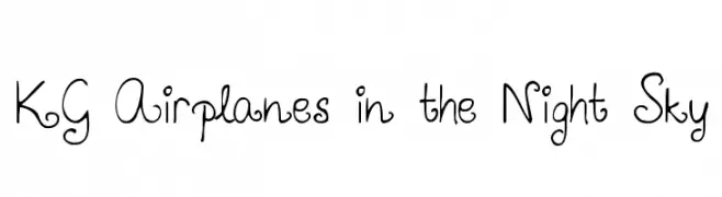
![KG Airplanes in the Night Sky Frei Schriftart Herunterladen]() Herunterladen 322 Downloads@WebFont
Herunterladen 322 Downloads@WebFont -
( Fonts by Daniel Zadorozny - www.iconian.com )
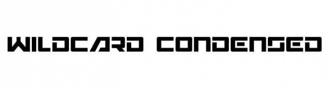
A bold, geometric font with a futuristic and digital aesthetic.
![Wildcard Condensed Frei Schriftart Herunterladen]() Herunterladen 322 Downloads@WebFont
Herunterladen 322 Downloads@WebFont -
( Fonts by Lisa Schoppa )
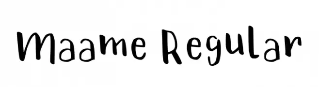
Playful handwritten font with a casual style.
![Maame Regular Frei Schriftart Herunterladen]() Herunterladen 322 Downloads@WebFont
Herunterladen 322 Downloads@WebFont -
( SSI.Scraps - Syukur Setiyadi - www.creativefabrica.com/designer/syukursetiyadi/ )
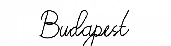
A flowing cursive font with elegant curves and loops.
![Budapest Frei Schriftart Herunterladen]() Herunterladen 322 Downloads@WebFont
Herunterladen 322 Downloads@WebFont -
( Fonts by www.woodcutter.es - woodcutter Manero - Personal-use only. For commercial use please contact owner. )
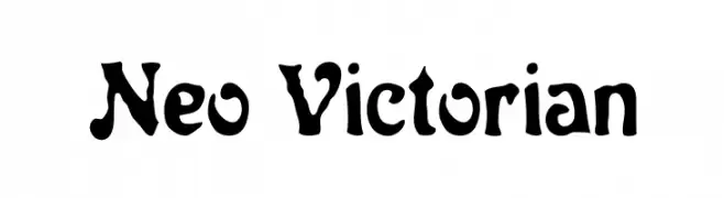
A bold, decorative font with Victorian-inspired flourishes.
![Neo Victorian Frei Schriftart Herunterladen]() Herunterladen 322 Downloads@WebFont
Herunterladen 322 Downloads@WebFont -
( Fonts by Pizzadude )
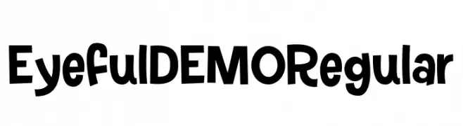
A playful and bold font with thick strokes and whimsical shapes.
![Eyeful DEMO Regular Frei Schriftart Herunterladen]() Herunterladen 322 Downloads@WebFont
Herunterladen 322 Downloads@WebFont -
( Fonts by MJType )
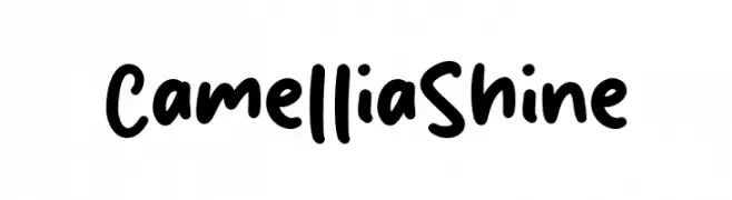
Playful handwritten font with rounded edges.
![Camellia Shine Frei Schriftart Herunterladen]() Herunterladen 322 Downloads@WebFont
Herunterladen 322 Downloads@WebFont -
( Fonts by Vladimir Nikolic - www.creativefabrica.com/designer/vladimirnikolic/ - Personal-use only. For commercial use please contact owner. )
A bold, geometric font with striking negative space and sharp angles.
![Monte Carlo Regular Frei Schriftart Herunterladen]() Herunterladen 322 Downloads@WebFont
Herunterladen 322 Downloads@WebFont -
( Fonts by Zetafonts - Personal-use only. For commercial use please contact owner. )
A bold, modern font with thick, uniform strokes ideal for headlines.
![Eastman Grt Trial Heavy Frei Schriftart Herunterladen]() Herunterladen 322 Downloads@WebFont
Herunterladen 322 Downloads@WebFont -
![Fair view Frei Schriftart Herunterladen]() Herunterladen 322 Downloads@WebFont
Herunterladen 322 Downloads@WebFont -
( Fonts by Integritype Studio )
Elegant, flowing script font with a handwritten look.
![Leandro Daniel Frei Schriftart Herunterladen]() Herunterladen 322 Downloads@WebFont
Herunterladen 322 Downloads@WebFont -
( Fonts by a Neale Davidson - www.pixelsagas.com. Personal-use only. For commercial use please contact owner. )
A modern, geometric, hollow italic font with a dynamic and futuristic style.
![Optimus Hollow Italic Frei Schriftart Herunterladen]() Herunterladen 322 Downloads@WebFont
Herunterladen 322 Downloads@WebFont -
![Blitzwing Hollow Italic Frei Schriftart Herunterladen]() Herunterladen 322 Downloads@WebFont
Herunterladen 322 Downloads@WebFont -
( Levi Szekeres - www.loremipsum.ro )
A modern, geometric outline font with clean lines and consistent stroke width.
![Fashion Fetish Outline Frei Schriftart Herunterladen]() Herunterladen 322 Downloads@WebFont
Herunterladen 322 Downloads@WebFont -
![KR Valentine Dings Frei Schriftart Herunterladen]() Herunterladen 322 Downloads@WebFont
Herunterladen 322 Downloads@WebFont -
( Fonts by Daniel Zadorozny - www.iconian.com - Free for personal use )
A modern, condensed font with a bold, geometric style.
![Federal Service Condensed Frei Schriftart Herunterladen]() Herunterladen 322 Downloads@WebFont
Herunterladen 322 Downloads@WebFont -
( Fonts by Woodcutter )
A decorative dingbat font featuring illustrated woman faces in multiple styles.
![Woman Faces Frei Schriftart Herunterladen]() Herunterladen 322 Downloads@WebFont
Herunterladen 322 Downloads@WebFont -
( Fonts by Letterena Studios )
Elegant handwritten script font.
![Reymonde Signature Frei Schriftart Herunterladen]() Herunterladen 322 Downloads@WebFont
Herunterladen 322 Downloads@WebFont -
( Fonts by Billy Argel - Personal-use only. For commercial use please contact owner. )
A bold, distressed font with a vintage collegiate style.
![UNIVERSIDAD PERSONAL USE Bold Frei Schriftart Herunterladen]() Herunterladen 322 Downloads@WebFont
Herunterladen 322 Downloads@WebFont -
( Fonts by weknow - Wino S Kadir )
A futuristic, geometric font with bold, interconnected lines and angular shapes.
![Aero Dynamic Frei Schriftart Herunterladen]() Herunterladen 322 Downloads@WebFont
Herunterladen 322 Downloads@WebFont


Welche Schriften sind gerade am populärsten?
Poppins, Roboto, Montserrat, Open Sans und Lato sind wegen ihrer klaren Formen und breiten Einsetzbarkeit sehr gefragt – von Markenauftritt über Landingpages bis hin zu Postern.
Welche Fonts eignen sich für Logos?
Geometrische Sans‑Serifs (z. B. Poppins, Familien im Gotham‑Stil) sind ein häufiger Griff für sauberes, skalierbares Branding. Für eine persönlichere Note bleiben Scripts und Handschrift‑Stile beliebt. Kombinieren Sie einen prägnanten Headline‑Font mit einer neutralen Brotschrift für Wiedererkennung und Harmonie.
Wie oft wird die Top‑Liste aktualisiert?
Regelmäßig – basierend auf realen Downloads und Interaktionen. Schauen Sie öfter vorbei, um aufstrebende Favoriten früh zu entdecken.
💡 Tipp: Seite bookmarken – Trends wechseln schnell, und heutige Top‑Schriften inspirieren morgen vielleicht das Rebranding.