Willkommen bei den Top‑Schriften – hier treffen Beliebtheit und Qualität aufeinander. Das sind die in diesem Jahr am häufigsten heruntergeladenen und genutzten Fonts. Wenn Sie sichere Optionen für Logo, Web oder Social suchen, starten Sie hier.
Jeder Top‑Font überzeugt durch Balance, Lesbarkeit und Vielseitigkeit. Sie finden moderne Sans‑Serifs, elegante Scripts, Vintage‑Serifs und minimalistische Displays.
-
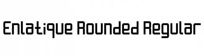
( Fonts by Rizky Andyno Ramadhan - Dichi. Personal-use only. For commercial use please contact owner. )
A modern, geometric typeface with rounded edges for a friendly look.
 Herunterladen 320 Downloads@WebFont
 -
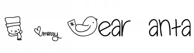
( Fonts by Miss Tiina at www.misstiina.com (please check the website before use) )
A playful, hand-drawn font with a festive, cheerful vibe.
![MTF Dear Santa Frei Schriftart Herunterladen]() Herunterladen 320 Downloads@WebFont
Herunterladen 320 Downloads@WebFont -
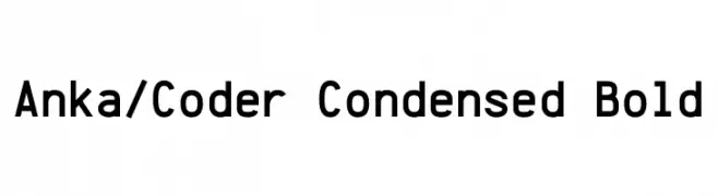
( Personal-use only. For commercial use please contact owner. )
A bold, condensed monospaced font ideal for coding and technical use.
![Anka/Coder Condensed Bold Frei Schriftart Herunterladen]() Herunterladen 320 Downloads@WebFont
Herunterladen 320 Downloads@WebFont -
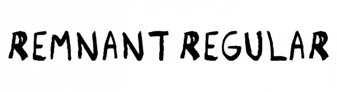
( Chris Au - www.chrisau-design.co.uk )
A hand-drawn, rustic font with bold, uneven strokes and a playful appearance.
![Remnant Regular Frei Schriftart Herunterladen]() Herunterladen 320 Downloads@WebFont
Herunterladen 320 Downloads@WebFont -
![Commons Font Final Frei Schriftart Herunterladen]() Herunterladen 320 Downloads@WebFont
Herunterladen 320 Downloads@WebFont -
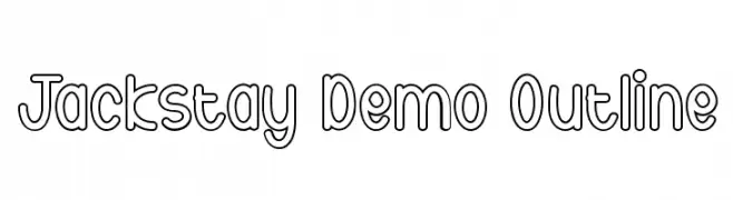
( Fonts by Noah Type )
A playful, modern outline font with bold, rounded letterforms.
![Jackstay Demo Outline Frei Schriftart Herunterladen]() Herunterladen 320 Downloads@WebFont
Herunterladen 320 Downloads@WebFont -
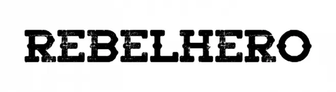
( Fonts by Woodcutter Manero - http://www.woodcutter.es - Personal-use only. For commercial use please contact owner. )
A bold, distressed font with a rugged, vintage style.
![Rebel Hero Frei Schriftart Herunterladen]() Herunterladen 320 Downloads@WebFont
Herunterladen 320 Downloads@WebFont -
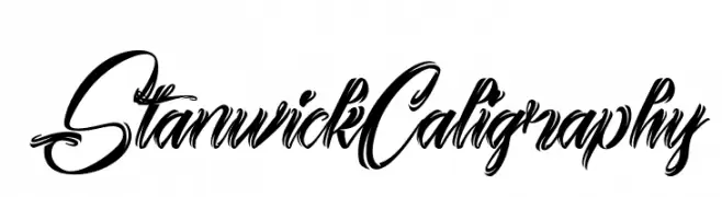
( Fonts by Edric Studio www.creativefabrica.com/designer/edricstudio/ - Personal-use only. For commercial use please contact owner. )
A flowing, elegant calligraphy-style font with dramatic curves and high contrast.
![Stanwick Caligraphy Frei Schriftart Herunterladen]() Herunterladen 320 Downloads@WebFont
Herunterladen 320 Downloads@WebFont -
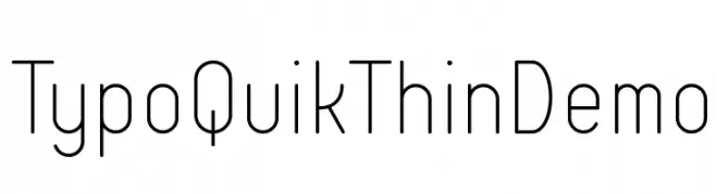
( Fonts by www.studiotypo.com - Personal-use only. For commercial use please contact owner. )
A clean, modern sans-serif font with thin, uniform strokes and a minimalist design.
![Typo Quik Thin Demo Frei Schriftart Herunterladen]() Herunterladen 320 Downloads@WebFont
Herunterladen 320 Downloads@WebFont -
( Fonts by a Max Infeld - XEROGRAPHER FONTS - xerographer.blogspot.com . Personal-use only. For commercial use please contact owner. )
An elegant and flowing script font with ornate and decorative letterforms.
![YoungRanger Frei Schriftart Herunterladen]() Herunterladen 320 Downloads@WebFont
Herunterladen 320 Downloads@WebFont -
( Fonts by NendesKombet - Husain Assyahid - Personal-use only. For commercial use please contact owner. )
A bold, high-contrast serif font with a modern yet classic style.
![SealandFr Frei Schriftart Herunterladen]() Herunterladen 320 Downloads@WebFont
Herunterladen 320 Downloads@WebFont -
( Font by Jonathan Harris - www.tattoowoo.com )
A playful, hand-drawn font with a textured and whimsical style.
![The Jolly Rancher Frei Schriftart Herunterladen]() Herunterladen 320 Downloads@WebFont
Herunterladen 320 Downloads@WebFont -
( Fonts by Manfred Klein. Free for private and charity use. Free for commercial with donation to organizations )
A pictorial, silhouette-based decorative font inspired by paper-cut art.
![Scherenschnitte Frei Schriftart Herunterladen]() Herunterladen 320 Downloads@WebFont
Herunterladen 320 Downloads@WebFont -
![Holyrose Sale Frei Schriftart Herunterladen]() Herunterladen 320 Downloads@WebFont
Herunterladen 320 Downloads@WebFont -
( Fonts by Nick Curtis - www.nicksfonts.com )
A bold, geometric font with sharp angles and high contrast.
![StandingRoomOnly Frei Schriftart Herunterladen]() Herunterladen 320 Downloads
Herunterladen 320 Downloads -
![SPEzra Frei Schriftart Herunterladen]() Herunterladen 320 Downloads@WebFont
Herunterladen 320 Downloads@WebFont -
( Copyright 2012 The Scada Project Authors (lemonad@jovanny.ru) )
A modern, clean sans-serif font with geometric letterforms.
![Scada Regular Frei Schriftart Herunterladen]() Herunterladen 320 Downloads@WebFont
Herunterladen 320 Downloads@WebFont -
( Noto is a trademark of Google Inc. Noto fonts are open source. All Noto fonts are published under the SIL Open Font License, Version 1.1 )
A classic serif font with medium weight and balanced readability.
![Noto Serif Tamil Medium Frei Schriftart Herunterladen]() Herunterladen 320 Downloads@WebFont
Herunterladen 320 Downloads@WebFont -
![Baby Metal Frei Schriftart Herunterladen]() Herunterladen 320 Downloads@WebFont
Herunterladen 320 Downloads@WebFont -
( Fonts by www.endie.prv.pl )
Transit-inspired display font with bold, geometric symbols.
![Subway Sign Frei Schriftart Herunterladen]() Herunterladen 320 Downloads@WebFont
Herunterladen 320 Downloads@WebFont -
![Old Rugged Cross Frei Schriftart Herunterladen]() Herunterladen 320 Downloads@WebFont
Herunterladen 320 Downloads@WebFont -
( Fonts by MJType - mjtype.com - Personal-use only. For commercial use please contact owner. )
A playful, casual handwritten font with smooth, flowing lines.
![Valentine Girls Frei Schriftart Herunterladen]() Herunterladen 320 Downloads@WebFont
Herunterladen 320 Downloads@WebFont -
![Glyphter Frei Schriftart Herunterladen]() Herunterladen 320 Downloads@WebFont
Herunterladen 320 Downloads@WebFont -
( Fonts by www.impallari.com )
A bold, flowing script font with a modern, elegant style.
![Lobsterbeta9 Frei Schriftart Herunterladen]() Herunterladen 319 Downloads@WebFont
Herunterladen 319 Downloads@WebFont -
( Fonts by Daniel Zadorozny - www.iconian.com )
A bold, geometric font with a futuristic and expanded design.
![Gemina 2 Expanded Frei Schriftart Herunterladen]() Herunterladen 319 Downloads@WebFont
Herunterladen 319 Downloads@WebFont -
![HeilVertica Frei Schriftart Herunterladen]() Herunterladen 319 Downloads@WebFont
Herunterladen 319 Downloads@WebFont -
Schriftart von TGIFStudio. For commercial use please contact the owner.
( Thank you for downloading this font This font is free for PERSONAL USE ONLY! Commercial license for this font can be purchased at: http://bit.ly/2xZKj1Q )
A dynamic and flowing script font with elegant cursive letterforms.
![Elliot Frei Schriftart Herunterladen]() Herunterladen 319 Downloads@WebFont
Herunterladen 319 Downloads@WebFont -
Schriftart von defharo. For commercial use please contact the owner.
![Posteratus-Rex Frei Schriftart Herunterladen]() Herunterladen 319 Downloads@WebFont
Herunterladen 319 Downloads@WebFont -
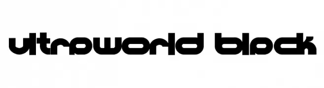
![Ultraworld black Frei Schriftart Herunterladen]() Herunterladen 319 Downloads@WebFont
Herunterladen 319 Downloads@WebFont -
( Fonts by Octotype - www.foundmyfont.com - Personal-use only. For commercial use please contact owner. )
A bold, cursive script font with elegant, flowing strokes.
![Delicate Moments Frei Schriftart Herunterladen]() Herunterladen 319 Downloads@WebFont
Herunterladen 319 Downloads@WebFont -
( Fonts by CosmicStunky )
A playful, handwritten font with smooth, rounded edges and a casual style.
![BunnyCookies Frei Schriftart Herunterladen]() Herunterladen 319 Downloads@WebFont
Herunterladen 319 Downloads@WebFont -
( Fonts by Xerographer Fonts )
A playful, handwritten font with fluid, slightly irregular strokes.
![RipeApricots Frei Schriftart Herunterladen]() Herunterladen 319 Downloads@WebFont
Herunterladen 319 Downloads@WebFont -
( Fonts by Steve Cloutier - www.cloutierfontes.ca - Personal-use only. For commercial use please contact owner. )
A bold, brush-style font with a hand-painted appearance.
![CF Paradise City Regular Frei Schriftart Herunterladen]() Herunterladen 319 Downloads@WebFont
Herunterladen 319 Downloads@WebFont -
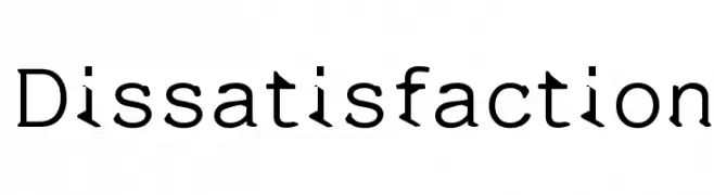
![Dissatisfaction Frei Schriftart Herunterladen]() Herunterladen 319 Downloads@WebFont
Herunterladen 319 Downloads@WebFont -
( Character )
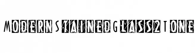
A modern, stained glass-inspired font with bold, geometric patterns.
![ModernStainedGlass2Tone Frei Schriftart Herunterladen]() Herunterladen 319 Downloads@WebFont
Herunterladen 319 Downloads@WebFont


Welche Schriften sind gerade am populärsten?
Poppins, Roboto, Montserrat, Open Sans und Lato sind wegen ihrer klaren Formen und breiten Einsetzbarkeit sehr gefragt – von Markenauftritt über Landingpages bis hin zu Postern.
Welche Fonts eignen sich für Logos?
Geometrische Sans‑Serifs (z. B. Poppins, Familien im Gotham‑Stil) sind ein häufiger Griff für sauberes, skalierbares Branding. Für eine persönlichere Note bleiben Scripts und Handschrift‑Stile beliebt. Kombinieren Sie einen prägnanten Headline‑Font mit einer neutralen Brotschrift für Wiedererkennung und Harmonie.
Wie oft wird die Top‑Liste aktualisiert?
Regelmäßig – basierend auf realen Downloads und Interaktionen. Schauen Sie öfter vorbei, um aufstrebende Favoriten früh zu entdecken.
💡 Tipp: Seite bookmarken – Trends wechseln schnell, und heutige Top‑Schriften inspirieren morgen vielleicht das Rebranding.