Willkommen bei den Top‑Schriften – hier treffen Beliebtheit und Qualität aufeinander. Das sind die in diesem Jahr am häufigsten heruntergeladenen und genutzten Fonts. Wenn Sie sichere Optionen für Logo, Web oder Social suchen, starten Sie hier.
Jeder Top‑Font überzeugt durch Balance, Lesbarkeit und Vielseitigkeit. Sie finden moderne Sans‑Serifs, elegante Scripts, Vintage‑Serifs und minimalistische Displays.
-
 Herunterladen 317 Downloads@WebFont
 -
( Fonts by Fabien Despinoy - Personal-use only. For commercial use please contact owner. )
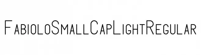
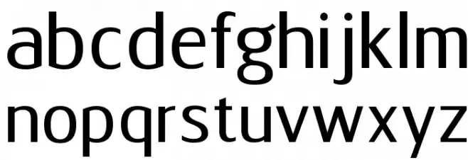
A clean, modern font with narrow, elongated characters and a light, airy feel.
![FabioloSmallCap Light Regular Frei Schriftart Herunterladen]() Herunterladen 317 Downloads@WebFont
Herunterladen 317 Downloads@WebFont -
( Fonts by Carlos Daniel Matteoli - Qbotype Fonts - http://carlosmatteoli.wix.com/qbotype. Personal-use only. For commercial use please contact owner. )
A bold, geometric font composed of hexagonal shapes, offering a modern and playful style.
![Hexa Frei Schriftart Herunterladen]() Herunterladen 317 Downloads@WebFont
Herunterladen 317 Downloads@WebFont -
( Fonts by Iconian Fonts )
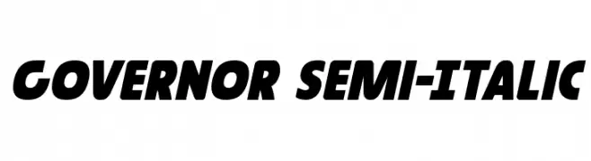
A bold, semi-italic font with a dynamic and modern style.
![Governor Semi-Italic Frei Schriftart Herunterladen]() Herunterladen 317 Downloads@WebFont
Herunterladen 317 Downloads@WebFont -
( Fonts by Adult Ramblings - Anastacia E. Zittel - Personal-use only. For commercial use please contact owner. )
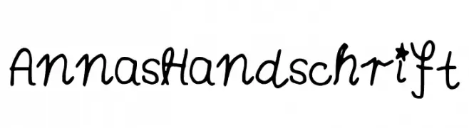
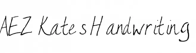
A casual, handwritten-style font with uneven strokes and a personal touch.
![AEZ Kate's Handwriting Frei Schriftart Herunterladen]() Herunterladen 317 Downloads@WebFont
Herunterladen 317 Downloads@WebFont -
( Fonts by Dirt2.com - SickCapital - Andrew Hart - Personal-use only. For commercial use please contact owner. )
A modern, geometric sans-serif font with a clean and professional look.
![Alpaca Scarlett Demo Frei Schriftart Herunterladen]() Herunterladen 317 Downloads@WebFont
Herunterladen 317 Downloads@WebFont -
( Copyright (c) 2010, Danh Hong (khmertype.blogspot.com) )
A clean, modern font with balanced spacing and clear characters.
![Suwannaphum Frei Schriftart Herunterladen]() Herunterladen 317 Downloads@WebFont
Herunterladen 317 Downloads@WebFont -
( Fonts by Press Gang Studios - Andeh Pinkard - www.pressgang-studios.com )
A bold, playful font with a hand-drawn, graffiti-like style.
![Roof runners active Frei Schriftart Herunterladen]() Herunterladen 317 Downloads@WebFont
Herunterladen 317 Downloads@WebFont -
( Iconian Fonts - Daniel Zadorozny - www.iconian.com )
A bold, angular, semi-italic font with a futuristic and dynamic style.
![Red Rocket Semi-Italic Frei Schriftart Herunterladen]() Herunterladen 317 Downloads@WebFont
Herunterladen 317 Downloads@WebFont -
( Font by Jonathan Harris - www.tattoowoo.com )
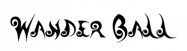
A decorative and whimsical font with bold, swirling elements and intricate detailing.
![Wander Ball Frei Schriftart Herunterladen]() Herunterladen 317 Downloads@WebFont
Herunterladen 317 Downloads@WebFont -
( Fonts by Shrenik Ganatra - Personal-use only. For commercial use please contact owner. )
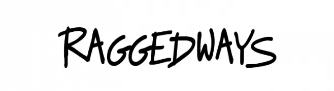
A casual, playful handwritten font with irregular strokes and a friendly appearance.
![Raggedways Frei Schriftart Herunterladen]() Herunterladen 317 Downloads@WebFont
Herunterladen 317 Downloads@WebFont -
( Fonts by Jacob Fisher - www.pizzadude.dk )
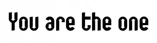
A bold, geometric font with angular lines and decorative cutouts.
![You are the one Frei Schriftart Herunterladen]() Herunterladen 317 Downloads@WebFont
Herunterladen 317 Downloads@WebFont -
( Copyright 2017 The Gemunu Libre Project Authors (https://github.com/mooniak/gemunu-libre-font) )
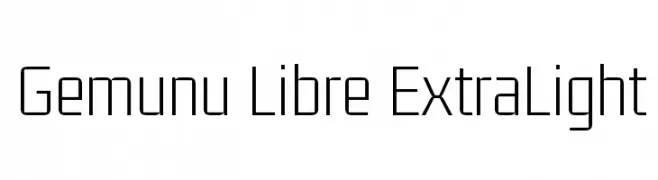
A modern, geometric sans-serif font with a clean and minimalistic design.
![Gemunu Libre ExtraLight Frei Schriftart Herunterladen]() Herunterladen 317 Downloads@WebFont
Herunterladen 317 Downloads@WebFont -
![SILManuscriptIPA Regular Frei Schriftart Herunterladen]() Herunterladen 317 Downloads@WebFont
Herunterladen 317 Downloads@WebFont -
( Iconian Fonts - Daniel Zadorozny - www.iconian.com )
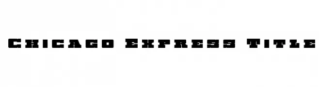
A bold, geometric font with strong, blocky characters.
![Chicago Express Title Frei Schriftart Herunterladen]() Herunterladen 317 Downloads@WebFont
Herunterladen 317 Downloads@WebFont -
( Fonts by Gassstype )
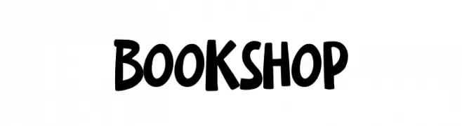
A bold, playful handwritten font with a casual and friendly style.
![Bookshop Frei Schriftart Herunterladen]() Herunterladen 317 Downloads@WebFont
Herunterladen 317 Downloads@WebFont -
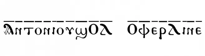
![AntoniousOL OverLine Frei Schriftart Herunterladen]() Herunterladen 317 Downloads
Herunterladen 317 Downloads -
( Fonts by Levi Halmos )
A bold, angular font with a modern twist on traditional calligraphy.
![Indochine Frei Schriftart Herunterladen]() Herunterladen 317 Downloads@WebFont
Herunterladen 317 Downloads@WebFont -
( Fonts by Ingo Zimmermann - www.ingofonts.com )
A modern, italic sans-serif font with a sleek and elegant design.
![FaberSansPro-NormalKursiv Frei Schriftart Herunterladen]() Herunterladen 317 Downloads@WebFont
Herunterladen 317 Downloads@WebFont -
( Fonts by Divide By Zero! - fonts.tom7.com )
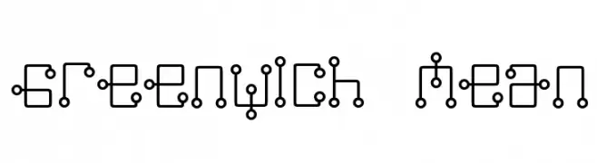
A futuristic, geometric font with interconnected lines and circles.
![Greenwich Mean Frei Schriftart Herunterladen]() Herunterladen 317 Downloads@WebFont
Herunterladen 317 Downloads@WebFont -
( christianmunk.blogspot.com/ )
A decorative font with ribbon-like, angular characters and a bold, vintage-modern style.
![Ribbons and banners Regular Frei Schriftart Herunterladen]() Herunterladen 317 Downloads@WebFont
Herunterladen 317 Downloads@WebFont -
( Fonts by Daniel Zadorozny - www.iconian.com )
A modern, futuristic outline font with a sleek and dynamic design.
![Excelerate Outline Frei Schriftart Herunterladen]() Herunterladen 317 Downloads
Herunterladen 317 Downloads -
( Fonts by Edric Studio www.creativefabrica.com/designer/edricstudio/ - Personal-use only. For commercial use please contact owner. )
A modern sans-serif font with smooth curves and uniform strokes.
![Nairi Amber Sanserif Frei Schriftart Herunterladen]() Herunterladen 317 Downloads@WebFont
Herunterladen 317 Downloads@WebFont -
( Fonts by Kurnia Setyadi )
A playful, rounded font with consistent stroke thickness and a slightly condensed style.
![Cherry Caramel Frei Schriftart Herunterladen]() Herunterladen 317 Downloads@WebFont
Herunterladen 317 Downloads@WebFont -
( Fonts by David Rakowski )
A decorative font with intricate, swirling patterns and high contrast strokes.
![KinigsteinKaps Frei Schriftart Herunterladen]() Herunterladen 317 Downloads
Herunterladen 317 Downloads -
( Fonts by The Scriptorium - Dave Nalle )
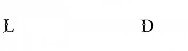
A decorative, gothic-style font with thorn-like extensions and high contrast strokes.
![Linthicum Demo Frei Schriftart Herunterladen]() Herunterladen 317 Downloads@WebFont
Herunterladen 317 Downloads@WebFont -
![Bassackwards Frei Schriftart Herunterladen]() Herunterladen 317 Downloads@WebFont
Herunterladen 317 Downloads@WebFont -
( Fonts by Khurasan )
A playful, handwritten font with smooth, flowing curves and a casual style.
![Buydog Frei Schriftart Herunterladen]() Herunterladen 317 Downloads@WebFont
Herunterladen 317 Downloads@WebFont -
( Fonts by ShyFonts )
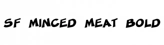
A bold, playful font with angular strokes and a dynamic slant.
![SF Minced Meat Bold Frei Schriftart Herunterladen]() Herunterladen 317 Downloads@WebFont
Herunterladen 317 Downloads@WebFont -
( Fonts by anke-art - Personal-use only. For commercial use please contact owner. )
A whimsical font with characters integrated into penguin illustrations, perfect for playful designs.
![Pingu Frei Schriftart Herunterladen]() Herunterladen 317 Downloads@WebFont
Herunterladen 317 Downloads@WebFont -
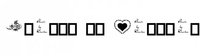
![Hearts by Darrian Frei Schriftart Herunterladen]() Herunterladen 317 Downloads@WebFont
Herunterladen 317 Downloads@WebFont -
( Fonts by Khurasan )
A playful, hand-drawn font with a whimsical and informal style.
![Mommyland Frei Schriftart Herunterladen]() Herunterladen 317 Downloads@WebFont
Herunterladen 317 Downloads@WebFont -
![Discotic Frei Schriftart Herunterladen]() Herunterladen 317 Downloads@WebFont
Herunterladen 317 Downloads@WebFont -
( Fonts by Astigmatic One Eye Typographic Institute - Brian J. Bonislawsky - astigmatic.com )
A whimsical, hand-drawn font with irregular, artistic strokes.
![Lovesick AOE Frei Schriftart Herunterladen]() Herunterladen 317 Downloads@WebFont
Herunterladen 317 Downloads@WebFont -
( Fonts by Geronimo Fonts - Personal-use only. For commercial use please contact owner. )
A playful, hand-drawn font with a whimsical and informal style.
![Florida Frei Schriftart Herunterladen]() Herunterladen 317 Downloads@WebFont
Herunterladen 317 Downloads@WebFont


Welche Schriften sind gerade am populärsten?
Poppins, Roboto, Montserrat, Open Sans und Lato sind wegen ihrer klaren Formen und breiten Einsetzbarkeit sehr gefragt – von Markenauftritt über Landingpages bis hin zu Postern.
Welche Fonts eignen sich für Logos?
Geometrische Sans‑Serifs (z. B. Poppins, Familien im Gotham‑Stil) sind ein häufiger Griff für sauberes, skalierbares Branding. Für eine persönlichere Note bleiben Scripts und Handschrift‑Stile beliebt. Kombinieren Sie einen prägnanten Headline‑Font mit einer neutralen Brotschrift für Wiedererkennung und Harmonie.
Wie oft wird die Top‑Liste aktualisiert?
Regelmäßig – basierend auf realen Downloads und Interaktionen. Schauen Sie öfter vorbei, um aufstrebende Favoriten früh zu entdecken.
💡 Tipp: Seite bookmarken – Trends wechseln schnell, und heutige Top‑Schriften inspirieren morgen vielleicht das Rebranding.