Willkommen bei den Top‑Schriften – hier treffen Beliebtheit und Qualität aufeinander. Das sind die in diesem Jahr am häufigsten heruntergeladenen und genutzten Fonts. Wenn Sie sichere Optionen für Logo, Web oder Social suchen, starten Sie hier.
Jeder Top‑Font überzeugt durch Balance, Lesbarkeit und Vielseitigkeit. Sie finden moderne Sans‑Serifs, elegante Scripts, Vintage‑Serifs und minimalistische Displays.
-
 Herunterladen 316 Downloads@WebFont
 -
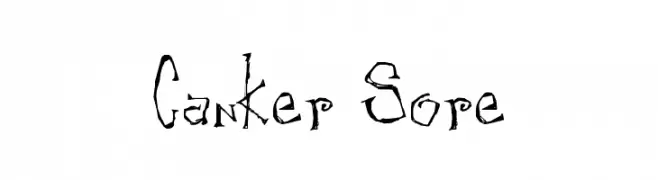
( Free for non-commercial use. www.johnmartz.com )
A jagged, thorny font with an edgy, hand-drawn appearance.
![Canker Sore Frei Schriftart Herunterladen]() Herunterladen 316 Downloads
Herunterladen 316 Downloads -
![TX Timesquare Frei Schriftart Herunterladen]() Herunterladen 316 Downloads@WebFont
Herunterladen 316 Downloads@WebFont -
( Fonts by Press Gang Studios - Andeh Pinkard - www.pressgang-studios.com )
A bold, handwritten font with an energetic and playful style.
![Stubborn Heartz TBS Bold Frei Schriftart Herunterladen]() Herunterladen 316 Downloads@WebFont
Herunterladen 316 Downloads@WebFont -
( Fonts by ShyFonts )
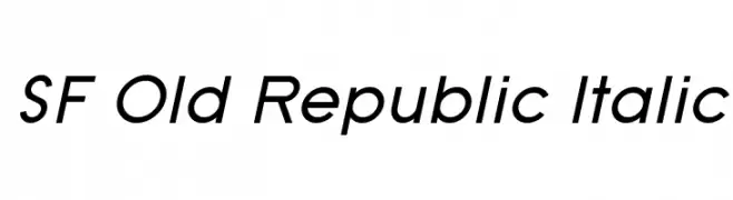
A sleek, italicized font with a modern and elegant style.
![SF Old Republic Italic Frei Schriftart Herunterladen]() Herunterladen 316 Downloads@WebFont
Herunterladen 316 Downloads@WebFont -
( Fonts by Daniel Zadorozny - www.iconian.com - Free for personal use )
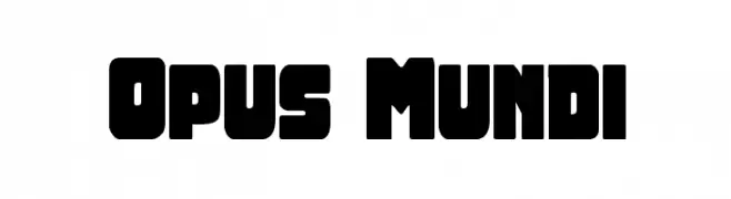
A bold, geometric display font with blocky, rounded letterforms.
![Opus Mundi Frei Schriftart Herunterladen]() Herunterladen 316 Downloads@WebFont
Herunterladen 316 Downloads@WebFont -
![Cordel Valentine Frei Schriftart Herunterladen]() Herunterladen 316 Downloads@WebFont
Herunterladen 316 Downloads@WebFont -
( Fonts by Alpaprana Studio )
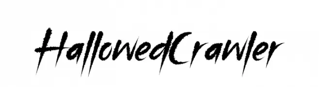
A dramatic, edgy font with sharp, angular strokes and a dynamic appearance.
![Hallowed Crawler Frei Schriftart Herunterladen]() Herunterladen 316 Downloads@WebFont
Herunterladen 316 Downloads@WebFont -
( Iconian Fonts - Daniel Zadorozny - www.iconian.com )
A bold, condensed, and italicized font with a futuristic and geometric design.
![Drone Tracker Condensed Italic Frei Schriftart Herunterladen]() Herunterladen 316 Downloads@WebFont
Herunterladen 316 Downloads@WebFont -
( Fonts by Ahmad Zulfikar Ali )
A playful, hand-drawn font with a 3D doodle effect and textured hatching.
![Doodletoon line Frei Schriftart Herunterladen]() Herunterladen 316 Downloads@WebFont
Herunterladen 316 Downloads@WebFont -
( Fonts by Daniel Zadorozny - www.iconian.com - Free for personal use )
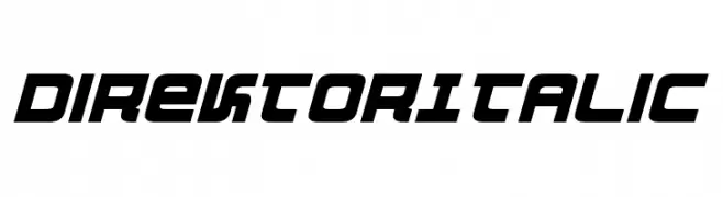
A bold, italic, and futuristic font with geometric shapes and sharp angles.
![DirektorItalic Frei Schriftart Herunterladen]() Herunterladen 316 Downloads@WebFont
Herunterladen 316 Downloads@WebFont -
( Fonts by AEnigma - www.aenigmafonts.com )
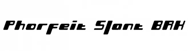
A bold, slanted font with a futuristic and dynamic design.
![Phorfeit Slant BRK Frei Schriftart Herunterladen]() Herunterladen 316 Downloads@WebFont
Herunterladen 316 Downloads@WebFont -
( Fonts by deFharo - Fernando Haro - Personal-use only. For commercial use please contact owner. )
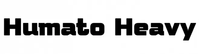
A bold, geometric font with a modern and impactful style.
![Humato Heavy Frei Schriftart Herunterladen]() Herunterladen 316 Downloads@WebFont
Herunterladen 316 Downloads@WebFont -
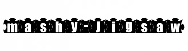
![mashy-Jigsaw Frei Schriftart Herunterladen]() Herunterladen 316 Downloads@WebFont
Herunterladen 316 Downloads@WebFont -
( Fonts by Matthew Austin Petty - www.disturbed.com )
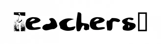
A playful, handwritten-style font with bold, irregular characters.
![Teachers? Frei Schriftart Herunterladen]() Herunterladen 316 Downloads@WebFont
Herunterladen 316 Downloads@WebFont -
( Fonts by a Neale Davidson - www.pixelsagas.com. Personal-use only. For commercial use please contact owner. )
A bold, angular font with a modern, geometric style.
![Harker Frei Schriftart Herunterladen]() Herunterladen 316 Downloads@WebFont
Herunterladen 316 Downloads@WebFont -
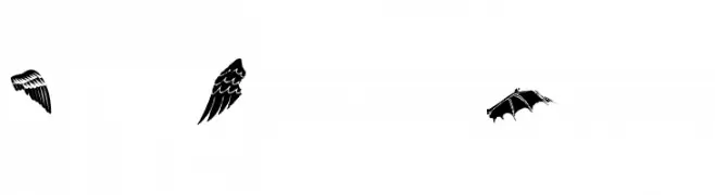
![Two Wingy Dingy Frei Schriftart Herunterladen]() Herunterladen 316 Downloads@WebFont
Herunterladen 316 Downloads@WebFont -
( Fonts by Henrich Fichna )
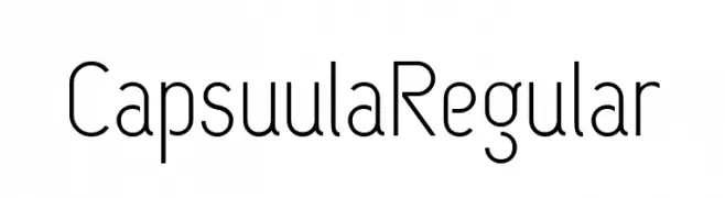
A modern, geometric sans-serif font with a clean and streamlined design.
![CapsuulaRegular Frei Schriftart Herunterladen]() Herunterladen 316 Downloads@WebFont
Herunterladen 316 Downloads@WebFont -
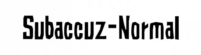
![Subaccuz-Normal Frei Schriftart Herunterladen]() Herunterladen 316 Downloads@WebFont
Herunterladen 316 Downloads@WebFont -
( Fonts by dustBUST - Andreas Nylin )
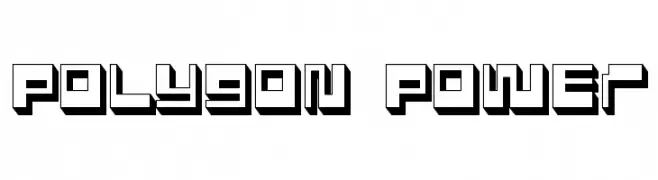
A bold, geometric font with a 3D polygonal design.
![Polygon Power Frei Schriftart Herunterladen]() Herunterladen 316 Downloads@WebFont
Herunterladen 316 Downloads@WebFont -
![WWHeavenSent Frei Schriftart Herunterladen]() Herunterladen 316 Downloads@WebFont
Herunterladen 316 Downloads@WebFont -
( Fonts by Manfred Klein - manfred-klein.ina-mar.com )
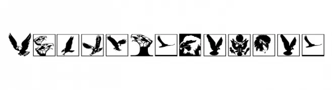
Bird-themed dingbat font with diverse bird and eagle silhouettes.
![BirdsInHeaven Frei Schriftart Herunterladen]() Herunterladen 316 Downloads@WebFont
Herunterladen 316 Downloads@WebFont -
( Fonts by www.peter-wiegel.de. Personal-use only. For commercial use please contact owner. )
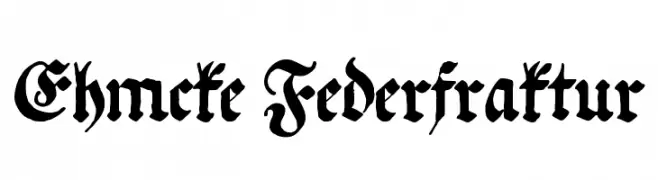
An ornate Blackletter font with intricate, gothic-inspired letterforms.
![Ehmcke Federfraktur Frei Schriftart Herunterladen]() Herunterladen 316 Downloads@WebFont
Herunterladen 316 Downloads@WebFont -
( Free for personal use - jaydegarrow.wix.com/jaydefonts )
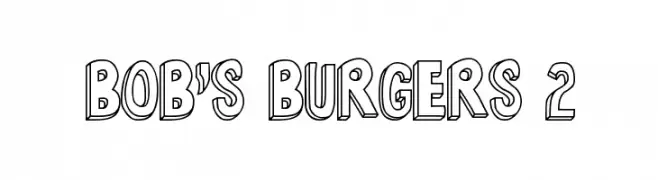
A bold, 3D cartoonish font with a playful shadow effect.
![Bob's Burgers 2 Frei Schriftart Herunterladen]() Herunterladen 316 Downloads@WebFont
Herunterladen 316 Downloads@WebFont -
( Free for a personal use. For a commercial use please visit www.kevinandamanda.com )
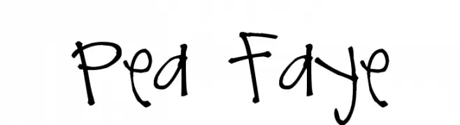
A playful, handwritten font with a whimsical and informal style.
![Pea Faye Frei Schriftart Herunterladen]() Herunterladen 316 Downloads@WebFont
Herunterladen 316 Downloads@WebFont -
![Zerotype Frei Schriftart Herunterladen]() Herunterladen 316 Downloads@WebFont
Herunterladen 316 Downloads@WebFont -
( Fonts by Tan Cundrawan - cove703 - creativemarket.com/cove703 - Personal-use only. For commercial use please contact owner. )
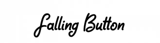
A bold, cursive font with interconnected characters and a modern calligraphic style.
![Falling Button Frei Schriftart Herunterladen]() Herunterladen 316 Downloads@WebFont
Herunterladen 316 Downloads@WebFont -
( Copyright (c) Blondina Elms Pastel (blondina@atelierelms.com) )
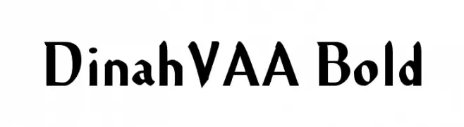
A bold, dynamic serif typeface with angular serifs and strong presence.
![DinahVAA Bold Frei Schriftart Herunterladen]() Herunterladen 316 Downloads@WebFont
Herunterladen 316 Downloads@WebFont -
![LCR Frightful Frames Frei Schriftart Herunterladen]() Herunterladen 316 Downloads@WebFont
Herunterladen 316 Downloads@WebFont -
( Fonts by Gatonegro - www.ekkiicat.com Sponsoren Schriftart )
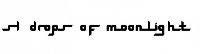
A futuristic, geometric font with bold, stylized characters and star accents.
![SL Drops Of Moonlight Frei Schriftart Herunterladen]() Herunterladen 316 Downloads
Herunterladen 316 Downloads -
( Fonts by Manfred Klein - manfred-klein.ina-mar.com )
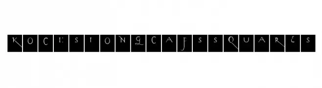
A decorative font with elongated, elegant letterforms enclosed in squares, featuring thin strokes and subtle curves.
![KochsLongCapsSquares Frei Schriftart Herunterladen]() Herunterladen 316 Downloads@WebFont
Herunterladen 316 Downloads@WebFont -
( Fonts by NJ Studio - Personal-use only. For commercial use please contact owner. )
A flowing, cursive font with elegant loops and artistic flair.
![Sunbunny Frei Schriftart Herunterladen]() Herunterladen 316 Downloads@WebFont
Herunterladen 316 Downloads@WebFont -
![KR Tulips Frei Schriftart Herunterladen]() Herunterladen 316 Downloads@WebFont
Herunterladen 316 Downloads@WebFont -
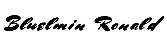
![Bluelmin Ronald Frei Schriftart Herunterladen]() Herunterladen 316 Downloads@WebFont
Herunterladen 316 Downloads@WebFont -
( Fonts by junkohanhero )
A bold, distressed font with a grunge texture, ideal for vintage or industrial designs.
![Another name for Frei Schriftart Herunterladen]() Herunterladen 316 Downloads@WebFont
Herunterladen 316 Downloads@WebFont


Welche Schriften sind gerade am populärsten?
Poppins, Roboto, Montserrat, Open Sans und Lato sind wegen ihrer klaren Formen und breiten Einsetzbarkeit sehr gefragt – von Markenauftritt über Landingpages bis hin zu Postern.
Welche Fonts eignen sich für Logos?
Geometrische Sans‑Serifs (z. B. Poppins, Familien im Gotham‑Stil) sind ein häufiger Griff für sauberes, skalierbares Branding. Für eine persönlichere Note bleiben Scripts und Handschrift‑Stile beliebt. Kombinieren Sie einen prägnanten Headline‑Font mit einer neutralen Brotschrift für Wiedererkennung und Harmonie.
Wie oft wird die Top‑Liste aktualisiert?
Regelmäßig – basierend auf realen Downloads und Interaktionen. Schauen Sie öfter vorbei, um aufstrebende Favoriten früh zu entdecken.
💡 Tipp: Seite bookmarken – Trends wechseln schnell, und heutige Top‑Schriften inspirieren morgen vielleicht das Rebranding.