Willkommen bei den Top‑Schriften – hier treffen Beliebtheit und Qualität aufeinander. Das sind die in diesem Jahr am häufigsten heruntergeladenen und genutzten Fonts. Wenn Sie sichere Optionen für Logo, Web oder Social suchen, starten Sie hier.
Jeder Top‑Font überzeugt durch Balance, Lesbarkeit und Vielseitigkeit. Sie finden moderne Sans‑Serifs, elegante Scripts, Vintage‑Serifs und minimalistische Displays.
-
 Herunterladen 309 Downloads@WebFont
 -
( Halim Antoni - fontbundles.net/halimstudio )
An elegant script font with flowing, high-contrast strokes and ornate curves.
![natasya Frei Schriftart Herunterladen]() Herunterladen 309 Downloads@WebFont
Herunterladen 309 Downloads@WebFont -
( Fonts by a Neale Davidson - www.pixelsagas.com. Personal-use only. For commercial use please contact owner. )
A futuristic, condensed italic font with sharp, angular edges.
![Cyberverse Condensed Italic Frei Schriftart Herunterladen]() Herunterladen 309 Downloads@WebFont
Herunterladen 309 Downloads@WebFont -
( Sabrtype - creativemarket.com/Sabrtype )
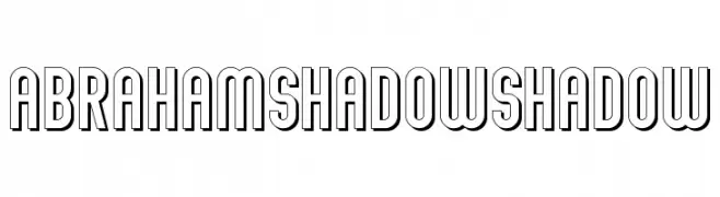
A bold, shadowed font with a three-dimensional effect and geometric structure.
![Abraham Shadow Shadow Frei Schriftart Herunterladen]() Herunterladen 309 Downloads@WebFont
Herunterladen 309 Downloads@WebFont -
( Fonts by www.koenhachmang.com - Glitch )
A bold, futuristic font with geometric shapes and strong lines.
![Warzone-97-Medium-Left Frei Schriftart Herunterladen]() Herunterladen 309 Downloads@WebFont
Herunterladen 309 Downloads@WebFont -
( I Like Fonts - Alan Alan )
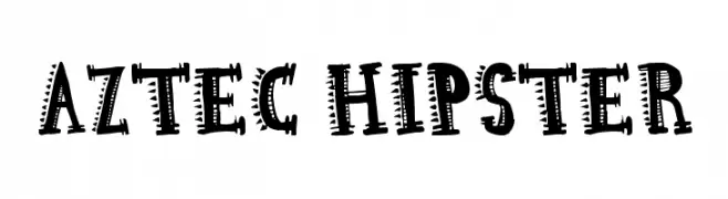
A bold, decorative font with tribal-inspired geometric patterns.
![Aztec Hipster Frei Schriftart Herunterladen]() Herunterladen 309 Downloads@WebFont
Herunterladen 309 Downloads@WebFont -
( Fonts by Agustian Eko Saputro )
A playful, handwritten font with a casual and friendly style.
![Melon hunter Frei Schriftart Herunterladen]() Herunterladen 309 Downloads@WebFont
Herunterladen 309 Downloads@WebFont -
( Fonts by Daniel Zadorozny - www.iconian.com - Free for personal use )
Bold, outlined, condensed font with a playful yet assertive style.
![Jack's Candlestick Academy Condensed Frei Schriftart Herunterladen]() Herunterladen 309 Downloads@WebFont
Herunterladen 309 Downloads@WebFont -
( Fonts by www.houseoflime.com )
A bold, decorative font with intricate embellishments on each letter.
![PhilliBoo Frei Schriftart Herunterladen]() Herunterladen 309 Downloads@WebFont
Herunterladen 309 Downloads@WebFont -
( Fonts by Graham Meade - GemFonts )
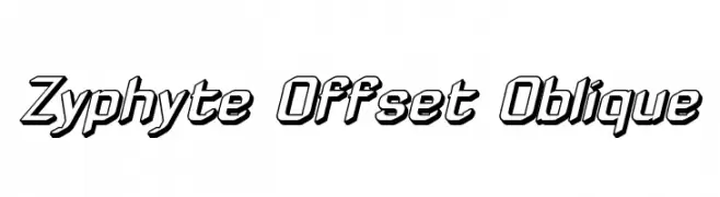
A bold, offset oblique font with a dynamic, three-dimensional style.
![Zyphyte Offset Oblique Frei Schriftart Herunterladen]() Herunterladen 309 Downloads@WebFont
Herunterladen 309 Downloads@WebFont -
![Signus Digital Square NBP Frei Schriftart Herunterladen]() Herunterladen 309 Downloads@WebFont
Herunterladen 309 Downloads@WebFont -
![Roundy Regular Frei Schriftart Herunterladen]() Herunterladen 309 Downloads@WebFont
Herunterladen 309 Downloads@WebFont -
![Symbolic Scient Frei Schriftart Herunterladen]() Herunterladen 309 Downloads@WebFont
Herunterladen 309 Downloads@WebFont -
( Fonts by Pennyzine - www.thedevilinjasonramirez.com - Free for personal use )
A bold, distressed serif font with a grunge aesthetic.
![Times New Omen Frei Schriftart Herunterladen]() Herunterladen 309 Downloads@WebFont
Herunterladen 309 Downloads@WebFont -
( Free for a personal use. For a commercial use please visit www.kevinandamanda.com )
A playful, handwritten font with rounded, informal letterforms.
![Pea Emma Frei Schriftart Herunterladen]() Herunterladen 309 Downloads@WebFont
Herunterladen 309 Downloads@WebFont -
( Fonts by Dieter Steffmann )
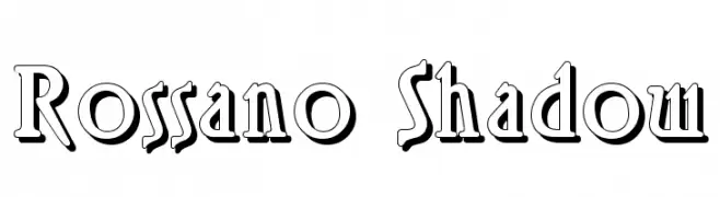
A bold, shadowed font with a dynamic, three-dimensional appearance.
![Rossano Shadow Frei Schriftart Herunterladen]() Herunterladen 309 Downloads@WebFont
Herunterladen 309 Downloads@WebFont -
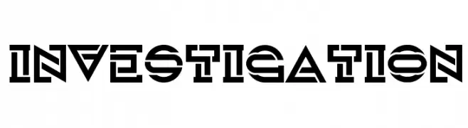
![Investigation Frei Schriftart Herunterladen]() Herunterladen 309 Downloads@WebFont
Herunterladen 309 Downloads@WebFont -
( Fonts by Zetafonts - Personal-use only. For commercial use please contact owner. )
A bold, italicized font with a modern and dynamic style.
![HeadingNow Trial 16 Bold Italic Frei Schriftart Herunterladen]() Herunterladen 309 Downloads@WebFont
Herunterladen 309 Downloads@WebFont -
( Fonts by Apostrophic Lab )
A futuristic, geometric font with bold, angular letterforms.
![Back to the Futurex Frei Schriftart Herunterladen]() Herunterladen 309 Downloads@WebFont
Herunterladen 309 Downloads@WebFont -
( Fonts by Tri Sakti Oktaviano )
A bold, playful font with rounded, bubbly characters.
![Kind Kids Frei Schriftart Herunterladen]() Herunterladen 309 Downloads@WebFont
Herunterladen 309 Downloads@WebFont -
( Download for Personal Use. For Commercial: http://www.k-type.com )
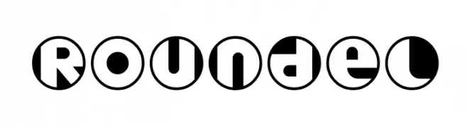
A bold, circular geometric font with high contrast and modern style.
![Roundel Frei Schriftart Herunterladen]() Herunterladen 309 Downloads@WebFont
Herunterladen 309 Downloads@WebFont -
( Fonts by Matthew Austin Petty - www.disturbed.com )
A modern, decorative font with geometric shapes and playful curves.
![Regork Frei Schriftart Herunterladen]() Herunterladen 309 Downloads@WebFont
Herunterladen 309 Downloads@WebFont -
![LCR Mountain Climber Frei Schriftart Herunterladen]() Herunterladen 309 Downloads@WebFont
Herunterladen 309 Downloads@WebFont -
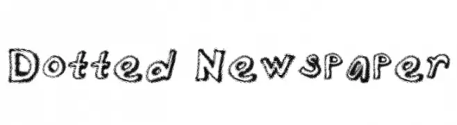
![Dotted Newspaper Frei Schriftart Herunterladen]() Herunterladen 309 Downloads@WebFont
Herunterladen 309 Downloads@WebFont -
![Anti-School Frei Schriftart Herunterladen]() Herunterladen 309 Downloads@WebFont
Herunterladen 309 Downloads@WebFont -
( Fonts by Apostrophic Lab )
A geometric, angular font with thin, hairline strokes and a modern, minimalist style.
![Mastodon Hairline Frei Schriftart Herunterladen]() Herunterladen 309 Downloads@WebFont
Herunterladen 309 Downloads@WebFont -
( - www.bakuro3.com/ )
A decorative font with jagged, artistic strokes and a wild, untamed appearance.
![pnÏRegular Frei Schriftart Herunterladen]() Herunterladen 309 Downloads@WebFont
Herunterladen 309 Downloads@WebFont -
( Fonts by Daniel Zadorozny - www.iconian.com )
A bold, geometric font with sharp angles and dynamic style.
![Heroes Assemble Regular Frei Schriftart Herunterladen]() Herunterladen 309 Downloads@WebFont
Herunterladen 309 Downloads@WebFont -
( Fonts by Khurasan™ )
Playful handwritten font.
![Rosellia Frei Schriftart Herunterladen]() Herunterladen 309 Downloads@WebFont
Herunterladen 309 Downloads@WebFont -
( Fonts by Casady & Greene )
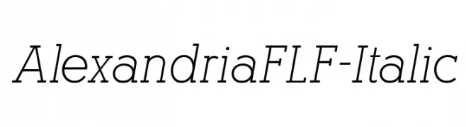
A refined italic font with elegant, slanted characters and smooth curves.
![AlexandriaFLF-Italic Frei Schriftart Herunterladen]() Herunterladen 309 Downloads@WebFont
Herunterladen 309 Downloads@WebFont -
![Fade 2 Back Frei Schriftart Herunterladen]() Herunterladen 309 Downloads@WebFont
Herunterladen 309 Downloads@WebFont -
![Eygptian Frei Schriftart Herunterladen]() Herunterladen 309 Downloads@WebFont
Herunterladen 309 Downloads@WebFont -
( Fonts by Manfred Klein - manfred-klein.ina-mar.com )
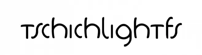
A playful, modern font with rounded edges and consistent stroke width.
![TschichLightFS Frei Schriftart Herunterladen]() Herunterladen 309 Downloads@WebFont
Herunterladen 309 Downloads@WebFont -
![faithhandwriting Frei Schriftart Herunterladen]() Herunterladen 309 Downloads@WebFont
Herunterladen 309 Downloads@WebFont -
( Fonts by Daniel Gauthier )
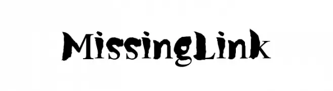
A bold, brush-like font with a dramatic and artistic style.
![MissingLink Frei Schriftart Herunterladen]() Herunterladen 309 Downloads@WebFont
Herunterladen 309 Downloads@WebFont


Welche Schriften sind gerade am populärsten?
Poppins, Roboto, Montserrat, Open Sans und Lato sind wegen ihrer klaren Formen und breiten Einsetzbarkeit sehr gefragt – von Markenauftritt über Landingpages bis hin zu Postern.
Welche Fonts eignen sich für Logos?
Geometrische Sans‑Serifs (z. B. Poppins, Familien im Gotham‑Stil) sind ein häufiger Griff für sauberes, skalierbares Branding. Für eine persönlichere Note bleiben Scripts und Handschrift‑Stile beliebt. Kombinieren Sie einen prägnanten Headline‑Font mit einer neutralen Brotschrift für Wiedererkennung und Harmonie.
Wie oft wird die Top‑Liste aktualisiert?
Regelmäßig – basierend auf realen Downloads und Interaktionen. Schauen Sie öfter vorbei, um aufstrebende Favoriten früh zu entdecken.
💡 Tipp: Seite bookmarken – Trends wechseln schnell, und heutige Top‑Schriften inspirieren morgen vielleicht das Rebranding.