Willkommen bei den Top‑Schriften – hier treffen Beliebtheit und Qualität aufeinander. Das sind die in diesem Jahr am häufigsten heruntergeladenen und genutzten Fonts. Wenn Sie sichere Optionen für Logo, Web oder Social suchen, starten Sie hier.
Jeder Top‑Font überzeugt durch Balance, Lesbarkeit und Vielseitigkeit. Sie finden moderne Sans‑Serifs, elegante Scripts, Vintage‑Serifs und minimalistische Displays.
-
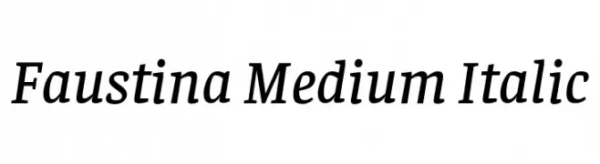
( Copyright 2016 The Faustina Project Authors (omnibus.type@gmail.com) )
A medium-weight, italic serif font with a classic and elegant style.
 Herunterladen 309 Downloads@WebFont
 -
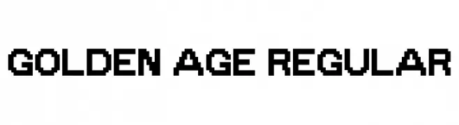
( imagex - www.imagex-fonts.com )
A bold, pixelated font with a retro digital style.
![Golden Age Regular Frei Schriftart Herunterladen]() Herunterladen 309 Downloads@WebFont
Herunterladen 309 Downloads@WebFont -
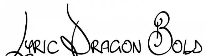
![Lyric Dragon Bold Frei Schriftart Herunterladen]() Herunterladen 309 Downloads@WebFont
Herunterladen 309 Downloads@WebFont -
( Fonts by www.aenigmafonts.com )
A cross-stitch patterned font with a handcrafted, decorative style.
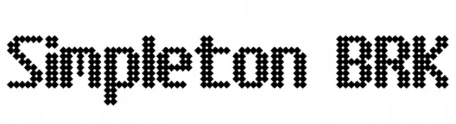
![Simpleton BRK Frei Schriftart Herunterladen]() Herunterladen 309 Downloads@WebFont
Herunterladen 309 Downloads@WebFont -
![Pandemic Frei Schriftart Herunterladen]() Herunterladen 309 Downloads@WebFont
Herunterladen 309 Downloads@WebFont -
( Dan Smith's Fantasy Fonts - www.acondia.com/fonts/index.html )
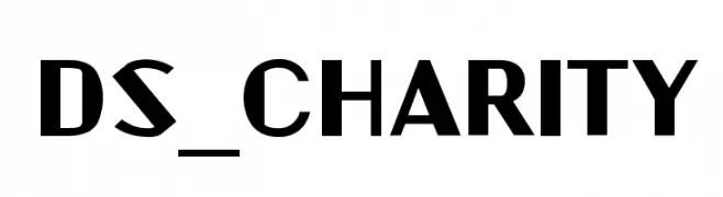
A bold, geometric font with a modern and assertive style.
![DS_Charity Frei Schriftart Herunterladen]() Herunterladen 309 Downloads
Herunterladen 309 Downloads -
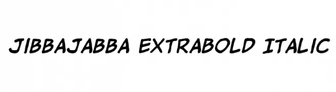
( Fonts by Jason Arthur - JibbaJabba Fonts - www.myspace.com/jasonarthurloaded )
A bold, italicized handwritten font with a playful and dynamic style.
![jibbajabba ExtraBold Italic Frei Schriftart Herunterladen]() Herunterladen 309 Downloads@WebFont
Herunterladen 309 Downloads@WebFont -
![Heraldic Frei Schriftart Herunterladen]() Herunterladen 309 Downloads@WebFont
Herunterladen 309 Downloads@WebFont -
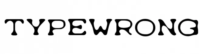
( Fonts by Ryoichi Tsunekawa - www.dharmatype.com )
A bold, playful font with irregular, blob-like shapes and a whimsical design.
![Typewrong Frei Schriftart Herunterladen]() Herunterladen 309 Downloads@WebFont
Herunterladen 309 Downloads@WebFont -
( Fonts by a kmzero font foundry - www.zetafonts.com. Personal-use only. For commercial use please contact owner. )
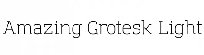
A modern, light sans-serif font with a clean and minimalist design.
![Amazing Grotesk Light Frei Schriftart Herunterladen]() Herunterladen 308 Downloads@WebFont
Herunterladen 308 Downloads@WebFont -
( Fonts by Galdino Otten - galdinootten.com )
A bold, handcrafted font with a rugged, organic appearance.
![Xilo Prosa Frei Schriftart Herunterladen]() Herunterladen 308 Downloads@WebFont
Herunterladen 308 Downloads@WebFont -
![Pascu1 Frei Schriftart Herunterladen]() Herunterladen 308 Downloads@WebFont
Herunterladen 308 Downloads@WebFont -
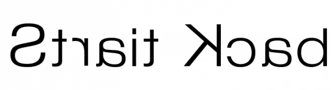
![Strait Kcab Frei Schriftart Herunterladen]() Herunterladen 308 Downloads@WebFont
Herunterladen 308 Downloads@WebFont -
( Fonts by twinletter )
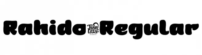
A bold, playful font with rounded edges and a chunky appearance.
![Rahido-Regular Frei Schriftart Herunterladen]() Herunterladen 308 Downloads@WebFont
Herunterladen 308 Downloads@WebFont -
![Aztecways Frei Schriftart Herunterladen]() Herunterladen 308 Downloads@WebFont
Herunterladen 308 Downloads@WebFont -
( Fonts by www.peter-wiegel.de. Personal-use only. For commercial use please contact owner. )
A bold, playful font with rounded characters and a modern style.
![Quirkus Bold Frei Schriftart Herunterladen]() Herunterladen 308 Downloads@WebFont
Herunterladen 308 Downloads@WebFont -
( Fonts by www.blambot.com )
A dynamic, angular font with sharp lines and high contrast, perfect for impactful designs.
![BlamBlam BB Frei Schriftart Herunterladen]() Herunterladen 308 Downloads@WebFont
Herunterladen 308 Downloads@WebFont -
( Fonts by Fernando Haro - defharo.com )
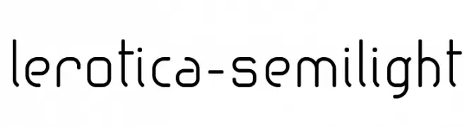
A modern, geometric font with rounded edges and consistent character spacing.
![lerotica-semilight Frei Schriftart Herunterladen]() Herunterladen 308 Downloads@WebFont
Herunterladen 308 Downloads@WebFont -
( Fonts by Din Studio - Donis Miftahudin - Personal-use only. For commercial use please contact owner. )
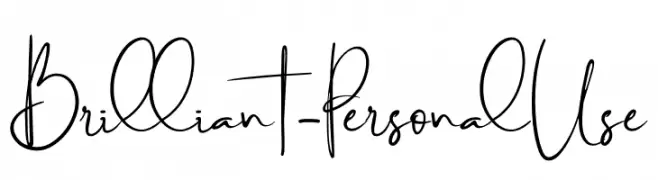
A dynamic and expressive handwritten font with fluid cursive letterforms.
![Brilliant - Personal Use Frei Schriftart Herunterladen]() Herunterladen 308 Downloads@WebFont
Herunterladen 308 Downloads@WebFont -
( Fonts by a Typeface Leone - www.tipografialeone.net. Personal-use only. For commercial use please contact owner. )
A modern, geometric sans-serif font with clean lines and consistent stroke width.
![Urban Elegance Frei Schriftart Herunterladen]() Herunterladen 308 Downloads@WebFont
Herunterladen 308 Downloads@WebFont -
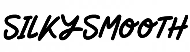
![Silky Smooth Frei Schriftart Herunterladen]() Herunterladen 308 Downloads@WebFont
Herunterladen 308 Downloads@WebFont -
( Fonts by Altsys Metamorphosis )
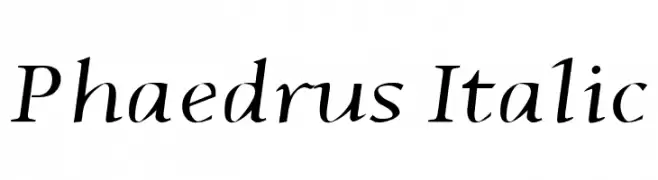
An elegant italic serif font with smooth strokes and moderate contrast.
![Phaedrus Italic Frei Schriftart Herunterladen]() Herunterladen 308 Downloads@WebFont
Herunterladen 308 Downloads@WebFont -
( Fonts by Itsm )
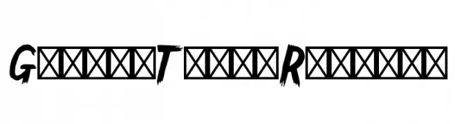
A bold, jagged font with a dynamic, hand-drawn appearance.
![GallowTree-Regular Frei Schriftart Herunterladen]() Herunterladen 308 Downloads@WebFont
Herunterladen 308 Downloads@WebFont -
( Fonts by Billy Argel - www.billyargel.com - Personal-use only. For commercial use please contact owner. )
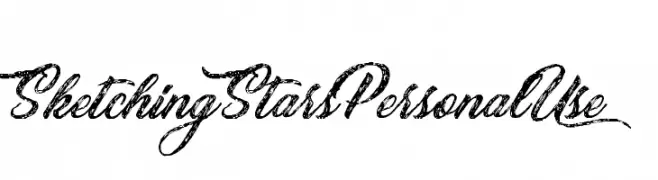
A decorative script font with flowing, hand-drawn calligraphy style.
![Sketching Stars Personal Use Frei Schriftart Herunterladen]() Herunterladen 308 Downloads@WebFont
Herunterladen 308 Downloads@WebFont -
![Movie Script Ending Frei Schriftart Herunterladen]() Herunterladen 308 Downloads@WebFont
Herunterladen 308 Downloads@WebFont -
( Fonts by Eduardo Tunni )
A modern, clean sans-serif font with balanced spacing and uniform stroke width.
![Sintony Frei Schriftart Herunterladen]() Herunterladen 308 Downloads@WebFont
Herunterladen 308 Downloads@WebFont -
( Fonts by www.lobbby24.com - Personal-use only. For commercial use please contact owner. )
A decorative font with sharp serifs and high contrast, perfect for bold designs.
![BBBouquet Ultra Expanded Frei Schriftart Herunterladen]() Herunterladen 308 Downloads@WebFont
Herunterladen 308 Downloads@WebFont -
( Free for a personal use. For a commercial use please visit www.kevinandamanda.com )
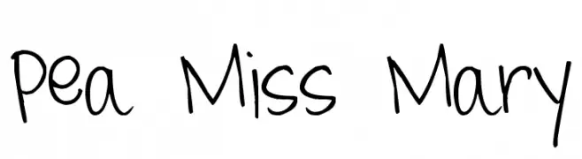
A playful, handwritten font with a casual and lively style.
![Pea Miss Mary Frei Schriftart Herunterladen]() Herunterladen 308 Downloads@WebFont
Herunterladen 308 Downloads@WebFont -
( Fonts by Zetafonts - Personal-use only. For commercial use please contact owner. )
A sleek, ultra-thin font with a modern and elegant design.
![Aristotelica Text Trial Hairline Frei Schriftart Herunterladen]() Herunterladen 308 Downloads@WebFont
Herunterladen 308 Downloads@WebFont -
( Fonts by a Neale Davidson - www.pixelsagas.com. Personal-use only. For commercial use please contact owner. )
A playful, rounded font with a modern and friendly appearance.
![Callie-Mae Frei Schriftart Herunterladen]() Herunterladen 308 Downloads@WebFont
Herunterladen 308 Downloads@WebFont -
![EURONEW Normal Frei Schriftart Herunterladen]() Herunterladen 308 Downloads@WebFont
Herunterladen 308 Downloads@WebFont -
( Zetafonts - www.zetafonts.com )
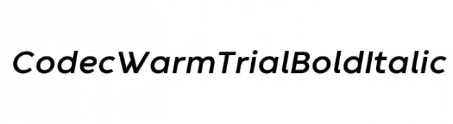
A bold, italicized font with a modern and dynamic style.
![Codec Warm Trial Bold Italic Frei Schriftart Herunterladen]() Herunterladen 308 Downloads@WebFont
Herunterladen 308 Downloads@WebFont -
![ScriptME 3 Frei Schriftart Herunterladen]() Herunterladen 308 Downloads@WebFont
Herunterladen 308 Downloads@WebFont -
![tusch Frei Schriftart Herunterladen]() Herunterladen 308 Downloads@WebFont
Herunterladen 308 Downloads@WebFont -
![Peggy Frei Schriftart Herunterladen]() Herunterladen 308 Downloads@WebFont
Herunterladen 308 Downloads@WebFont


Welche Schriften sind gerade am populärsten?
Poppins, Roboto, Montserrat, Open Sans und Lato sind wegen ihrer klaren Formen und breiten Einsetzbarkeit sehr gefragt – von Markenauftritt über Landingpages bis hin zu Postern.
Welche Fonts eignen sich für Logos?
Geometrische Sans‑Serifs (z. B. Poppins, Familien im Gotham‑Stil) sind ein häufiger Griff für sauberes, skalierbares Branding. Für eine persönlichere Note bleiben Scripts und Handschrift‑Stile beliebt. Kombinieren Sie einen prägnanten Headline‑Font mit einer neutralen Brotschrift für Wiedererkennung und Harmonie.
Wie oft wird die Top‑Liste aktualisiert?
Regelmäßig – basierend auf realen Downloads und Interaktionen. Schauen Sie öfter vorbei, um aufstrebende Favoriten früh zu entdecken.
💡 Tipp: Seite bookmarken – Trends wechseln schnell, und heutige Top‑Schriften inspirieren morgen vielleicht das Rebranding.