Willkommen bei den Top‑Schriften – hier treffen Beliebtheit und Qualität aufeinander. Das sind die in diesem Jahr am häufigsten heruntergeladenen und genutzten Fonts. Wenn Sie sichere Optionen für Logo, Web oder Social suchen, starten Sie hier.
Jeder Top‑Font überzeugt durch Balance, Lesbarkeit und Vielseitigkeit. Sie finden moderne Sans‑Serifs, elegante Scripts, Vintage‑Serifs und minimalistische Displays.
-
 Herunterladen 308 Downloads@WebFont
 -
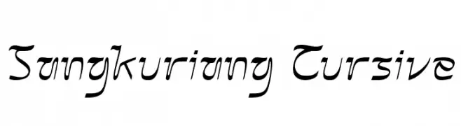
( Fonts by Hendrick Rolandez - Personal-use only. For commercial use please contact owner. )
An elegant, high-contrast font with decorative elements and modern flair.
![Vanity-LightWide Frei Schriftart Herunterladen]() Herunterladen 308 Downloads@WebFont
Herunterladen 308 Downloads@WebFont -
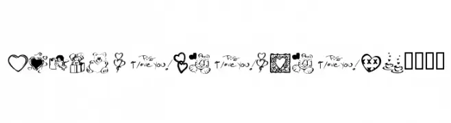
( Fonts by Kat`s Fun Fonts - Personal-use only. For commercial use please contact owner. )
A playful and romantic collection of love-themed dingbats, perfect for decorative projects.
![KR Valentine Dings 2002 Frei Schriftart Herunterladen]() Herunterladen 308 Downloads@WebFont
Herunterladen 308 Downloads@WebFont -
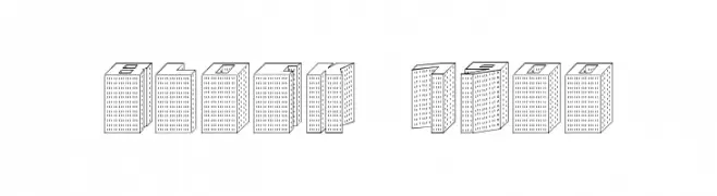
![Block 1900 Frei Schriftart Herunterladen]() Herunterladen 308 Downloads@WebFont
Herunterladen 308 Downloads@WebFont -
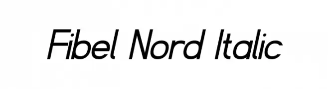
( Fonts by www.peter-wiegel.de. Personal-use only. For commercial use please contact owner. )
A modern, italicized font with sleek, consistent strokes and a dynamic appearance.
![Fibel Nord Italic Frei Schriftart Herunterladen]() Herunterladen 308 Downloads@WebFont
Herunterladen 308 Downloads@WebFont -
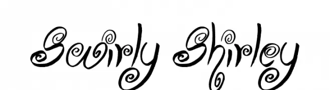
![Swirly Shirley Frei Schriftart Herunterladen]() Herunterladen 308 Downloads@WebFont
Herunterladen 308 Downloads@WebFont -
( Fonts by Stefie Justprince - https://shoppy.gg/@stefiejustprince- Personal-use only. For commercial use please contact owner. )
A smooth, flowing script font with elegant, connected letters.
![Koeltoerals Frei Schriftart Herunterladen]() Herunterladen 308 Downloads@WebFont
Herunterladen 308 Downloads@WebFont -
( Fonts by Ahmad Muslimin )
A playful, bold font with rounded, thick strokes and a whimsical touch.
![KIDERSUN Frei Schriftart Herunterladen]() Herunterladen 308 Downloads@WebFont
Herunterladen 308 Downloads@WebFont -
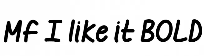
![Mf I like it BOLD Frei Schriftart Herunterladen]() Herunterladen 308 Downloads@WebFont
Herunterladen 308 Downloads@WebFont -
![cheek2cheek [black!] by shk.dezign Frei Schriftart Herunterladen]() Herunterladen 308 Downloads
Herunterladen 308 Downloads -
( Fonts by Gassstype )
A bold, playful font with a hand-drawn, irregular style.
![Not Found Frei Schriftart Herunterladen]() Herunterladen 308 Downloads@WebFont
Herunterladen 308 Downloads@WebFont -
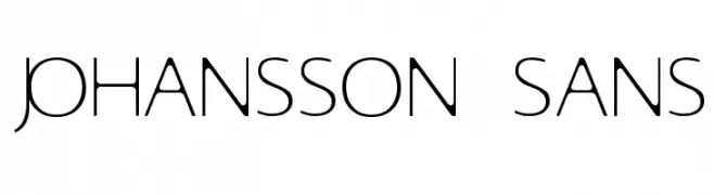
( Andreas Johansson - hem.passagen.se/anjo77/font/ )
A modern, elegant sans-serif font with sleek, elongated characters.
![Johansson Sans Frei Schriftart Herunterladen]() Herunterladen 308 Downloads@WebFont
Herunterladen 308 Downloads@WebFont -
Schriftart von spideraysfonts. For commercial use please contact the owner.
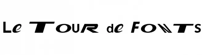
( Le Tour de Fonts )
A bold, italicized font with a futuristic and dynamic style.
![Le Tour de Fonts Frei Schriftart Herunterladen]() Herunterladen 308 Downloads@WebFont
Herunterladen 308 Downloads@WebFont -
( Fonts by Alpaprana - Personal-use only. For commercial use please contact owner. )
A modern, handwritten font with a playful and artistic flair.
![Carolina Frei Schriftart Herunterladen]() Herunterladen 308 Downloads@WebFont
Herunterladen 308 Downloads@WebFont -
( Fonts by Iconian Fonts )
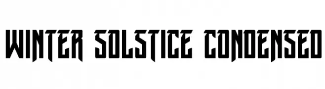
A bold, condensed font with sharp, angular edges and a modern, geometric style.
![Winter Solstice Condensed Frei Schriftart Herunterladen]() Herunterladen 308 Downloads@WebFont
Herunterladen 308 Downloads@WebFont -
( Fonts by www.houseoflime.com )
Not a font; illustrated cat artwork.
![Cats Frei Schriftart Herunterladen]() Herunterladen 308 Downloads@WebFont
Herunterladen 308 Downloads@WebFont -
( Fonts by Eknoji Studio - www.eknojistudio.com - Personal-use only. For commercial use please contact owner. )
A graceful and elegant script font with flowing cursive lines.
![Aunten Bedany Frei Schriftart Herunterladen]() Herunterladen 308 Downloads@WebFont
Herunterladen 308 Downloads@WebFont -
( Fonts by Impallari Type - Personal-use only. For commercial use please contact owner. )
A clean, modern sans-serif typeface with excellent legibility.
![Encode Sans Normal Frei Schriftart Herunterladen]() Herunterladen 308 Downloads@WebFont
Herunterladen 308 Downloads@WebFont -
( Fonts by a Max Infeld - XEROGRAPHER FONTS - xerographer.blogspot.com . Personal-use only. For commercial use please contact owner. )
A bold, shattered glass effect font with fragmented, edgy characters.
![BadLuck Frei Schriftart Herunterladen]() Herunterladen 308 Downloads@WebFont
Herunterladen 308 Downloads@WebFont -
( Fonts by Manuel Ramos - www.infinitismo.com - Personal-use only. For commercial use please contact owner. )
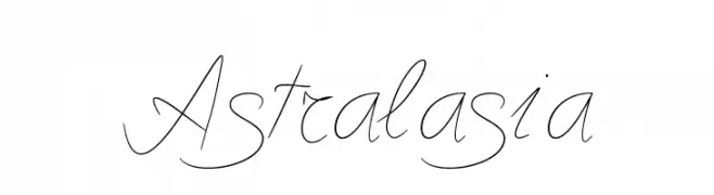
A graceful script font with elegant, flowing strokes.
![Astralasia Frei Schriftart Herunterladen]() Herunterladen 308 Downloads@WebFont
Herunterladen 308 Downloads@WebFont -
( Fonts by Iconian Fonts )
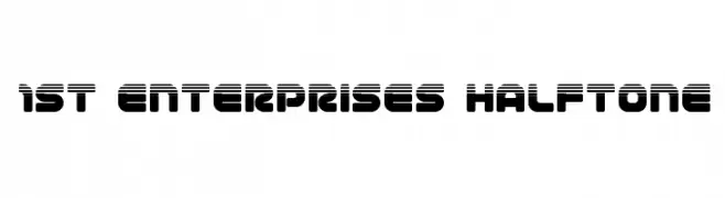
A bold, futuristic font with a halftone effect and rounded edges.
![1st Enterprises Halftone Frei Schriftart Herunterladen]() Herunterladen 308 Downloads@WebFont
Herunterladen 308 Downloads@WebFont -
( Fonts by Al Ghul )
A whimsical, curly font with playful loops and swirls.
![Cute Malika Frei Schriftart Herunterladen]() Herunterladen 308 Downloads@WebFont
Herunterladen 308 Downloads@WebFont -
( Fonts by Mans Greback - Personal-use only. For commercial use please contact owner. )
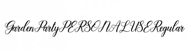
An elegant, flowing script font with ornate uppercase and cohesive lowercase letters.
![Garden Party PERSONAL USE Regular Frei Schriftart Herunterladen]() Herunterladen 308 Downloads@WebFont
Herunterladen 308 Downloads@WebFont -
( Fonts by www.DigitalDreamDesign.net )
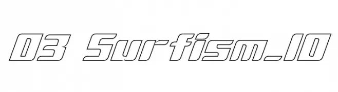
A bold, geometric outline font with a futuristic and dynamic style.
![D3 Surfism_IO Frei Schriftart Herunterladen]() Herunterladen 308 Downloads@WebFont
Herunterladen 308 Downloads@WebFont -
( Free for Personal Use. To use commercially please visit the www.bvfonts.com )
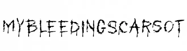
A bold, distressed font with a chaotic, splattered ink appearance.
![MyBleedingScarsOT Frei Schriftart Herunterladen]() Herunterladen 308 Downloads@WebFont
Herunterladen 308 Downloads@WebFont -
![Banana Split Frei Schriftart Herunterladen]() Herunterladen 308 Downloads@WebFont
Herunterladen 308 Downloads@WebFont -
![First Blind 2 Frei Schriftart Herunterladen]() Herunterladen 308 Downloads@WebFont
Herunterladen 308 Downloads@WebFont -
( Fonts by Goma Shin - www.geocities.jp/gomarice_font/ - Personal-use only. For commercial use please contact owner. )
A bold, playful font with a hand-drawn, informal style.
![Marker2 Frei Schriftart Herunterladen]() Herunterladen 308 Downloads@WebFont
Herunterladen 308 Downloads@WebFont -
![Staubiges Vergngen Frei Schriftart Herunterladen]() Herunterladen 308 Downloads@WebFont
Herunterladen 308 Downloads@WebFont -
( Fonts by www.fenotype.com )
A bold, geometric font with a modern, futuristic style and rounded edges.
![pectopah Frei Schriftart Herunterladen]() Herunterladen 308 Downloads@WebFont
Herunterladen 308 Downloads@WebFont -
( Noto is a trademark of Google Inc. Noto fonts are open source. All Noto fonts are published under the SIL Open Font License, Version 1.1 )
A clean and modern sans-serif font with excellent readability.
![Noto Sans Devanagari UI Medium Frei Schriftart Herunterladen]() Herunterladen 308 Downloads@WebFont
Herunterladen 308 Downloads@WebFont -
![OXE OXE Frei Schriftart Herunterladen]() Herunterladen 308 Downloads@WebFont
Herunterladen 308 Downloads@WebFont -
( Fonts by Manfred Klein - manfred-klein.ina-mar.com )
A bold, blackletter-inspired font with dramatic strokes and ornate details.
![BigElla Frei Schriftart Herunterladen]() Herunterladen 308 Downloads@WebFont
Herunterladen 308 Downloads@WebFont -
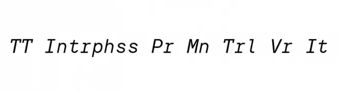
( Fonts by TypeType Foundry )
A modern sans-serif font with a slight italic slant and uniform stroke width.
![TT Intrphss Pr Mn Trl Vr It Frei Schriftart Herunterladen]() Herunterladen 308 Downloads@WebFont
Herunterladen 308 Downloads@WebFont -
![Dungeons Frei Schriftart Herunterladen]() Herunterladen 308 Downloads@WebFont
Herunterladen 308 Downloads@WebFont


![cheek2cheek [black!] by shk.dezign Frei Schriftart Herunterladen](https://d144mzi0q5mijx.cloudfront.net/img/C/H/cheek2cheek-black-by-shkdezign.webp)


Welche Schriften sind gerade am populärsten?
Poppins, Roboto, Montserrat, Open Sans und Lato sind wegen ihrer klaren Formen und breiten Einsetzbarkeit sehr gefragt – von Markenauftritt über Landingpages bis hin zu Postern.
Welche Fonts eignen sich für Logos?
Geometrische Sans‑Serifs (z. B. Poppins, Familien im Gotham‑Stil) sind ein häufiger Griff für sauberes, skalierbares Branding. Für eine persönlichere Note bleiben Scripts und Handschrift‑Stile beliebt. Kombinieren Sie einen prägnanten Headline‑Font mit einer neutralen Brotschrift für Wiedererkennung und Harmonie.
Wie oft wird die Top‑Liste aktualisiert?
Regelmäßig – basierend auf realen Downloads und Interaktionen. Schauen Sie öfter vorbei, um aufstrebende Favoriten früh zu entdecken.
💡 Tipp: Seite bookmarken – Trends wechseln schnell, und heutige Top‑Schriften inspirieren morgen vielleicht das Rebranding.