Willkommen bei den Top‑Schriften – hier treffen Beliebtheit und Qualität aufeinander. Das sind die in diesem Jahr am häufigsten heruntergeladenen und genutzten Fonts. Wenn Sie sichere Optionen für Logo, Web oder Social suchen, starten Sie hier.
Jeder Top‑Font überzeugt durch Balance, Lesbarkeit und Vielseitigkeit. Sie finden moderne Sans‑Serifs, elegante Scripts, Vintage‑Serifs und minimalistische Displays.
-
( Vladimir Fedotov )
A modern, rounded sans-serif font with smooth curves and a clean appearance.
 Herunterladen 307 Downloads@WebFont
 -
( Fonts by Sancrea Studio )
A bold, playful font with a hand-drawn, dynamic style.
![Daily Hours Frei Schriftart Herunterladen]() Herunterladen 307 Downloads@WebFont
Herunterladen 307 Downloads@WebFont -
( Fonts by www.kimberlygeswein.com - Kimberly Geswein )
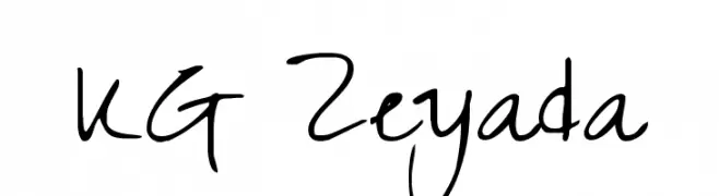
A lively handwritten font with fluid strokes and playful character.
![KG Zeyada Frei Schriftart Herunterladen]() Herunterladen 307 Downloads@WebFont
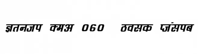
Herunterladen 307 Downloads@WebFont -
![Kruti Dev 060 Bold Italic Frei Schriftart Herunterladen]() Herunterladen 307 Downloads@WebFont
Herunterladen 307 Downloads@WebFont -
( Fonts by Hanoded )
A playful, hand-drawn font with tall, narrow letters and artistic flair.
![DK Southside Fizz Regular Frei Schriftart Herunterladen]() Herunterladen 307 Downloads@WebFont
Herunterladen 307 Downloads@WebFont -
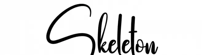
( Fonts by Scratchones )
A dynamic and expressive handwritten font with fluid, cursive strokes.
![Skeleton Frei Schriftart Herunterladen]() Herunterladen 307 Downloads@WebFont
Herunterladen 307 Downloads@WebFont -
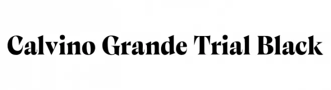
( Fonts by Zetafonts - Personal-use only. For commercial use please contact owner. )
A bold, high-contrast serif font with sharp serifs and a dramatic style.
![Calvino Grande Trial Black Frei Schriftart Herunterladen]() Herunterladen 307 Downloads@WebFont
Herunterladen 307 Downloads@WebFont -
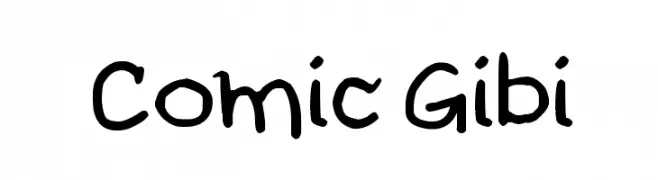
( Fonts by Galdino Otten - galdinootten.com )
A playful, comic-style handwritten font with rounded, medium-thick strokes.
![Comic Gibi Frei Schriftart Herunterladen]() Herunterladen 307 Downloads@WebFont
Herunterladen 307 Downloads@WebFont -
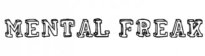
( Fonts by Rodrigo German - RASDESIGN )
A bold, decorative font with a hand-drawn, sketch-like appearance.
![MENTAL FREAK Frei Schriftart Herunterladen]() Herunterladen 307 Downloads@WebFont
Herunterladen 307 Downloads@WebFont -
( Fonts by Pandan Wangi )
A playful, handwritten-style font with bold, dynamic characters.
![Amina Reska Frei Schriftart Herunterladen]() Herunterladen 307 Downloads@WebFont
Herunterladen 307 Downloads@WebFont -
( Aldus )
An ornate, decorative font with intricate floral embellishments, ideal for elegant and sophisticated designs.
![Regal Frei Schriftart Herunterladen]() Herunterladen 307 Downloads@WebFont
Herunterladen 307 Downloads@WebFont -
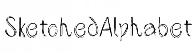
( Fonts by Manfred Klein. Free for private and charity use. Free for commercial with donation to organizations )
A playful, hand-drawn font with a sketch-like, artistic style.
![SketchedAlphabet Frei Schriftart Herunterladen]() Herunterladen 307 Downloads@WebFont
Herunterladen 307 Downloads@WebFont -
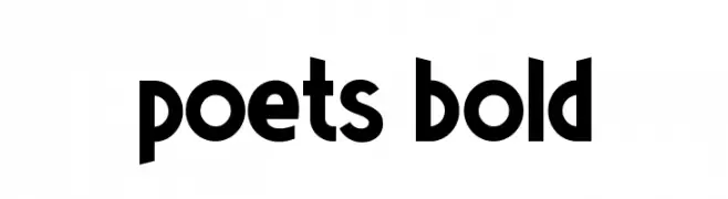
( Valdeir Junior )
A bold, modern font with thick, rounded strokes and tight spacing.
![Poets Bold Frei Schriftart Herunterladen]() Herunterladen 307 Downloads@WebFont
Herunterladen 307 Downloads@WebFont -
![SANDWICHES FALL ZFRZOM THE SKY!! Frei Schriftart Herunterladen]() Herunterladen 307 Downloads@WebFont
Herunterladen 307 Downloads@WebFont -
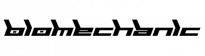
![Biomechanic Frei Schriftart Herunterladen]() Herunterladen 307 Downloads@WebFont
Herunterladen 307 Downloads@WebFont -
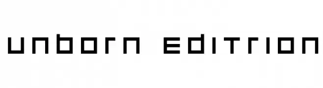
( Fonts by Espen Morten Kvalheim - www.unbornchikken.com )
A geometric, pixelated font with a modern, digital aesthetic.
![unborn editrion Frei Schriftart Herunterladen]() Herunterladen 307 Downloads@WebFont
Herunterladen 307 Downloads@WebFont -
( Fonts by Namara Creative Studio - Personal-use only. For commercial use please contact owner. )
A modern, geometric font with rounded edges and a clean, minimalistic style.
![Micolesther Free Regular Frei Schriftart Herunterladen]() Herunterladen 307 Downloads@WebFont
Herunterladen 307 Downloads@WebFont -
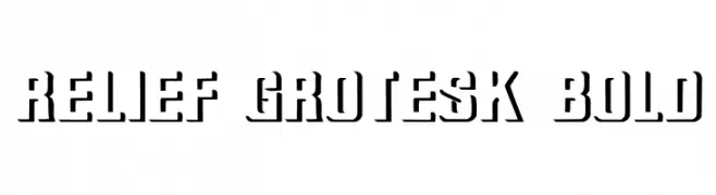
( Fonts by Dieter Steffmann )
A bold, three-dimensional font with a shadow effect, ideal for impactful headlines.
![Relief Grotesk Bold Frei Schriftart Herunterladen]() Herunterladen 307 Downloads@WebFont
Herunterladen 307 Downloads@WebFont -
( Fonts by Castcraft Software - opti.netii.net - check the website before use )
A refined, elegant serif font with a light, italic style.
![OPTIAdministerLightItalic Frei Schriftart Herunterladen]() Herunterladen 307 Downloads@WebFont
Herunterladen 307 Downloads@WebFont -
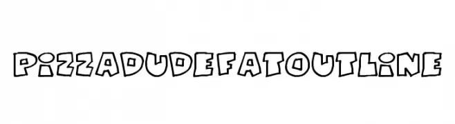
( Fonts by Jacob Fisher - www.pizzadude.dk )
A bold, playful font with chunky outlines and a cartoonish style.
![PizzaDudeFatOutline Frei Schriftart Herunterladen]() Herunterladen 307 Downloads@WebFont
Herunterladen 307 Downloads@WebFont -
( Fonts by Jacob Fisher - www.pizzadude.dk )
A bold, playful font with an edgy, graffiti-inspired style.
![Sk8ordye Frei Schriftart Herunterladen]() Herunterladen 307 Downloads@WebFont
Herunterladen 307 Downloads@WebFont -
( Personal-use only. For commercial use please contact owner. )
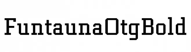
A bold, slab serif font with geometric shapes and strong serifs.
![Funtauna Otg Bold Frei Schriftart Herunterladen]() Herunterladen 307 Downloads@WebFont
Herunterladen 307 Downloads@WebFont -
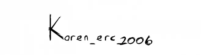
( Font by Eric Wirjanata. All of my font are donation based. You can support by buying something from here. http://society6.com/EricWirjanata )
A hand-drawn, artistic font with irregular strokes and a unique, expressive style.
![Karen_erc_2006 Frei Schriftart Herunterladen]() Herunterladen 307 Downloads@WebFont
Herunterladen 307 Downloads@WebFont -
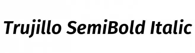
( Fonts by Fira Sans original fonts by bBox Type GmbH, Carrois Corporate GbR, & Edenspiekermann AG / Changes by Cristiano Sobral - Personal-use only. For commercial use please contact owner. )
A modern, semi-bold italic font with a sleek and dynamic style.
![Trujillo SemiBold Italic Frei Schriftart Herunterladen]() Herunterladen 307 Downloads@WebFont
Herunterladen 307 Downloads@WebFont -
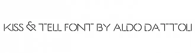
( Aldo Dattoli )
A modern, geometric font with a unique cut-out style and sleek design.
![Kiss & Tell Font By Aldo Dattoli Frei Schriftart Herunterladen]() Herunterladen 307 Downloads@WebFont
Herunterladen 307 Downloads@WebFont -
( Fonts by Abas Creative - Farhan Ramadhika - Personal-use only. For commercial use please contact owner. )
A playful, handwritten script font with fluid connections and a casual vibe.
![Rybeth Frei Schriftart Herunterladen]() Herunterladen 307 Downloads@WebFont
Herunterladen 307 Downloads@WebFont -
( Fonts by www.freakyfonts.de )
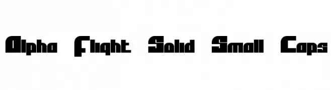
A bold, geometric font with a futuristic and digital style.
![Alpha Flight Solid Small Caps Frei Schriftart Herunterladen]() Herunterladen 307 Downloads@WebFont
Herunterladen 307 Downloads@WebFont -
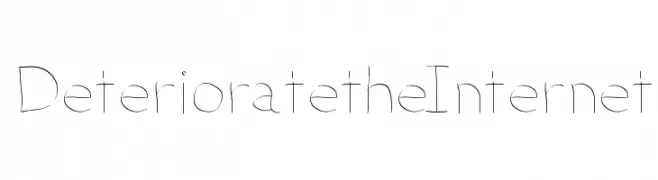
( charmingcharlie.co.nr/ )
A thin, elegant font with a handwritten touch and consistent stroke width.
![DeterioratetheInternet Frei Schriftart Herunterladen]() Herunterladen 307 Downloads@WebFont
Herunterladen 307 Downloads@WebFont -
( Fonts by Greg Medina - www.dcoxy.com - Personal-use only. For commercial use please contact owner. )
A sophisticated and elegant script font with flowing, cursive letterforms.
![Ready to Ride Frei Schriftart Herunterladen]() Herunterladen 307 Downloads@WebFont
Herunterladen 307 Downloads@WebFont -
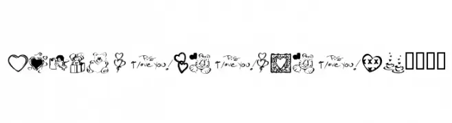
( Fonts by Kat`s Fun Fonts - Personal-use only. For commercial use please contact owner. )
A playful and romantic collection of love-themed dingbats, perfect for decorative projects.
![KR Valentine Dings 2002 Frei Schriftart Herunterladen]() Herunterladen 307 Downloads@WebFont
Herunterladen 307 Downloads@WebFont -
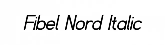
( Fonts by www.peter-wiegel.de. Personal-use only. For commercial use please contact owner. )
A modern, italicized font with sleek, consistent strokes and a dynamic appearance.
![Fibel Nord Italic Frei Schriftart Herunterladen]() Herunterladen 307 Downloads@WebFont
Herunterladen 307 Downloads@WebFont -
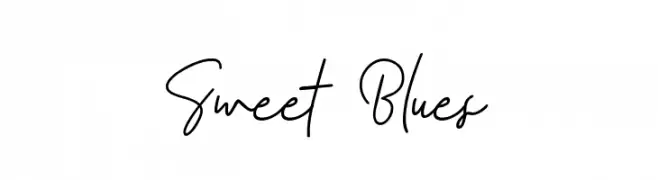
( Fonts by zamjump - Ahmad Zamzami - Personal-use only. For commercial use please contact owner. )
A flowing, cursive font with elegant loops and smooth transitions.
![Sweet Blues Frei Schriftart Herunterladen]() Herunterladen 307 Downloads@WebFont
Herunterladen 307 Downloads@WebFont -
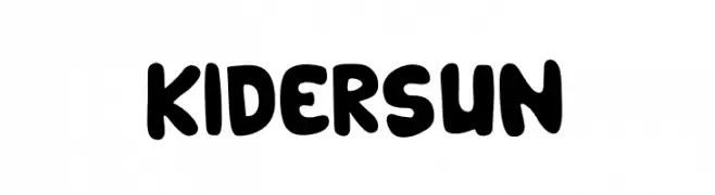
( Fonts by Ahmad Muslimin )
A playful, bold font with rounded, thick strokes and a whimsical touch.
![KIDERSUN Frei Schriftart Herunterladen]() Herunterladen 307 Downloads@WebFont
Herunterladen 307 Downloads@WebFont -
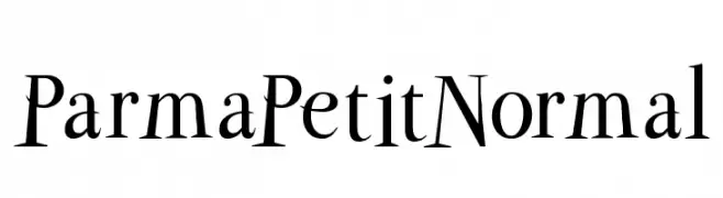
( Fonts by Manfred Klein. Free for private and charity use. Free for commercial with donation to organizations )
A classic serif font with elegant lines and high contrast, featuring playful lowercase characters.
![ParmaPetitNormal Frei Schriftart Herunterladen]() Herunterladen 307 Downloads@WebFont
Herunterladen 307 Downloads@WebFont -
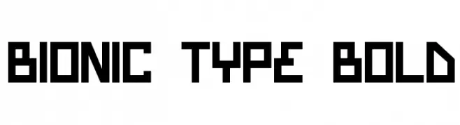
( Fonts by Daniel Zadorozny - www.iconian.com - Free for personal use )
A bold, geometric font with a futuristic and digital aesthetic.
![Bionic Type Bold Frei Schriftart Herunterladen]() Herunterladen 307 Downloads
Herunterladen 307 Downloads


Welche Schriften sind gerade am populärsten?
Poppins, Roboto, Montserrat, Open Sans und Lato sind wegen ihrer klaren Formen und breiten Einsetzbarkeit sehr gefragt – von Markenauftritt über Landingpages bis hin zu Postern.
Welche Fonts eignen sich für Logos?
Geometrische Sans‑Serifs (z. B. Poppins, Familien im Gotham‑Stil) sind ein häufiger Griff für sauberes, skalierbares Branding. Für eine persönlichere Note bleiben Scripts und Handschrift‑Stile beliebt. Kombinieren Sie einen prägnanten Headline‑Font mit einer neutralen Brotschrift für Wiedererkennung und Harmonie.
Wie oft wird die Top‑Liste aktualisiert?
Regelmäßig – basierend auf realen Downloads und Interaktionen. Schauen Sie öfter vorbei, um aufstrebende Favoriten früh zu entdecken.
💡 Tipp: Seite bookmarken – Trends wechseln schnell, und heutige Top‑Schriften inspirieren morgen vielleicht das Rebranding.