Willkommen bei den Top‑Schriften – hier treffen Beliebtheit und Qualität aufeinander. Das sind die in diesem Jahr am häufigsten heruntergeladenen und genutzten Fonts. Wenn Sie sichere Optionen für Logo, Web oder Social suchen, starten Sie hier.
Jeder Top‑Font überzeugt durch Balance, Lesbarkeit und Vielseitigkeit. Sie finden moderne Sans‑Serifs, elegante Scripts, Vintage‑Serifs und minimalistische Displays.
-
 Herunterladen 304 Downloads@WebFont
 -
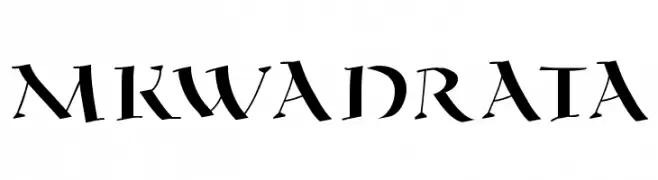
![MKwadrata Frei Schriftart Herunterladen]() Herunterladen 304 Downloads@WebFont
Herunterladen 304 Downloads@WebFont -
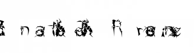
( Fonts by a David Fens. Personal-use only. For commercial use please contact owner. )
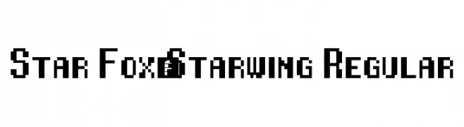
A bold, pixelated font with a retro, digital style.
![Star Fox/Starwing Regular Frei Schriftart Herunterladen]() Herunterladen 304 Downloads@WebFont
Herunterladen 304 Downloads@WebFont -
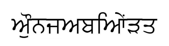
![PunjabiText Frei Schriftart Herunterladen]() Herunterladen 304 Downloads@WebFont
Herunterladen 304 Downloads@WebFont -
![TypographerGotisch B Bold Frei Schriftart Herunterladen]() Herunterladen 304 Downloads@WebFont
Herunterladen 304 Downloads@WebFont -
( Fonts by Alex Tomlinson - Skyhaven Fonts - shfonts.com )
A bold, retro-inspired font with a striped pattern and geometric structure.
![RetroGamer Frei Schriftart Herunterladen]() Herunterladen 304 Downloads@WebFont
Herunterladen 304 Downloads@WebFont -
![GokturkUnicodeFont Frei Schriftart Herunterladen]() Herunterladen 304 Downloads@WebFont
Herunterladen 304 Downloads@WebFont -
![Fifont Frei Schriftart Herunterladen]() Herunterladen 304 Downloads@WebFont
Herunterladen 304 Downloads@WebFont -
( www.myspace.com/palafoxunico )
A textured, hand-drawn style font with an artistic and rugged appearance.
![Palafotz Frei Schriftart Herunterladen]() Herunterladen 304 Downloads@WebFont
Herunterladen 304 Downloads@WebFont -
( Fonts by Douglas Vitkauskas - www.vtksdesign.com. Personal-use only. For commercial use please contact owner. )
An ornate, decorative font with elegant flourishes and calligraphic elements.
![Vtks Thanks You Frei Schriftart Herunterladen]() Herunterladen 304 Downloads@WebFont
Herunterladen 304 Downloads@WebFont -
( Fonts by www.abecedarienne.com )
A bold, stencil-like font with fragmented, dynamic strokes.
![Cricket Fills Frei Schriftart Herunterladen]() Herunterladen 304 Downloads@WebFont
Herunterladen 304 Downloads@WebFont -
( mlkwsn - Malik Wisnu )
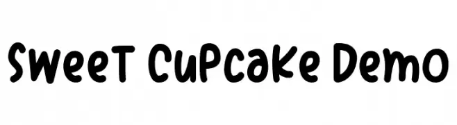
A playful, hand-drawn font with rounded, bold characters and a whimsical style.
![Sweet Cupcake Demo Frei Schriftart Herunterladen]() Herunterladen 304 Downloads@WebFont
Herunterladen 304 Downloads@WebFont -
![HAPPYLOVERSTOWN.EU - Lovers Square Frei Schriftart Herunterladen]() Herunterladen 304 Downloads@WebFont
Herunterladen 304 Downloads@WebFont -
![FETTECKE Frei Schriftart Herunterladen]() Herunterladen 304 Downloads@WebFont
Herunterladen 304 Downloads@WebFont -
( Fonts by Brian Zick - Personal-use only. For commercial use please contact owner. )
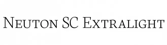
A refined serif typeface with thin strokes and a modern elegance.
![Neuton SC Extralight Frei Schriftart Herunterladen]() Herunterladen 304 Downloads@WebFont
Herunterladen 304 Downloads@WebFont -
( Fonts by Hanzel Space - Personal-use only. For commercial use please contact owner. )
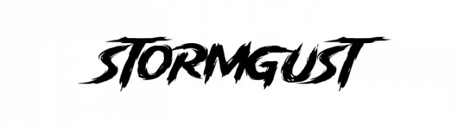
A bold, brush-style font with dynamic, jagged edges and a stormy appearance.
![Storm Gust Frei Schriftart Herunterladen]() Herunterladen 304 Downloads@WebFont
Herunterladen 304 Downloads@WebFont -
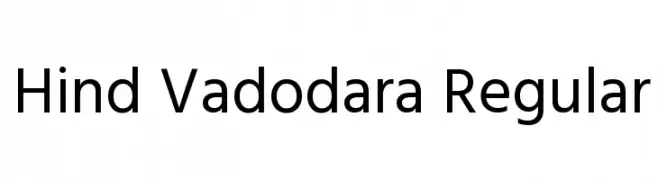
( Copyright (c) 2015 Indian Type Foundry (info@indiantypefoundry.com) )
A clean, modern sans-serif typeface with excellent readability.
![Hind Vadodara Regular Frei Schriftart Herunterladen]() Herunterladen 304 Downloads@WebFont
Herunterladen 304 Downloads@WebFont -
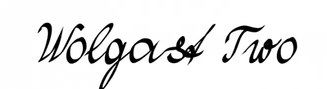
( Fonts by Peter Wiegel - www.peter-wiegel.de )
A dynamic and elegant script font with flowing, connected letterforms.
![Wolgast Two Frei Schriftart Herunterladen]() Herunterladen 304 Downloads@WebFont
Herunterladen 304 Downloads@WebFont -
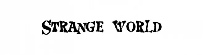
( Fonts by Christopher Hansen )
A bold, distressed font with a rugged, grunge-like appearance.
![Strange world Frei Schriftart Herunterladen]() Herunterladen 304 Downloads@WebFont
Herunterladen 304 Downloads@WebFont -
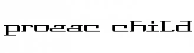
![Prozac Child Frei Schriftart Herunterladen]() Herunterladen 304 Downloads@WebFont
Herunterladen 304 Downloads@WebFont -
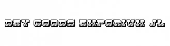
![Dry Goods Emporium JL Frei Schriftart Herunterladen]() Herunterladen 304 Downloads@WebFont
Herunterladen 304 Downloads@WebFont -
( Fonts by ShyFonts )
A sleek, modern, and light oblique font with thin strokes and normal spacing.
![SF Arborcrest Light Oblique Frei Schriftart Herunterladen]() Herunterladen 304 Downloads@WebFont
Herunterladen 304 Downloads@WebFont -
( Fonts by Timur Type )
A lively and dynamic handwritten font with fluid strokes.
![Justica Frei Schriftart Herunterladen]() Herunterladen 304 Downloads@WebFont
Herunterladen 304 Downloads@WebFont -
( Fonts by ShyFonts )
A sleek, modern sans-serif font with an oblique slant and medium weight.
![SF Arborcrest Medium Oblique Frei Schriftart Herunterladen]() Herunterladen 303 Downloads@WebFont
Herunterladen 303 Downloads@WebFont -
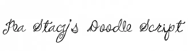
( Free for a personal use. For a commercial use please visit www.kevinandamanda.com )
A playful, whimsical cursive script with intricate swirls and loops.
![Pea Stacy's Doodle Script Frei Schriftart Herunterladen]() Herunterladen 303 Downloads@WebFont
Herunterladen 303 Downloads@WebFont -
( Zetafonts - www.zetafonts.com )
A modern, thin, and condensed font with a sleek geometric design.
![Cocogoose Condensed Trial Thin Frei Schriftart Herunterladen]() Herunterladen 303 Downloads@WebFont
Herunterladen 303 Downloads@WebFont -
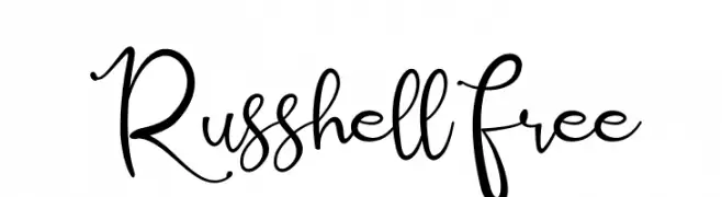
( Agung Rohmat )
A playful and elegant handwritten script font with a dynamic flow.
![Russhell Free Frei Schriftart Herunterladen]() Herunterladen 303 Downloads@WebFont
Herunterladen 303 Downloads@WebFont -
( Fonts by www.blambot.com )
A bold, hand-painted style font with an italicized, textured appearance.
![ProtestPaint BB Italic Frei Schriftart Herunterladen]() Herunterladen 303 Downloads@WebFont
Herunterladen 303 Downloads@WebFont -
( Fonts by www.fontalicious.com )
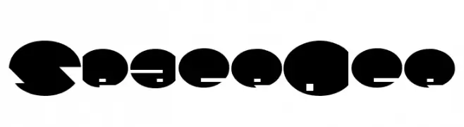
A bold, geometric font with a futuristic and modern design.
![SpaceAce Frei Schriftart Herunterladen]() Herunterladen 303 Downloads@WebFont
Herunterladen 303 Downloads@WebFont -
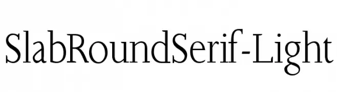
( Fonts by Manfred Klein. Free for private and charity use. Free for commercial with donation to organizations )
A light slab serif font with rounded edges, combining classic and modern elements.
![SlabRoundSerif-Light Frei Schriftart Herunterladen]() Herunterladen 303 Downloads@WebFont
Herunterladen 303 Downloads@WebFont -
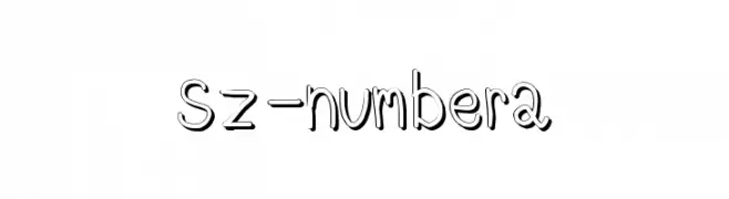
![Sz-number2 Frei Schriftart Herunterladen]() Herunterladen 303 Downloads@WebFont
Herunterladen 303 Downloads@WebFont -
![LJ Studios MonitorIS MAYUS/Minus Frei Schriftart Herunterladen]() Herunterladen 303 Downloads@WebFont
Herunterladen 303 Downloads@WebFont -
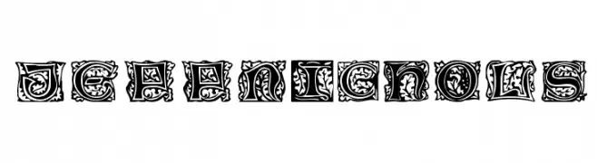
( Fonts by David Rakowski )
An ornate, decorative font with intricate patterns and a medieval flair.
![JeffNichols Frei Schriftart Herunterladen]() Herunterladen 303 Downloads
Herunterladen 303 Downloads -
![fb_nyan Frei Schriftart Herunterladen]() Herunterladen 303 Downloads@WebFont
Herunterladen 303 Downloads@WebFont -
![Just Jessie Frei Schriftart Herunterladen]() Herunterladen 303 Downloads@WebFont
Herunterladen 303 Downloads@WebFont


Welche Schriften sind gerade am populärsten?
Poppins, Roboto, Montserrat, Open Sans und Lato sind wegen ihrer klaren Formen und breiten Einsetzbarkeit sehr gefragt – von Markenauftritt über Landingpages bis hin zu Postern.
Welche Fonts eignen sich für Logos?
Geometrische Sans‑Serifs (z. B. Poppins, Familien im Gotham‑Stil) sind ein häufiger Griff für sauberes, skalierbares Branding. Für eine persönlichere Note bleiben Scripts und Handschrift‑Stile beliebt. Kombinieren Sie einen prägnanten Headline‑Font mit einer neutralen Brotschrift für Wiedererkennung und Harmonie.
Wie oft wird die Top‑Liste aktualisiert?
Regelmäßig – basierend auf realen Downloads und Interaktionen. Schauen Sie öfter vorbei, um aufstrebende Favoriten früh zu entdecken.
💡 Tipp: Seite bookmarken – Trends wechseln schnell, und heutige Top‑Schriften inspirieren morgen vielleicht das Rebranding.