Willkommen bei den Top‑Schriften – hier treffen Beliebtheit und Qualität aufeinander. Das sind die in diesem Jahr am häufigsten heruntergeladenen und genutzten Fonts. Wenn Sie sichere Optionen für Logo, Web oder Social suchen, starten Sie hier.
Jeder Top‑Font überzeugt durch Balance, Lesbarkeit und Vielseitigkeit. Sie finden moderne Sans‑Serifs, elegante Scripts, Vintage‑Serifs und minimalistische Displays.
-
 Herunterladen 303 Downloads@WebFont
 -
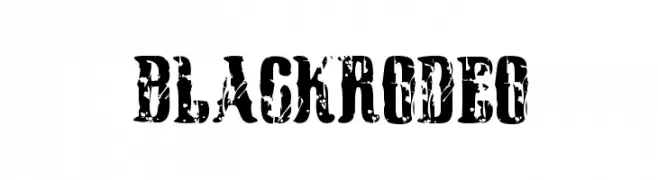
( www.woodcutter.es )
A bold, distressed font with a vintage, weathered look.
![Black Rodeo Frei Schriftart Herunterladen]() Herunterladen 303 Downloads@WebFont
Herunterladen 303 Downloads@WebFont -
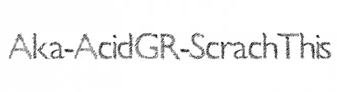
( Fonts by www.aka-acid.com )
A scratchy, hand-drawn font with an energetic and edgy style.
![Aka-AcidGR-ScrachThis Frei Schriftart Herunterladen]() Herunterladen 303 Downloads@WebFont
Herunterladen 303 Downloads@WebFont -
![RM Playtime bold Regular Frei Schriftart Herunterladen]() Herunterladen 303 Downloads@WebFont
Herunterladen 303 Downloads@WebFont -
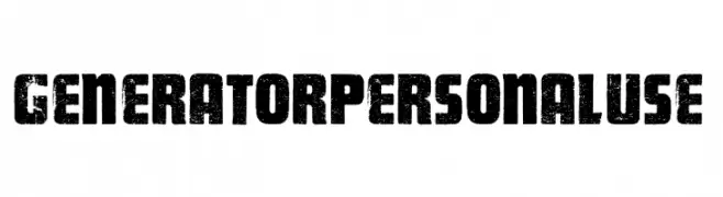
( Fonts by Billy Argel Fonts - www.billyargel.com - Personal-use only. For commercial use please contact owner. )
A bold, distressed font with a rugged, textured appearance.
![GENERATOR PERSONAL USE Frei Schriftart Herunterladen]() Herunterladen 303 Downloads@WebFont
Herunterladen 303 Downloads@WebFont -
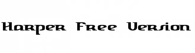
![Harper Free Version Frei Schriftart Herunterladen]() Herunterladen 303 Downloads@WebFont
Herunterladen 303 Downloads@WebFont -
![CosmicBats V1 Frei Schriftart Herunterladen]() Herunterladen 303 Downloads@WebFont
Herunterladen 303 Downloads@WebFont -
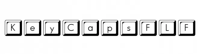
( Fonts by Casady & Greene )
A bold, sans-serif font with characters enclosed in square keycap-like frames.
![KeyCapsFLF Frei Schriftart Herunterladen]() Herunterladen 303 Downloads@WebFont
Herunterladen 303 Downloads@WebFont -
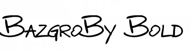
![BazgroBy Bold Frei Schriftart Herunterladen]() Herunterladen 303 Downloads@WebFont
Herunterladen 303 Downloads@WebFont -
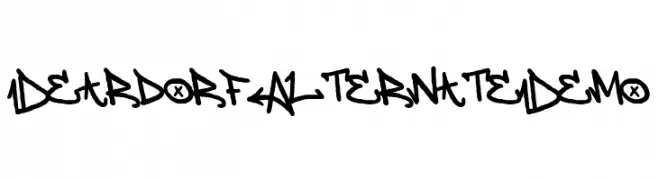
( Fonts by Allouse Studio - Personal-use only. For commercial use please contact owner. )
A bold, graffiti-inspired font with dynamic and angular letterforms.
![Deardorf Alternate Demo Frei Schriftart Herunterladen]() Herunterladen 303 Downloads@WebFont
Herunterladen 303 Downloads@WebFont -
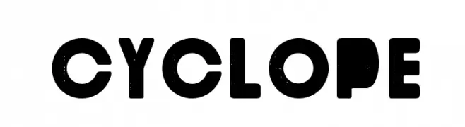
( Fonts by www.paintblackeditions.org )
A bold, geometric font with a vintage, distressed texture.
![Cyclope Frei Schriftart Herunterladen]() Herunterladen 303 Downloads@WebFont
Herunterladen 303 Downloads@WebFont -
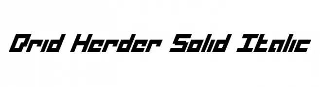
( Fonts by Daniel Zadorozny - www.iconian.com - Free for personal use )
A bold, angular, and italicized font with a futuristic design.
![Drid Herder Solid Italic Frei Schriftart Herunterladen]() Herunterladen 303 Downloads@WebFont
Herunterladen 303 Downloads@WebFont -
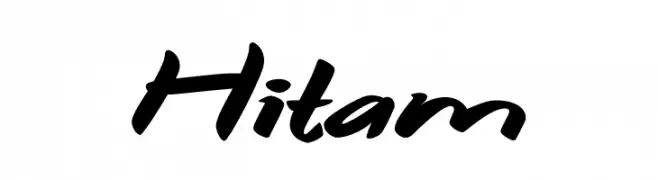
( Fonts by Syaf Rizal - https://creativemarket.com/khurasan - Personal-use only. For commercial use please contact owner. )
A bold, dynamic script font with a handwritten, energetic style.
![Hitam Frei Schriftart Herunterladen]() Herunterladen 303 Downloads@WebFont
Herunterladen 303 Downloads@WebFont -
( Fonts by Hendra Maulia )
An elegant and flowing script font with intricate loops and swirls.
![CeciliaScript Frei Schriftart Herunterladen]() Herunterladen 303 Downloads@WebFont
Herunterladen 303 Downloads@WebFont -
![Rokford Frei Schriftart Herunterladen]() Herunterladen 303 Downloads@WebFont
Herunterladen 303 Downloads@WebFont -
![MKwadrata Frei Schriftart Herunterladen]() Herunterladen 303 Downloads@WebFont
Herunterladen 303 Downloads@WebFont -
![Eradicate Frei Schriftart Herunterladen]() Herunterladen 303 Downloads@WebFont
Herunterladen 303 Downloads@WebFont -
( Fonts by Matthew Welch - www.squaregear.net/fonts/ )
A sleek, modern italic font with clean lines and smooth curves.
![Fudd Italic Frei Schriftart Herunterladen]() Herunterladen 303 Downloads@WebFont
Herunterladen 303 Downloads@WebFont -
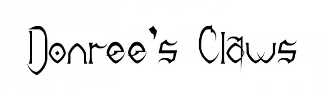
( Fonts by Sinister Visions - Chad Savage - www.sinisterfonts.com )
An edgy, claw-inspired font with sharp, dramatic detailing.
![Donree's Claws Frei Schriftart Herunterladen]() Herunterladen 303 Downloads@WebFont
Herunterladen 303 Downloads@WebFont -
( Fonts by vilogsign - Nur Kholis - Personal-use only. For commercial use please contact owner. )
A bold, modern font with thick strokes and a strong presence.
![Hardtown DEMO Bold Frei Schriftart Herunterladen]() Herunterladen 303 Downloads@WebFont
Herunterladen 303 Downloads@WebFont -
( imagex - www.imagex-fonts.com )
A bold, angular font with a futuristic and geometric design.
![Fuji Quake Zone Frei Schriftart Herunterladen]() Herunterladen 303 Downloads@WebFont
Herunterladen 303 Downloads@WebFont -
Schriftart von danny91194. For commercial use please contact the owner.
( what it the a say? )
A decorative font with abstract, alien-like shapes and molecular designs.
![alien crush Frei Schriftart Herunterladen]() Herunterladen 303 Downloads@WebFont
Herunterladen 303 Downloads@WebFont -
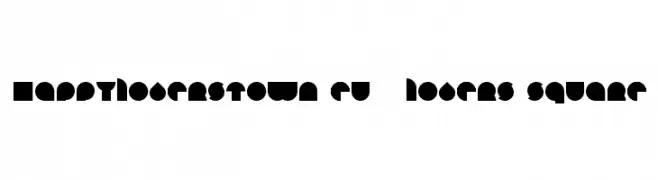
![HAPPYLOVERSTOWN.EU - Lovers Square Frei Schriftart Herunterladen]() Herunterladen 303 Downloads@WebFont
Herunterladen 303 Downloads@WebFont -
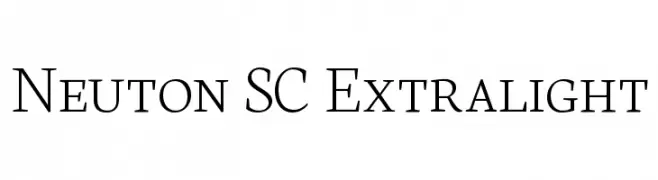
( Fonts by Brian Zick - Personal-use only. For commercial use please contact owner. )
A refined serif typeface with thin strokes and a modern elegance.
![Neuton SC Extralight Frei Schriftart Herunterladen]() Herunterladen 303 Downloads@WebFont
Herunterladen 303 Downloads@WebFont -
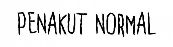
( Fonts by Adien Gunarta - fontasticindonesia.blogspot.com )
A hand-drawn, edgy font with jagged edges and dynamic strokes.
![Penakut Normal Frei Schriftart Herunterladen]() Herunterladen 303 Downloads@WebFont
Herunterladen 303 Downloads@WebFont -
( Fonts by Hanzel Space - Personal-use only. For commercial use please contact owner. )
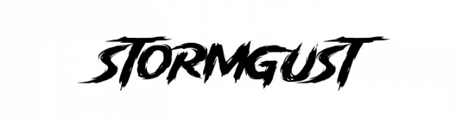
A bold, brush-style font with dynamic, jagged edges and a stormy appearance.
![Storm Gust Frei Schriftart Herunterladen]() Herunterladen 303 Downloads@WebFont
Herunterladen 303 Downloads@WebFont -
( Jens Cherukad )
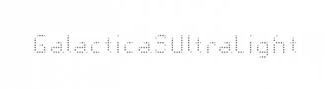
A futuristic, dotted font with a pixelated, ultra-light design.
![Galactica S Ultra Light Frei Schriftart Herunterladen]() Herunterladen 303 Downloads@WebFont
Herunterladen 303 Downloads@WebFont -
( Fonts by www.aenigmafonts.com )
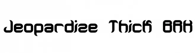
A bold, geometric font with a futuristic and modern aesthetic.
![Jeopardize Thick BRK Frei Schriftart Herunterladen]() Herunterladen 303 Downloads@WebFont
Herunterladen 303 Downloads@WebFont -
( Fonts by wonoayu79 - Agung Harto - Personal-use only. For commercial use please contact owner. )
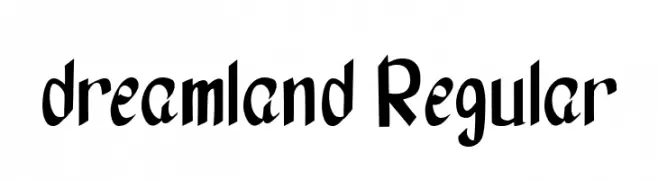
A playful, hand-drawn style font with bold, irregular characters.
![dreamland Regular Frei Schriftart Herunterladen]() Herunterladen 303 Downloads@WebFont
Herunterladen 303 Downloads@WebFont -
![Hey Kids Frei Schriftart Herunterladen]() Herunterladen 303 Downloads@WebFont
Herunterladen 303 Downloads@WebFont -
![Oscilloscope 4 Frei Schriftart Herunterladen]() Herunterladen 303 Downloads@WebFont
Herunterladen 303 Downloads@WebFont -
![Groove Machine Bold Frei Schriftart Herunterladen]() Herunterladen 303 Downloads@WebFont
Herunterladen 303 Downloads@WebFont -
( Fonts by Four Lines )
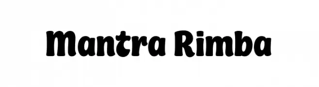
A bold, playful font with rounded edges and a whimsical style.
![Mantra Rimba Frei Schriftart Herunterladen]() Herunterladen 302 Downloads@WebFont
Herunterladen 302 Downloads@WebFont -
( Fonts by www.peter-wiegel.de. Personal-use only. For commercial use please contact owner. )
A bold, rounded font with a playful and dynamic style.
![Beta54 Frei Schriftart Herunterladen]() Herunterladen 302 Downloads@WebFont
Herunterladen 302 Downloads@WebFont -
( Fonts by dalerms - Daler Mukhiddinov - Personal-use only. For commercial use please contact owner. )
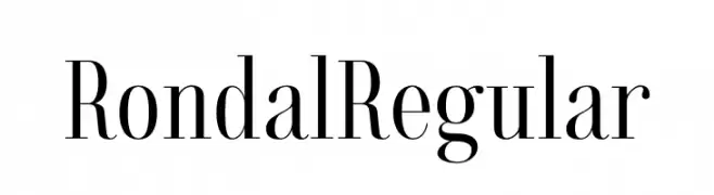
A classic serif font with high contrast and elegant, elongated strokes.
![Rondal Regular Frei Schriftart Herunterladen]() Herunterladen 302 Downloads@WebFont
Herunterladen 302 Downloads@WebFont


Welche Schriften sind gerade am populärsten?
Poppins, Roboto, Montserrat, Open Sans und Lato sind wegen ihrer klaren Formen und breiten Einsetzbarkeit sehr gefragt – von Markenauftritt über Landingpages bis hin zu Postern.
Welche Fonts eignen sich für Logos?
Geometrische Sans‑Serifs (z. B. Poppins, Familien im Gotham‑Stil) sind ein häufiger Griff für sauberes, skalierbares Branding. Für eine persönlichere Note bleiben Scripts und Handschrift‑Stile beliebt. Kombinieren Sie einen prägnanten Headline‑Font mit einer neutralen Brotschrift für Wiedererkennung und Harmonie.
Wie oft wird die Top‑Liste aktualisiert?
Regelmäßig – basierend auf realen Downloads und Interaktionen. Schauen Sie öfter vorbei, um aufstrebende Favoriten früh zu entdecken.
💡 Tipp: Seite bookmarken – Trends wechseln schnell, und heutige Top‑Schriften inspirieren morgen vielleicht das Rebranding.