Willkommen bei den Top‑Schriften – hier treffen Beliebtheit und Qualität aufeinander. Das sind die in diesem Jahr am häufigsten heruntergeladenen und genutzten Fonts. Wenn Sie sichere Optionen für Logo, Web oder Social suchen, starten Sie hier.
Jeder Top‑Font überzeugt durch Balance, Lesbarkeit und Vielseitigkeit. Sie finden moderne Sans‑Serifs, elegante Scripts, Vintage‑Serifs und minimalistische Displays.
-
 Herunterladen 287 Downloads@WebFont
 -
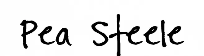
( Free for a personal use. For a commercial use please visit www.kevinandamanda.com )
A playful, casual handwritten font with irregular strokes and a lively feel.
![Pea Steele Frei Schriftart Herunterladen]() Herunterladen 287 Downloads@WebFont
Herunterladen 287 Downloads@WebFont -
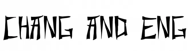
( Fonts by Typearound )
A bold, angular font with sharp lines and a distinctive, edgy style.
![Chang and Eng Frei Schriftart Herunterladen]() Herunterladen 286 Downloads@WebFont
Herunterladen 286 Downloads@WebFont -
( Fonts by Jacob Fisher - www.pizzadude.dk )
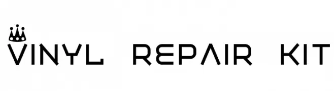
A modern, geometric font with crown motifs, ideal for decorative use.
![Vinyl repair kit Frei Schriftart Herunterladen]() Herunterladen 286 Downloads@WebFont
Herunterladen 286 Downloads@WebFont -
( www.judzign.com/ )
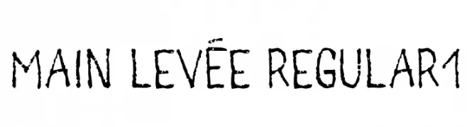
A rugged, hand-drawn font with a textured, organic appearance.
![main levée regular1 Frei Schriftart Herunterladen]() Herunterladen 286 Downloads@WebFont
Herunterladen 286 Downloads@WebFont -
-
( Fonts by The Scriptorium - Dave Nalle )
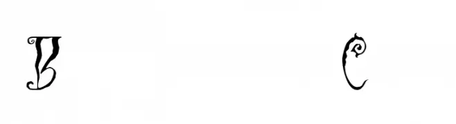
A decorative font with swirling, vine-like extensions and high contrast, ideal for fantasy themes.
![Black Cow Frei Schriftart Herunterladen]() Herunterladen 286 Downloads@WebFont
Herunterladen 286 Downloads@WebFont -
( Fonts by Fontfabric - Svetoslav Simov - Personal-use only. For commercial use please contact owner. )
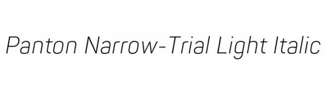
A sleek, narrow, and light italic font with a modern and elegant style.
![Panton Narrow-Trial Light Italic Frei Schriftart Herunterladen]() Herunterladen 286 Downloads@WebFont
Herunterladen 286 Downloads@WebFont -
( Måns Grebäck - www.mansgreback.com )
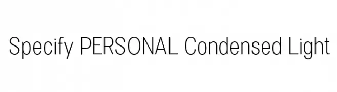
A modern, condensed sans-serif font with a light weight and tight spacing.
![Specify PERSONAL Condensed Light Frei Schriftart Herunterladen]() Herunterladen 286 Downloads@WebFont
Herunterladen 286 Downloads@WebFont -
![Lastu # 1 Frei Schriftart Herunterladen]() Herunterladen 286 Downloads@WebFont
Herunterladen 286 Downloads@WebFont -
( Fonts by www.movefont .com - Personal-use only. For commercial use please contact owner. )
A playful, energetic script font with bold, flowing letters and whimsical swirls.
![Megabite Frei Schriftart Herunterladen]() Herunterladen 286 Downloads@WebFont
Herunterladen 286 Downloads@WebFont -
( Fonts by Marc Beekhuis - www.beekhuis.ch )
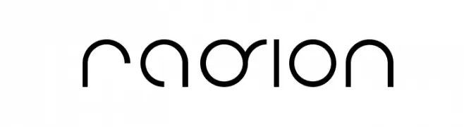
A futuristic, geometric font with circular and semi-circular shapes.
![radion Frei Schriftart Herunterladen]() Herunterladen 286 Downloads@WebFont
Herunterladen 286 Downloads@WebFont -
( Fonts by www.blambot.com )
A playful, handwritten font with a casual and friendly style.
![IndieStarBB Frei Schriftart Herunterladen]() Herunterladen 286 Downloads@WebFont
Herunterladen 286 Downloads@WebFont -
( Fonts by Chris Simpkins )
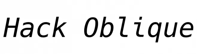
A modern, oblique font with clean lines and a slightly condensed style.
![Hack Oblique Frei Schriftart Herunterladen]() Herunterladen 286 Downloads@WebFont
Herunterladen 286 Downloads@WebFont -
( Fonts by www.blambot.com )
A bold, hand-painted style font with an italicized, textured appearance.
![ProtestPaint BB Italic Frei Schriftart Herunterladen]() Herunterladen 286 Downloads@WebFont
Herunterladen 286 Downloads@WebFont -
![RakeslyRg-BoldItalic Frei Schriftart Herunterladen]() Herunterladen 286 Downloads@WebFont
Herunterladen 286 Downloads@WebFont -
![LucifersPension Roman Frei Schriftart Herunterladen]() Herunterladen 286 Downloads@WebFont
Herunterladen 286 Downloads@WebFont -
![AntPoltLtSemiExpd-BoldItalic Frei Schriftart Herunterladen]() Herunterladen 286 Downloads@WebFont
Herunterladen 286 Downloads@WebFont -
![Screamer Frei Schriftart Herunterladen]() Herunterladen 286 Downloads@WebFont
Herunterladen 286 Downloads@WebFont -
( Free for a personal use. For a commercial use please visit www.kevinandamanda.com )
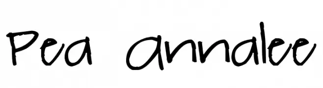
A playful, casual handwritten font with a dynamic and lively appearance.
![Pea Annalee Frei Schriftart Herunterladen]() Herunterladen 286 Downloads@WebFont
Herunterladen 286 Downloads@WebFont -
( Fonts by BLKBK Fonts Sponsoren Schriftart )
A dynamic script font with smooth, flowing lines and a handwritten style.
![Sonic Waves Frei Schriftart Herunterladen]() Herunterladen 286 Downloads
Herunterladen 286 Downloads -
( Fonts by Daniel Zadorozny - www.iconian.com - Free for personal use )
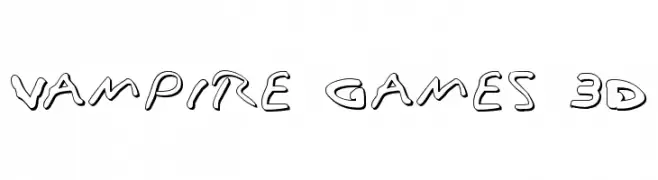
A bold, playful font with a 3D effect and rounded, irregular characters.
![Vampire Games 3D Frei Schriftart Herunterladen]() Herunterladen 286 Downloads@WebFont
Herunterladen 286 Downloads@WebFont -
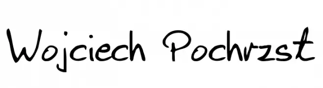
![Wojciech Pochrzst Frei Schriftart Herunterladen]() Herunterladen 286 Downloads@WebFont
Herunterladen 286 Downloads@WebFont -
![Whitelighter Frei Schriftart Herunterladen]() Herunterladen 286 Downloads@WebFont
Herunterladen 286 Downloads@WebFont -
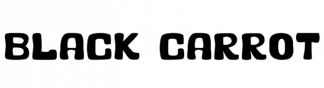
![Black Carrot Frei Schriftart Herunterladen]() Herunterladen 286 Downloads@WebFont
Herunterladen 286 Downloads@WebFont -
( Fonts by David Kerkhoff - www.hanodedphotography.com )
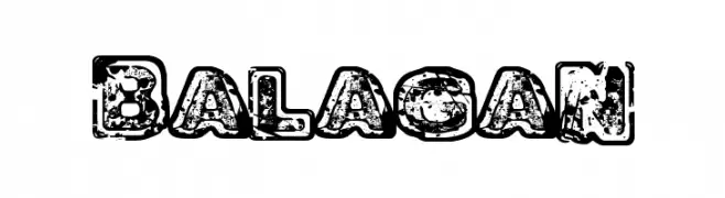
A bold, distressed font with a grunge aesthetic and textured edges.
![Balagan Frei Schriftart Herunterladen]() Herunterladen 286 Downloads@WebFont
Herunterladen 286 Downloads@WebFont -
( Fonts by Daniel Zadorozny - www.iconian.com - Free for personal use )
A futuristic, expanded italic font with medium contrast and a sleek, modern style.
![Planet NS Expanded Italic Frei Schriftart Herunterladen]() Herunterladen 286 Downloads@WebFont
Herunterladen 286 Downloads@WebFont -
Schriftart von NicholasJudy456. For commercial use please contact the owner.
( Here's More of the House Fonts )
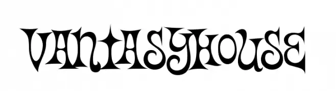
A whimsical and decorative font with intricate flourishes and curves.
![Vantasyhouse Frei Schriftart Herunterladen]() Herunterladen 286 Downloads@WebFont
Herunterladen 286 Downloads@WebFont -
( These fonts are free to use in any private, recreational manner.For commercial go to www.flopdesign.com/fordesign/font.html )
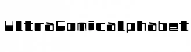
A playful, bold font with a cartoonish, hand-drawn style.
![UltraComicalphabet Frei Schriftart Herunterladen]() Herunterladen 286 Downloads@WebFont
Herunterladen 286 Downloads@WebFont -
( Fonts by a Neale Davidson - www.pixelsagas.com. Personal-use only. For commercial use please contact owner. )
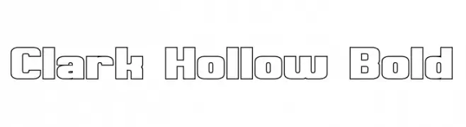
A bold, hollow, geometric font with a uniform and structured appearance.
![Clark Hollow Bold Frei Schriftart Herunterladen]() Herunterladen 286 Downloads@WebFont
Herunterladen 286 Downloads@WebFont -
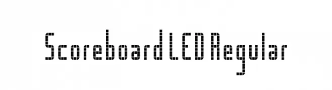
![Scoreboard LED Regular Frei Schriftart Herunterladen]() Herunterladen 286 Downloads@WebFont
Herunterladen 286 Downloads@WebFont -
( Fonts by Daniel Zadorozny - www.iconian.com - Free for personal use )
A modern, expanded italic font with geometric and dynamic letterforms.
![Crixus Expanded Italic Frei Schriftart Herunterladen]() Herunterladen 286 Downloads@WebFont
Herunterladen 286 Downloads@WebFont -
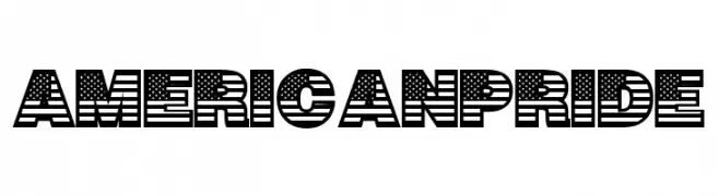
( Fonts by Woodcutter )
A bold, decorative font with stars and stripes, inspired by the American flag.
![American Pride Frei Schriftart Herunterladen]() Herunterladen 286 Downloads@WebFont
Herunterladen 286 Downloads@WebFont -
( Fonts by twinletter )
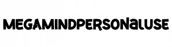
A bold, playful font with a cartoonish and dynamic style.
![MEGAMIND Personal Use Frei Schriftart Herunterladen]() Herunterladen 286 Downloads@WebFont
Herunterladen 286 Downloads@WebFont -
( Fonts by or from www.graffitifonts.net )
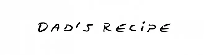
A casual, handwritten-style font with fluid, slightly slanted characters.
![Dad's Recipe Frei Schriftart Herunterladen]() Herunterladen 286 Downloads@WebFont
Herunterladen 286 Downloads@WebFont -
( Fonts by David Rakowski )
An ornate and decorative font with intricate patterns and embellishments.
![Griffin Regular Frei Schriftart Herunterladen]() Herunterladen 286 Downloads@WebFont
Herunterladen 286 Downloads@WebFont


Welche Schriften sind gerade am populärsten?
Poppins, Roboto, Montserrat, Open Sans und Lato sind wegen ihrer klaren Formen und breiten Einsetzbarkeit sehr gefragt – von Markenauftritt über Landingpages bis hin zu Postern.
Welche Fonts eignen sich für Logos?
Geometrische Sans‑Serifs (z. B. Poppins, Familien im Gotham‑Stil) sind ein häufiger Griff für sauberes, skalierbares Branding. Für eine persönlichere Note bleiben Scripts und Handschrift‑Stile beliebt. Kombinieren Sie einen prägnanten Headline‑Font mit einer neutralen Brotschrift für Wiedererkennung und Harmonie.
Wie oft wird die Top‑Liste aktualisiert?
Regelmäßig – basierend auf realen Downloads und Interaktionen. Schauen Sie öfter vorbei, um aufstrebende Favoriten früh zu entdecken.
💡 Tipp: Seite bookmarken – Trends wechseln schnell, und heutige Top‑Schriften inspirieren morgen vielleicht das Rebranding.