Willkommen bei den Top‑Schriften – hier treffen Beliebtheit und Qualität aufeinander. Das sind die in diesem Jahr am häufigsten heruntergeladenen und genutzten Fonts. Wenn Sie sichere Optionen für Logo, Web oder Social suchen, starten Sie hier.
Jeder Top‑Font überzeugt durch Balance, Lesbarkeit und Vielseitigkeit. Sie finden moderne Sans‑Serifs, elegante Scripts, Vintage‑Serifs und minimalistische Displays.
-
( Fonts by Daniel Zadorozny - www.iconian.com )
Bold, italicized font with high contrast and dynamic style.
 Herunterladen 300 Downloads@WebFont
 -
( Fonts by Chris Vile - fontmonger.com - Personal-use only. For commercial use please contact owner. )
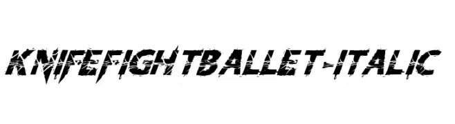
A bold, italicized font with a jagged, distressed style.
![KnifeFightBallet-Italic Frei Schriftart Herunterladen]() Herunterladen 300 Downloads@WebFont
Herunterladen 300 Downloads@WebFont -
( Fonts by Alit Suarnegara - Alit Design - www.alitdesign.net - Personal-use only. For commercial use please contact owner. )
A lively, handwritten script font with dynamic strokes and a playful style.
![nahye Regular Frei Schriftart Herunterladen]() Herunterladen 300 Downloads@WebFont
Herunterladen 300 Downloads@WebFont -
( Fonts by Apostrophic Lab )
A digital dot matrix font with a retro, tech-inspired style.
![Karnivore Digit Frei Schriftart Herunterladen]() Herunterladen 300 Downloads@WebFont
Herunterladen 300 Downloads@WebFont -
( Fonts by Arkandis Digital Foundry )
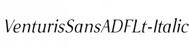
A refined italic font with smooth curves and moderate contrast.
![VenturisSansADFLt-Italic Frei Schriftart Herunterladen]() Herunterladen 300 Downloads@WebFont
Herunterladen 300 Downloads@WebFont -
( Fonts by www.aenigmafonts.com )
A decorative, textured font with a chaotic, artistic style.
![Spastic BRK Frei Schriftart Herunterladen]() Herunterladen 300 Downloads@WebFont
Herunterladen 300 Downloads@WebFont -
( truefonts.blogspot.com )
A display font composed of iconic beverage and beer brand logo designs.
![logos and logos tfb Frei Schriftart Herunterladen]() Herunterladen 300 Downloads@WebFont
Herunterladen 300 Downloads@WebFont -
( Fonts by Des Gomez )
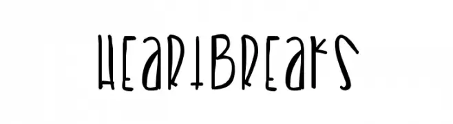
A playful, hand-drawn font with elongated, irregular strokes and a whimsical style.
![Heartbreaks Frei Schriftart Herunterladen]() Herunterladen 300 Downloads@WebFont
Herunterladen 300 Downloads@WebFont -
( Fonts by Vanessa Bays - bythebutterfly.com )
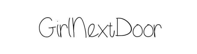
A playful, handwritten font with tall, narrow letters and rounded edges.
![GirlNextDoor Frei Schriftart Herunterladen]() Herunterladen 300 Downloads@WebFont
Herunterladen 300 Downloads@WebFont -
![VTC NightOfTheStretchedDead Frei Schriftart Herunterladen]() Herunterladen 300 Downloads@WebFont
Herunterladen 300 Downloads@WebFont -
( Fonts by Laura Chen )
A playful, hand-drawn serif font with quirky, irregular strokes.
![Stupid Medium Frei Schriftart Herunterladen]() Herunterladen 300 Downloads@WebFont
Herunterladen 300 Downloads@WebFont -
![SF Eccentric Opus Oblique Frei Schriftart Herunterladen]() Herunterladen 300 Downloads@WebFont
Herunterladen 300 Downloads@WebFont -
( Fonts by Ben Kohan )
A futuristic, geometric font with clean lines and angular shapes.
![Ides of Jade Regular Frei Schriftart Herunterladen]() Herunterladen 300 Downloads@WebFont
Herunterladen 300 Downloads@WebFont -
( Fonts by www.studiotypo.com - Personal-use only. For commercial use please contact owner. )
A bold, distressed font with an eroded, vintage look.
![Bluefish ERODED DEMO Frei Schriftart Herunterladen]() Herunterladen 300 Downloads@WebFont
Herunterladen 300 Downloads@WebFont -
( Fonts by Arkandis Digital Foundry )
A bold, italicized font with a modern and elegant style.
![VenturisSansADFNo2Ex-BoldItal Frei Schriftart Herunterladen]() Herunterladen 300 Downloads@WebFont
Herunterladen 300 Downloads@WebFont -
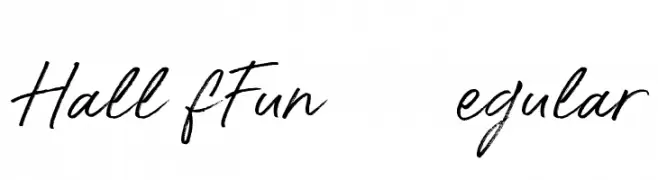
( Konstantine Studio - konstantinestudio.com/ )
A playful, dynamic handwritten font with fluid strokes and a textured appearance.
![Hall Of Fun DEMO Regular Frei Schriftart Herunterladen]() Herunterladen 300 Downloads@WebFont
Herunterladen 300 Downloads@WebFont -
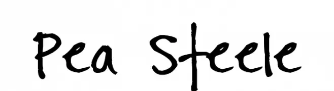
( Free for a personal use. For a commercial use please visit www.kevinandamanda.com )
A playful, casual handwritten font with irregular strokes and a lively feel.
![Pea Steele Frei Schriftart Herunterladen]() Herunterladen 300 Downloads@WebFont
Herunterladen 300 Downloads@WebFont -
![Miltrain-Generic Frei Schriftart Herunterladen]() Herunterladen 299 Downloads@WebFont
Herunterladen 299 Downloads@WebFont -
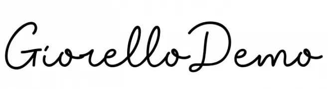
( Fonts by www.movefont .com - Personal-use only. For commercial use please contact owner. )
A flowing, cursive script font with a handwritten, elegant style.
![Giorello Demo Frei Schriftart Herunterladen]() Herunterladen 299 Downloads@WebFont
Herunterladen 299 Downloads@WebFont -
( Vladimir Fedotov )
A modern, geometric font with artistic double lines and clean strokes.
![Summer Frei Schriftart Herunterladen]() Herunterladen 299 Downloads@WebFont
Herunterladen 299 Downloads@WebFont -
( Fonts by www.blambot.com )
A playful, handwritten font with a casual and friendly style.
![IndieStarBB Frei Schriftart Herunterladen]() Herunterladen 299 Downloads@WebFont
Herunterladen 299 Downloads@WebFont -
( Fonts by Hanoded )
A playful, hand-drawn font with a whimsical and friendly style.
![Mayblossom DEMO Regular Frei Schriftart Herunterladen]() Herunterladen 299 Downloads@WebFont
Herunterladen 299 Downloads@WebFont -
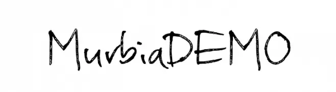
( Fonts by Pizzadude )
A textured, handwritten font with a casual and organic style.
![MurbiaDEMO Frei Schriftart Herunterladen]() Herunterladen 299 Downloads@WebFont
Herunterladen 299 Downloads@WebFont -
![Denial2Regular Frei Schriftart Herunterladen]() Herunterladen 299 Downloads@WebFont
Herunterladen 299 Downloads@WebFont -
![Screw DSG Frei Schriftart Herunterladen]() Herunterladen 299 Downloads@WebFont
Herunterladen 299 Downloads@WebFont -
( Fonts by Eva Barabas - www.etsy.com/ie/shop/digitaltypefaces - Personal-use only. For commercial use please contact owner. )
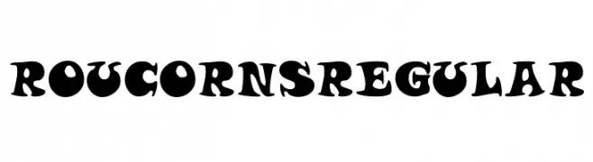
A bold, playful font with exaggerated curves and thick strokes, perfect for whimsical designs.
![Roucorns Regular Frei Schriftart Herunterladen]() Herunterladen 299 Downloads@WebFont
Herunterladen 299 Downloads@WebFont -
![SF Covington Exp Bold Frei Schriftart Herunterladen]() Herunterladen 299 Downloads@WebFont
Herunterladen 299 Downloads@WebFont -
( Fonts by Billy Argel )
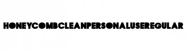
A bold, geometric font with a modern and playful aesthetic, ideal for impactful designs.
![HONEYCOMB CLEAN PERSONAL USE Regular Frei Schriftart Herunterladen]() Herunterladen 299 Downloads@WebFont
Herunterladen 299 Downloads@WebFont -
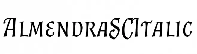
( Fonts by Ana Sanfelippo )
An elegant, italic serif font with a classic, calligraphic style.
![Almendra SC Italic Frei Schriftart Herunterladen]() Herunterladen 299 Downloads@WebFont
Herunterladen 299 Downloads@WebFont -
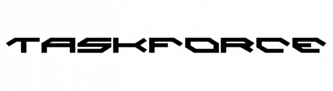
( Fonts by Daniel Zadorozny - www.iconian.com - Free for personal use )
A futuristic, angular font with sharp edges and geometric shapes.
![Taskforce Frei Schriftart Herunterladen]() Herunterladen 299 Downloads@WebFont
Herunterladen 299 Downloads@WebFont -
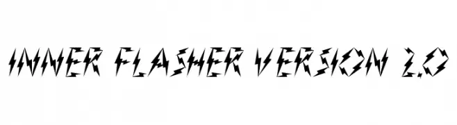
( Fonts by www.waltervelezart.com )
A bold, jagged font with a lightning bolt-inspired design.
![Inner Flasher Version 2.0 Frei Schriftart Herunterladen]() Herunterladen 299 Downloads@WebFont
Herunterladen 299 Downloads@WebFont -
( Valentin François - www.valentinfrancois.fr )
A clean, geometric font with a modern and balanced design.
![Golden Ratio Demo Regular Frei Schriftart Herunterladen]() Herunterladen 299 Downloads@WebFont
Herunterladen 299 Downloads@WebFont -
( Solar Sister - web.archive.org/web/20050308194059/www.hellostranger.com/solarsister/ )
A classic serif font with calligraphic influences and elegant, irregular strokes.
![Asha Frei Schriftart Herunterladen]() Herunterladen 299 Downloads@WebFont
Herunterladen 299 Downloads@WebFont -
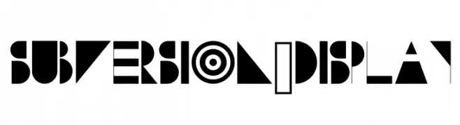
( www.danielmcshee.co.uk )
A bold, geometric display font with high contrast and abstract shapes.
![Subversion-Display Frei Schriftart Herunterladen]() Herunterladen 299 Downloads@WebFont
Herunterladen 299 Downloads@WebFont -
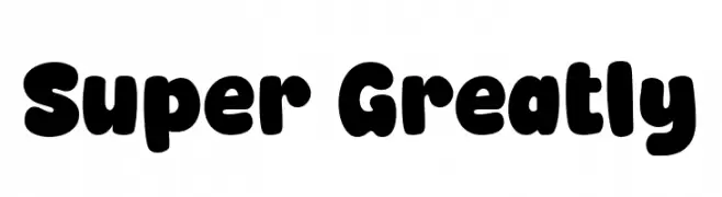
( Fonts by fsuarez913 )
A bold, rounded font with a playful and bubbly style.
![Super Greatly Frei Schriftart Herunterladen]() Herunterladen 299 Downloads@WebFont
Herunterladen 299 Downloads@WebFont


Welche Schriften sind gerade am populärsten?
Poppins, Roboto, Montserrat, Open Sans und Lato sind wegen ihrer klaren Formen und breiten Einsetzbarkeit sehr gefragt – von Markenauftritt über Landingpages bis hin zu Postern.
Welche Fonts eignen sich für Logos?
Geometrische Sans‑Serifs (z. B. Poppins, Familien im Gotham‑Stil) sind ein häufiger Griff für sauberes, skalierbares Branding. Für eine persönlichere Note bleiben Scripts und Handschrift‑Stile beliebt. Kombinieren Sie einen prägnanten Headline‑Font mit einer neutralen Brotschrift für Wiedererkennung und Harmonie.
Wie oft wird die Top‑Liste aktualisiert?
Regelmäßig – basierend auf realen Downloads und Interaktionen. Schauen Sie öfter vorbei, um aufstrebende Favoriten früh zu entdecken.
💡 Tipp: Seite bookmarken – Trends wechseln schnell, und heutige Top‑Schriften inspirieren morgen vielleicht das Rebranding.