Willkommen bei den Top‑Schriften – hier treffen Beliebtheit und Qualität aufeinander. Das sind die in diesem Jahr am häufigsten heruntergeladenen und genutzten Fonts. Wenn Sie sichere Optionen für Logo, Web oder Social suchen, starten Sie hier.
Jeder Top‑Font überzeugt durch Balance, Lesbarkeit und Vielseitigkeit. Sie finden moderne Sans‑Serifs, elegante Scripts, Vintage‑Serifs und minimalistische Displays.
-
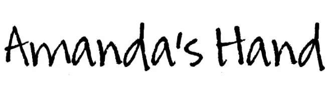
( Free for a personal use. For a commercial use please visit www.kevinandamanda.com )
A casual, playful handwritten font with irregular, organic letterforms.
 Herunterladen 3914 Downloads@WebFont
 -
( Fonts by Agathe M.Joyce - www.foundmyfont.com - Personal-use only. For commercial use please contact owner. )
An elegant script font with flowing, cursive lines and decorative swashes.
![Laughing and Smiling Frei Schriftart Herunterladen]() Herunterladen 3913 Downloads@WebFont
Herunterladen 3913 Downloads@WebFont -
( Fonts by Andrew McCluskey - nalgames.com. Personal-use only. For commercial use please contact owner. )
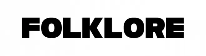
A bold, geometric font with thick, uniform strokes for a modern look.
![Folklore Frei Schriftart Herunterladen]() Herunterladen 3912 Downloads@WebFont
Herunterladen 3912 Downloads@WebFont -
( Fonts by Plamen Motev - www.fontfabric.com - Personal-use only. For commercial use please contact owner. )
A modern, geometric sans-serif font with a minimalist design.
![Akrobat ExtraLight Frei Schriftart Herunterladen]() Herunterladen 3910 Downloads@WebFont
Herunterladen 3910 Downloads@WebFont -
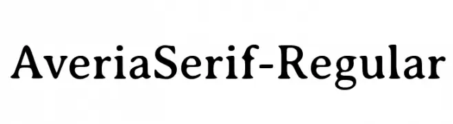
![AveriaSerif-Regular Frei Schriftart Herunterladen]() Herunterladen 3910 Downloads@WebFont
Herunterladen 3910 Downloads@WebFont -
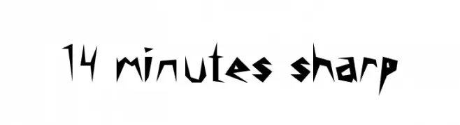
![14 minutes sharp Frei Schriftart Herunterladen]() Herunterladen 3910 Downloads@WebFont
Herunterladen 3910 Downloads@WebFont -
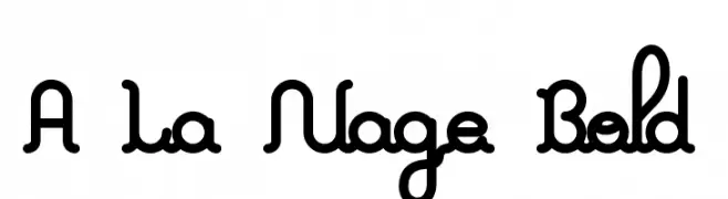
![A La Nage Bold Frei Schriftart Herunterladen]() Herunterladen 3909 Downloads@WebFont
Herunterladen 3909 Downloads@WebFont -
![Quinfo Frei Schriftart Herunterladen]() Herunterladen 3908 Downloads@WebFont
Herunterladen 3908 Downloads@WebFont -
( Fonts by billyargel.blogspot.com - Billy Argel )
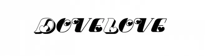
A whimsical and romantic font with heart-shaped elements and high contrast strokes.
![Dove Love Frei Schriftart Herunterladen]() Herunterladen 3908 Downloads@WebFont
Herunterladen 3908 Downloads@WebFont -
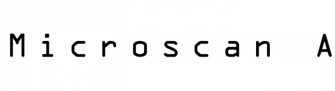
![Microscan A Frei Schriftart Herunterladen]() Herunterladen 3908 Downloads@WebFont
Herunterladen 3908 Downloads@WebFont -
![Marvel Regular Frei Schriftart Herunterladen]() Herunterladen 3907 Downloads@WebFont
Herunterladen 3907 Downloads@WebFont -
( Google Web Fonts )
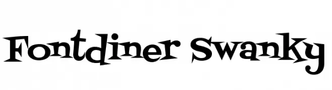
A playful, retro-inspired font with bold, quirky letterforms.
![Fontdiner Swanky Frei Schriftart Herunterladen]() Herunterladen 3907 Downloads@WebFont
Herunterladen 3907 Downloads@WebFont -
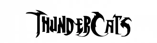
![ThunderCats Frei Schriftart Herunterladen]() Herunterladen 3907 Downloads@WebFont
Herunterladen 3907 Downloads@WebFont -
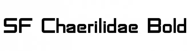
![SF Chaerilidae Bold Frei Schriftart Herunterladen]() Herunterladen 3907 Downloads@WebFont
Herunterladen 3907 Downloads@WebFont -
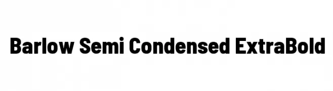
( Copyright 2017 The Barlow Project Authors (https://github.com/jpt/barlow) )
A bold, semi-condensed font with a modern and impactful style.
![Barlow Semi Condensed ExtraBold Frei Schriftart Herunterladen]() Herunterladen 3906 Downloads@WebFont
Herunterladen 3906 Downloads@WebFont -
( Fonts by www.fontmesa.com )
A bold, vintage-style font with strong, thick strokes and a slightly condensed appearance.
![Corleone Due Frei Schriftart Herunterladen]() Herunterladen 3905 Downloads@WebFont
Herunterladen 3905 Downloads@WebFont -
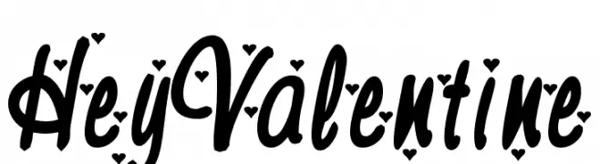
![HeyValentine Frei Schriftart Herunterladen]() Herunterladen 3905 Downloads@WebFont
Herunterladen 3905 Downloads@WebFont -
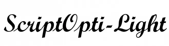
( Fonts by Castcraft Software - OPTI Fonts Archive - opti.netii.net - Personal-use only. For commercial use please contact owner. )
An elegant script font with flowing, cursive letterforms and medium contrast.
![ScriptOpti-Light Frei Schriftart Herunterladen]() Herunterladen 3904 Downloads@WebFont
Herunterladen 3904 Downloads@WebFont -
( Fonts by www.norfok.com - Norfok® Incredible Font Design - Thomas W. Otto )
A bold, dripping font with a melting effect, ideal for horror themes.
![Pieces NFI Frei Schriftart Herunterladen]() Herunterladen 3904 Downloads@WebFont
Herunterladen 3904 Downloads@WebFont -
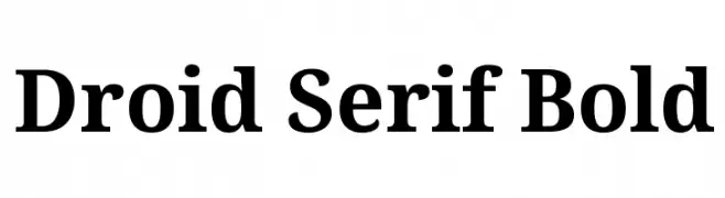
( Google Web Fonts )
A bold serif typeface with strong strokes and elegant serifs, ideal for impactful text.
![Droid Serif Bold Frei Schriftart Herunterladen]() Herunterladen 3904 Downloads@WebFont
Herunterladen 3904 Downloads@WebFont -
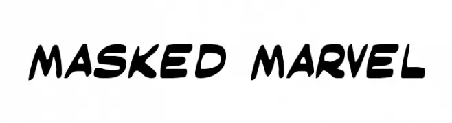
( Fonts by Daniel Zadorozny - www.iconian.com - Free for personal use )
A bold, dynamic font with rounded, slanted characters and a playful style.
![Masked Marvel Frei Schriftart Herunterladen]() Herunterladen 3903 Downloads@WebFont
Herunterladen 3903 Downloads@WebFont -
( Fonts by Zetafonts - Personal-use only. For commercial use please contact owner. )
A bold, modern sans-serif font with clean lines and uniform strokes.
![Heading Now Trial 45 Medium Frei Schriftart Herunterladen]() Herunterladen 3901 Downloads@WebFont
Herunterladen 3901 Downloads@WebFont -
![Blake Frei Schriftart Herunterladen]() Herunterladen 3899 Downloads@WebFont
Herunterladen 3899 Downloads@WebFont -
( Fonts by a Max Infeld - XEROGRAPHER FONTS - xerographer.blogspot.com . Personal-use only. For commercial use please contact owner. )
A bold, decorative font with intricate marijuana leaf patterns.
![Marijuana Frei Schriftart Herunterladen]() Herunterladen 3897 Downloads@WebFont
Herunterladen 3897 Downloads@WebFont -
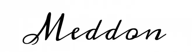
( Copyright (c) 2010, 2011 by vernon adams (vern@newtypography.co.uk) )
An elegant, cursive font with flowing, ornate characters.
![Meddon Frei Schriftart Herunterladen]() Herunterladen 3897 Downloads@WebFont
Herunterladen 3897 Downloads@WebFont -
![Farrah Frei Schriftart Herunterladen]() Herunterladen 3895 Downloads@WebFont
Herunterladen 3895 Downloads@WebFont -
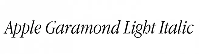
![Apple Garamond Light Italic Frei Schriftart Herunterladen]() Herunterladen 3894 Downloads@WebFont
Herunterladen 3894 Downloads@WebFont -
( Download for Personal Use. For Commercial: http://www.k-type.com )
A bold, rounded font with a playful and approachable style.
![CreditCard Frei Schriftart Herunterladen]() Herunterladen 3893 Downloads@WebFont
Herunterladen 3893 Downloads@WebFont -
( Fonts by Octotype - www.foundmyfont.com - Personal-use only. For commercial use please contact owner. )
A bold, cursive font with elegant loops and a dynamic flow.
![The Blacklist Frei Schriftart Herunterladen]() Herunterladen 3892 Downloads@WebFont
Herunterladen 3892 Downloads@WebFont -
( Fonts by www.gliphmaker.com. Personal-use only. For commercial use please contact owner. )
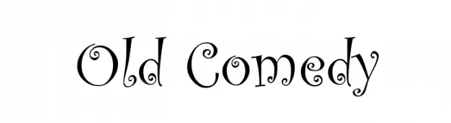
A whimsical, playful font with quirky serifs and lively embellishments.
![Old Comedy Frei Schriftart Herunterladen]() Herunterladen 3891 Downloads@WebFont
Herunterladen 3891 Downloads@WebFont -
( Fonts by Christoph Kutta - weltraumgangster.de - Personal-use only. For commercial use please contact owner. )
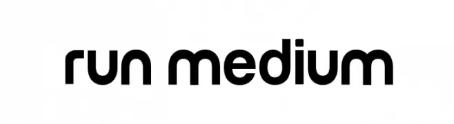
A bold, modern sans-serif font with geometric and rounded characteristics.
![Run Medium Frei Schriftart Herunterladen]() Herunterladen 3890 Downloads@WebFont
Herunterladen 3890 Downloads@WebFont -
![Chrysanthi Unicode Regular Frei Schriftart Herunterladen]() Herunterladen 3890 Downloads@WebFont
Herunterladen 3890 Downloads@WebFont -
( Fonts by Luke Owens - Personal-use only. For commercial use please contact owner. )
A refined and elegant typeface with clean lines and balanced proportions.
![Oregon LDO Book Frei Schriftart Herunterladen]() Herunterladen 3889 Downloads@WebFont
Herunterladen 3889 Downloads@WebFont -
![Vendetta Frei Schriftart Herunterladen]() Herunterladen 3889 Downloads@WebFont
Herunterladen 3889 Downloads@WebFont -
![a Papa Frei Schriftart Herunterladen]() Herunterladen 3889 Downloads@WebFont
Herunterladen 3889 Downloads@WebFont


Welche Schriften sind gerade am populärsten?
Poppins, Roboto, Montserrat, Open Sans und Lato sind wegen ihrer klaren Formen und breiten Einsetzbarkeit sehr gefragt – von Markenauftritt über Landingpages bis hin zu Postern.
Welche Fonts eignen sich für Logos?
Geometrische Sans‑Serifs (z. B. Poppins, Familien im Gotham‑Stil) sind ein häufiger Griff für sauberes, skalierbares Branding. Für eine persönlichere Note bleiben Scripts und Handschrift‑Stile beliebt. Kombinieren Sie einen prägnanten Headline‑Font mit einer neutralen Brotschrift für Wiedererkennung und Harmonie.
Wie oft wird die Top‑Liste aktualisiert?
Regelmäßig – basierend auf realen Downloads und Interaktionen. Schauen Sie öfter vorbei, um aufstrebende Favoriten früh zu entdecken.
💡 Tipp: Seite bookmarken – Trends wechseln schnell, und heutige Top‑Schriften inspirieren morgen vielleicht das Rebranding.