Willkommen bei den Top‑Schriften – hier treffen Beliebtheit und Qualität aufeinander. Das sind die in diesem Jahr am häufigsten heruntergeladenen und genutzten Fonts. Wenn Sie sichere Optionen für Logo, Web oder Social suchen, starten Sie hier.
Jeder Top‑Font überzeugt durch Balance, Lesbarkeit und Vielseitigkeit. Sie finden moderne Sans‑Serifs, elegante Scripts, Vintage‑Serifs und minimalistische Displays.
-
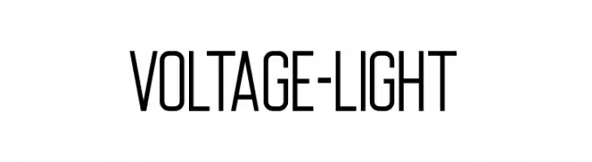
( Fonts by Typologic - Fadiel Muhammad - Personal-use only. For commercial use please contact owner. )
A modern, narrow font with clean lines and a sophisticated style.
 Herunterladen 299 Downloads@WebFont
 -
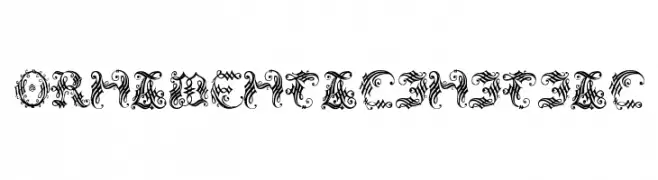
( Fonts by Manfred Klein - manfred-klein.ina-mar.com )
An ornate and decorative font with intricate flourishes and historical charm.
![OrnamentalInitial Frei Schriftart Herunterladen]() Herunterladen 299 Downloads@WebFont
Herunterladen 299 Downloads@WebFont -
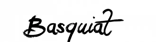
( Fonts by Jonathan S. Harris - www.tattoowoo.com. Personal-use only. For commercial use please contact owner. )
A bold, expressive brush script font with dynamic and artistic flair.
![Basquiat Frei Schriftart Herunterladen]() Herunterladen 299 Downloads@WebFont
Herunterladen 299 Downloads@WebFont -
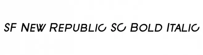
![SF New Republic SC Bold Italic Frei Schriftart Herunterladen]() Herunterladen 299 Downloads@WebFont
Herunterladen 299 Downloads@WebFont -
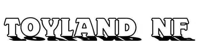
( Fonts by Nick Curtis - www.nicksfonts.com )
A bold, playful font with a 3D shadow effect, perfect for eye-catching designs.
![Toyland NF Frei Schriftart Herunterladen]() Herunterladen 299 Downloads@WebFont
Herunterladen 299 Downloads@WebFont -
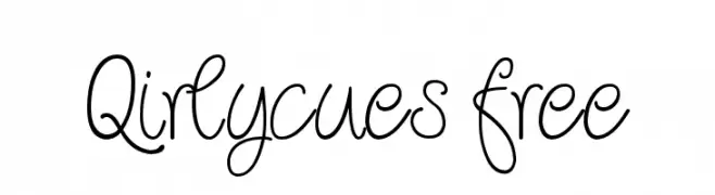
![Qirlycues free Frei Schriftart Herunterladen]() Herunterladen 299 Downloads@WebFont
Herunterladen 299 Downloads@WebFont -
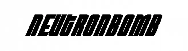
![NeutronBomb Frei Schriftart Herunterladen]() Herunterladen 299 Downloads@WebFont
Herunterladen 299 Downloads@WebFont -
( Fonts by Woodcutter )
A bold, dotted font with a textured, pixelated appearance.
![Simple Myopia Frei Schriftart Herunterladen]() Herunterladen 299 Downloads@WebFont
Herunterladen 299 Downloads@WebFont -
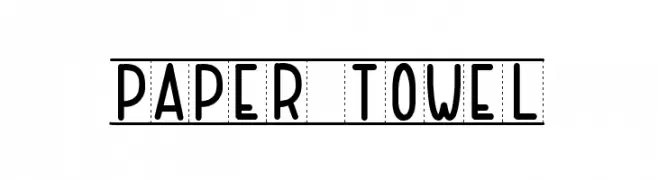
( Fonts by Maelle.K - Thomas Boucherie )
A playful, hand-drawn font with rounded edges and a casual style.
![PAPER TOWEL Frei Schriftart Herunterladen]() Herunterladen 299 Downloads@WebFont
Herunterladen 299 Downloads@WebFont -
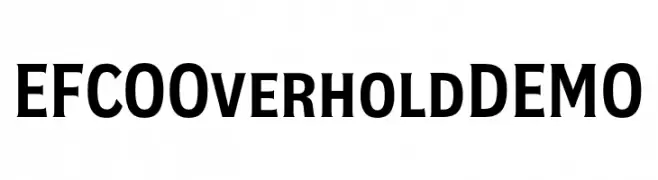
( Fonts by Ilham Herry - Personal-use only. For commercial use please contact owner. )
A bold, serif-inspired font perfect for impactful headlines.
![EFCO Overhold DEMO Frei Schriftart Herunterladen]() Herunterladen 299 Downloads@WebFont
Herunterladen 299 Downloads@WebFont -
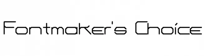
( Fonts by Dieter Schumacher )
A geometric, futuristic font with angular and linear characters.
![Fontmaker's Choice Frei Schriftart Herunterladen]() Herunterladen 299 Downloads@WebFont
Herunterladen 299 Downloads@WebFont -
![Dogs Frei Schriftart Herunterladen]() Herunterladen 299 Downloads@WebFont
Herunterladen 299 Downloads@WebFont -
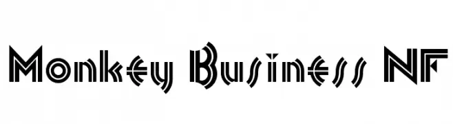
( Fonts by Nick Curtis - www.nicksfonts.com )
A bold, geometric font with Art Deco influences and high contrast.
![Monkey Business NF Frei Schriftart Herunterladen]() Herunterladen 299 Downloads@WebFont
Herunterladen 299 Downloads@WebFont -
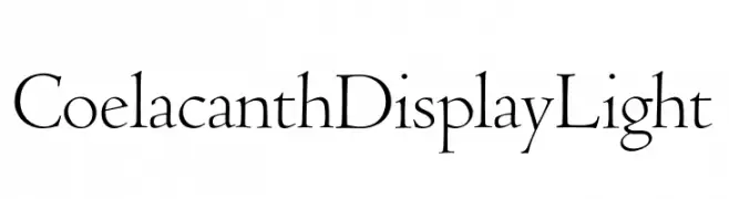
( Personal-use only. For commercial use please contact owner. )
A classic serif font with elegant, thin strokes and subtle curves.
![Coelacanth Display Light Frei Schriftart Herunterladen]() Herunterladen 299 Downloads@WebFont
Herunterladen 299 Downloads@WebFont -
![RadioRadio Frei Schriftart Herunterladen]() Herunterladen 299 Downloads@WebFont
Herunterladen 299 Downloads@WebFont -
![Rocketeer_Gothic Frei Schriftart Herunterladen]() Herunterladen 299 Downloads@WebFont
Herunterladen 299 Downloads@WebFont -
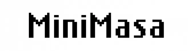
( Fonts by Bartek Nowak - www.nowak.tv/fontoholic/ )
A pixelated, retro-style font inspired by early digital typography.
![MiniMasa Frei Schriftart Herunterladen]() Herunterladen 299 Downloads@WebFont
Herunterladen 299 Downloads@WebFont -
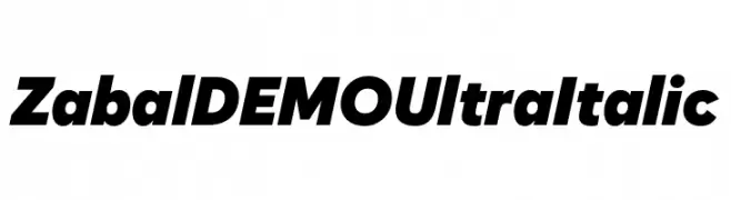
( Fonts by Font People - Personal-use only. For commercial use please contact owner. )
A bold, italic font with a strong, dynamic presence.
![Zabal DEMO Ultra Italic Frei Schriftart Herunterladen]() Herunterladen 299 Downloads@WebFont
Herunterladen 299 Downloads@WebFont -
( Fonts by 212 fonts - Elizabeth - Personal-use only. For commercial use please contact owner. )
A playful, modern font with rounded, slightly condensed characters.
![212 Queenie Sans Frei Schriftart Herunterladen]() Herunterladen 299 Downloads@WebFont
Herunterladen 299 Downloads@WebFont -
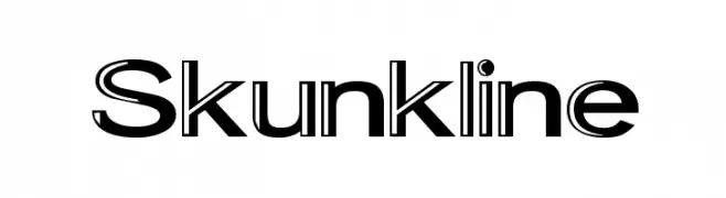
( Fonts by Graham Meade - GemFonts )
A bold, modern font with a unique dual-line style for dynamic visual impact.
![Skunkline Frei Schriftart Herunterladen]() Herunterladen 299 Downloads@WebFont
Herunterladen 299 Downloads@WebFont -
![Kittavit Charusombat-Regular Frei Schriftart Herunterladen]() Herunterladen 299 Downloads@WebFont
Herunterladen 299 Downloads@WebFont -
( Fonts by www.kimberlygeswein.com - Kimberly Geswein )
A playful, striped decorative font ideal for festive designs.
![KG Candy Cane Stripe Frei Schriftart Herunterladen]() Herunterladen 299 Downloads@WebFont
Herunterladen 299 Downloads@WebFont -
![Michele Frei Schriftart Herunterladen]() Herunterladen 299 Downloads@WebFont
Herunterladen 299 Downloads@WebFont -
( Fonts by Edric Studio www.creativefabrica.com/designer/edricstudio/ - Personal-use only. For commercial use please contact owner. )
A bold, modern font with rounded edges and consistent stroke width.
![Qalin Frei Schriftart Herunterladen]() Herunterladen 299 Downloads@WebFont
Herunterladen 299 Downloads@WebFont -
( Fonts by www.chequered.ink - Chequered Ink - Personal-use only. For commercial use please contact owner. )
A bold, graffiti-style font with a rough, hand-painted look.
![Dog Rough Frei Schriftart Herunterladen]() Herunterladen 299 Downloads@WebFont
Herunterladen 299 Downloads@WebFont -
( Fonts by Zetafonts - Personal-use only. For commercial use please contact owner. )
A bold slab serif font with strong, block-like serifs and a modern yet classic style.
![Amazing Slab Trial Bold Frei Schriftart Herunterladen]() Herunterladen 299 Downloads@WebFont
Herunterladen 299 Downloads@WebFont -
( Fonts by Loraine Wauer Ferus www.billybear4kids.com )
A playful font with characters in balloon shapes, perfect for fun and joyful designs.
![BB Balloons Frei Schriftart Herunterladen]() Herunterladen 299 Downloads@WebFont
Herunterladen 299 Downloads@WebFont -
( Fonts by Apostrophic Lab )
A bold, geometric font with a modern and robust style.
![Dexedrine Frei Schriftart Herunterladen]() Herunterladen 299 Downloads@WebFont
Herunterladen 299 Downloads@WebFont -
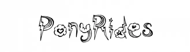
( Fonts by a Max Infeld - XEROGRAPHER FONTS - xerographer.blogspot.com . Personal-use only. For commercial use please contact owner. )
A whimsical and decorative font with playful embellishments and dynamic shapes.
![PonyRides Frei Schriftart Herunterladen]() Herunterladen 299 Downloads@WebFont
Herunterladen 299 Downloads@WebFont -
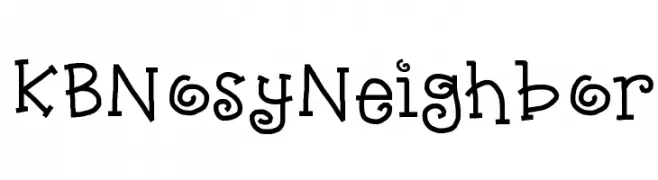
( www.teacherspayteachers.com/Store/Khrys-Bosland )
A playful, hand-drawn font with quirky, animated characters.
![KBNosyNeighbor Frei Schriftart Herunterladen]() Herunterladen 299 Downloads@WebFont
Herunterladen 299 Downloads@WebFont -
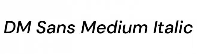
( Copyright 2014-2017 Indian Type Foundry (info@indiantypefoundry.com). )
A modern, italic sans-serif font with clean lines and balanced proportions.
![DM Sans Medium Italic Frei Schriftart Herunterladen]() Herunterladen 299 Downloads@WebFont
Herunterladen 299 Downloads@WebFont -
![Kubra_Hollow Frei Schriftart Herunterladen]() Herunterladen 299 Downloads@WebFont
Herunterladen 299 Downloads@WebFont -
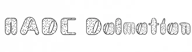
![NADC Dalmatian Frei Schriftart Herunterladen]() Herunterladen 299 Downloads@WebFont
Herunterladen 299 Downloads@WebFont -
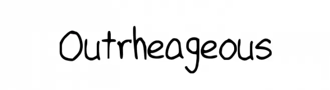
![Outrheageous Frei Schriftart Herunterladen]() Herunterladen 299 Downloads@WebFont
Herunterladen 299 Downloads@WebFont -
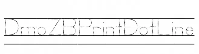
( Demo font. To purchase the full version, you can order it online at www.schoolhousefonts.com )
A modern, dotted line font with geometric precision.
![DmoZBPrintDotLine Frei Schriftart Herunterladen]() Herunterladen 299 Downloads@WebFont
Herunterladen 299 Downloads@WebFont


Welche Schriften sind gerade am populärsten?
Poppins, Roboto, Montserrat, Open Sans und Lato sind wegen ihrer klaren Formen und breiten Einsetzbarkeit sehr gefragt – von Markenauftritt über Landingpages bis hin zu Postern.
Welche Fonts eignen sich für Logos?
Geometrische Sans‑Serifs (z. B. Poppins, Familien im Gotham‑Stil) sind ein häufiger Griff für sauberes, skalierbares Branding. Für eine persönlichere Note bleiben Scripts und Handschrift‑Stile beliebt. Kombinieren Sie einen prägnanten Headline‑Font mit einer neutralen Brotschrift für Wiedererkennung und Harmonie.
Wie oft wird die Top‑Liste aktualisiert?
Regelmäßig – basierend auf realen Downloads und Interaktionen. Schauen Sie öfter vorbei, um aufstrebende Favoriten früh zu entdecken.
💡 Tipp: Seite bookmarken – Trends wechseln schnell, und heutige Top‑Schriften inspirieren morgen vielleicht das Rebranding.