Willkommen bei den Top‑Schriften – hier treffen Beliebtheit und Qualität aufeinander. Das sind die in diesem Jahr am häufigsten heruntergeladenen und genutzten Fonts. Wenn Sie sichere Optionen für Logo, Web oder Social suchen, starten Sie hier.
Jeder Top‑Font überzeugt durch Balance, Lesbarkeit und Vielseitigkeit. Sie finden moderne Sans‑Serifs, elegante Scripts, Vintage‑Serifs und minimalistische Displays.
-
 Herunterladen 280 Downloads@WebFont
 -
( Fonts by www.freakyfonts.de )
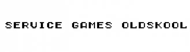
A pixelated, retro font inspired by classic video game graphics.
![Service Games Oldskool Frei Schriftart Herunterladen]() Herunterladen 280 Downloads@WebFont
Herunterladen 280 Downloads@WebFont -
![watching t.v Frei Schriftart Herunterladen]() Herunterladen 280 Downloads@WebFont
Herunterladen 280 Downloads@WebFont -
![VTC StressedHand Regular Frei Schriftart Herunterladen]() Herunterladen 280 Downloads@WebFont
Herunterladen 280 Downloads@WebFont -
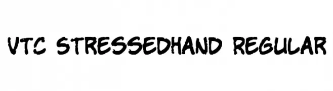
( Fonts by David Kerkhoff - www.hanodedphotography.com )
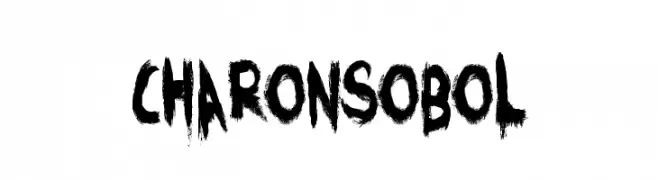
A bold, brush-textured font with a raw and energetic style.
![CharonsObol Frei Schriftart Herunterladen]() Herunterladen 280 Downloads@WebFont
Herunterladen 280 Downloads@WebFont -
-
( Fonts by URW++ - Personal-use only. For commercial use please contact owner. )
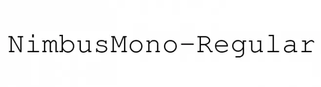
A monospaced serif font with uniform character width and a clean, organized appearance.
![NimbusMono-Regular Frei Schriftart Herunterladen]() Herunterladen 280 Downloads@WebFont
Herunterladen 280 Downloads@WebFont -
( Free for personal use - www.angelamichanitzi.com )
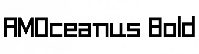
A bold, geometric font with a modern, digital aesthetic.
![AMOceanus Bold Frei Schriftart Herunterladen]() Herunterladen 280 Downloads@WebFont
Herunterladen 280 Downloads@WebFont -
( Fonts by Steve Cloutier - www.cloutierfontes.ca )
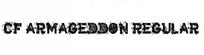
A decorative and intricate font with bold, uppercase letters and elaborate flourishes.
![CF Armageddon Regular Frei Schriftart Herunterladen]() Herunterladen 280 Downloads@WebFont
Herunterladen 280 Downloads@WebFont -
( Fonts by Dirt2.com - SickCapital - Andrew Hart - Personal-use only. For commercial use please contact owner. )
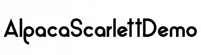
A modern, geometric sans-serif font with a clean and professional look.
![Alpaca Scarlett Demo Frei Schriftart Herunterladen]() Herunterladen 280 Downloads@WebFont
Herunterladen 280 Downloads@WebFont -
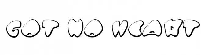
![Got No Heart Frei Schriftart Herunterladen]() Herunterladen 280 Downloads@WebFont
Herunterladen 280 Downloads@WebFont -
( Fonts by BLKBK Fonts - www.blkbk.shop - Personal-use only. For commercial use please contact owner. Sponsoren Schriftart )
A bold, hand-drawn font with an expressive, brush-like texture.
![Spot Light Frei Schriftart Herunterladen]() Herunterladen 280 Downloads
Herunterladen 280 Downloads -
( Fonts by Paul - viciousink.net )
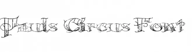
A whimsical, decorative font inspired by vintage circus posters.
![Pauls Circus Font Frei Schriftart Herunterladen]() Herunterladen 280 Downloads@WebFont
Herunterladen 280 Downloads@WebFont -
( Fonts by Letterhend Studio - Hendry Juanda - Personal-use only. For commercial use please contact owner. )
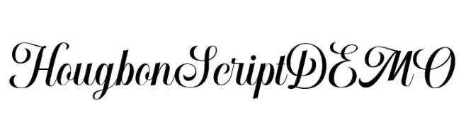
An elegant script font with high contrast and flowing cursive style.
![HougbonScriptDEMO Frei Schriftart Herunterladen]() Herunterladen 280 Downloads@WebFont
Herunterladen 280 Downloads@WebFont -
( Noto is a trademark of Google Inc. Noto fonts are open source. All Noto fonts are published under the SIL Open Font License, Version 1.1 )
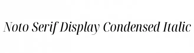
An elegant, condensed serif font with italic styling, perfect for sophisticated designs.
![Noto Serif Display Condensed Italic Frei Schriftart Herunterladen]() Herunterladen 280 Downloads@WebFont
Herunterladen 280 Downloads@WebFont -
( Fonts by Erik Studio )
A decorative, Easter-themed font with playful elements and intricate patterns.
![Happy Easter Frei Schriftart Herunterladen]() Herunterladen 280 Downloads@WebFont
Herunterladen 280 Downloads@WebFont -
( Fonts by VinType )
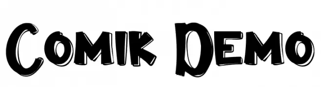
A bold, playful font with a comic book style and hand-drawn appearance.
![Comik Demo Frei Schriftart Herunterladen]() Herunterladen 280 Downloads@WebFont
Herunterladen 280 Downloads@WebFont -
( Fonts by Daniel Zadorozny - www.iconian.com )
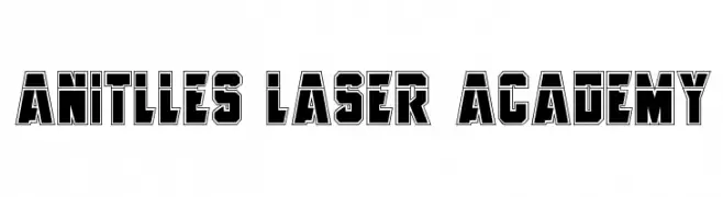
A bold, geometric font with a three-dimensional effect and strong outlines.
![Anitlles Laser Academy Frei Schriftart Herunterladen]() Herunterladen 280 Downloads@WebFont
Herunterladen 280 Downloads@WebFont -
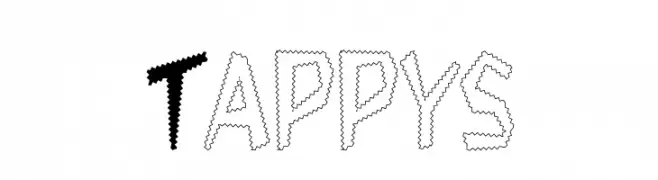
![Tappys Frei Schriftart Herunterladen]() Herunterladen 280 Downloads
Herunterladen 280 Downloads -
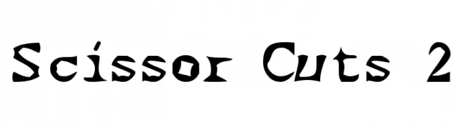
![Scissor Cuts 2 Frei Schriftart Herunterladen]() Herunterladen 280 Downloads@WebFont
Herunterladen 280 Downloads@WebFont -
( deFharo - Fernando Haro - defharo.com )
A modern, sans-serif typeface with clean lines and balanced proportions.
![FlamanteSecaBook Frei Schriftart Herunterladen]() Herunterladen 280 Downloads@WebFont
Herunterladen 280 Downloads@WebFont -
![Gunther Frei Schriftart Herunterladen]() Herunterladen 280 Downloads@WebFont
Herunterladen 280 Downloads@WebFont -
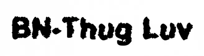
( Fonts by Ben Nathan )
A bold, rugged font with jagged edges and a grungy, distressed style.
![BN-Thug Luv Frei Schriftart Herunterladen]() Herunterladen 280 Downloads@WebFont
Herunterladen 280 Downloads@WebFont -
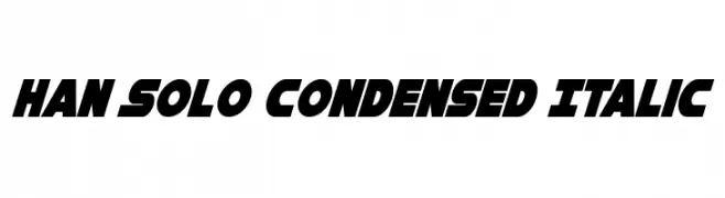
( Fonts by Daniel Zadorozny - www.iconian.com )
A bold, condensed, and italicized font with a futuristic style.
![Han Solo Condensed Italic Frei Schriftart Herunterladen]() Herunterladen 280 Downloads@WebFont
Herunterladen 280 Downloads@WebFont -
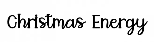
( Fonts by Endri Sulistyawan - Personal-use only. For commercial use please contact owner. )
A playful, energetic font with script and sans-serif elements, ideal for festive designs.
![Christmas Energy Frei Schriftart Herunterladen]() Herunterladen 280 Downloads@WebFont
Herunterladen 280 Downloads@WebFont -
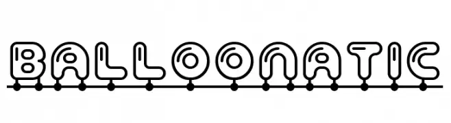
![Balloonatic Frei Schriftart Herunterladen]() Herunterladen 280 Downloads@WebFont
Herunterladen 280 Downloads@WebFont -
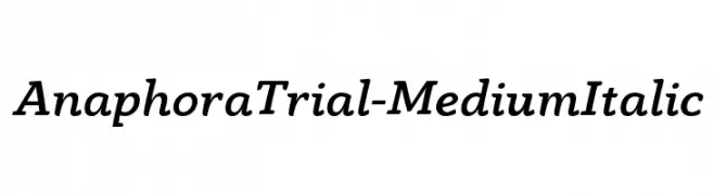
( Zetafonts - www.zetafonts.com )
A medium weight, italic serif font with elegant curves and subtle serifs.
![AnaphoraTrial-MediumItalic Frei Schriftart Herunterladen]() Herunterladen 280 Downloads@WebFont
Herunterladen 280 Downloads@WebFont -
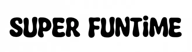
( Fonts by allsuperfont.com - Personal-use only. For commercial use please contact owner. )
A playful, bold font with rounded, bubbly characters ideal for fun and whimsical designs.
![Super Funtime Frei Schriftart Herunterladen]() Herunterladen 280 Downloads@WebFont
Herunterladen 280 Downloads@WebFont -
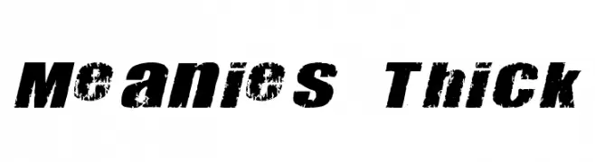
![Meanies Thick Frei Schriftart Herunterladen]() Herunterladen 280 Downloads@WebFont
Herunterladen 280 Downloads@WebFont -
( Fonts by Daniel Zadorozny - www.iconian.com - Free for personal use )
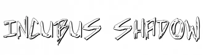
A bold, edgy font with a hand-drawn, shadowed style.
![Incubus Shadow Frei Schriftart Herunterladen]() Herunterladen 280 Downloads@WebFont
Herunterladen 280 Downloads@WebFont -
( Fonts by www.gust.org.pl )
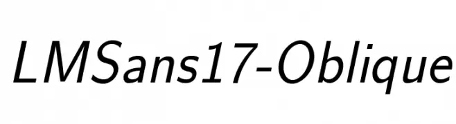
A modern, oblique sans-serif font with a clean and professional look.
![LMSans17-Oblique Frei Schriftart Herunterladen]() Herunterladen 280 Downloads@WebFont
Herunterladen 280 Downloads@WebFont -
( Fonts by www.gust.org.pl )
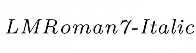
An elegant serif italic font with smooth lines and moderate contrast.
![LMRoman7-Italic Frei Schriftart Herunterladen]() Herunterladen 280 Downloads@WebFont
Herunterladen 280 Downloads@WebFont -
( Fonts by Vanessa Bays - bythebutterfly.com )
A playful, thin, and whimsical font with elongated strokes and a casual style.
![LazyDay Frei Schriftart Herunterladen]() Herunterladen 280 Downloads@WebFont
Herunterladen 280 Downloads@WebFont -
( Fonts by Christopher Hansen )
A jagged, edgy font with thorn-like extensions for a mysterious look.
![Frank Knows Frei Schriftart Herunterladen]() Herunterladen 280 Downloads@WebFont
Herunterladen 280 Downloads@WebFont -
( Fonts by allsuperfont.com - Personal-use only. For commercial use please contact owner. )
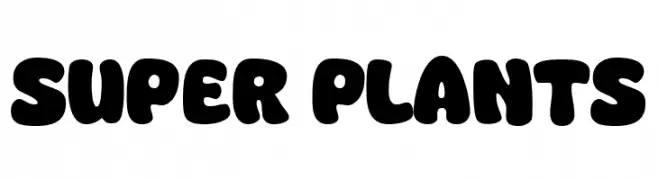
A bold, rounded font with a playful and friendly style.
![Super Plants Frei Schriftart Herunterladen]() Herunterladen 280 Downloads@WebFont
Herunterladen 280 Downloads@WebFont -
( Fonts by Vladimir Nikolic - www.creativefabrica.com/designer/vladimirnikolic/ - Personal-use only. For commercial use please contact owner. )
A bold, italicized font with a sporty, outlined style.
![Sport Italic Frei Schriftart Herunterladen]() Herunterladen 280 Downloads@WebFont
Herunterladen 280 Downloads@WebFont


Welche Schriften sind gerade am populärsten?
Poppins, Roboto, Montserrat, Open Sans und Lato sind wegen ihrer klaren Formen und breiten Einsetzbarkeit sehr gefragt – von Markenauftritt über Landingpages bis hin zu Postern.
Welche Fonts eignen sich für Logos?
Geometrische Sans‑Serifs (z. B. Poppins, Familien im Gotham‑Stil) sind ein häufiger Griff für sauberes, skalierbares Branding. Für eine persönlichere Note bleiben Scripts und Handschrift‑Stile beliebt. Kombinieren Sie einen prägnanten Headline‑Font mit einer neutralen Brotschrift für Wiedererkennung und Harmonie.
Wie oft wird die Top‑Liste aktualisiert?
Regelmäßig – basierend auf realen Downloads und Interaktionen. Schauen Sie öfter vorbei, um aufstrebende Favoriten früh zu entdecken.
💡 Tipp: Seite bookmarken – Trends wechseln schnell, und heutige Top‑Schriften inspirieren morgen vielleicht das Rebranding.