Willkommen bei den Top‑Schriften – hier treffen Beliebtheit und Qualität aufeinander. Das sind die in diesem Jahr am häufigsten heruntergeladenen und genutzten Fonts. Wenn Sie sichere Optionen für Logo, Web oder Social suchen, starten Sie hier.
Jeder Top‑Font überzeugt durch Balance, Lesbarkeit und Vielseitigkeit. Sie finden moderne Sans‑Serifs, elegante Scripts, Vintage‑Serifs und minimalistische Displays.
-
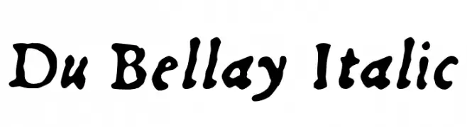
( Fonts by Daniel Midgley )
A classic, calligraphic font with fluid, artistic strokes.
 Herunterladen 291 Downloads
 -
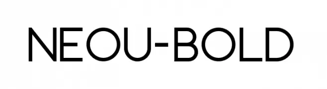
( Fonts by André Uenojo - Personal-use only. For commercial use please contact owner. )
A modern, bold sans-serif font with geometric shapes and uniform strokes.
![Neou-Bold Frei Schriftart Herunterladen]() Herunterladen 291 Downloads@WebFont
Herunterladen 291 Downloads@WebFont -
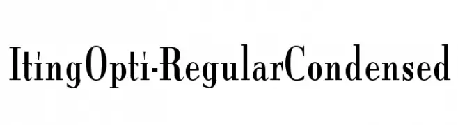
( Fonts by Castcraft Software - opti.netii.net - check the website before use )
A condensed serif font with sharp serifs and a modern yet classic style.
![ItingOpti-RegularCondensed Frei Schriftart Herunterladen]() Herunterladen 291 Downloads@WebFont
Herunterladen 291 Downloads@WebFont -
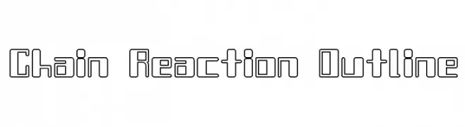
![Chain Reaction Outline Frei Schriftart Herunterladen]() Herunterladen 291 Downloads@WebFont
Herunterladen 291 Downloads@WebFont -
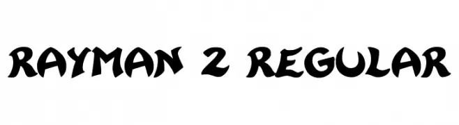
( Fonts by Franz Liszt )
A bold, playful font with a whimsical, cartoon-like style.
![Rayman 2 Regular Frei Schriftart Herunterladen]() Herunterladen 291 Downloads@WebFont
Herunterladen 291 Downloads@WebFont -
( Fonts by Vernon Adams )
A tall, narrow, all-caps font with a modern, minimalist style.
![Six Caps Frei Schriftart Herunterladen]() Herunterladen 291 Downloads@WebFont
Herunterladen 291 Downloads@WebFont -
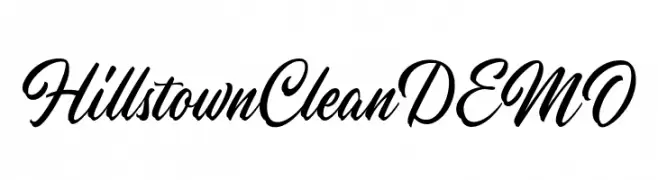
( Fonts by Letterhend Studio - Hendry Juanda - Personal-use only. For commercial use please contact owner. )
An elegant script font with flowing, cursive letters and intricate flourishes.
![HillstownCleanDEMO Frei Schriftart Herunterladen]() Herunterladen 291 Downloads@WebFont
Herunterladen 291 Downloads@WebFont -
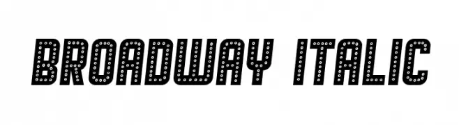
( Vladimir Nikolic - www.coroflot.com/vladimirnikolic )
A bold, decorative font with a dotted pattern, ideal for theatrical and eye-catching designs.
![Broadway Italic Frei Schriftart Herunterladen]() Herunterladen 291 Downloads@WebFont
Herunterladen 291 Downloads@WebFont -
![Josh_Script Frei Schriftart Herunterladen]() Herunterladen 291 Downloads@WebFont
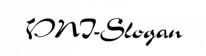
Herunterladen 291 Downloads@WebFont -
![VNI-Slogan Frei Schriftart Herunterladen]() Herunterladen 291 Downloads@WebFont
Herunterladen 291 Downloads@WebFont -
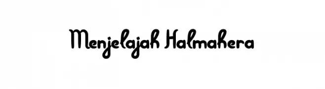
( Fonts by Adien Gunarta - fontasticindonesia.blogspot.com )
A playful, handwritten-style font with rounded, flowing letterforms.
![Menjelajah Halmahera Frei Schriftart Herunterladen]() Herunterladen 291 Downloads@WebFont
Herunterladen 291 Downloads@WebFont -
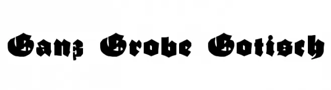
( Fonts by Dieter Steffmann )
A bold, Gothic-style font with intricate and angular letterforms.
![Ganz Grobe Gotisch Frei Schriftart Herunterladen]() Herunterladen 291 Downloads@WebFont
Herunterladen 291 Downloads@WebFont -
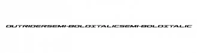
( Iconian Fonts - Daniel Zadorozny - www.iconian.com )
A dynamic, futuristic font with angular lines and a semi-bold, italicized style.
![Outrider Semi-Bold Italic Semi-Bold Italic Frei Schriftart Herunterladen]() Herunterladen 291 Downloads@WebFont
Herunterladen 291 Downloads@WebFont -
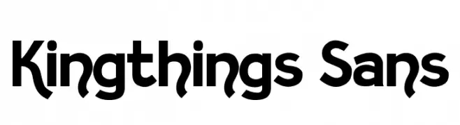
( Font by kingthingsfonts.co.uk )
A bold, playful sans-serif font with geometric influences and whimsical curves.
![Kingthings Sans Frei Schriftart Herunterladen]() Herunterladen 291 Downloads@WebFont
Herunterladen 291 Downloads@WebFont -
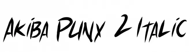
( Fonts by Press Gang Studios - Andeh Pinkard - www.pressgang-studios.com )
A bold, italicized font with a dynamic, graffiti-inspired style.
![Akiba Punx 2 Italic Frei Schriftart Herunterladen]() Herunterladen 291 Downloads@WebFont
Herunterladen 291 Downloads@WebFont -
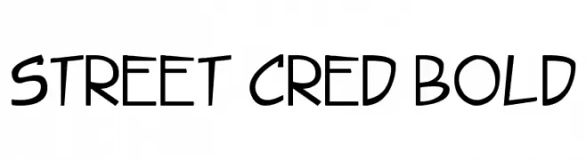
( Fonts by Press Gang Studios - Andeh Pinkard - www.pressgang-studios.com )
A bold, playful font with a hand-drawn, casual style.
![Street Cred Bold Frei Schriftart Herunterladen]() Herunterladen 291 Downloads@WebFont
Herunterladen 291 Downloads@WebFont -
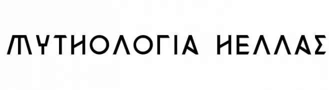
( Fonts by www.waltervelezart.com )
A modern, geometric font with bold, clean lines and a structured appearance.
![Mythologia Hellas Frei Schriftart Herunterladen]() Herunterladen 291 Downloads@WebFont
Herunterladen 291 Downloads@WebFont -
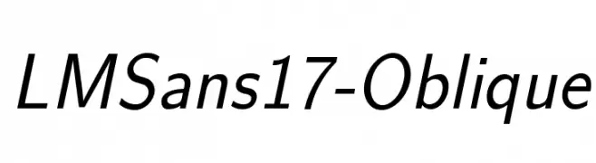
( Fonts by www.gust.org.pl )
A modern, oblique sans-serif font with a clean and professional look.
![LMSans17-Oblique Frei Schriftart Herunterladen]() Herunterladen 291 Downloads@WebFont
Herunterladen 291 Downloads@WebFont -
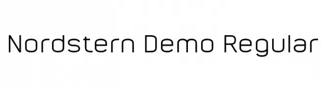
( Büro Sequenz - sequenz.net )
A modern, geometric sans-serif font with clean lines and balanced proportions.
![Nordstern Demo Regular Frei Schriftart Herunterladen]() Herunterladen 291 Downloads@WebFont
Herunterladen 291 Downloads@WebFont -
![YuleLikeThisNF Frei Schriftart Herunterladen]() Herunterladen 291 Downloads@WebFont
Herunterladen 291 Downloads@WebFont -
![Zarrow Frei Schriftart Herunterladen]() Herunterladen 291 Downloads
Herunterladen 291 Downloads -
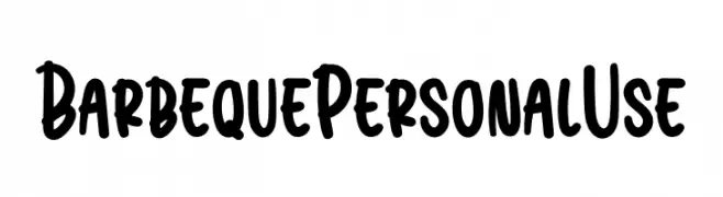
( Fonts by twinletter )
A bold, playful font with a hand-drawn, marker-like style.
![Barbeque Personal Use Frei Schriftart Herunterladen]() Herunterladen 291 Downloads@WebFont
Herunterladen 291 Downloads@WebFont -
( Fonts by www.aka-acid.com )
A playful, curly font with interconnected loops and swirls.
![Aka-AcidGR-Pasta Frei Schriftart Herunterladen]() Herunterladen 291 Downloads@WebFont
Herunterladen 291 Downloads@WebFont -
( Fonts by Gilar Studio )
A bold, playful font with rounded, exaggerated shapes and a whimsical style.
![We Are Allstar Regular Frei Schriftart Herunterladen]() Herunterladen 291 Downloads@WebFont
Herunterladen 291 Downloads@WebFont -
![SF Pale Bottom Frei Schriftart Herunterladen]() Herunterladen 291 Downloads@WebFont
Herunterladen 291 Downloads@WebFont -
![Schneider Buch Deutsch Shadow Two Frei Schriftart Herunterladen]() Herunterladen 291 Downloads@WebFont
Herunterladen 291 Downloads@WebFont -
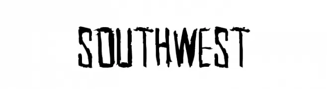
( Fonts by a Max Infeld - XEROGRAPHER FONTS - xerographer.blogspot.com . Personal-use only. For commercial use please contact owner. )
A rugged, distressed font with a bold, graffiti-like style.
![SouthWest Frei Schriftart Herunterladen]() Herunterladen 291 Downloads@WebFont
Herunterladen 291 Downloads@WebFont -
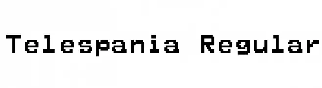
![Telespania Regular Frei Schriftart Herunterladen]() Herunterladen 291 Downloads@WebFont
Herunterladen 291 Downloads@WebFont -
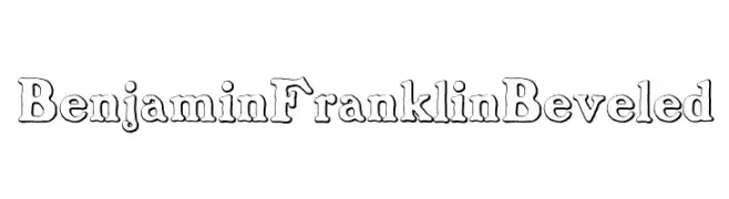
( Free for personal use - new.myfonts.com/foundry/Intellecta_Design/?refby=paulow )
A classic serif font with a unique beveled, three-dimensional style.
![BenjaminFranklinBeveled Frei Schriftart Herunterladen]() Herunterladen 291 Downloads@WebFont
Herunterladen 291 Downloads@WebFont -
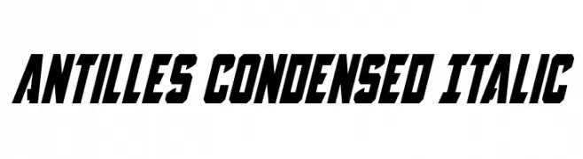
![Antilles Condensed Italic Frei Schriftart Herunterladen]() Herunterladen 291 Downloads@WebFont
Herunterladen 291 Downloads@WebFont -
( Fonts by Dieter Steffmann )
A bold, rounded font with a contour effect, perfect for playful and eye-catching designs.
![Fat Freddie Contour Frei Schriftart Herunterladen]() Herunterladen 291 Downloads@WebFont
Herunterladen 291 Downloads@WebFont -
( Iconian Fonts - Daniel Zadorozny - www.iconian.com )
A bold, geometric font with a futuristic and impactful design.
![Aircruiser Frei Schriftart Herunterladen]() Herunterladen 291 Downloads@WebFont
Herunterladen 291 Downloads@WebFont -
( Fonts by Steve Cloutier - www.cloutierfontes.ca )
A bold serif font with strong strokes and a classic, vintage appeal.
![CF Metropolis Serif Regular Frei Schriftart Herunterladen]() Herunterladen 291 Downloads@WebFont
Herunterladen 291 Downloads@WebFont -
![KingdomCome Frei Schriftart Herunterladen]() Herunterladen 291 Downloads@WebFont
Herunterladen 291 Downloads@WebFont -
![The Drips Frei Schriftart Herunterladen]() Herunterladen 291 Downloads@WebFont
Herunterladen 291 Downloads@WebFont


Welche Schriften sind gerade am populärsten?
Poppins, Roboto, Montserrat, Open Sans und Lato sind wegen ihrer klaren Formen und breiten Einsetzbarkeit sehr gefragt – von Markenauftritt über Landingpages bis hin zu Postern.
Welche Fonts eignen sich für Logos?
Geometrische Sans‑Serifs (z. B. Poppins, Familien im Gotham‑Stil) sind ein häufiger Griff für sauberes, skalierbares Branding. Für eine persönlichere Note bleiben Scripts und Handschrift‑Stile beliebt. Kombinieren Sie einen prägnanten Headline‑Font mit einer neutralen Brotschrift für Wiedererkennung und Harmonie.
Wie oft wird die Top‑Liste aktualisiert?
Regelmäßig – basierend auf realen Downloads und Interaktionen. Schauen Sie öfter vorbei, um aufstrebende Favoriten früh zu entdecken.
💡 Tipp: Seite bookmarken – Trends wechseln schnell, und heutige Top‑Schriften inspirieren morgen vielleicht das Rebranding.