Willkommen bei den Top‑Schriften – hier treffen Beliebtheit und Qualität aufeinander. Das sind die in diesem Jahr am häufigsten heruntergeladenen und genutzten Fonts. Wenn Sie sichere Optionen für Logo, Web oder Social suchen, starten Sie hier.
Jeder Top‑Font überzeugt durch Balance, Lesbarkeit und Vielseitigkeit. Sie finden moderne Sans‑Serifs, elegante Scripts, Vintage‑Serifs und minimalistische Displays.
-
( Fonts by Chris Vile )
A bold, playful, and hand-drawn style font with a graffiti-like appearance.
 Herunterladen 287 Downloads@WebFont
 -
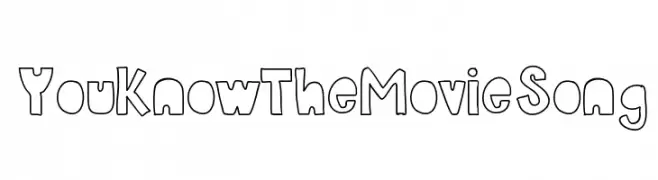
![YouKnowTheMovieSong Frei Schriftart Herunterladen]() Herunterladen 287 Downloads@WebFont
Herunterladen 287 Downloads@WebFont -
![Timuz Roman Frei Schriftart Herunterladen]() Herunterladen 287 Downloads@WebFont
Herunterladen 287 Downloads@WebFont -
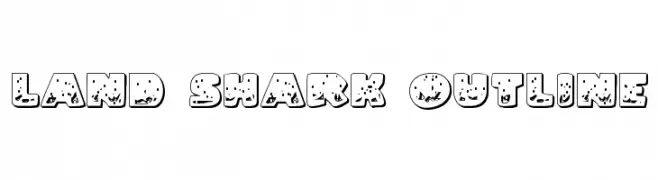
( Fonts by Daniel Zadorozny - www.iconian.com )
A bold, playful outline font with a textured, oceanic theme.
![Land Shark Outline Frei Schriftart Herunterladen]() Herunterladen 287 Downloads@WebFont
Herunterladen 287 Downloads@WebFont -
![ATeam Frei Schriftart Herunterladen]() Herunterladen 287 Downloads@WebFont
Herunterladen 287 Downloads@WebFont -
( Fonts by Jérémie Gauthier - Personal-use only. For commercial use please contact owner. )
A bold, geometric font with high contrast and unique cutouts.
![Stanley Frei Schriftart Herunterladen]() Herunterladen 287 Downloads@WebFont
Herunterladen 287 Downloads@WebFont -
( Fonts by Nirmala Creative - Personal-use only. For commercial use please contact owner. )
A playful, handwritten font with rounded edges and a casual style.
![Sticky Notes Frei Schriftart Herunterladen]() Herunterladen 287 Downloads@WebFont
Herunterladen 287 Downloads@WebFont -
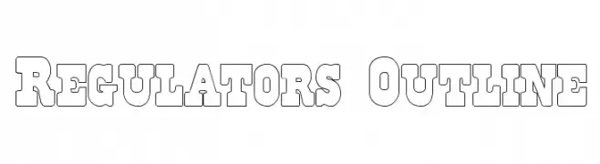
![Regulators Outline Frei Schriftart Herunterladen]() Herunterladen 287 Downloads@WebFont
Herunterladen 287 Downloads@WebFont -
![Jannisaries Bold Italic Frei Schriftart Herunterladen]() Herunterladen 287 Downloads@WebFont
Herunterladen 287 Downloads@WebFont -
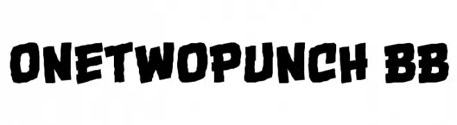
( Fonts by www.blambot.com )
A bold, dynamic font with a comic book style and energetic feel.
![OneTwoPunch BB Frei Schriftart Herunterladen]() Herunterladen 287 Downloads@WebFont
Herunterladen 287 Downloads@WebFont -
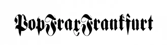
( Fonts by Manfred Klein. Free for private and charity use. Free for commercial with donation to organizations )
An ornate blackletter font with bold, intricate details and a Gothic flair.
![PopFraxFrankfurt Frei Schriftart Herunterladen]() Herunterladen 287 Downloads@WebFont
Herunterladen 287 Downloads@WebFont -
( THESE ARE SHAREWARE FONTS ! NOT FREEWARE ! PLEASE VISIT www.fuelfonts.com )
A bold, hand-drawn font with a rough, textured style and playful character.
![Klonk Frei Schriftart Herunterladen]() Herunterladen 287 Downloads@WebFont
Herunterladen 287 Downloads@WebFont -
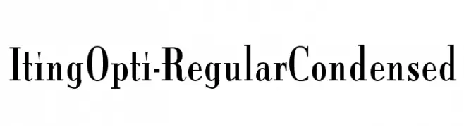
( Fonts by Castcraft Software - opti.netii.net - check the website before use )
A condensed serif font with sharp serifs and a modern yet classic style.
![ItingOpti-RegularCondensed Frei Schriftart Herunterladen]() Herunterladen 287 Downloads@WebFont
Herunterladen 287 Downloads@WebFont -
![Indie Komiks Sketch BoldItalic Frei Schriftart Herunterladen]() Herunterladen 287 Downloads@WebFont
Herunterladen 287 Downloads@WebFont -
( Fonts by www.studiotypo.com - Personal-use only. For commercial use please contact owner. )
A thin, modern sans-serif font with a clean and minimalist design.
![Malter Sans Thin Demo Frei Schriftart Herunterladen]() Herunterladen 287 Downloads@WebFont
Herunterladen 287 Downloads@WebFont -
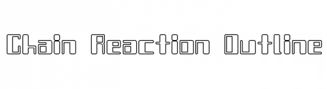
![Chain Reaction Outline Frei Schriftart Herunterladen]() Herunterladen 287 Downloads@WebFont
Herunterladen 287 Downloads@WebFont -
![zsarchankian Frei Schriftart Herunterladen]() Herunterladen 287 Downloads@WebFont
Herunterladen 287 Downloads@WebFont -
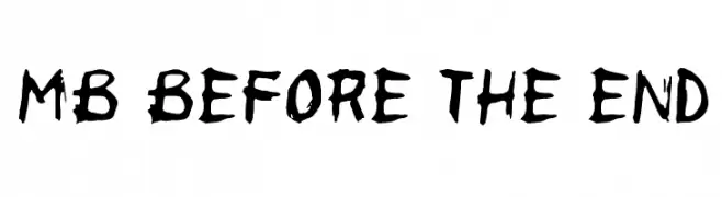
![MB Before the End Frei Schriftart Herunterladen]() Herunterladen 287 Downloads@WebFont
Herunterladen 287 Downloads@WebFont -
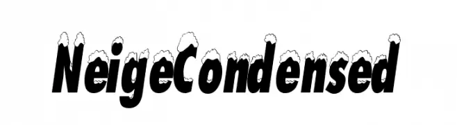
![NeigeCondensed Frei Schriftart Herunterladen]() Herunterladen 287 Downloads@WebFont
Herunterladen 287 Downloads@WebFont -
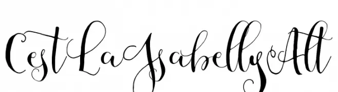
( Fonts by Mycandythemes )
An elegant script font with intricate swashes and flowing lines.
![CestLaIsabellyAlt Frei Schriftart Herunterladen]() Herunterladen 287 Downloads@WebFont
Herunterladen 287 Downloads@WebFont -
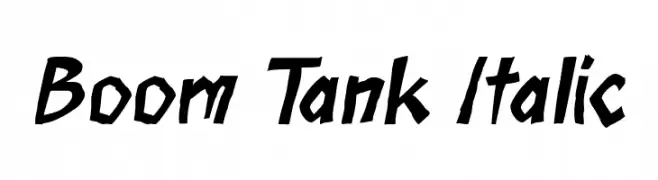
( Fonts by Press Gang Studios - Andeh Pinkard - www.pressgang-studios.com )
A bold, italic, hand-drawn font with sharp angles and dynamic energy.
![Boom Tank Italic Frei Schriftart Herunterladen]() Herunterladen 287 Downloads@WebFont
Herunterladen 287 Downloads@WebFont -
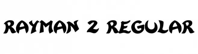
( Fonts by Franz Liszt )
A bold, playful font with a whimsical, cartoon-like style.
![Rayman 2 Regular Frei Schriftart Herunterladen]() Herunterladen 287 Downloads@WebFont
Herunterladen 287 Downloads@WebFont -
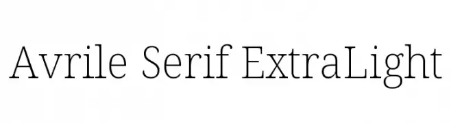
( Fonts by Cristiano Sobral - Personal-use only. For commercial use please contact owner. )
A refined serif font with thin, elegant strokes and subtle serifs.
![Avrile Serif ExtraLight Frei Schriftart Herunterladen]() Herunterladen 287 Downloads@WebFont
Herunterladen 287 Downloads@WebFont -
![Hammered Type Frei Schriftart Herunterladen]() Herunterladen 287 Downloads@WebFont
Herunterladen 287 Downloads@WebFont -
![Josh_Script Frei Schriftart Herunterladen]() Herunterladen 287 Downloads@WebFont
Herunterladen 287 Downloads@WebFont -
Schriftart von Fontscafe. For commercial use please contact the owner.
![sign-handwriting_demo-version Frei Schriftart Herunterladen]() Herunterladen 287 Downloads@WebFont
Herunterladen 287 Downloads@WebFont -
( Fonts by Rodrigo German - RASDESIGN )
A bold, playful font with thick, rounded strokes and a whimsical style.
![logo Regular Frei Schriftart Herunterladen]() Herunterladen 287 Downloads@WebFont
Herunterladen 287 Downloads@WebFont -
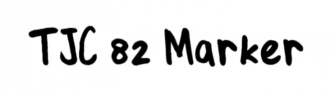
( Fonts by Tom Raaymakers. Personal-use only. For commercial use please contact owner. )
A playful, handwritten marker-style font with bold, rounded characters.
![TJC 82 Marker Frei Schriftart Herunterladen]() Herunterladen 287 Downloads@WebFont
Herunterladen 287 Downloads@WebFont -
( Fonts by Adobe )
A bold, modern sans-serif font with clean lines and excellent readability.
![Source Sans Pro Black Frei Schriftart Herunterladen]() Herunterladen 287 Downloads@WebFont
Herunterladen 287 Downloads@WebFont -
( Fonts by Adien Gunarta - fontasticindonesia.blogspot.com )
A playful, handwritten-style font with rounded, flowing letterforms.
![Menjelajah Halmahera Frei Schriftart Herunterladen]() Herunterladen 287 Downloads@WebFont
Herunterladen 287 Downloads@WebFont -
![SPDamascus Frei Schriftart Herunterladen]() Herunterladen 287 Downloads@WebFont
Herunterladen 287 Downloads@WebFont -
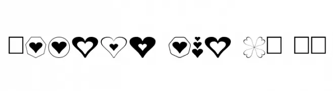
Schriftart von fontsnthings. For commercial use please contact the owner.
![Hearts for 3D FX Frei Schriftart Herunterladen]() Herunterladen 287 Downloads@WebFont
Herunterladen 287 Downloads@WebFont -
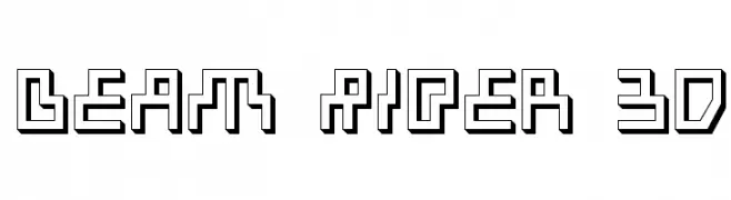
![Beam Rider 3D Frei Schriftart Herunterladen]() Herunterladen 287 Downloads@WebFont
Herunterladen 287 Downloads@WebFont -
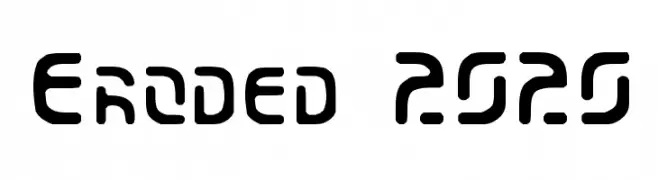
( Fonts by Scott Dieznyik - Kejak (formerly Cheops) )
A futuristic, geometric font with rounded edges and a bold, stencil-like appearance.
![Eroded 2020 Frei Schriftart Herunterladen]() Herunterladen 287 Downloads@WebFont
Herunterladen 287 Downloads@WebFont -
( Fonts by billyargel.blogspot.com - Billy Argel )
A bold, dotted font with a vintage, textured style.
![DOTLED Frei Schriftart Herunterladen]() Herunterladen 287 Downloads@WebFont
Herunterladen 287 Downloads@WebFont


Welche Schriften sind gerade am populärsten?
Poppins, Roboto, Montserrat, Open Sans und Lato sind wegen ihrer klaren Formen und breiten Einsetzbarkeit sehr gefragt – von Markenauftritt über Landingpages bis hin zu Postern.
Welche Fonts eignen sich für Logos?
Geometrische Sans‑Serifs (z. B. Poppins, Familien im Gotham‑Stil) sind ein häufiger Griff für sauberes, skalierbares Branding. Für eine persönlichere Note bleiben Scripts und Handschrift‑Stile beliebt. Kombinieren Sie einen prägnanten Headline‑Font mit einer neutralen Brotschrift für Wiedererkennung und Harmonie.
Wie oft wird die Top‑Liste aktualisiert?
Regelmäßig – basierend auf realen Downloads und Interaktionen. Schauen Sie öfter vorbei, um aufstrebende Favoriten früh zu entdecken.
💡 Tipp: Seite bookmarken – Trends wechseln schnell, und heutige Top‑Schriften inspirieren morgen vielleicht das Rebranding.