Willkommen bei den Top‑Schriften – hier treffen Beliebtheit und Qualität aufeinander. Das sind die in diesem Jahr am häufigsten heruntergeladenen und genutzten Fonts. Wenn Sie sichere Optionen für Logo, Web oder Social suchen, starten Sie hier.
Jeder Top‑Font überzeugt durch Balance, Lesbarkeit und Vielseitigkeit. Sie finden moderne Sans‑Serifs, elegante Scripts, Vintage‑Serifs und minimalistische Displays.
-
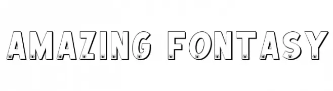
Schriftart von spideraysfonts. For commercial use please contact the owner.
( AMAZING FONTASY )
A bold, playful font with spider icons for a whimsical touch.
 Herunterladen 272 Downloads@WebFont
 -
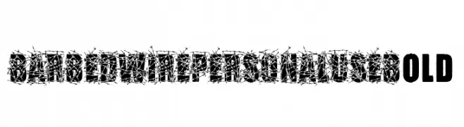
( Fonts by Billy Argel Fonts ® )
A bold, barbed wire-themed decorative font with a rugged, distressed appearance.
![BARBEDWIRE PERSONAL USE Bold Frei Schriftart Herunterladen]() Herunterladen 272 Downloads@WebFont
Herunterladen 272 Downloads@WebFont -
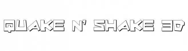
( Fonts by Daniel Zadorozny - www.iconian.com - Free for personal use )
A bold, 3D geometric font with a playful, dynamic style.
![Quake & Shake 3D Frei Schriftart Herunterladen]() Herunterladen 272 Downloads@WebFont
Herunterladen 272 Downloads@WebFont -
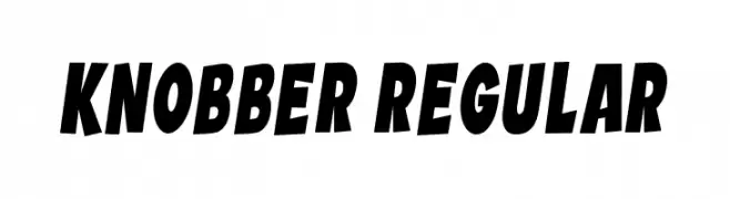
( Fonts by Vladimir Nikolic )
A bold, dynamic font with thick strokes and a slight slant, perfect for impactful designs.
![Knobber Regular Frei Schriftart Herunterladen]() Herunterladen 272 Downloads@WebFont
Herunterladen 272 Downloads@WebFont -
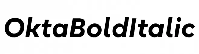
( Fonts by Eugene Tantsurin - Personal-use only. For commercial use please contact owner. )
A bold, italic, and modern sans-serif font with consistent stroke thickness.
![Okta Bold Italic Frei Schriftart Herunterladen]() Herunterladen 272 Downloads@WebFont
Herunterladen 272 Downloads@WebFont -
-
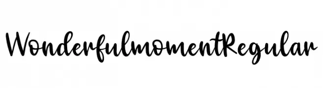
( Fonts by Maria Feliz Studio - Personal-use only. For commercial use please contact owner. )
A playful, handwritten font with bold, dynamic strokes.
![Wonderful moment Regular Frei Schriftart Herunterladen]() Herunterladen 272 Downloads@WebFont
Herunterladen 272 Downloads@WebFont -
( Fonts by Qaratype - Personal-use only. For commercial use please contact owner. )
A bold, playful handwritten font with a casual and energetic style.
![Riwaya Frei Schriftart Herunterladen]() Herunterladen 272 Downloads@WebFont
Herunterladen 272 Downloads@WebFont -
( Fonts by Jacob Fisher - www.pizzadude.dk )
A bold, playful font with irregular, chunky characters.
![Guinea pigs Frei Schriftart Herunterladen]() Herunterladen 272 Downloads@WebFont
Herunterladen 272 Downloads@WebFont -
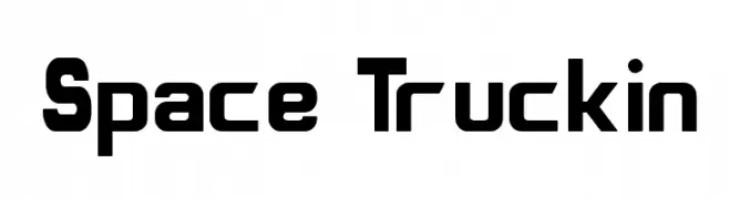
![Space Truckin Frei Schriftart Herunterladen]() Herunterladen 272 Downloads@WebFont
Herunterladen 272 Downloads@WebFont -
( Fonts by Peter Wiegel - www.peter-wiegel.de - Personal-use only. For commercial use please contact owner. )
A geometric, modern font with clean lines and smooth curves.
![Rundspruch Frei Schriftart Herunterladen]() Herunterladen 272 Downloads@WebFont
Herunterladen 272 Downloads@WebFont -
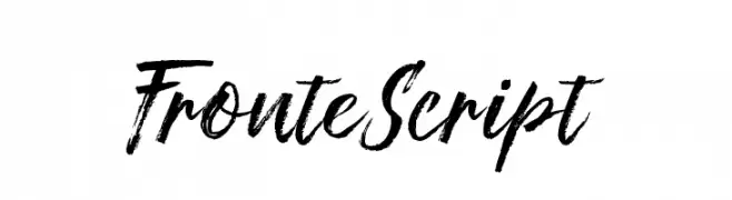
( Roy Jorse - creativemarket.com/jorse )
A bold, brush-style script font with dynamic, textured strokes.
![FronteScript Frei Schriftart Herunterladen]() Herunterladen 272 Downloads@WebFont
Herunterladen 272 Downloads@WebFont -
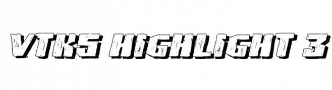
( Fonts by Douglas Vitkauskas - www.vtksdesign.com. Personal-use only. For commercial use please contact owner. )
A bold, distressed 3D font with a rugged, dynamic style.
![VTKS HIGHLIGHT 3 Frei Schriftart Herunterladen]() Herunterladen 272 Downloads@WebFont
Herunterladen 272 Downloads@WebFont -
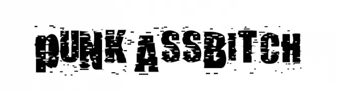
![pUNKASSBITCH Frei Schriftart Herunterladen]() Herunterladen 272 Downloads@WebFont
Herunterladen 272 Downloads@WebFont -
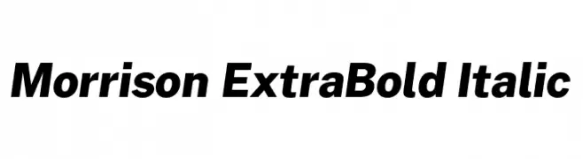
( Fonts by Pablo Impallari, Rodrigo Fuenzalida (Modified by Dan O. Williams) - Personal-use only. For commercial use please contact owner. )
A bold, italic font with a modern and dynamic style.
![Morrison ExtraBold Italic Frei Schriftart Herunterladen]() Herunterladen 272 Downloads@WebFont
Herunterladen 272 Downloads@WebFont -
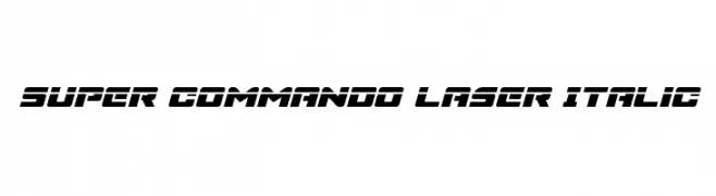
( Fonts by Daniel Zadorozny - www.iconian.com )
A bold, futuristic italic font with sharp, angular edges and a strong geometric style.
![Super Commando Laser Italic Frei Schriftart Herunterladen]() Herunterladen 272 Downloads@WebFont
Herunterladen 272 Downloads@WebFont -
( Fonts by Luke Owens - Personal-use only. For commercial use please contact owner. )
A bold, extended black font with a modern and commanding style.
![Oregon LDO Extended Black Frei Schriftart Herunterladen]() Herunterladen 272 Downloads@WebFont
Herunterladen 272 Downloads@WebFont -
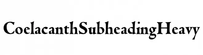
( Personal-use only. For commercial use please contact owner. )
A bold, high-contrast serif font with dramatic and elegant features.
![Coelacanth Subheading Heavy Frei Schriftart Herunterladen]() Herunterladen 272 Downloads@WebFont
Herunterladen 272 Downloads@WebFont -
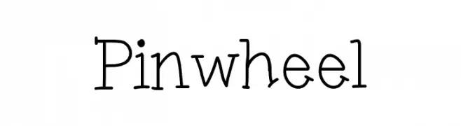
( www.porcelainpaperandpie.com )
A playful, hand-drawn font with irregular, wavy strokes and a whimsical style.
![Pinwheel Frei Schriftart Herunterladen]() Herunterladen 272 Downloads@WebFont
Herunterladen 272 Downloads@WebFont -
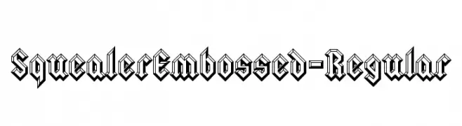
( Fonts by www.typodermicfonts.com - Ray Larabie )
A bold, embossed font with a three-dimensional effect and sharp, angular lines.
![SquealerEmbossed-Regular Frei Schriftart Herunterladen]() Herunterladen 272 Downloads@WebFont
Herunterladen 272 Downloads@WebFont -
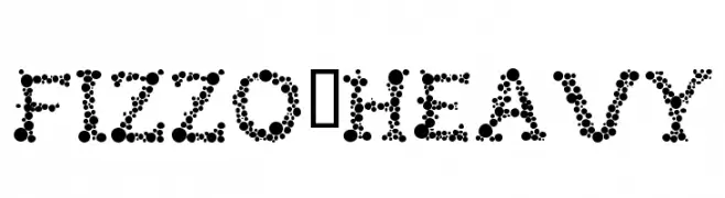
( Fonts by Rafa )
A bold, dotted font perfect for decorative and playful designs.
![FIZZO-Heavy Frei Schriftart Herunterladen]() Herunterladen 272 Downloads@WebFont
Herunterladen 272 Downloads@WebFont -
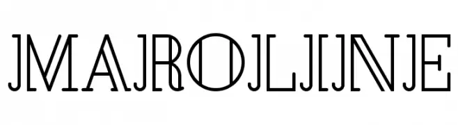
![Maroline Frei Schriftart Herunterladen]() Herunterladen 272 Downloads@WebFont
Herunterladen 272 Downloads@WebFont -
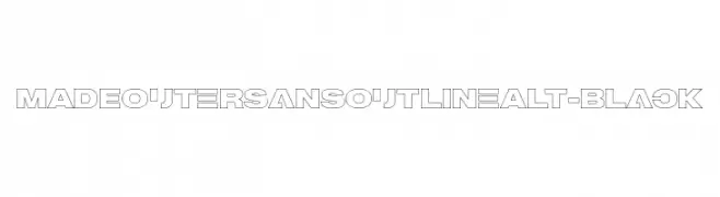
( Fonts by MadeType - Personal-use only. For commercial use please contact owner. )
A bold, geometric sans-serif font with a modern outline style.
![MADEOuterSansOutlineAlt-Black Frei Schriftart Herunterladen]() Herunterladen 272 Downloads@WebFont
Herunterladen 272 Downloads@WebFont -
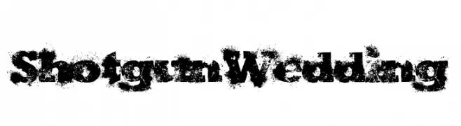
( Fonts by Kevin Christopher - www.kcfonts.com )
A bold, distressed font with a grunge, spray-painted effect.
![ShotgunWedding Frei Schriftart Herunterladen]() Herunterladen 272 Downloads@WebFont
Herunterladen 272 Downloads@WebFont -
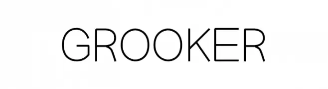
( Fonts by zanfonts - ari budi setiawan - Personal-use only. For commercial use please contact owner. )
A modern, geometric sans-serif font with clean lines and uniform strokes.
![GROOKER Frei Schriftart Herunterladen]() Herunterladen 272 Downloads@WebFont
Herunterladen 272 Downloads@WebFont -
( Fonts by Chris Vile )
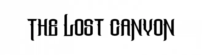
A bold, gothic-style font with sharp, angular edges and a medieval feel.
![The Lost Canyon Frei Schriftart Herunterladen]() Herunterladen 272 Downloads@WebFont
Herunterladen 272 Downloads@WebFont -
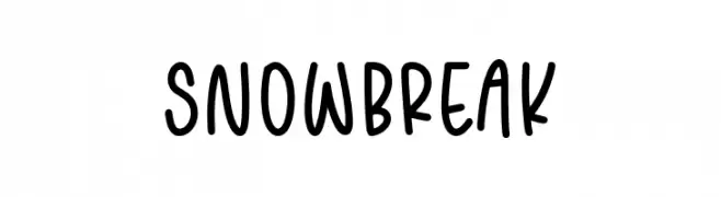
( Fonts by Balpirick Studio - https://www.creativefabrica.com/designer/balpirick/ref/308299/ - Personal-use only. For commercial use please contact owner. )
A playful, handwritten font with rounded, consistent strokes and a casual feel.
![SNOWBREAK Frei Schriftart Herunterladen]() Herunterladen 272 Downloads@WebFont
Herunterladen 272 Downloads@WebFont -
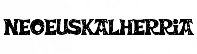
( Fonts by Woodcutter Manero - www.woodcutter.es - Personal-use only. For commercial use please contact owner. )
A bold, textured decorative font with a rustic, handcrafted appearance.
![Neo Euskal Herria Frei Schriftart Herunterladen]() Herunterladen 272 Downloads@WebFont
Herunterladen 272 Downloads@WebFont -
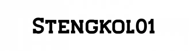
( Fonts by ViactionType - Lukman Hidayat - Personal-use only. For commercial use please contact owner. )
A bold, modern font with strong, thick strokes and a geometric influence.
![Stengkol01 Frei Schriftart Herunterladen]() Herunterladen 272 Downloads@WebFont
Herunterladen 272 Downloads@WebFont -
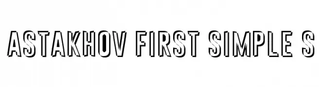
( Fonts by Dmitry Astakhov - www.behance.net/adonis-abe1e - Personal-use only. For commercial use please contact owner. )
A bold, outlined font with a modern and dynamic style.
![Astakhov First Simple S Frei Schriftart Herunterladen]() Herunterladen 272 Downloads@WebFont
Herunterladen 272 Downloads@WebFont -
Schriftart von typotopia. For commercial use please contact the owner.
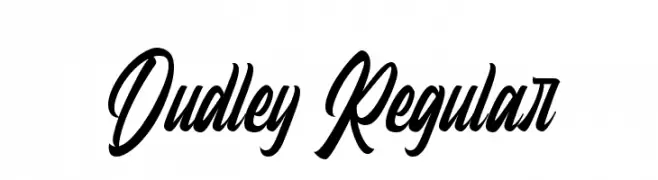
( Fonts by Typotopia - Typotopia.co - Personal Use Only, for Commercial Use, please contact us )
A dynamic and elegant script font with fluid, cursive letterforms.
![Dudley Regular Frei Schriftart Herunterladen]() Herunterladen 272 Downloads@WebFont
Herunterladen 272 Downloads@WebFont -
( Flamde Studio - Nur Solikh - creativemarket.com/flamde/ )
A bold, hand-painted style font with expressive, uneven strokes.
![Lariess Frei Schriftart Herunterladen]() Herunterladen 272 Downloads@WebFont
Herunterladen 272 Downloads@WebFont -
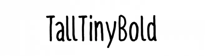
( Fonts by Digi Temply )
A playful, hand-drawn font with tall, narrow characters and a bold, quirky style.
![TallTiny Bold Frei Schriftart Herunterladen]() Herunterladen 272 Downloads@WebFont
Herunterladen 272 Downloads@WebFont -
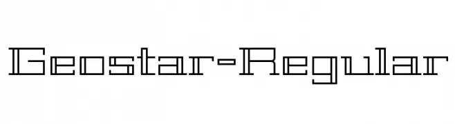
( Copyright (c) 2011, Joe Prince, Admix Designs (http://www.admixdesigns.com/) )
A geometric, futuristic font with sharp angles and a structured design.
![Geostar-Regular Frei Schriftart Herunterladen]() Herunterladen 272 Downloads@WebFont
Herunterladen 272 Downloads@WebFont -
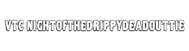
![VTC NightOfTheDrippyDeadOuttie Frei Schriftart Herunterladen]() Herunterladen 272 Downloads@WebFont
Herunterladen 272 Downloads@WebFont -
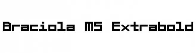
( Fonts by a kmzero font foundry - www.zetafonts.com. Personal-use only. For commercial use please contact owner. )
A bold, geometric font with a futuristic, digital appearance.
![Braciola MS Extrabold Frei Schriftart Herunterladen]() Herunterladen 272 Downloads@WebFont
Herunterladen 272 Downloads@WebFont


Welche Schriften sind gerade am populärsten?
Poppins, Roboto, Montserrat, Open Sans und Lato sind wegen ihrer klaren Formen und breiten Einsetzbarkeit sehr gefragt – von Markenauftritt über Landingpages bis hin zu Postern.
Welche Fonts eignen sich für Logos?
Geometrische Sans‑Serifs (z. B. Poppins, Familien im Gotham‑Stil) sind ein häufiger Griff für sauberes, skalierbares Branding. Für eine persönlichere Note bleiben Scripts und Handschrift‑Stile beliebt. Kombinieren Sie einen prägnanten Headline‑Font mit einer neutralen Brotschrift für Wiedererkennung und Harmonie.
Wie oft wird die Top‑Liste aktualisiert?
Regelmäßig – basierend auf realen Downloads und Interaktionen. Schauen Sie öfter vorbei, um aufstrebende Favoriten früh zu entdecken.
💡 Tipp: Seite bookmarken – Trends wechseln schnell, und heutige Top‑Schriften inspirieren morgen vielleicht das Rebranding.