Willkommen bei den Top‑Schriften – hier treffen Beliebtheit und Qualität aufeinander. Das sind die in diesem Jahr am häufigsten heruntergeladenen und genutzten Fonts. Wenn Sie sichere Optionen für Logo, Web oder Social suchen, starten Sie hier.
Jeder Top‑Font überzeugt durch Balance, Lesbarkeit und Vielseitigkeit. Sie finden moderne Sans‑Serifs, elegante Scripts, Vintage‑Serifs und minimalistische Displays.
-
( Fonts by Jean-Baptiste Morizot. Personal-use only. For commercial use please contact owner. )
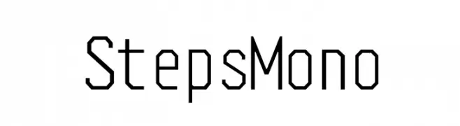
A geometric, monospaced font with a technical and modern design.
 Herunterladen 284 Downloads@WebFont
 -
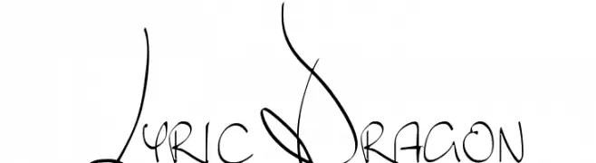
![Lyric Dragon Frei Schriftart Herunterladen]() Herunterladen 284 Downloads@WebFont
Herunterladen 284 Downloads@WebFont -
( Fonts by www.peter-wiegel.de. Personal-use only. For commercial use please contact owner. )
A dynamic and expressive brush script font with fluid, connected strokes.
![KrugmannBrush Frei Schriftart Herunterladen]() Herunterladen 284 Downloads@WebFont
Herunterladen 284 Downloads@WebFont -
( Fonts by Xerographer Fonts )
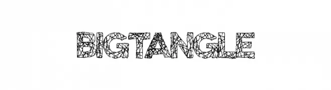
A bold, web-patterned decorative font ideal for artistic headlines and logos.
![BigTangle Frei Schriftart Herunterladen]() Herunterladen 284 Downloads@WebFont
Herunterladen 284 Downloads@WebFont -
( Fonts by Rajesh Rajput - gumroad.com/rajputrajesh_448 - Personal-use only. For commercial use please contact owner. )
A modern, italic font with a sleek, condensed style and consistent stroke thickness.
![Morganite Medium Italic Frei Schriftart Herunterladen]() Herunterladen 284 Downloads@WebFont
Herunterladen 284 Downloads@WebFont -
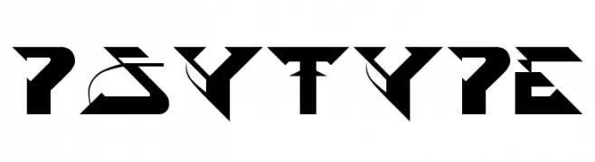
![PsyType Frei Schriftart Herunterladen]() Herunterladen 284 Downloads@WebFont
Herunterladen 284 Downloads@WebFont -
( Fonts by Putra Khan )
A dynamic and elegant script font with flowing cursive letterforms.
![HardestStyleDemo Frei Schriftart Herunterladen]() Herunterladen 284 Downloads@WebFont
Herunterladen 284 Downloads@WebFont -
( Fonts by Dan P. Lyons - Personal-use only. For commercial use please contact owner. )
A playful, bold font with a whimsical and childlike design.
![KidZone Frei Schriftart Herunterladen]() Herunterladen 284 Downloads@WebFont
Herunterladen 284 Downloads@WebFont -
![Borzoi BoldItalic Frei Schriftart Herunterladen]() Herunterladen 283 Downloads@WebFont
Herunterladen 283 Downloads@WebFont -
( Fonts by Manfred Klein. Free for private and charity use. Free for commercial with donation to organizations )
Elegant oblique serif font with high contrast and sharp serifs.
![CybapeeTX-heightOblique Frei Schriftart Herunterladen]() Herunterladen 283 Downloads@WebFont
Herunterladen 283 Downloads@WebFont -
( Fonts by Hanoded )
A bold, hand-painted style font with dynamic brush-like strokes.
![DKBuntaro Frei Schriftart Herunterladen]() Herunterladen 283 Downloads@WebFont
Herunterladen 283 Downloads@WebFont -
( Font by Mark Burrough - www.teamscope.com.au Sponsoren Schriftart )
A bold, playful handwritten font with rounded, consistent strokes.
![ClaireHand-Bold Frei Schriftart Herunterladen]() Herunterladen 283 Downloads
Herunterladen 283 Downloads -
![gaplek Frei Schriftart Herunterladen]() Herunterladen 283 Downloads@WebFont
Herunterladen 283 Downloads@WebFont -
( Murat Yegul - www.formatltd.com )
A tall, antique serif font with a hand-drawn, vintage style.
![Gar-A-MondTall Antique Frei Schriftart Herunterladen]() Herunterladen 283 Downloads@WebFont
Herunterladen 283 Downloads@WebFont -
![Great Leader Frei Schriftart Herunterladen]() Herunterladen 283 Downloads@WebFont
Herunterladen 283 Downloads@WebFont -
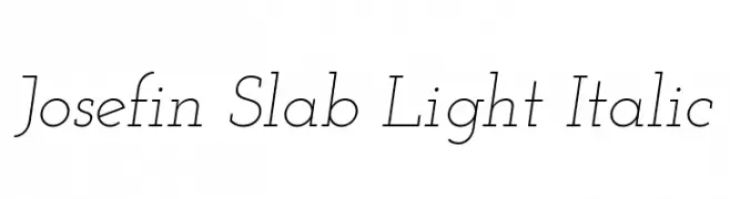
( Copyright (c) 2010, Santiago Orozco (hi@typemade.mx) )
A light, elegant serif font with an italic style and refined appearance.
![Josefin Slab Light Italic Frei Schriftart Herunterladen]() Herunterladen 283 Downloads@WebFont
Herunterladen 283 Downloads@WebFont -
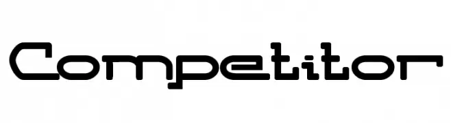
![Competitor Frei Schriftart Herunterladen]() Herunterladen 283 Downloads@WebFont
Herunterladen 283 Downloads@WebFont -
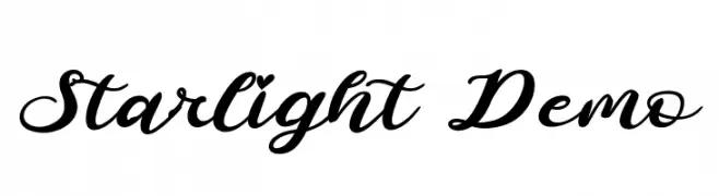
( Fonts by www.movefont .com - Personal-use only. For commercial use please contact owner. )
An elegant cursive font with flowing, ornate characters.
![Starlight Demo Frei Schriftart Herunterladen]() Herunterladen 283 Downloads@WebFont
Herunterladen 283 Downloads@WebFont -
![Laundry Day Frei Schriftart Herunterladen]() Herunterladen 283 Downloads@WebFont
Herunterladen 283 Downloads@WebFont -
![Secrets Stencil Regular Frei Schriftart Herunterladen]() Herunterladen 283 Downloads@WebFont
Herunterladen 283 Downloads@WebFont -
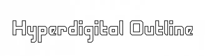
![Hyperdigital Outline Frei Schriftart Herunterladen]() Herunterladen 283 Downloads@WebFont
Herunterladen 283 Downloads@WebFont -
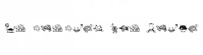
![KR Turtles For Julie Frei Schriftart Herunterladen]() Herunterladen 283 Downloads@WebFont
Herunterladen 283 Downloads@WebFont -
![Bluebird Light Oblique Frei Schriftart Herunterladen]() Herunterladen 283 Downloads@WebFont
Herunterladen 283 Downloads@WebFont -
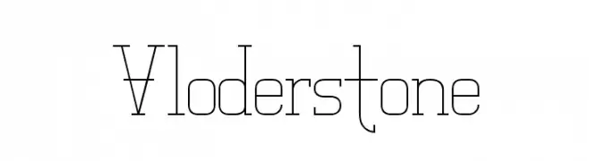
( Fonts by Andrew Hart - dirt2.com )
A modern, geometric font with thin, elongated strokes and a minimalistic design.
![Vloderstone Frei Schriftart Herunterladen]() Herunterladen 283 Downloads@WebFont
Herunterladen 283 Downloads@WebFont -
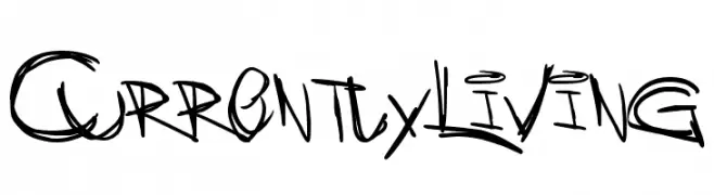
![CurrentlyLiving Frei Schriftart Herunterladen]() Herunterladen 283 Downloads@WebFont
Herunterladen 283 Downloads@WebFont -
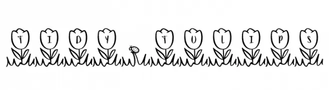
( Fonts by Brittney Murphy Design )
A playful, tulip-themed decorative font with a hand-drawn style.
![Tidy*Tulips Frei Schriftart Herunterladen]() Herunterladen 283 Downloads@WebFont
Herunterladen 283 Downloads@WebFont -
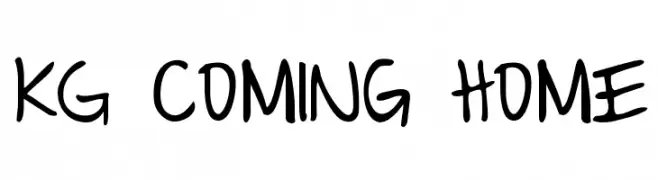
( Fonts by www.kimberlygeswein.com - Kimberly Geswein )
A playful, handwritten font with bold, smooth lines and a casual style.
![KG Coming Home Frei Schriftart Herunterladen]() Herunterladen 283 Downloads@WebFont
Herunterladen 283 Downloads@WebFont -
( Fonts by MadeType - Personal-use only. For commercial use please contact owner. )
A futuristic, geometric font with a modern, tech-inspired design.
![MADEFutureXHEADER-Medium Frei Schriftart Herunterladen]() Herunterladen 283 Downloads@WebFont
Herunterladen 283 Downloads@WebFont -
![SRG MARKER Frei Schriftart Herunterladen]() Herunterladen 283 Downloads@WebFont
Herunterladen 283 Downloads@WebFont -
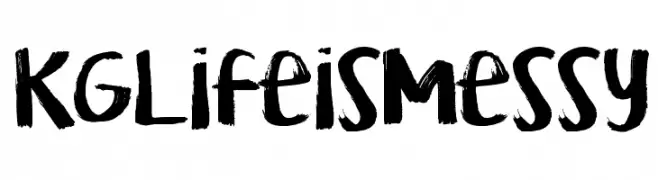
( Fonts by Kimberly Geswein )
A bold, brush-style font with an expressive, hand-painted appearance.
![KG Life is Messy Frei Schriftart Herunterladen]() Herunterladen 283 Downloads@WebFont
Herunterladen 283 Downloads@WebFont -
( Fonts by www.gliphmaker.com. Personal-use only. For commercial use please contact owner. )
A bold, geometric font with a futuristic and playful style.
![Picaresque Two Frei Schriftart Herunterladen]() Herunterladen 283 Downloads@WebFont
Herunterladen 283 Downloads@WebFont -
( carlosmatteoli.wix.com/qbotype )
A bold, angular, and tech-inspired font with a modern slant.
![Gtek Regular Frei Schriftart Herunterladen]() Herunterladen 283 Downloads@WebFont
Herunterladen 283 Downloads@WebFont -
![pirates pw Frei Schriftart Herunterladen]() Herunterladen 283 Downloads@WebFont
Herunterladen 283 Downloads@WebFont -
( Fonts by Kong Font - Personal-use only. For commercial use please contact owner. )
A sophisticated, high-contrast serif font with elegant, condensed characters.
![La Fleur Frei Schriftart Herunterladen]() Herunterladen 283 Downloads@WebFont
Herunterladen 283 Downloads@WebFont -
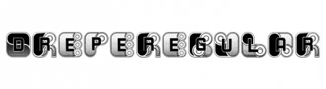
( Fonts by Vladimir Nikolic )
A bold, decorative font with geometric shapes and intricate patterns.
![Drepe Regular Frei Schriftart Herunterladen]() Herunterladen 283 Downloads@WebFont
Herunterladen 283 Downloads@WebFont


Welche Schriften sind gerade am populärsten?
Poppins, Roboto, Montserrat, Open Sans und Lato sind wegen ihrer klaren Formen und breiten Einsetzbarkeit sehr gefragt – von Markenauftritt über Landingpages bis hin zu Postern.
Welche Fonts eignen sich für Logos?
Geometrische Sans‑Serifs (z. B. Poppins, Familien im Gotham‑Stil) sind ein häufiger Griff für sauberes, skalierbares Branding. Für eine persönlichere Note bleiben Scripts und Handschrift‑Stile beliebt. Kombinieren Sie einen prägnanten Headline‑Font mit einer neutralen Brotschrift für Wiedererkennung und Harmonie.
Wie oft wird die Top‑Liste aktualisiert?
Regelmäßig – basierend auf realen Downloads und Interaktionen. Schauen Sie öfter vorbei, um aufstrebende Favoriten früh zu entdecken.
💡 Tipp: Seite bookmarken – Trends wechseln schnell, und heutige Top‑Schriften inspirieren morgen vielleicht das Rebranding.