Willkommen bei den Top‑Schriften – hier treffen Beliebtheit und Qualität aufeinander. Das sind die in diesem Jahr am häufigsten heruntergeladenen und genutzten Fonts. Wenn Sie sichere Optionen für Logo, Web oder Social suchen, starten Sie hier.
Jeder Top‑Font überzeugt durch Balance, Lesbarkeit und Vielseitigkeit. Sie finden moderne Sans‑Serifs, elegante Scripts, Vintage‑Serifs und minimalistische Displays.
-
( Fonts by Misti Hammers - mistifonts.com - Personal-use only. For commercial use please contact owner. )
A playful, handwritten font with rounded edges and a casual style.
 Herunterladen 281 Downloads@WebFont
 -
![Pixel Sleigh Regular Frei Schriftart Herunterladen]() Herunterladen 281 Downloads@WebFont
Herunterladen 281 Downloads@WebFont -
![Ghoul Frei Schriftart Herunterladen]() Herunterladen 281 Downloads@WebFont
Herunterladen 281 Downloads@WebFont -
![Covenant/Forerunner Bold Frei Schriftart Herunterladen]() Herunterladen 281 Downloads@WebFont
Herunterladen 281 Downloads@WebFont -
![Electro Static RAIN Frei Schriftart Herunterladen]() Herunterladen 281 Downloads@WebFont
Herunterladen 281 Downloads@WebFont -
( Fonts by Hanna Bie )
A bold, playful font with thick, rounded strokes and a bubbly appearance.
![Genoise Frei Schriftart Herunterladen]() Herunterladen 281 Downloads@WebFont
Herunterladen 281 Downloads@WebFont -
![Outer Limits Solid Extended Italic Frei Schriftart Herunterladen]() Herunterladen 281 Downloads@WebFont
Herunterladen 281 Downloads@WebFont -
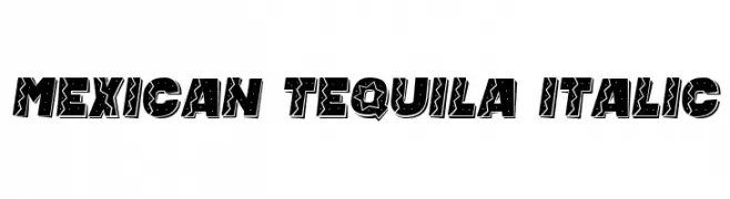
( Vladimir Nikolic - www.coroflot.com/vladimirnikolic )
A bold, decorative font with a Mexican-inspired, playful style and italicized slant.
![Mexican Tequila Italic Frei Schriftart Herunterladen]() Herunterladen 281 Downloads@WebFont
Herunterladen 281 Downloads@WebFont -
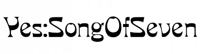
( Fonts by www.varian.net )
A bold, decorative font with a modern and vintage blend, featuring angular strokes and elegant curves.
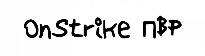
![Yes:SongOfSeven Frei Schriftart Herunterladen]() Herunterladen 281 Downloads@WebFont
Herunterladen 281 Downloads@WebFont -
![OnStrike NBP Frei Schriftart Herunterladen]() Herunterladen 281 Downloads@WebFont
Herunterladen 281 Downloads@WebFont -
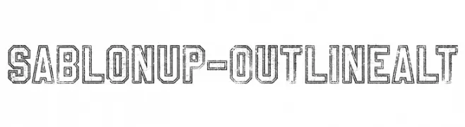
( Fonts by a Youssef Habchi - youssef-habchi.com. Personal-use only. For commercial use please contact owner. )
A bold, outlined font with a distressed, vintage texture.
![SablonUp-OutlineAlt Frei Schriftart Herunterladen]() Herunterladen 281 Downloads@WebFont
Herunterladen 281 Downloads@WebFont -
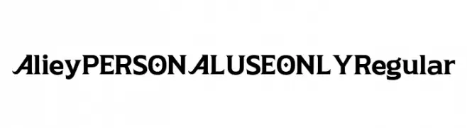
( Fonts by Mans Greback - Personal-use only. For commercial use please contact owner. )
A bold, modern font with unique geometric elements and strong character presence.
![Aliey PERSONAL USE ONLY Regular Frei Schriftart Herunterladen]() Herunterladen 281 Downloads@WebFont
Herunterladen 281 Downloads@WebFont -
Schriftart von typotopia. For commercial use please contact the owner.
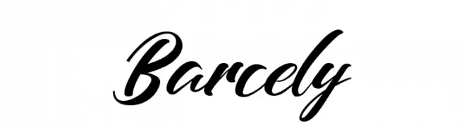
( Fonts by Typotopia - Typotopia.co - Personal Use Only, for Commercial Use, please contact us )
A dynamic and elegant script font with fluid, cursive strokes.
![Barcely Frei Schriftart Herunterladen]() Herunterladen 281 Downloads@WebFont
Herunterladen 281 Downloads@WebFont -
![kaum keras kepala Frei Schriftart Herunterladen]() Herunterladen 281 Downloads@WebFont
Herunterladen 281 Downloads@WebFont -
![Yapix Frei Schriftart Herunterladen]() Herunterladen 281 Downloads@WebFont
Herunterladen 281 Downloads@WebFont -
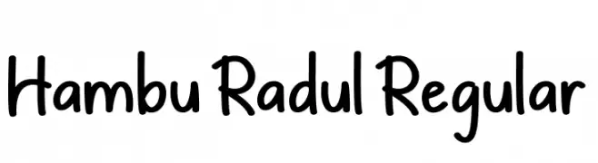
( Fonts by CBRTEXT Studio )
A playful, handwritten font with a casual and friendly style.
![Hambu Radul Regular Frei Schriftart Herunterladen]() Herunterladen 281 Downloads@WebFont
Herunterladen 281 Downloads@WebFont -
![Rootle Bold Frei Schriftart Herunterladen]() Herunterladen 281 Downloads@WebFont
Herunterladen 281 Downloads@WebFont -
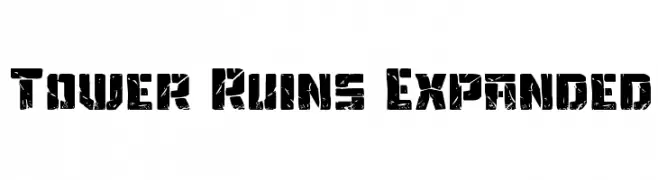
( Fonts by Daniel Zadorozny - www.iconian.com - Free for personal use )
A bold, distressed font with a rugged, textured appearance.
![Tower Ruins Expanded Frei Schriftart Herunterladen]() Herunterladen 281 Downloads@WebFont
Herunterladen 281 Downloads@WebFont -
( Fonts by Maulana Creative )
A bold, geometric font with high contrast and a modern, edgy style.
![Grimblocks Free Regular Frei Schriftart Herunterladen]() Herunterladen 281 Downloads@WebFont
Herunterladen 281 Downloads@WebFont -
( Fonts by MagicType - Jaikishan Patel - Personal-use only. For commercial use please contact owner. )
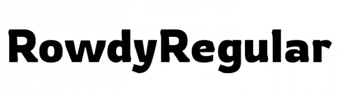
A bold, modern font with strong, uniform letterforms.
![Rowdy Regular Frei Schriftart Herunterladen]() Herunterladen 281 Downloads@WebFont
Herunterladen 281 Downloads@WebFont -
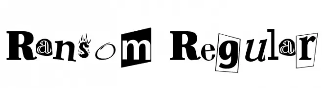
( Fonts by Altsys Metamorphosis )
A playful, eclectic font mimicking a ransom note with varied styles and bold design.
![Ransom Regular Frei Schriftart Herunterladen]() Herunterladen 281 Downloads@WebFont
Herunterladen 281 Downloads@WebFont -
( Fonts by Iconian Fonts )
A bold, geometric, and futuristic condensed font with a strong visual impact.
![1968 Odyssey Condensed Frei Schriftart Herunterladen]() Herunterladen 281 Downloads@WebFont
Herunterladen 281 Downloads@WebFont -
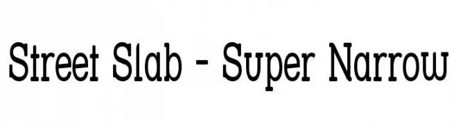
( Fonts by Apostrophic Lab )
A bold, condensed slab serif font with a modern and structured design.
![Street Slab - Super Narrow Frei Schriftart Herunterladen]() Herunterladen 281 Downloads@WebFont
Herunterladen 281 Downloads@WebFont -
( Fonts by wep - Wahyu Eka Prasetya - Personal-use only. For commercial use please contact owner. )
A bold, dynamic brush script with flowing strokes and an energetic style.
![Atos_ Frei Schriftart Herunterladen]() Herunterladen 281 Downloads@WebFont
Herunterladen 281 Downloads@WebFont -
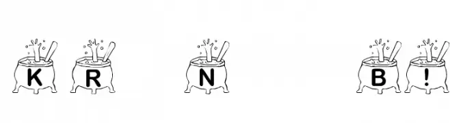
( Fonts by Kat`s Fun Fonts - Personal-use only. For commercial use please contact owner. )
A whimsical font with characters inside bubbling cauldrons, perfect for fantasy themes.
![KR Nght's Brew! Frei Schriftart Herunterladen]() Herunterladen 281 Downloads@WebFont
Herunterladen 281 Downloads@WebFont -
( Fonts by www.omniglot.com )
A bold, modern font with thick strokes and angular shapes.
![poebya Frei Schriftart Herunterladen]() Herunterladen 281 Downloads
Herunterladen 281 Downloads -
( Copyright 2012 The Scada Project Authors (lemonad@jovanny.ru) )
A sleek, modern italic font with smooth, slightly slanted letterforms.
![Scada Italic Frei Schriftart Herunterladen]() Herunterladen 281 Downloads@WebFont
Herunterladen 281 Downloads@WebFont -
( Fonts by Jeri Ingalls - littlehouse.homestead.com )
A playful, crayon-like font with a hand-drawn, whimsical style.
![JI Color Crayons Frei Schriftart Herunterladen]() Herunterladen 281 Downloads@WebFont
Herunterladen 281 Downloads@WebFont -
![Charlie's Angles Frei Schriftart Herunterladen]() Herunterladen 281 Downloads@WebFont
Herunterladen 281 Downloads@WebFont -
( Fonts by Dan P. Lyons - Personal-use only. For commercial use please contact owner. )
A dynamic, flowing script font with elegant cursive strokes.
![NiseBuschGardens Frei Schriftart Herunterladen]() Herunterladen 281 Downloads@WebFont
Herunterladen 281 Downloads@WebFont -
( Free for personal use - www.junkohanhero.com )
A bold, rounded font with a playful and robust appearance.
![Hiekkalasi Frei Schriftart Herunterladen]() Herunterladen 281 Downloads@WebFont
Herunterladen 281 Downloads@WebFont -
( Fonts by Attype Studio )
A bold, dripping decorative font with a playful and whimsical style.
![Sweetie Summer Display - Personal Use Frei Schriftart Herunterladen]() Herunterladen 281 Downloads@WebFont
Herunterladen 281 Downloads@WebFont -
( Fonts by Adam Jagosz - Personal-use only. For commercial use please contact owner. )
A bold, geometric font with a modern, futuristic style and tight spacing.
![Tektur Tight Regular Frei Schriftart Herunterladen]() Herunterladen 281 Downloads@WebFont
Herunterladen 281 Downloads@WebFont -
( Fonts by www.artill.de - Lukas Bischoff )
A geometric, modern font with sharp angles and a clean, technical appearance.
![Wombat Light Frei Schriftart Herunterladen]() Herunterladen 281 Downloads@WebFont
Herunterladen 281 Downloads@WebFont -
![Tamarind Frei Schriftart Herunterladen]() Herunterladen 281 Downloads@WebFont
Herunterladen 281 Downloads@WebFont


Welche Schriften sind gerade am populärsten?
Poppins, Roboto, Montserrat, Open Sans und Lato sind wegen ihrer klaren Formen und breiten Einsetzbarkeit sehr gefragt – von Markenauftritt über Landingpages bis hin zu Postern.
Welche Fonts eignen sich für Logos?
Geometrische Sans‑Serifs (z. B. Poppins, Familien im Gotham‑Stil) sind ein häufiger Griff für sauberes, skalierbares Branding. Für eine persönlichere Note bleiben Scripts und Handschrift‑Stile beliebt. Kombinieren Sie einen prägnanten Headline‑Font mit einer neutralen Brotschrift für Wiedererkennung und Harmonie.
Wie oft wird die Top‑Liste aktualisiert?
Regelmäßig – basierend auf realen Downloads und Interaktionen. Schauen Sie öfter vorbei, um aufstrebende Favoriten früh zu entdecken.
💡 Tipp: Seite bookmarken – Trends wechseln schnell, und heutige Top‑Schriften inspirieren morgen vielleicht das Rebranding.