Willkommen bei den Top‑Schriften – hier treffen Beliebtheit und Qualität aufeinander. Das sind die in diesem Jahr am häufigsten heruntergeladenen und genutzten Fonts. Wenn Sie sichere Optionen für Logo, Web oder Social suchen, starten Sie hier.
Jeder Top‑Font überzeugt durch Balance, Lesbarkeit und Vielseitigkeit. Sie finden moderne Sans‑Serifs, elegante Scripts, Vintage‑Serifs und minimalistische Displays.
-
 Herunterladen 279 Downloads@WebFont
 -
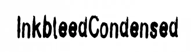
![InkbleedCondensed Frei Schriftart Herunterladen]() Herunterladen 279 Downloads@WebFont
Herunterladen 279 Downloads@WebFont -
( Fonts by AEnigma - www.aenigmafonts.com )
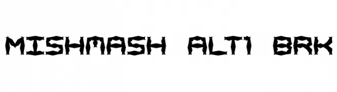
A bold, angular font with a jagged, fragmented design.
![Mishmash ALT1 BRK Frei Schriftart Herunterladen]() Herunterladen 279 Downloads@WebFont
Herunterladen 279 Downloads@WebFont -
( Copyright (c) 2013, Natanael Gama (www.ndiscovered.com . info(at)ndiscovered.com), with Reserved Font Name 'Exo' )
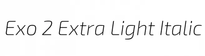
A sleek, modern, and slightly italicized font with thin, elongated characters.
![Exo 2 Extra Light Italic Frei Schriftart Herunterladen]() Herunterladen 279 Downloads@WebFont
Herunterladen 279 Downloads@WebFont -
( Fonts by Dieter Schumacher )
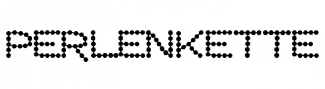
A dotted, decorative font with a playful and modern aesthetic.
![Perlenkette Frei Schriftart Herunterladen]() Herunterladen 279 Downloads@WebFont
Herunterladen 279 Downloads@WebFont -
( Fonts by Zetafonts - Personal-use only. For commercial use please contact owner. )
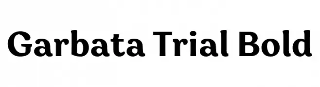
A bold, modern serif font with a classic touch, ideal for impactful designs.
![Garbata Trial Bold Frei Schriftart Herunterladen]() Herunterladen 279 Downloads@WebFont
Herunterladen 279 Downloads@WebFont -
( Fonts by www.gliphmaker.com. Personal-use only. For commercial use please contact owner. )
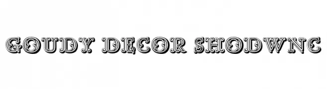
A bold, decorative font with intricate detailing and a three-dimensional appearance.
![Goudy Decor ShodwnC Frei Schriftart Herunterladen]() Herunterladen 279 Downloads@WebFont
Herunterladen 279 Downloads@WebFont -
( Fontomen - www.algonet.se/~j-j/ )
A playful, hand-drawn font with quirky, irregular letterforms.
![Tigger Frei Schriftart Herunterladen]() Herunterladen 279 Downloads@WebFont
Herunterladen 279 Downloads@WebFont -
( Fonts by Peter Wiegel - Personal-use only. For commercial use please contact owner. )
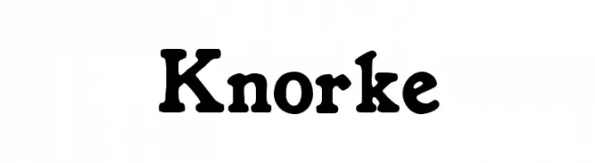
A bold, playful font with rounded characters and thick strokes.
![Knorke Frei Schriftart Herunterladen]() Herunterladen 279 Downloads@WebFont
Herunterladen 279 Downloads@WebFont -
![Sketch Frei Schriftart Herunterladen]() Herunterladen 279 Downloads@WebFont
Herunterladen 279 Downloads@WebFont -
![Tvdinner Frei Schriftart Herunterladen]() Herunterladen 279 Downloads@WebFont
Herunterladen 279 Downloads@WebFont -
![VOpen Frei Schriftart Herunterladen]() Herunterladen 279 Downloads@WebFont
Herunterladen 279 Downloads@WebFont -
( Fonts by a Neale Davidson - www.pixelsagas.com. Personal-use only. For commercial use please contact owner. )
A bold, angular font with a futuristic and edgy design.
![Visionaries 2 Frei Schriftart Herunterladen]() Herunterladen 279 Downloads@WebFont
Herunterladen 279 Downloads@WebFont -
( Fonts by a Max Infeld - XEROGRAPHER FONTS - xerographer.blogspot.com . Personal-use only. For commercial use please contact owner. )
A bold, halftone-patterned font with a retro, disco-inspired style.
![FrenchDisco Frei Schriftart Herunterladen]() Herunterladen 279 Downloads@WebFont
Herunterladen 279 Downloads@WebFont -
( Fonts by Attype Studio )
A bold, textured, hand-drawn style font with a playful and dynamic appearance.
![Tabby Display - Personal Use Frei Schriftart Herunterladen]() Herunterladen 279 Downloads@WebFont
Herunterladen 279 Downloads@WebFont -
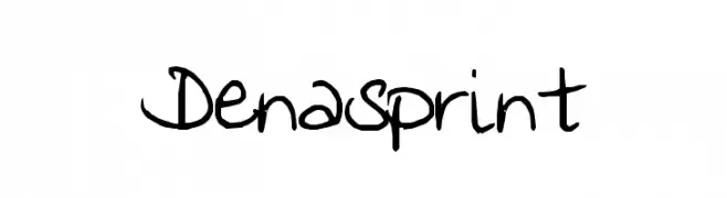
![Denasprint Frei Schriftart Herunterladen]() Herunterladen 279 Downloads@WebFont
Herunterladen 279 Downloads@WebFont -
( Fonts by Velvetyne Type Foundry - Personal-use only. For commercial use please contact owner. )
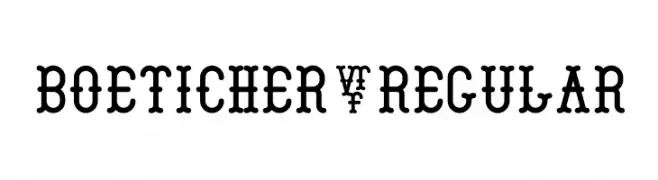
A bold, decorative font with rounded serifs and consistent spacing, perfect for headlines.
![Boeticher-Regular Frei Schriftart Herunterladen]() Herunterladen 279 Downloads@WebFont
Herunterladen 279 Downloads@WebFont -
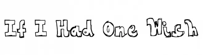
![If I Had One Wish Frei Schriftart Herunterladen]() Herunterladen 279 Downloads@WebFont
Herunterladen 279 Downloads@WebFont -
( Free for personal use - www.chrisvile.com/ )
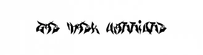
An aggressive, edgy font with sharp, angular lines and a bold presence.
![Gas Mask Warriors Frei Schriftart Herunterladen]() Herunterladen 279 Downloads@WebFont
Herunterladen 279 Downloads@WebFont -
( Fonts by Anomali Creative )
A playful, hand-drawn font with a whimsical and creative style.
![Funyard Frei Schriftart Herunterladen]() Herunterladen 279 Downloads@WebFont
Herunterladen 279 Downloads@WebFont -
( Fonts by Typocrisy Studio )
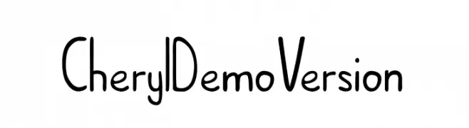
A playful, handwritten font with rounded, consistent strokes and a casual vibe.
![Cheryl_DemoVersion Frei Schriftart Herunterladen]() Herunterladen 279 Downloads@WebFont
Herunterladen 279 Downloads@WebFont -
( Fonts by wep )
A playful, hand-drawn style font with bold, irregular strokes.
![Ablasco Frei Schriftart Herunterladen]() Herunterladen 279 Downloads@WebFont
Herunterladen 279 Downloads@WebFont -
![nunacom Frei Schriftart Herunterladen]() Herunterladen 279 Downloads@WebFont
Herunterladen 279 Downloads@WebFont -
( Fonts by Risal Dan - Personal-use only. For commercial use please contact owner. )
A bold, geometric font with a modern and futuristic style.
![marwan Frei Schriftart Herunterladen]() Herunterladen 279 Downloads@WebFont
Herunterladen 279 Downloads@WebFont -
( Fonts by Situjuh Nazara - 7ntypes.com - Personal-use only. For commercial use please contact owner. )
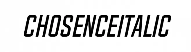
A modern, italic font with a condensed and dynamic style.
![Chosence Italic Frei Schriftart Herunterladen]() Herunterladen 279 Downloads@WebFont
Herunterladen 279 Downloads@WebFont -
( Jane Bond )
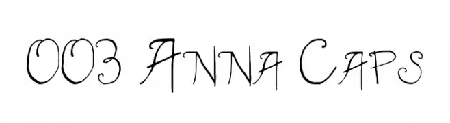
A whimsical, hand-drawn font with playful loops and swirls.
![003 Anna Caps Frei Schriftart Herunterladen]() Herunterladen 279 Downloads@WebFont
Herunterladen 279 Downloads@WebFont -
( Fonts by Daniel Gauthier )
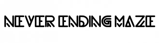
A geometric, maze-like font with bold, interconnected lines and a modern artistic style.
![never ending maze Frei Schriftart Herunterladen]() Herunterladen 279 Downloads@WebFont
Herunterladen 279 Downloads@WebFont -
( www.hanodedphotography.com )
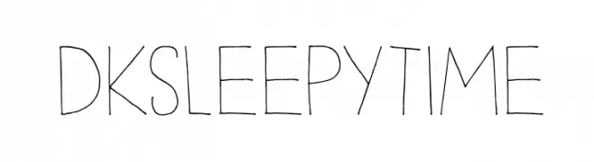
A whimsical, hand-drawn font with tall, slender characters and a playful style.
![DKSleepyTime Frei Schriftart Herunterladen]() Herunterladen 279 Downloads@WebFont
Herunterladen 279 Downloads@WebFont -
( Fonts by Leonard Posavec )
An ornate and decorative font with elaborate swirls and flourishes.
![Areson Frei Schriftart Herunterladen]() Herunterladen 279 Downloads@WebFont
Herunterladen 279 Downloads@WebFont -
( Fonts by Katika Hovorka )
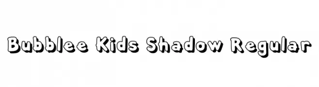
A playful, bold font with rounded characters and a shadow effect, perfect for fun projects.
![Bubblee Kids Shadow Regular Frei Schriftart Herunterladen]() Herunterladen 279 Downloads@WebFont
Herunterladen 279 Downloads@WebFont -
![Klaudia Bold Frei Schriftart Herunterladen]() Herunterladen 279 Downloads@WebFont
Herunterladen 279 Downloads@WebFont -
( Fonts by Daniel Zadorozny - www.iconian.com - Free for personal use )
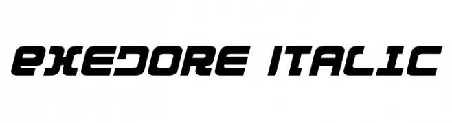
A bold, italicized font with a futuristic and sporty design.
![Exedore Italic Frei Schriftart Herunterladen]() Herunterladen 279 Downloads@WebFont
Herunterladen 279 Downloads@WebFont -
( Fonts by Daniel Zadorozny - www.iconian.com - Free for personal use )
A rugged, distressed font with a bold, grunge-inspired aesthetic.
![Tussle Frei Schriftart Herunterladen]() Herunterladen 279 Downloads@WebFont
Herunterladen 279 Downloads@WebFont -
( Fonts by Apostrophic Lab )
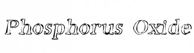
A hand-drawn, sketch-like font with bold outlines and artistic flair.
![Phosphorus Oxide Frei Schriftart Herunterladen]() Herunterladen 279 Downloads@WebFont
Herunterladen 279 Downloads@WebFont -
![Shaak Sans Regular Frei Schriftart Herunterladen]() Herunterladen 279 Downloads@WebFont
Herunterladen 279 Downloads@WebFont


Welche Schriften sind gerade am populärsten?
Poppins, Roboto, Montserrat, Open Sans und Lato sind wegen ihrer klaren Formen und breiten Einsetzbarkeit sehr gefragt – von Markenauftritt über Landingpages bis hin zu Postern.
Welche Fonts eignen sich für Logos?
Geometrische Sans‑Serifs (z. B. Poppins, Familien im Gotham‑Stil) sind ein häufiger Griff für sauberes, skalierbares Branding. Für eine persönlichere Note bleiben Scripts und Handschrift‑Stile beliebt. Kombinieren Sie einen prägnanten Headline‑Font mit einer neutralen Brotschrift für Wiedererkennung und Harmonie.
Wie oft wird die Top‑Liste aktualisiert?
Regelmäßig – basierend auf realen Downloads und Interaktionen. Schauen Sie öfter vorbei, um aufstrebende Favoriten früh zu entdecken.
💡 Tipp: Seite bookmarken – Trends wechseln schnell, und heutige Top‑Schriften inspirieren morgen vielleicht das Rebranding.