Willkommen bei den Top‑Schriften – hier treffen Beliebtheit und Qualität aufeinander. Das sind die in diesem Jahr am häufigsten heruntergeladenen und genutzten Fonts. Wenn Sie sichere Optionen für Logo, Web oder Social suchen, starten Sie hier.
Jeder Top‑Font überzeugt durch Balance, Lesbarkeit und Vielseitigkeit. Sie finden moderne Sans‑Serifs, elegante Scripts, Vintage‑Serifs und minimalistische Displays.
-
( Fonts by Kreative Korporation - www.kreativekorp.com )
A playful, handwritten font with rounded edges and a casual style.
 Herunterladen 277 Downloads@WebFont
 -
( Fonts by Patria Ari Typestudio - Patria Ari - Personal-use only. For commercial use please contact owner. )
A bold, modern sans-serif font with clean lines and uniform strokes.
![Slenco-Black Frei Schriftart Herunterladen]() Herunterladen 277 Downloads@WebFont
Herunterladen 277 Downloads@WebFont -
( Fonts by Zetafonts - Personal-use only. For commercial use please contact owner. )
A bold, condensed, modern font with tight spacing and clean lines.
![Heading Now Trial 06 Bold Frei Schriftart Herunterladen]() Herunterladen 277 Downloads@WebFont
Herunterladen 277 Downloads@WebFont -
( Fonts by Letterative Studio )
A casual, handwritten-style font with smooth, flowing curves.
![Richglory Frei Schriftart Herunterladen]() Herunterladen 277 Downloads@WebFont
Herunterladen 277 Downloads@WebFont -
( Fonts by Andi Moz )
A playful, whimsical handwritten font with flowing curves and loops.
![Beekeepers Frei Schriftart Herunterladen]() Herunterladen 277 Downloads@WebFont
Herunterladen 277 Downloads@WebFont -
( Fonts by Daniel Zadorozny - www.iconian.com - Free for personal use )
A bold, geometric font with a futuristic and edgy design.
![Vyper Frei Schriftart Herunterladen]() Herunterladen 277 Downloads@WebFont
Herunterladen 277 Downloads@WebFont -
( Fonts by Iconian Fonts )
A futuristic, geometric font with clean lines and a bold presence.
![Elite Danger Bold Frei Schriftart Herunterladen]() Herunterladen 277 Downloads@WebFont
Herunterladen 277 Downloads@WebFont -
( Fonts by Peter Wiegel - www.peter-wiegel.de - Personal-use only. For commercial use please contact owner. )
A bold, three-dimensional font with a strong geometric structure and shadow effect.
![Preussische VI 9 Schatten Frei Schriftart Herunterladen]() Herunterladen 277 Downloads@WebFont
Herunterladen 277 Downloads@WebFont -
( Fonts by FactoryType - Wahyu Rahmawan - Personal-use only. For commercial use please contact owner. )
A classic serif font with high contrast and elegant styling.
![Welland Demo Frei Schriftart Herunterladen]() Herunterladen 277 Downloads@WebFont
Herunterladen 277 Downloads@WebFont -
( Fonts by www.studiotypo.com - Personal-use only. For commercial use please contact owner. )
A modern, rounded, light italic font with a clean and approachable style.
![Typo Grotesk Rounded Light Italic Frei Schriftart Herunterladen]() Herunterladen 277 Downloads@WebFont
Herunterladen 277 Downloads@WebFont -
( Fonts by Daniel Zadorozny - www.iconian.com )
A bold, condensed italic font with sharp, jagged edges for dramatic impact.
![Young Frankenstein Condensed Italic Frei Schriftart Herunterladen]() Herunterladen 277 Downloads@WebFont
Herunterladen 277 Downloads@WebFont -
( Fonts by Kong Font - Personal-use only. For commercial use please contact owner. )
A bold, gothic-inspired font with sharp, angular lines and a strong presence.
![Buckingham Frei Schriftart Herunterladen]() Herunterladen 277 Downloads@WebFont
Herunterladen 277 Downloads@WebFont -
![EZ Sharpz Frei Schriftart Herunterladen]() Herunterladen 277 Downloads@WebFont
Herunterladen 277 Downloads@WebFont -
( Fonts by www.peter-wiegel.de. Personal-use only. For commercial use please contact owner. )
A bold, geometric outline font with a modern aesthetic and consistent character width.
![MakushkaQuadriga Frei Schriftart Herunterladen]() Herunterladen 277 Downloads@WebFont
Herunterladen 277 Downloads@WebFont -
( Fonts by Daniel Zadorozny - www.iconian.com )
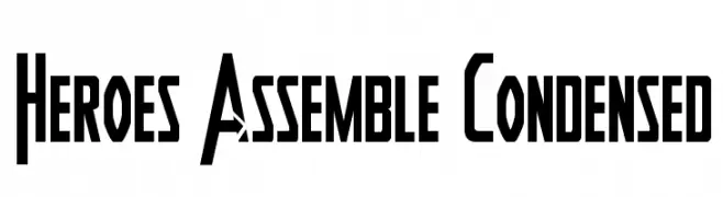
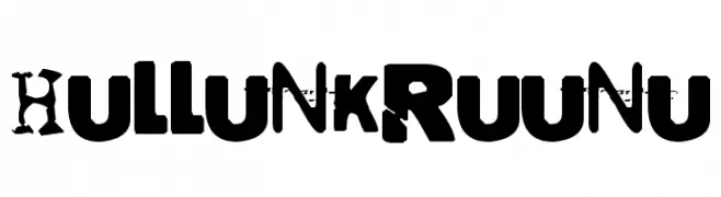
A bold, condensed font with sharp, angular edges, ideal for dynamic and powerful designs.
![Heroes Assemble Condensed Frei Schriftart Herunterladen]() Herunterladen 277 Downloads@WebFont
Herunterladen 277 Downloads@WebFont -
![Hullunkruunu Frei Schriftart Herunterladen]() Herunterladen 277 Downloads@WebFont
Herunterladen 277 Downloads@WebFont -
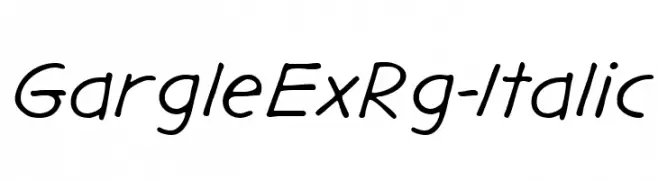
( Fonts by Typodermic Fonts )
A casual, handwritten-style font with a slight slant and smooth, consistent strokes.
![GargleExRg-Italic Frei Schriftart Herunterladen]() Herunterladen 277 Downloads@WebFont
Herunterladen 277 Downloads@WebFont -
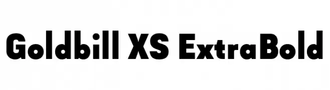
( Fonts by Wahyu & Sani Co. - Sani Sanjaya - Personal-use only. For commercial use please contact owner. )
A bold, modern font with thick strokes and a strong presence.
![Goldbill XS ExtraBold Frei Schriftart Herunterladen]() Herunterladen 277 Downloads@WebFont
Herunterladen 277 Downloads@WebFont -
( Herofonts - www.herofonts.com )
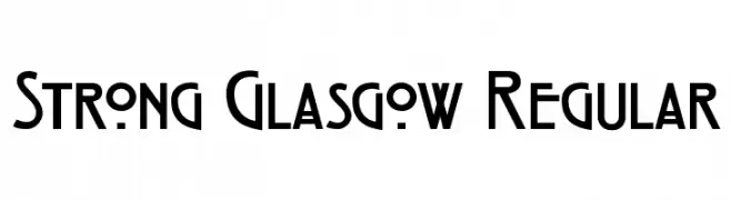
A bold, geometric font with strong, angular lines and a modern aesthetic.
![Strong Glasgow Regular Frei Schriftart Herunterladen]() Herunterladen 277 Downloads@WebFont
Herunterladen 277 Downloads@WebFont -
( be.net/gr81life )
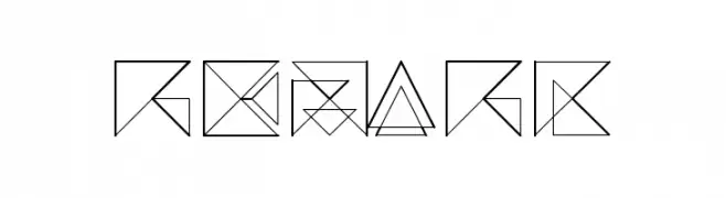
A geometric and abstract font with intersecting lines and shapes.
![REMARK Frei Schriftart Herunterladen]() Herunterladen 277 Downloads@WebFont
Herunterladen 277 Downloads@WebFont -
![AntykwaTorunskaCondLight-Regular Frei Schriftart Herunterladen]() Herunterladen 277 Downloads@WebFont
Herunterladen 277 Downloads@WebFont -
( Fonts by a David Fens. Personal-use only. For commercial use please contact owner. )
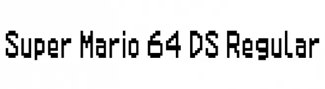
A pixelated, retro-style font inspired by classic video games.
![Super Mario 64 DS Regular Frei Schriftart Herunterladen]() Herunterladen 277 Downloads@WebFont
Herunterladen 277 Downloads@WebFont -
( Fonts by Miss Tiina at www.misstiina.com (please check the website before use) )
A playful, informal handwritten font with irregular strokes and a whimsical appearance.
![MTF Gavin Frei Schriftart Herunterladen]() Herunterladen 277 Downloads@WebFont
Herunterladen 277 Downloads@WebFont -
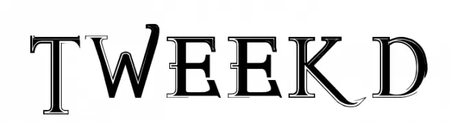
![TWEEKD Frei Schriftart Herunterladen]() Herunterladen 277 Downloads@WebFont
Herunterladen 277 Downloads@WebFont -
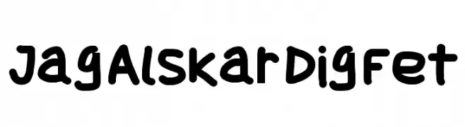
![Jag Alskar Dig Fet Frei Schriftart Herunterladen]() Herunterladen 277 Downloads@WebFont
Herunterladen 277 Downloads@WebFont -
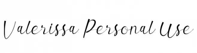
( StudioAKTYPE - Jani Nurman - www.creativefabrica.com/designer/studioaktype/ )
A flowing, cursive script with elegant, interconnected strokes.
![Valerissa Personal Use Frei Schriftart Herunterladen]() Herunterladen 277 Downloads@WebFont
Herunterladen 277 Downloads@WebFont -
![SLBookArts Frei Schriftart Herunterladen]() Herunterladen 277 Downloads@WebFont
Herunterladen 277 Downloads@WebFont -
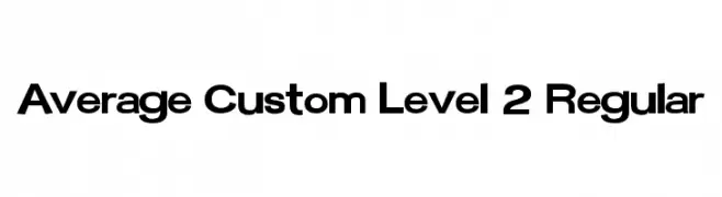
![Average Custom Level 2 Regular Frei Schriftart Herunterladen]() Herunterladen 277 Downloads@WebFont
Herunterladen 277 Downloads@WebFont -
( www.leodsen.com )
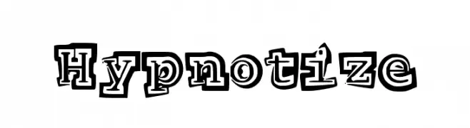
A bold, playful font with a 3D shadow effect and hand-drawn style.
![Hypnotize Frei Schriftart Herunterladen]() Herunterladen 277 Downloads@WebFont
Herunterladen 277 Downloads@WebFont -
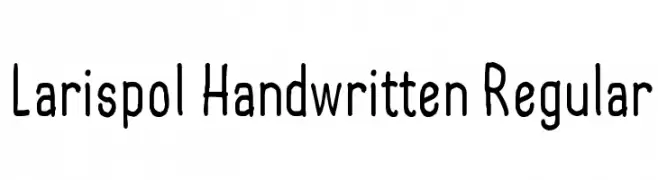
( Linafis Studio - Ahmad Fashihullisan )
A playful handwritten font with smooth curves and a casual style.
![Larispol Handwritten Regular Frei Schriftart Herunterladen]() Herunterladen 277 Downloads@WebFont
Herunterladen 277 Downloads@WebFont -
![FlorenceHC Frei Schriftart Herunterladen]() Herunterladen 277 Downloads
Herunterladen 277 Downloads -
( Fonts by Omega Font Labs )
A diverse icon set featuring global cultural and symbolic motifs.
![Cultural Icons Frei Schriftart Herunterladen]() Herunterladen 277 Downloads@WebFont
Herunterladen 277 Downloads@WebFont -
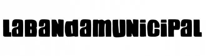
( Fonts by Woodcutter )
A bold, playful font with thick, rounded strokes and a friendly appearance.
![La Banda Municipal Frei Schriftart Herunterladen]() Herunterladen 277 Downloads@WebFont
Herunterladen 277 Downloads@WebFont -
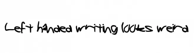
![Left handed writing looks weird Frei Schriftart Herunterladen]() Herunterladen 277 Downloads@WebFont
Herunterladen 277 Downloads@WebFont -
( Fonts by Tokopress )
A bold, edgy font with sharp, angular serifs and a distressed texture.
![KONSTANTINE Frei Schriftart Herunterladen]() Herunterladen 277 Downloads@WebFont
Herunterladen 277 Downloads@WebFont


Welche Schriften sind gerade am populärsten?
Poppins, Roboto, Montserrat, Open Sans und Lato sind wegen ihrer klaren Formen und breiten Einsetzbarkeit sehr gefragt – von Markenauftritt über Landingpages bis hin zu Postern.
Welche Fonts eignen sich für Logos?
Geometrische Sans‑Serifs (z. B. Poppins, Familien im Gotham‑Stil) sind ein häufiger Griff für sauberes, skalierbares Branding. Für eine persönlichere Note bleiben Scripts und Handschrift‑Stile beliebt. Kombinieren Sie einen prägnanten Headline‑Font mit einer neutralen Brotschrift für Wiedererkennung und Harmonie.
Wie oft wird die Top‑Liste aktualisiert?
Regelmäßig – basierend auf realen Downloads und Interaktionen. Schauen Sie öfter vorbei, um aufstrebende Favoriten früh zu entdecken.
💡 Tipp: Seite bookmarken – Trends wechseln schnell, und heutige Top‑Schriften inspirieren morgen vielleicht das Rebranding.