Willkommen bei den Top‑Schriften – hier treffen Beliebtheit und Qualität aufeinander. Das sind die in diesem Jahr am häufigsten heruntergeladenen und genutzten Fonts. Wenn Sie sichere Optionen für Logo, Web oder Social suchen, starten Sie hier.
Jeder Top‑Font überzeugt durch Balance, Lesbarkeit und Vielseitigkeit. Sie finden moderne Sans‑Serifs, elegante Scripts, Vintage‑Serifs und minimalistische Displays.
-
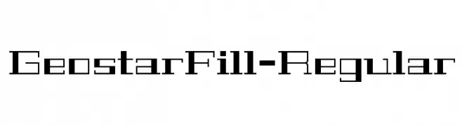
( Copyright (c) 2011, Joe Prince, Admix Designs (http://www.admixdesigns.com/) )
A geometric, futuristic font with angular, blocky letterforms.
 Herunterladen 273 Downloads@WebFont
 -
![Slimamif Frei Schriftart Herunterladen]() Herunterladen 273 Downloads@WebFont
Herunterladen 273 Downloads@WebFont -
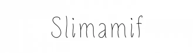
( Fonts by Jonathan S. Harris - Personal-use only. For commercial use please contact owner. )
A dynamic, handwritten font with sharp, angular strokes and a lively appearance.
![Sticky Pops Frei Schriftart Herunterladen]() Herunterladen 273 Downloads@WebFont
Herunterladen 273 Downloads@WebFont -
![WALL PAINTING Frei Schriftart Herunterladen]() Herunterladen 273 Downloads@WebFont
Herunterladen 273 Downloads@WebFont -
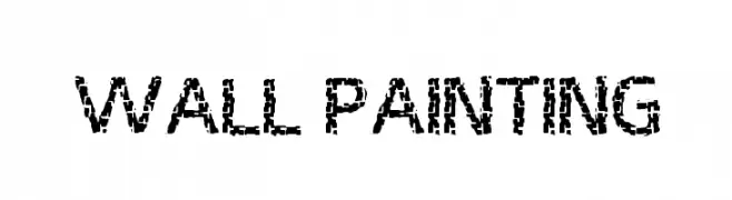
( www.porcelainpaperandpie.com )
A decorative font with dotted outlines and playful, whimsical characters.
![Indifference Frei Schriftart Herunterladen]() Herunterladen 273 Downloads@WebFont
Herunterladen 273 Downloads@WebFont -
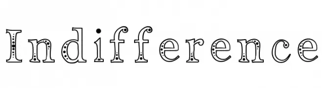
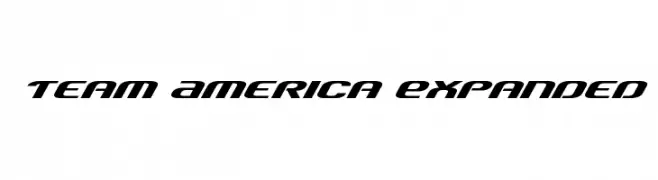
( Fonts by Daniel Zadorozny - www.iconian.com - Free for personal use )
A bold, slanted font with a futuristic and dynamic style.
![Team America Expanded Frei Schriftart Herunterladen]() Herunterladen 273 Downloads@WebFont
Herunterladen 273 Downloads@WebFont -
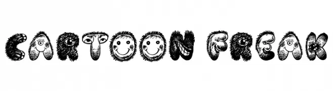
( Fonts by Jonathan S. Harris )
A playful, cartoonish font with unique, textured characters.
![Cartoon Freak Frei Schriftart Herunterladen]() Herunterladen 273 Downloads@WebFont
Herunterladen 273 Downloads@WebFont -
![Funiko Frei Schriftart Herunterladen]() Herunterladen 273 Downloads@WebFont
Herunterladen 273 Downloads@WebFont -
![Lombax Frei Schriftart Herunterladen]() Herunterladen 273 Downloads@WebFont
Herunterladen 273 Downloads@WebFont -
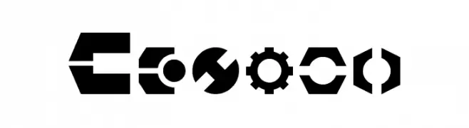
( Fonts by Daniel Zadorozny - www.iconian.com - Free for personal use )
A bold, geometric font with a futuristic and industrial style.
![Gearhead Expanded Frei Schriftart Herunterladen]() Herunterladen 273 Downloads@WebFont
Herunterladen 273 Downloads@WebFont -
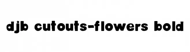
![DJB Cutouts-Flowers Bold Frei Schriftart Herunterladen]() Herunterladen 273 Downloads@WebFont
Herunterladen 273 Downloads@WebFont -
![Glaring Frei Schriftart Herunterladen]() Herunterladen 273 Downloads@WebFont
Herunterladen 273 Downloads@WebFont -
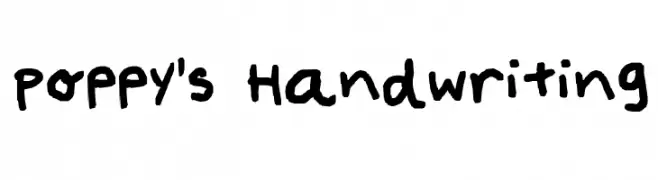
![Poppy's Handwriting Frei Schriftart Herunterladen]() Herunterladen 273 Downloads@WebFont
Herunterladen 273 Downloads@WebFont -
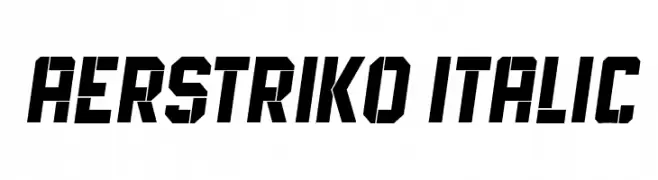
( Fonts by Vladimir Nikolic - www.creativefabrica.com/designer/vladimirnikolic/ - Personal-use only. For commercial use please contact owner. )
A bold, angular italic font with a futuristic and dynamic style.
![Aerstriko Italic Frei Schriftart Herunterladen]() Herunterladen 273 Downloads@WebFont
Herunterladen 273 Downloads@WebFont -
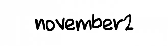
( November Clark )
A playful, bold handwritten font with a casual and friendly style.
![november2 Frei Schriftart Herunterladen]() Herunterladen 273 Downloads@WebFont
Herunterladen 273 Downloads@WebFont -
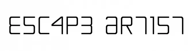
( Fonts by Daniel Zadorozny - www.iconian.com )
A modern, geometric font with clean lines and a structured appearance.
![Escape Artist Frei Schriftart Herunterladen]() Herunterladen 273 Downloads@WebFont
Herunterladen 273 Downloads@WebFont -
( Fonts by Dan P. Lyons - Personal-use only. For commercial use please contact owner. )
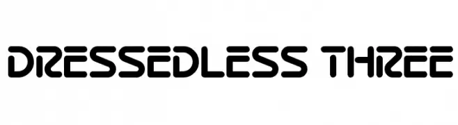
A bold, rounded font with a futuristic and modern design.
![Dressedless Three Frei Schriftart Herunterladen]() Herunterladen 273 Downloads@WebFont
Herunterladen 273 Downloads@WebFont -
![Structure Sans Regular Frei Schriftart Herunterladen]() Herunterladen 273 Downloads@WebFont
Herunterladen 273 Downloads@WebFont -
( Fonts by www.gliphmaker.com. Personal-use only. For commercial use please contact owner. )
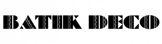
A bold, decorative font with intricate batik-inspired patterns.
![Batik Deco Frei Schriftart Herunterladen]() Herunterladen 273 Downloads@WebFont
Herunterladen 273 Downloads@WebFont -
( Peter Wiegel - www.peter-wiegel.de/ )
A modern, geometric font with rounded edges and a minimalist style.
![Googee Frei Schriftart Herunterladen]() Herunterladen 273 Downloads@WebFont
Herunterladen 273 Downloads@WebFont -
![V5 Loxica Lixera Frei Schriftart Herunterladen]() Herunterladen 273 Downloads@WebFont
Herunterladen 273 Downloads@WebFont -
![Klevin Frei Schriftart Herunterladen]() Herunterladen 273 Downloads@WebFont
Herunterladen 273 Downloads@WebFont -
( Public domain / GPL / OFL - www.finck.co )
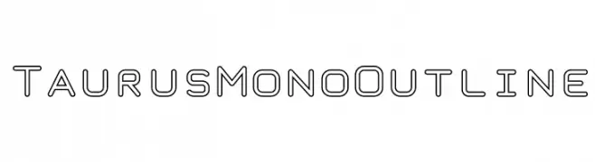
A modern, monospaced outline font with a futuristic style.
![TaurusMonoOutline Frei Schriftart Herunterladen]() Herunterladen 273 Downloads@WebFont
Herunterladen 273 Downloads@WebFont -
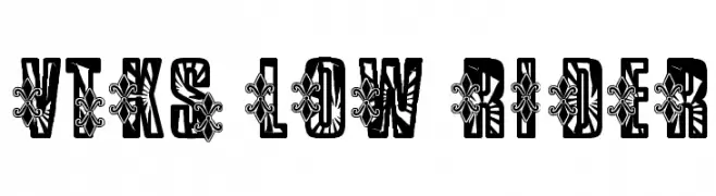
( Fonts by Douglas Vitkauskas - www.vtksdesign.com. Personal-use only. For commercial use please contact owner. )
A bold, decorative font with intricate patterns and thick strokes.
![VTKS Low Rider Frei Schriftart Herunterladen]() Herunterladen 273 Downloads@WebFont
Herunterladen 273 Downloads@WebFont -
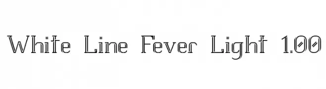
( Fonts by Graham Meade - GemFonts )
A modern, decorative font with outlined, hollow characters.
![White Line Fever Light 1.00 Frei Schriftart Herunterladen]() Herunterladen 273 Downloads@WebFont
Herunterladen 273 Downloads@WebFont -
( Fonts by Andrew Hart - dirt2.com )
A playful, cursive font with flowing loops and decorative swirls.
![LittleBlissBold Frei Schriftart Herunterladen]() Herunterladen 273 Downloads@WebFont
Herunterladen 273 Downloads@WebFont -
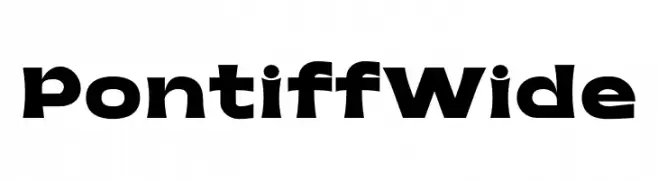
( Fonts by Jehoo Creative - Anwar Patihan - Personal-use only. For commercial use please contact owner. )
A bold, wide font with geometric shapes and a modern aesthetic.
![Pontiff Wide Frei Schriftart Herunterladen]() Herunterladen 273 Downloads@WebFont
Herunterladen 273 Downloads@WebFont -
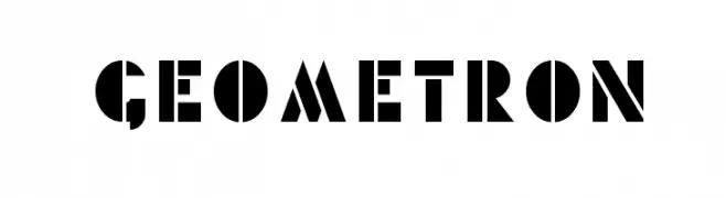
( 3rd Eye Graphics )
A bold, geometric font with angular shapes and a modern aesthetic.
![Geometron Frei Schriftart Herunterladen]() Herunterladen 273 Downloads@WebFont
Herunterladen 273 Downloads@WebFont -
( Fonts by Alex Squack - http://twitter.com/NoGoodToMe )
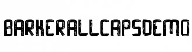
A bold, distressed, hand-drawn uppercase font with a rugged, vintage look.
![Barker-AllCapsDemo Frei Schriftart Herunterladen]() Herunterladen 273 Downloads@WebFont
Herunterladen 273 Downloads@WebFont -
( Fonts by SnailFonts )
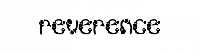
A bold, decorative font with abstract, organic shapes and a playful aesthetic.
![reverence Frei Schriftart Herunterladen]() Herunterladen 273 Downloads@WebFont
Herunterladen 273 Downloads@WebFont -
( Fonts by wepfont - Wahyu Eka Prasetya - Personal-use only. For commercial use please contact owner. )
A bold, dynamic font with sharp, angular edges and a hand-drawn feel.
![Api Nyala Frei Schriftart Herunterladen]() Herunterladen 273 Downloads@WebFont
Herunterladen 273 Downloads@WebFont -
( http://www.typhoontype.net/category/fonts/ Sponsoren Schriftart )
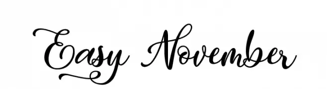
An elegant script font with flowing, interconnected letters and decorative swashes.
![Easy November Frei Schriftart Herunterladen]() Herunterladen 273 Downloads
Herunterladen 273 Downloads -
( Fonts by www.blambot.com )
A bold, playful font with a comic book style and rounded, slightly slanted characters.
![SundayComicsBB-Bold Frei Schriftart Herunterladen]() Herunterladen 273 Downloads@WebFont
Herunterladen 273 Downloads@WebFont -
( Fonts by Carolina Valtuille )
A playful, handwritten font with rounded edges and an informal style.
![Lunes Frei Schriftart Herunterladen]() Herunterladen 273 Downloads@WebFont
Herunterladen 273 Downloads@WebFont -
( Fonts by Adien Gunarta - fontasticindonesia.blogspot.com )
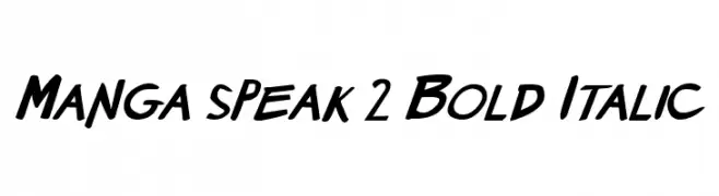
A bold, italic font with a dynamic and playful style.
![Manga speak 2 Bold Italic Frei Schriftart Herunterladen]() Herunterladen 273 Downloads@WebFont
Herunterladen 273 Downloads@WebFont


Welche Schriften sind gerade am populärsten?
Poppins, Roboto, Montserrat, Open Sans und Lato sind wegen ihrer klaren Formen und breiten Einsetzbarkeit sehr gefragt – von Markenauftritt über Landingpages bis hin zu Postern.
Welche Fonts eignen sich für Logos?
Geometrische Sans‑Serifs (z. B. Poppins, Familien im Gotham‑Stil) sind ein häufiger Griff für sauberes, skalierbares Branding. Für eine persönlichere Note bleiben Scripts und Handschrift‑Stile beliebt. Kombinieren Sie einen prägnanten Headline‑Font mit einer neutralen Brotschrift für Wiedererkennung und Harmonie.
Wie oft wird die Top‑Liste aktualisiert?
Regelmäßig – basierend auf realen Downloads und Interaktionen. Schauen Sie öfter vorbei, um aufstrebende Favoriten früh zu entdecken.
💡 Tipp: Seite bookmarken – Trends wechseln schnell, und heutige Top‑Schriften inspirieren morgen vielleicht das Rebranding.