Willkommen bei den Top‑Schriften – hier treffen Beliebtheit und Qualität aufeinander. Das sind die in diesem Jahr am häufigsten heruntergeladenen und genutzten Fonts. Wenn Sie sichere Optionen für Logo, Web oder Social suchen, starten Sie hier.
Jeder Top‑Font überzeugt durch Balance, Lesbarkeit und Vielseitigkeit. Sie finden moderne Sans‑Serifs, elegante Scripts, Vintage‑Serifs und minimalistische Displays.
-
( www.itrydiy.me )
A modern, rounded sans-serif font with balanced spacing and clear characters.
 Herunterladen 271 Downloads@WebFont
 -
( Cioroianu Stefan Cristian )
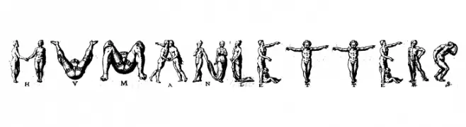
A unique font where human figures form each letter, offering a bold and artistic style.
![Human letters Frei Schriftart Herunterladen]() Herunterladen 271 Downloads@WebFont
Herunterladen 271 Downloads@WebFont -
( Fonts by SnailFonts )
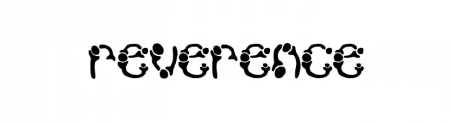
A bold, decorative font with abstract, organic shapes and a playful aesthetic.
![reverence Frei Schriftart Herunterladen]() Herunterladen 271 Downloads@WebFont
Herunterladen 271 Downloads@WebFont -
( Fonts by www.creatingkeepsakes.com )
A playful, handwritten font with a whimsical and casual style.
![SS Fun Frei Schriftart Herunterladen]() Herunterladen 271 Downloads@WebFont
Herunterladen 271 Downloads@WebFont -
( Fonts by Mehibi )
A bold, playful font with exaggerated curves and a lively style.
![jungleroar Frei Schriftart Herunterladen]() Herunterladen 271 Downloads@WebFont
Herunterladen 271 Downloads@WebFont -
( Fonts by ShyFonts )
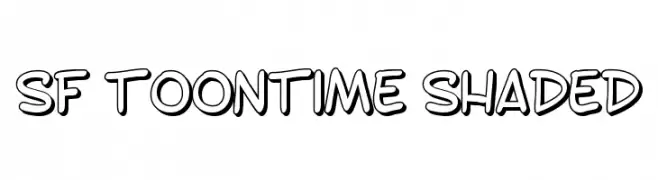
A playful, cartoonish font with a bold, shaded style.
![SF Toontime Shaded Frei Schriftart Herunterladen]() Herunterladen 271 Downloads@WebFont
Herunterladen 271 Downloads@WebFont -
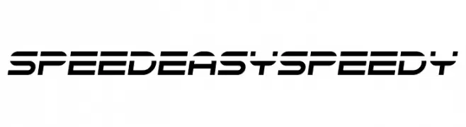
( Chequered Ink - chequered.ink/ )
A futuristic, dynamic font with sharp angles and sleek lines.
![Speedeasy Speedy Frei Schriftart Herunterladen]() Herunterladen 271 Downloads@WebFont
Herunterladen 271 Downloads@WebFont -
( Fonts by Adien Gunarta - fontasticindonesia.blogspot.com )
A bold, italic font with a dynamic and playful style.
![Manga speak 2 Bold Italic Frei Schriftart Herunterladen]() Herunterladen 271 Downloads@WebFont
Herunterladen 271 Downloads@WebFont -
![SUMMERCAMP Ialic Frei Schriftart Herunterladen]() Herunterladen 271 Downloads@WebFont
Herunterladen 271 Downloads@WebFont -
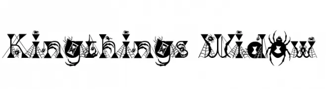
( Font by kingthingsfonts.co.uk )
A decorative font with spider and web motifs, perfect for Halloween themes.
![Kingthings Widow Frei Schriftart Herunterladen]() Herunterladen 271 Downloads@WebFont
Herunterladen 271 Downloads@WebFont -
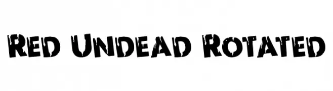
( Fonts by Iconian Fonts )
A bold, distressed font with a rugged, grunge style.
![Red Undead Rotated Frei Schriftart Herunterladen]() Herunterladen 271 Downloads@WebFont
Herunterladen 271 Downloads@WebFont -
( Fonts by sronstudio - Yusron Billah - Personal-use only. For commercial use please contact owner. )
A playful, handwritten font with rounded edges and a casual style.
![Sandy House Frei Schriftart Herunterladen]() Herunterladen 271 Downloads@WebFont
Herunterladen 271 Downloads@WebFont -
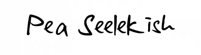
( Free for a personal use. For a commercial use please visit www.kevinandamanda.com )
A casual, handwritten font with fluid strokes and a playful style.
![Pea Seelekish Frei Schriftart Herunterladen]() Herunterladen 271 Downloads@WebFont
Herunterladen 271 Downloads@WebFont -
![Sixgun Frei Schriftart Herunterladen]() Herunterladen 271 Downloads@WebFont
Herunterladen 271 Downloads@WebFont -
( Fonts by Knackpack Studio - www.knackpack.studio - Personal-use only. For commercial use please contact owner. )
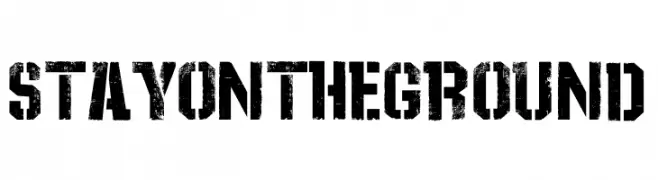
A bold, distressed font with a vintage, industrial feel.
![Stay On The Ground Frei Schriftart Herunterladen]() Herunterladen 271 Downloads@WebFont
Herunterladen 271 Downloads@WebFont -
( Fonts by Go Letter )
A playful, bold, and handwritten font with a quirky and friendly style.
![Crocodile Frei Schriftart Herunterladen]() Herunterladen 271 Downloads@WebFont
Herunterladen 271 Downloads@WebFont -
( Fonts by arukidz.fl )
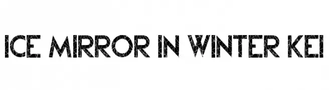
A bold, shattered glass effect font with a modern and decorative style.
![Ice Mirror in Winter Kei Frei Schriftart Herunterladen]() Herunterladen 271 Downloads@WebFont
Herunterladen 271 Downloads@WebFont -
( Fonts by Mytype Studio - Mhd Husaini - Personal-use only. For commercial use please contact owner. )
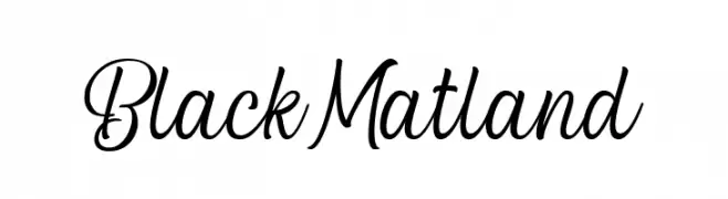
A flowing, cursive font with elegant, connected strokes.
![Black Matland Frei Schriftart Herunterladen]() Herunterladen 271 Downloads@WebFont
Herunterladen 271 Downloads@WebFont -
( Download for Personal Use. For Commercial: http://www.k-type.com )
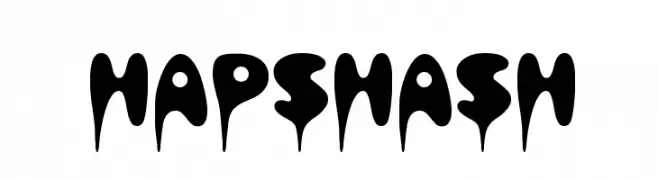
A bold, dripping font with a playful, liquid-like appearance.
![Hapshash Frei Schriftart Herunterladen]() Herunterladen 271 Downloads@WebFont
Herunterladen 271 Downloads@WebFont -
( Fonts by Leonard Posavec - leosupply.co - Personal-use only. For commercial use please contact owner. )
A bold, expressive handwritten font with dynamic strokes and artistic flair.
![Cup of Sea Frei Schriftart Herunterladen]() Herunterladen 271 Downloads@WebFont
Herunterladen 271 Downloads@WebFont -
( Fonts by Dustin Norlander - www.cheapskatefonts.com )
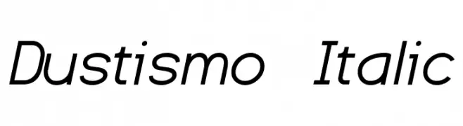
A modern, italic font with clean lines and a dynamic appearance.
![Dustismo Italic Frei Schriftart Herunterladen]() Herunterladen 271 Downloads@WebFont
Herunterladen 271 Downloads@WebFont -
![Gangga-Free-Font Frei Schriftart Herunterladen]() Herunterladen 271 Downloads@WebFont
Herunterladen 271 Downloads@WebFont -
![Bullet Trace 7 Frei Schriftart Herunterladen]() Herunterladen 271 Downloads@WebFont
Herunterladen 271 Downloads@WebFont -
![Winged Frei Schriftart Herunterladen]() Herunterladen 271 Downloads@WebFont
Herunterladen 271 Downloads@WebFont -
( Fonts by Misti`s Fonts - mistifonts.com - Personal-use only. For commercial use please contact owner. )
A textured, hand-drawn font with a rough, artistic style.
![Killing Loneliness Frei Schriftart Herunterladen]() Herunterladen 271 Downloads@WebFont
Herunterladen 271 Downloads@WebFont -
![Voco Script SSi Frei Schriftart Herunterladen]() Herunterladen 271 Downloads
Herunterladen 271 Downloads -
![SF Phosphorus Sulphide Frei Schriftart Herunterladen]() Herunterladen 271 Downloads@WebFont
Herunterladen 271 Downloads@WebFont -
![Tobin Tax Frei Schriftart Herunterladen]() Herunterladen 271 Downloads@WebFont
Herunterladen 271 Downloads@WebFont -
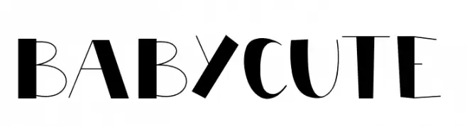
( Fonts by Fanastudio )
A playful and whimsical font with dynamic curves and varying stroke widths.
![BABYCUTE Frei Schriftart Herunterladen]() Herunterladen 271 Downloads@WebFont
Herunterladen 271 Downloads@WebFont -
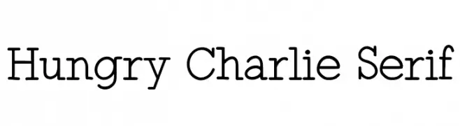
( Fonts by Lettering Mom )
A modern serif font with clean lines and medium contrast, ideal for elegant designs.
![Hungry Charlie Serif Frei Schriftart Herunterladen]() Herunterladen 271 Downloads@WebFont
Herunterladen 271 Downloads@WebFont -
( Fonts by Serge Shi - www.behance.net/positivart )
A modern, geometric font with a clean and precise design.
![Cony-Light Frei Schriftart Herunterladen]() Herunterladen 271 Downloads@WebFont
Herunterladen 271 Downloads@WebFont -
( Fonts by niyos - Nur Huda - Personal-use only. For commercial use please contact owner. )
A lively, expressive script font with a handwritten feel.
![adela Frei Schriftart Herunterladen]() Herunterladen 271 Downloads@WebFont
Herunterladen 271 Downloads@WebFont -
( Fonts by Ditya Ananto )
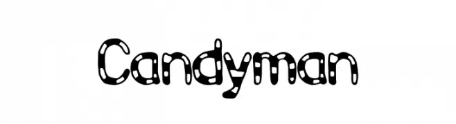
A playful, polka-dotted font with bold, rounded characters.
![Candyman Frei Schriftart Herunterladen]() Herunterladen 271 Downloads@WebFont
Herunterladen 271 Downloads@WebFont -
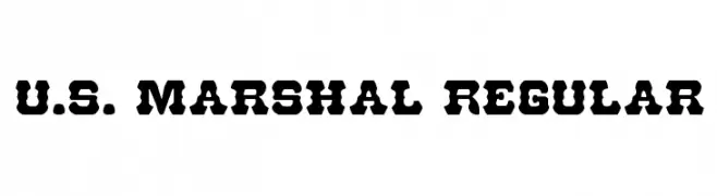
( Fonts by Daniel Zadorozny - www.iconian.com - Free for personal use )
A bold, vintage-style font with a Western flair and distinctive cutouts.
![U.S. Marshal Regular Frei Schriftart Herunterladen]() Herunterladen 271 Downloads@WebFont
Herunterladen 271 Downloads@WebFont -
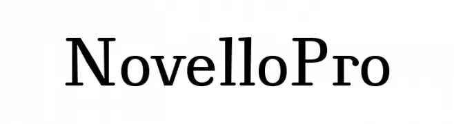
( Fonts by Ingo Zimmermann - www.ingofonts.com )
A classic serif font with elegant strokes and pronounced serifs.
![NovelloPro Frei Schriftart Herunterladen]() Herunterladen 271 Downloads@WebFont
Herunterladen 271 Downloads@WebFont


Welche Schriften sind gerade am populärsten?
Poppins, Roboto, Montserrat, Open Sans und Lato sind wegen ihrer klaren Formen und breiten Einsetzbarkeit sehr gefragt – von Markenauftritt über Landingpages bis hin zu Postern.
Welche Fonts eignen sich für Logos?
Geometrische Sans‑Serifs (z. B. Poppins, Familien im Gotham‑Stil) sind ein häufiger Griff für sauberes, skalierbares Branding. Für eine persönlichere Note bleiben Scripts und Handschrift‑Stile beliebt. Kombinieren Sie einen prägnanten Headline‑Font mit einer neutralen Brotschrift für Wiedererkennung und Harmonie.
Wie oft wird die Top‑Liste aktualisiert?
Regelmäßig – basierend auf realen Downloads und Interaktionen. Schauen Sie öfter vorbei, um aufstrebende Favoriten früh zu entdecken.
💡 Tipp: Seite bookmarken – Trends wechseln schnell, und heutige Top‑Schriften inspirieren morgen vielleicht das Rebranding.