Willkommen bei den Top‑Schriften – hier treffen Beliebtheit und Qualität aufeinander. Das sind die in diesem Jahr am häufigsten heruntergeladenen und genutzten Fonts. Wenn Sie sichere Optionen für Logo, Web oder Social suchen, starten Sie hier.
Jeder Top‑Font überzeugt durch Balance, Lesbarkeit und Vielseitigkeit. Sie finden moderne Sans‑Serifs, elegante Scripts, Vintage‑Serifs und minimalistische Displays.
-
( Fonts by www.typedepot.com )
A modern, geometric sans-serif font with consistent stroke width and clear readability.
 Herunterladen 3587 Downloads@WebFont
 -
( Fonts by www.peter-wiegel.de. Personal-use only. For commercial use please contact owner. )
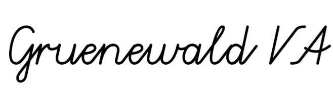
A cursive, handwritten-style font with smooth, connected letters and a natural flow.
![Gruenewald VA Frei Schriftart Herunterladen]() Herunterladen 3587 Downloads@WebFont
Herunterladen 3587 Downloads@WebFont -
( Fonts by www.Fontfabric.com )
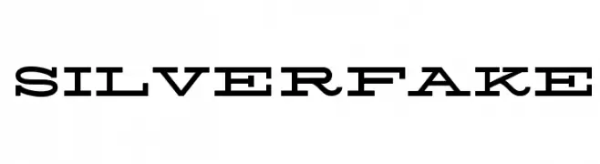
A bold, modern serif font with strong, angular serifs and cohesive design.
![Silverfake Frei Schriftart Herunterladen]() Herunterladen 3585 Downloads@WebFont
Herunterladen 3585 Downloads@WebFont -
![Jaipur Frei Schriftart Herunterladen]() Herunterladen 3585 Downloads@WebFont
Herunterladen 3585 Downloads@WebFont -
( Fonts by Spork Thug Typography - Josh Wilhelm - www.lifewithouttaffy.com/taffy/blog )
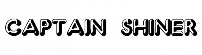
A bold, 3D-effect font with a playful and dynamic style.
![Captain Shiner Frei Schriftart Herunterladen]() Herunterladen 3585 Downloads@WebFont
Herunterladen 3585 Downloads@WebFont -
( Fonts by Greta Thunberg - Personal-use only. For commercial use please contact owner. )
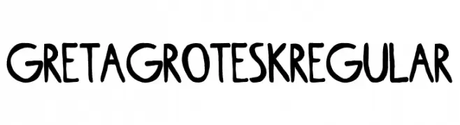
A bold, hand-drawn font with a playful and informal style.
![Greta Grotesk Regular Frei Schriftart Herunterladen]() Herunterladen 3584 Downloads@WebFont
Herunterladen 3584 Downloads@WebFont -
( Fonts by Manfred Klein. Free for private and charity use. Free for commercial with donation to organizations )
A bold, decorative font with artistic flair and dynamic letterforms.
![Cuban Frei Schriftart Herunterladen]() Herunterladen 3583 Downloads@WebFont
Herunterladen 3583 Downloads@WebFont -
( Fonts by Chris Simpson - Personal-use only. For commercial use please contact owner. )
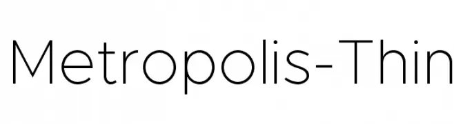
A sleek, modern font with clean lines and uniform stroke width.
![Metropolis-Thin Frei Schriftart Herunterladen]() Herunterladen 3582 Downloads@WebFont
Herunterladen 3582 Downloads@WebFont -
![Accordion Frei Schriftart Herunterladen]() Herunterladen 3582 Downloads@WebFont
Herunterladen 3582 Downloads@WebFont -
( Fonts by Ryoichi Tsunekawa - www.dharmatype.com )
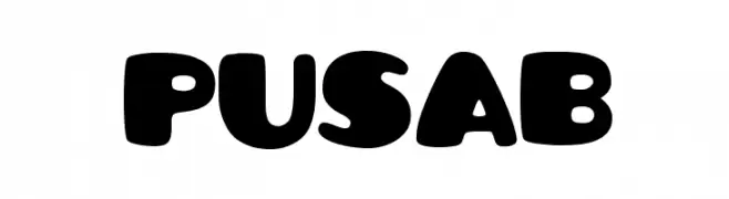
A bold, playful font with rounded, bubble-like characters.
![Pusab Frei Schriftart Herunterladen]() Herunterladen 3582 Downloads@WebFont
Herunterladen 3582 Downloads@WebFont -
( Copyright 2014 The Catamaran Authors (pria.ravichandran@gmail.com) )
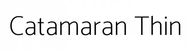
A modern, thin sans-serif font with a clean and elegant design.
![Catamaran Thin Frei Schriftart Herunterladen]() Herunterladen 3579 Downloads@WebFont
Herunterladen 3579 Downloads@WebFont -
( Free for personal use - www.studiotypo.com )
A bold, playful font with thick, rounded characters.
![Angella Frei Schriftart Herunterladen]() Herunterladen 3579 Downloads@WebFont
Herunterladen 3579 Downloads@WebFont -
( Fonts by ShyFonts )
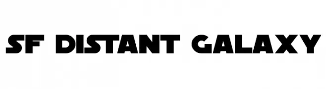
A bold, futuristic font with geometric shapes and a sci-fi aesthetic.
![SF Distant Galaxy Frei Schriftart Herunterladen]() Herunterladen 3579 Downloads@WebFont
Herunterladen 3579 Downloads@WebFont -
( Fonts by Namara Creative Studio - Personal-use only. For commercial use please contact owner. )
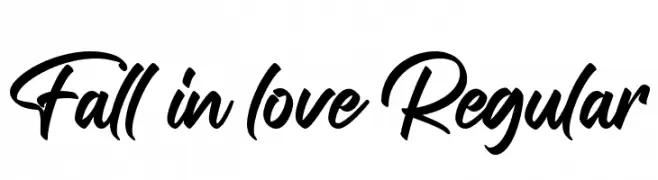
A bold, expressive script font with fluid strokes and dynamic curves.
![Fall in love Regular Frei Schriftart Herunterladen]() Herunterladen 3578 Downloads@WebFont
Herunterladen 3578 Downloads@WebFont -
( Copyright (c) 2015 Dan Reynolds. )
A bold, modern sans-serif font with clean lines and strong readability.
![Biryani Bold Frei Schriftart Herunterladen]() Herunterladen 3578 Downloads@WebFont
Herunterladen 3578 Downloads@WebFont -
( Copyright (c) 2011, Pablo Impallari (www.impallari.com|impallari@gmail.com) )
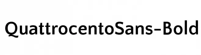
A bold, modern sans-serif font with clean lines and balanced proportions.
![QuattrocentoSans-Bold Frei Schriftart Herunterladen]() Herunterladen 3578 Downloads@WebFont
Herunterladen 3578 Downloads@WebFont -
![Blade Runner Movie Font 2 Frei Schriftart Herunterladen]() Herunterladen 3578 Downloads@WebFont
Herunterladen 3578 Downloads@WebFont -
![Tenby Five Frei Schriftart Herunterladen]() Herunterladen 3578 Downloads@WebFont
Herunterladen 3578 Downloads@WebFont -
( Fonts by www.peter-wiegel.de. Personal-use only. For commercial use please contact owner. )
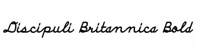
A bold, cursive font with a playful and energetic style.
![Discipuli Britannica Bold Frei Schriftart Herunterladen]() Herunterladen 3578 Downloads@WebFont
Herunterladen 3578 Downloads@WebFont -
![Foo Frei Schriftart Herunterladen]() Herunterladen 3578 Downloads@WebFont
Herunterladen 3578 Downloads@WebFont -
( Fonts by Original fonts by Vernon Adams / Changes by Cristiano Sobral - Personal-use only. For commercial use please contact owner. )
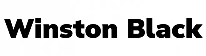
A bold, modern font with strong, uniform characters.
![Winston Black Frei Schriftart Herunterladen]() Herunterladen 3577 Downloads@WebFont
Herunterladen 3577 Downloads@WebFont -
( Fonts by HENRIavecunK. Personal-use only. For commercial use please contact owner. )
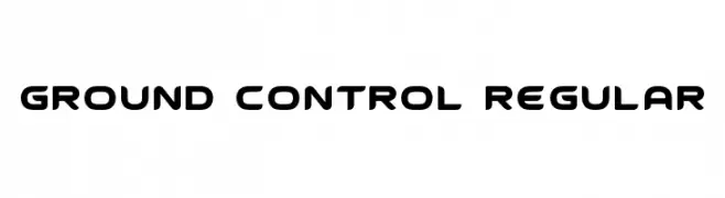
A futuristic, geometric font with rounded edges and consistent weight.
![Ground Control Regular Frei Schriftart Herunterladen]() Herunterladen 3577 Downloads@WebFont
Herunterladen 3577 Downloads@WebFont -
( Fonts by Matthew Welch - www.squaregear.net/fonts/ )
A bold, geometric font with a modern and impactful design.
![Libby Heavy:Version 1.00 Frei Schriftart Herunterladen]() Herunterladen 3577 Downloads@WebFont
Herunterladen 3577 Downloads@WebFont -
( Fonts by Manfred Klein. Free for private and charity use. Free for commercial with donation to organizations )
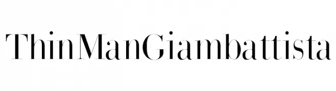
A high-contrast serif typeface with elegant, refined strokes.
![ThinManGiambattista Frei Schriftart Herunterladen]() Herunterladen 3577 Downloads@WebFont
Herunterladen 3577 Downloads@WebFont -
Schriftart von filsonkiol. For commercial use please contact the owner.
![Web Serveroff Frei Schriftart Herunterladen]() Herunterladen 3574 Downloads@WebFont
Herunterladen 3574 Downloads@WebFont -
![NHL Edge Minnesota Home Frei Schriftart Herunterladen]() Herunterladen 3573 Downloads@WebFont
Herunterladen 3573 Downloads@WebFont -
![RR Beaver Frei Schriftart Herunterladen]() Herunterladen 3572 Downloads@WebFont
Herunterladen 3572 Downloads@WebFont -
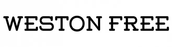
( Fonts by www.Fontfabric.com )
A modern, bold font with rounded edges and geometric structure.
![Weston-Free Frei Schriftart Herunterladen]() Herunterladen 3572 Downloads@WebFont
Herunterladen 3572 Downloads@WebFont -
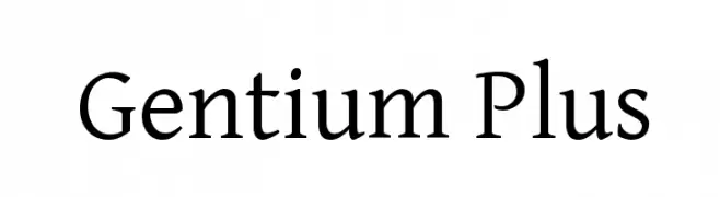
![Gentium Plus Frei Schriftart Herunterladen]() Herunterladen 3572 Downloads@WebFont
Herunterladen 3572 Downloads@WebFont -
( Copyright (c) 2010, Haley Fiege (haley@kingdomofawesome.com) )
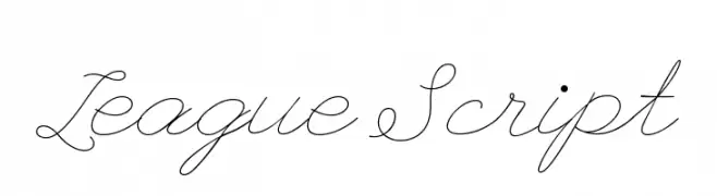
An elegant, flowing script font with classic cursive styling.
![League Script Frei Schriftart Herunterladen]() Herunterladen 3571 Downloads@WebFont
Herunterladen 3571 Downloads@WebFont -
( Fonts by Matthew Welch - www.squaregear.net/fonts/ )
A bold, modern sans-serif font with clean lines and strong presence.
![Hit the Road Regular Frei Schriftart Herunterladen]() Herunterladen 3571 Downloads@WebFont
Herunterladen 3571 Downloads@WebFont -
![Bambi Bold Frei Schriftart Herunterladen]() Herunterladen 3571 Downloads
Herunterladen 3571 Downloads -
( Fonts by Michelle Pha )
A playful, handwritten font with bold, rounded strokes and a whimsical touch.
![Shelby Frei Schriftart Herunterladen]() Herunterladen 3570 Downloads@WebFont
Herunterladen 3570 Downloads@WebFont -
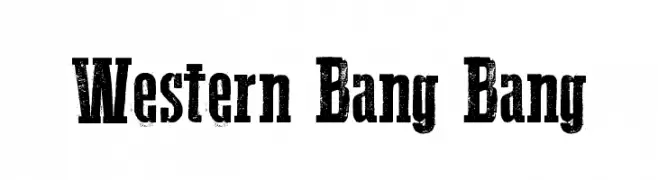
( Fonts by a Galdino Otten - galdinootten.com . Personal-use only. For commercial use please contact owner. )
A bold, distressed font with a vintage Western style.
![Western Bang Bang Frei Schriftart Herunterladen]() Herunterladen 3570 Downloads@WebFont
Herunterladen 3570 Downloads@WebFont -
( Fonts by Daniel Zadorozny - www.iconian.com - Free for personal use )
A bold, geometric font with a modern and assertive style.
![Voyage Fantastique Straight Regular Frei Schriftart Herunterladen]() Herunterladen 3570 Downloads@WebFont
Herunterladen 3570 Downloads@WebFont


Welche Schriften sind gerade am populärsten?
Poppins, Roboto, Montserrat, Open Sans und Lato sind wegen ihrer klaren Formen und breiten Einsetzbarkeit sehr gefragt – von Markenauftritt über Landingpages bis hin zu Postern.
Welche Fonts eignen sich für Logos?
Geometrische Sans‑Serifs (z. B. Poppins, Familien im Gotham‑Stil) sind ein häufiger Griff für sauberes, skalierbares Branding. Für eine persönlichere Note bleiben Scripts und Handschrift‑Stile beliebt. Kombinieren Sie einen prägnanten Headline‑Font mit einer neutralen Brotschrift für Wiedererkennung und Harmonie.
Wie oft wird die Top‑Liste aktualisiert?
Regelmäßig – basierend auf realen Downloads und Interaktionen. Schauen Sie öfter vorbei, um aufstrebende Favoriten früh zu entdecken.
💡 Tipp: Seite bookmarken – Trends wechseln schnell, und heutige Top‑Schriften inspirieren morgen vielleicht das Rebranding.