Willkommen bei den Top‑Schriften – hier treffen Beliebtheit und Qualität aufeinander. Das sind die in diesem Jahr am häufigsten heruntergeladenen und genutzten Fonts. Wenn Sie sichere Optionen für Logo, Web oder Social suchen, starten Sie hier.
Jeder Top‑Font überzeugt durch Balance, Lesbarkeit und Vielseitigkeit. Sie finden moderne Sans‑Serifs, elegante Scripts, Vintage‑Serifs und minimalistische Displays.
-
 Herunterladen 263 Downloads@WebFont
 -
( Fonts by David Rakowski )
An ornate and decorative font with intricate patterns and a vintage flair.
![VarahCaps Frei Schriftart Herunterladen]() Herunterladen 263 Downloads@WebFont
Herunterladen 263 Downloads@WebFont -
( Fonts by Zuzulgo Studio )
Playful, bold handwritten font.
![Terang Bulan Frei Schriftart Herunterladen]() Herunterladen 263 Downloads@WebFont
Herunterladen 263 Downloads@WebFont -
![Magenta Flower Frei Schriftart Herunterladen]() Herunterladen 263 Downloads@WebFont
Herunterladen 263 Downloads@WebFont -
( new.myfonts.com/foundry/Intellecta_Design/?refby=paulow )
The image contains decorative bird and feather illustrations, not a font.
![Penmanship Birds Free Frei Schriftart Herunterladen]() Herunterladen 263 Downloads@WebFont
Herunterladen 263 Downloads@WebFont -
![WarnerLogoFontNine Frei Schriftart Herunterladen]() Herunterladen 263 Downloads@WebFont
Herunterladen 263 Downloads@WebFont -
( Fonts by Daniel Zadorozny - www.iconian.com )
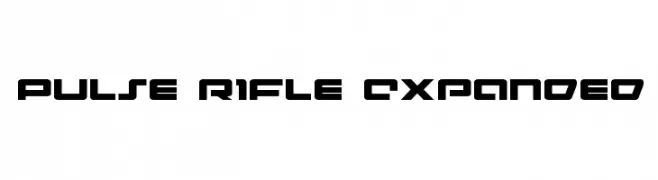
A futuristic, bold font with geometric and angular shapes, perfect for tech themes.
![Pulse Rifle Expanded Frei Schriftart Herunterladen]() Herunterladen 263 Downloads@WebFont
Herunterladen 263 Downloads@WebFont -
( deFharo - Fernando Haro - defharo.com )
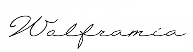
An elegant script font with flowing, cursive letterforms and high contrast.
![Wolframia Frei Schriftart Herunterladen]() Herunterladen 263 Downloads@WebFont
Herunterladen 263 Downloads@WebFont -
( Fonts by Alex Squack - http://twitter.com/NoGoodToMe )
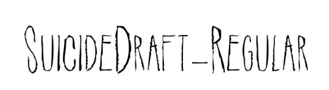
A distressed, hand-drawn font with a grungy, artistic style.
![SuicideDraft-Regular Frei Schriftart Herunterladen]() Herunterladen 263 Downloads@WebFont
Herunterladen 263 Downloads@WebFont -
![European Jazz American Music Frei Schriftart Herunterladen]() Herunterladen 263 Downloads@WebFont
Herunterladen 263 Downloads@WebFont -
![Antilles Academy Italic Frei Schriftart Herunterladen]() Herunterladen 263 Downloads@WebFont
Herunterladen 263 Downloads@WebFont -
( Fonts by Peter Wiegel - www.peter-wiegel.de - Personal-use only. For commercial use please contact owner. )
A playful handwritten font with rounded edges and a casual style.
![CATKakographie Frei Schriftart Herunterladen]() Herunterladen 263 Downloads@WebFont
Herunterladen 263 Downloads@WebFont -
![Enchiridion Frei Schriftart Herunterladen]() Herunterladen 263 Downloads@WebFont
Herunterladen 263 Downloads@WebFont -
( Fonts by Phantom Studio )
A playful, handwritten font with bold, rounded characters and smooth lines.
![Heart Unicorn Frei Schriftart Herunterladen]() Herunterladen 263 Downloads@WebFont
Herunterladen 263 Downloads@WebFont -
( Fonts by Manfred Klein. Free for private and charity use. Free for commercial with donation to organizations )
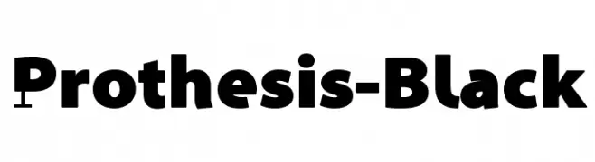
A bold, modern font with geometric elements and strong presence.
![Prothesis-Black Frei Schriftart Herunterladen]() Herunterladen 263 Downloads@WebFont
Herunterladen 263 Downloads@WebFont -
( Fonts by a Adrian Candela - http://www.behance.net/takuminokami . Personal-use only. For commercial use please contact owner. )
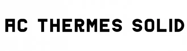
A bold, geometric font with strong lines and a modern aesthetic.
![AC Thermes Solid Frei Schriftart Herunterladen]() Herunterladen 263 Downloads@WebFont
Herunterladen 263 Downloads@WebFont -
( Extram Studios - Lewis Bauer )
A playful, hand-drawn font with bold, irregular strokes.
![6 Script Frei Schriftart Herunterladen]() Herunterladen 263 Downloads@WebFont
Herunterladen 263 Downloads@WebFont -
( Fonts by a Neale Davidson - www.pixelsagas.com. Personal-use only. For commercial use please contact owner. )
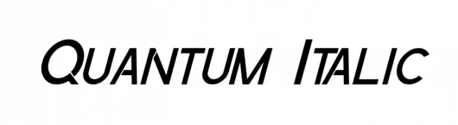
A sleek, italicized font with a modern and dynamic style.
![Quantum Italic Frei Schriftart Herunterladen]() Herunterladen 263 Downloads@WebFont
Herunterladen 263 Downloads@WebFont -
![Lubeck Frei Schriftart Herunterladen]() Herunterladen 263 Downloads@WebFont
Herunterladen 263 Downloads@WebFont -
( Fonts by www.peter-wiegel.de. Personal-use only. For commercial use please contact owner. )
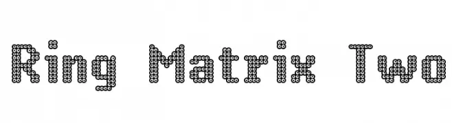
A decorative font with characters made of interconnected rings, offering a digital and futuristic look.
![Ring Matrix Two Frei Schriftart Herunterladen]() Herunterladen 263 Downloads@WebFont
Herunterladen 263 Downloads@WebFont -
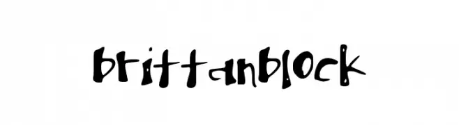
![brittanblock Frei Schriftart Herunterladen]() Herunterladen 263 Downloads@WebFont
Herunterladen 263 Downloads@WebFont -
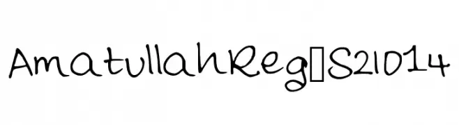
![AmatullahReg_S2014 Frei Schriftart Herunterladen]() Herunterladen 263 Downloads@WebFont
Herunterladen 263 Downloads@WebFont -
( Fonts by Chris Glover - https://fontbundles.net/sunkissedminimalist - Personal-use only. For commercial use please contact owner. )
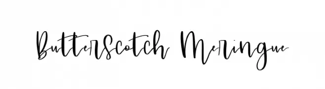
A playful, cursive font with flowing, interconnected strokes and a whimsical charm.
![Butterscotch Meringue Frei Schriftart Herunterladen]() Herunterladen 263 Downloads@WebFont
Herunterladen 263 Downloads@WebFont -
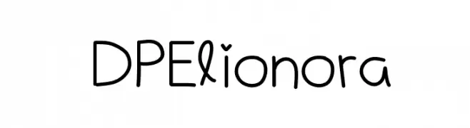
![DPElionora Frei Schriftart Herunterladen]() Herunterladen 263 Downloads@WebFont
Herunterladen 263 Downloads@WebFont -
( Fonts by Rune Bjørnerås )
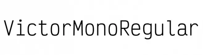
A modern, monospaced font with a clean and geometric design, perfect for coding.
![Victor Mono Regular Frei Schriftart Herunterladen]() Herunterladen 263 Downloads@WebFont
Herunterladen 263 Downloads@WebFont -
![Pixel II Regular Frei Schriftart Herunterladen]() Herunterladen 263 Downloads@WebFont
Herunterladen 263 Downloads@WebFont -
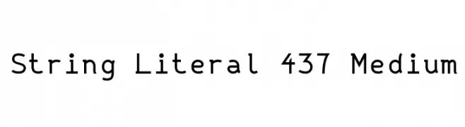
![String Literal 437 Medium Frei Schriftart Herunterladen]() Herunterladen 263 Downloads@WebFont
Herunterladen 263 Downloads@WebFont -
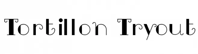
![Tortillon Tryout Frei Schriftart Herunterladen]() Herunterladen 263 Downloads@WebFont
Herunterladen 263 Downloads@WebFont -
( Fonts by StringLabs - stringlabscreative.com - Personal-use only. For commercial use please contact owner. )
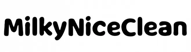
A playful, rounded font with bold, smooth curves and a friendly appearance.
![Milky Nice Clean Frei Schriftart Herunterladen]() Herunterladen 263 Downloads@WebFont
Herunterladen 263 Downloads@WebFont -
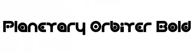
![Planetary Orbiter Bold Frei Schriftart Herunterladen]() Herunterladen 263 Downloads@WebFont
Herunterladen 263 Downloads@WebFont -
( Fonts by Marty Bee - www.martybee.com )
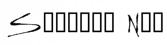
A dynamic, edgy font with sharp, angular strokes and a hand-drawn appearance.
![Slasher New Frei Schriftart Herunterladen]() Herunterladen 263 Downloads@WebFont
Herunterladen 263 Downloads@WebFont -
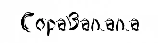
![CopaBanana Frei Schriftart Herunterladen]() Herunterladen 263 Downloads@WebFont
Herunterladen 263 Downloads@WebFont -
![MY GOLDEN STAR Frei Schriftart Herunterladen]() Herunterladen 263 Downloads@WebFont
Herunterladen 263 Downloads@WebFont -
( Fonts by Travis Howell - Personal-use only. For commercial use please contact owner. )
A bold, geometric font with sharp angles and modern style.
![Poggers Bold Frei Schriftart Herunterladen]() Herunterladen 263 Downloads@WebFont
Herunterladen 263 Downloads@WebFont -
![cool iris Regular Frei Schriftart Herunterladen]() Herunterladen 263 Downloads@WebFont
Herunterladen 263 Downloads@WebFont


Welche Schriften sind gerade am populärsten?
Poppins, Roboto, Montserrat, Open Sans und Lato sind wegen ihrer klaren Formen und breiten Einsetzbarkeit sehr gefragt – von Markenauftritt über Landingpages bis hin zu Postern.
Welche Fonts eignen sich für Logos?
Geometrische Sans‑Serifs (z. B. Poppins, Familien im Gotham‑Stil) sind ein häufiger Griff für sauberes, skalierbares Branding. Für eine persönlichere Note bleiben Scripts und Handschrift‑Stile beliebt. Kombinieren Sie einen prägnanten Headline‑Font mit einer neutralen Brotschrift für Wiedererkennung und Harmonie.
Wie oft wird die Top‑Liste aktualisiert?
Regelmäßig – basierend auf realen Downloads und Interaktionen. Schauen Sie öfter vorbei, um aufstrebende Favoriten früh zu entdecken.
💡 Tipp: Seite bookmarken – Trends wechseln schnell, und heutige Top‑Schriften inspirieren morgen vielleicht das Rebranding.