Willkommen bei den Top‑Schriften – hier treffen Beliebtheit und Qualität aufeinander. Das sind die in diesem Jahr am häufigsten heruntergeladenen und genutzten Fonts. Wenn Sie sichere Optionen für Logo, Web oder Social suchen, starten Sie hier.
Jeder Top‑Font überzeugt durch Balance, Lesbarkeit und Vielseitigkeit. Sie finden moderne Sans‑Serifs, elegante Scripts, Vintage‑Serifs und minimalistische Displays.
-
( Fonts by www.26plus-zeichen.de )
A modern, italicized sans-serif font with clean lines and a sleek design.
 Herunterladen 263 Downloads@WebFont
 -
![mashy Valentine Frei Schriftart Herunterladen]() Herunterladen 263 Downloads@WebFont
Herunterladen 263 Downloads@WebFont -
![Viney TimesRegular Frei Schriftart Herunterladen]() Herunterladen 263 Downloads@WebFont
Herunterladen 263 Downloads@WebFont -
![InavelTetkaCyr Frei Schriftart Herunterladen]() Herunterladen 263 Downloads@WebFont
Herunterladen 263 Downloads@WebFont -
( Tami Vu - thepinksushi.com )
A playful, hand-drawn font with tall, narrow characters and a whimsical style.
![6PM Frei Schriftart Herunterladen]() Herunterladen 263 Downloads@WebFont
Herunterladen 263 Downloads@WebFont -
( Fonts by a Max Infeld - XEROGRAPHER FONTS - xerographer.blogspot.com . Personal-use only. For commercial use please contact owner. )
A bold, spiky font with a rugged, thorn-like texture.
![RealHard Frei Schriftart Herunterladen]() Herunterladen 263 Downloads@WebFont
Herunterladen 263 Downloads@WebFont -
( Fonts by Darcy Baldwin - darcybaldwin.com. Free for personal use only )
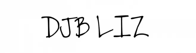
A playful, casual handwritten font with a lively and dynamic style.
![DJB LIZ Frei Schriftart Herunterladen]() Herunterladen 263 Downloads@WebFont
Herunterladen 263 Downloads@WebFont -
( Iconian Fonts - Daniel Zadorozny - www.iconian.com )
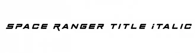
A bold, italic, futuristic font with angular and geometric design.
![Space Ranger Title Italic Frei Schriftart Herunterladen]() Herunterladen 263 Downloads@WebFont
Herunterladen 263 Downloads@WebFont -
( Fonts by Dicky Syafaat )
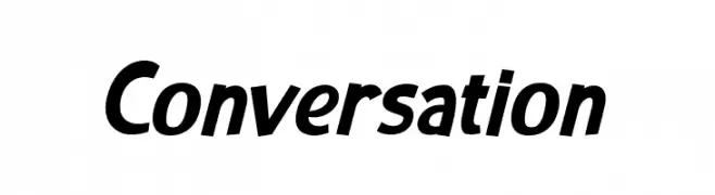
A bold, slightly italic font with dynamic and energetic character design.
![Conversation Frei Schriftart Herunterladen]() Herunterladen 263 Downloads@WebFont
Herunterladen 263 Downloads@WebFont -
( chanceeditions.deviantart.com/ )
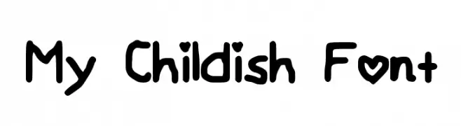
A playful, hand-drawn font with a childlike and whimsical style.
![My Childish Font Frei Schriftart Herunterladen]() Herunterladen 263 Downloads@WebFont
Herunterladen 263 Downloads@WebFont -
( Darrell Flood )
A bold, geometric font with a futuristic, digital aesthetic.
![Digital Dare Frei Schriftart Herunterladen]() Herunterladen 263 Downloads@WebFont
Herunterladen 263 Downloads@WebFont -
![Pixel Powerline Frei Schriftart Herunterladen]() Herunterladen 263 Downloads@WebFont
Herunterladen 263 Downloads@WebFont -
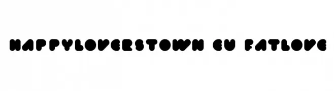
![happyloverstown.eu_fatlove Frei Schriftart Herunterladen]() Herunterladen 263 Downloads@WebFont
Herunterladen 263 Downloads@WebFont -
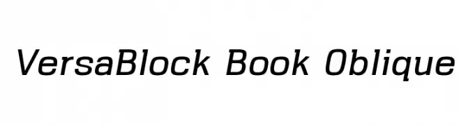
( Parker Creative - Alan Parker - fontbundles.net/parker-creative )
A modern, oblique font with clean lines and a dynamic style.
![VersaBlock Book Oblique Frei Schriftart Herunterladen]() Herunterladen 263 Downloads@WebFont
Herunterladen 263 Downloads@WebFont -
( Fonts by Twicolabs Fontdation - Fahrizal Tawakkal - Personal-use only. For commercial use please contact owner. )
A bold, decorative font with intricate details and high contrast.
![Cairlinn Frei Schriftart Herunterladen]() Herunterladen 263 Downloads@WebFont
Herunterladen 263 Downloads@WebFont -
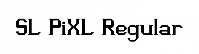
![SL PiXL Regular Frei Schriftart Herunterladen]() Herunterladen 263 Downloads@WebFont
Herunterladen 263 Downloads@WebFont -
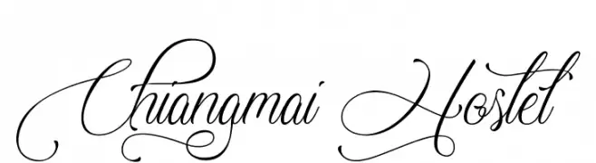
( http://www.typhoontype.net/category/fonts/ Sponsoren Schriftart )
An elegant script font with intricate swirls and flourishes.
![Chiangmai Hostel Frei Schriftart Herunterladen]() Herunterladen 263 Downloads
Herunterladen 263 Downloads -
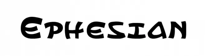
( Fonts by Daniel Zadorozny - www.iconian.com - Free for personal use )
A bold, playful font with a whimsical, cartoon-like style.
![Ephesian Frei Schriftart Herunterladen]() Herunterladen 263 Downloads@WebFont
Herunterladen 263 Downloads@WebFont -
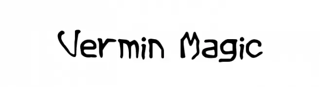
( Fonts by Cumberland Fontworks - http://www222.pair.com/sjohn/fonts.htm - S. John Ross )
A whimsical, hand-drawn style font with playful, wavy strokes.
![Vermin Magic Frei Schriftart Herunterladen]() Herunterladen 263 Downloads@WebFont
Herunterladen 263 Downloads@WebFont -
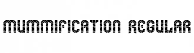
![mummification Regular Frei Schriftart Herunterladen]() Herunterladen 263 Downloads@WebFont
Herunterladen 263 Downloads@WebFont -
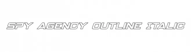
( Iconian Fonts - Daniel Zadorozny - www.iconian.com )
A bold, italicized outline font with a futuristic and dynamic style.
![Spy Agency Outline Italic Frei Schriftart Herunterladen]() Herunterladen 263 Downloads@WebFont
Herunterladen 263 Downloads@WebFont -
( These fonts are free to use in any private, recreational manner.For commercial go to www.flopdesign.com/fordesign/font.html )
A playful, bold font with thick, rounded strokes and a comic book style.
![UltraComickatakana Frei Schriftart Herunterladen]() Herunterladen 263 Downloads@WebFont
Herunterladen 263 Downloads@WebFont -
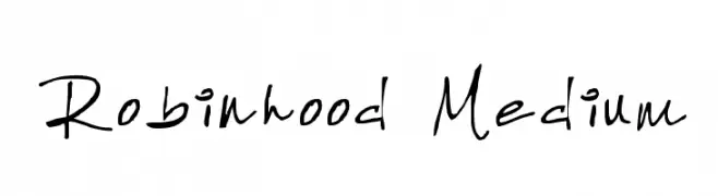
( Fonts by Robin Phelps )
A casual, handwritten font with a playful and informal style.
![Robinhood Medium Frei Schriftart Herunterladen]() Herunterladen 263 Downloads@WebFont
Herunterladen 263 Downloads@WebFont -
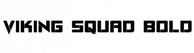
( Fonts by Daniel Zadorozny - www.iconian.com )
A bold, angular font with a geometric, rune-like design.
![Viking Squad Bold Frei Schriftart Herunterladen]() Herunterladen 263 Downloads@WebFont
Herunterladen 263 Downloads@WebFont -
( ingoFonts - Ingo Zimmermann - www.ingofonts.com )
A bold, oblique font with thick strokes and a dynamic appearance.
![Analogue Reduced 76 Bold Oblique Frei Schriftart Herunterladen]() Herunterladen 263 Downloads@WebFont
Herunterladen 263 Downloads@WebFont -
( Fonts by Edric Studio www.creativefabrica.com/designer/edricstudio/ - Personal-use only. For commercial use please contact owner. )
A dynamic brush-style font with fluid, expressive strokes and a hand-drawn appearance.
![Quamaine Brush Frei Schriftart Herunterladen]() Herunterladen 263 Downloads@WebFont
Herunterladen 263 Downloads@WebFont -
( Fonts by Daniel Zadorozny - www.iconian.com )
A bold, italic, futuristic font with a double-layer outline and geometric shapes.
![Gunship Academy Italic Frei Schriftart Herunterladen]() Herunterladen 263 Downloads@WebFont
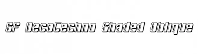
Herunterladen 263 Downloads@WebFont -
![SF DecoTechno Shaded Oblique Frei Schriftart Herunterladen]() Herunterladen 263 Downloads@WebFont
Herunterladen 263 Downloads@WebFont -
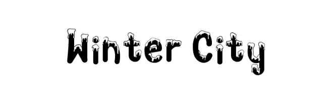
( Fonts by Tokopress )
A playful, winter-themed font with snow-like accents on each character.
![Winter City Frei Schriftart Herunterladen]() Herunterladen 263 Downloads@WebFont
Herunterladen 263 Downloads@WebFont -
( Free for personal use )
A bold, hand-drawn font with a strong, artistic presence.
![RectoFilled Frei Schriftart Herunterladen]() Herunterladen 263 Downloads@WebFont
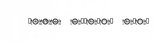
Herunterladen 263 Downloads@WebFont -
![AL Place Settings Dings Frei Schriftart Herunterladen]() Herunterladen 263 Downloads@WebFont
Herunterladen 263 Downloads@WebFont -
( Fonts by Zea Fonts - Personal-use only. For commercial use please contact owner. )
A bold, high-contrast font with wide, block-like characters ideal for impactful headlines.
![Bogam Frei Schriftart Herunterladen]() Herunterladen 263 Downloads@WebFont
Herunterladen 263 Downloads@WebFont -
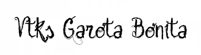
( Fonts by Douglas Vitkauskas - www.vtksdesign.com. Personal-use only. For commercial use please contact owner. )
An ornate, hand-drawn font with swirling, brush-like strokes and intricate details.
![Vtks Garota Bonita Frei Schriftart Herunterladen]() Herunterladen 263 Downloads@WebFont
Herunterladen 263 Downloads@WebFont -
( Fonts by Manfred Klein. Free for private and charity use. Free for commercial with donation to organizations )
A bold, playful font with a zigzag pattern for dynamic visual impact.
![ZagzagGoosePimples Frei Schriftart Herunterladen]() Herunterladen 263 Downloads@WebFont
Herunterladen 263 Downloads@WebFont -
( Fonts by www.blambot.com )
A tall, narrow, and geometric font with a modern, architectural style.
![HighRiseBB Frei Schriftart Herunterladen]() Herunterladen 263 Downloads@WebFont
Herunterladen 263 Downloads@WebFont


Welche Schriften sind gerade am populärsten?
Poppins, Roboto, Montserrat, Open Sans und Lato sind wegen ihrer klaren Formen und breiten Einsetzbarkeit sehr gefragt – von Markenauftritt über Landingpages bis hin zu Postern.
Welche Fonts eignen sich für Logos?
Geometrische Sans‑Serifs (z. B. Poppins, Familien im Gotham‑Stil) sind ein häufiger Griff für sauberes, skalierbares Branding. Für eine persönlichere Note bleiben Scripts und Handschrift‑Stile beliebt. Kombinieren Sie einen prägnanten Headline‑Font mit einer neutralen Brotschrift für Wiedererkennung und Harmonie.
Wie oft wird die Top‑Liste aktualisiert?
Regelmäßig – basierend auf realen Downloads und Interaktionen. Schauen Sie öfter vorbei, um aufstrebende Favoriten früh zu entdecken.
💡 Tipp: Seite bookmarken – Trends wechseln schnell, und heutige Top‑Schriften inspirieren morgen vielleicht das Rebranding.