Willkommen bei den Top‑Schriften – hier treffen Beliebtheit und Qualität aufeinander. Das sind die in diesem Jahr am häufigsten heruntergeladenen und genutzten Fonts. Wenn Sie sichere Optionen für Logo, Web oder Social suchen, starten Sie hier.
Jeder Top‑Font überzeugt durch Balance, Lesbarkeit und Vielseitigkeit. Sie finden moderne Sans‑Serifs, elegante Scripts, Vintage‑Serifs und minimalistische Displays.
-
( Google Web Fonts )
A clean, modern monospaced font with rounded edges and consistent spacing.
 Herunterladen 21336 Downloads@WebFont
 -
![WeezerFont Frei Schriftart Herunterladen]() Herunterladen 21323 Downloads@WebFont
Herunterladen 21323 Downloads@WebFont -
![Kabel Regular Frei Schriftart Herunterladen]() Herunterladen 21316 Downloads@WebFont
Herunterladen 21316 Downloads@WebFont -
![The Voice Font Frei Schriftart Herunterladen]() Herunterladen 21284 Downloads@WebFont
Herunterladen 21284 Downloads@WebFont -
![RSSlabface Frei Schriftart Herunterladen]() Herunterladen 21234 Downloads
Herunterladen 21234 Downloads -
-
![01 Digitall Frei Schriftart Herunterladen]() Herunterladen 21133 Downloads@WebFont
Herunterladen 21133 Downloads@WebFont -
Schriftart von spideraysfonts. For commercial use please contact the owner.
( OVERWATCH )
A bold, futuristic font with sharp angles and geometric shapes.
![OVERWATCH Frei Schriftart Herunterladen]() Herunterladen 21127 Downloads@WebFont
Herunterladen 21127 Downloads@WebFont -
( Copyright 2017 The Playfair Display Project Authors (https://github.com/clauseggers/Playfair-Display), with Reserved Font Name "Playfair Display". )
A high-contrast serif font with a classic yet modern elegance.
![Playfair Display Black Frei Schriftart Herunterladen]() Herunterladen 21104 Downloads@WebFont
Herunterladen 21104 Downloads@WebFont -
( Copyright (c) 2011 by vernon adams (vern@newtypography.co.uk) )
A modern, geometric font with parallel line detailing for a bold, futuristic look.
![Monoton Frei Schriftart Herunterladen]() Herunterladen 21090 Downloads@WebFont
Herunterladen 21090 Downloads@WebFont -
![Blueprint Frei Schriftart Herunterladen]() Herunterladen 21038 Downloads@WebFont
Herunterladen 21038 Downloads@WebFont -
( Fonts by Plamen Motev - www.fontfabric.com - Personal-use only. For commercial use please contact owner. )
A bold, modern sans-serif font with clean lines and excellent legibility.
![Akrobat Bold Frei Schriftart Herunterladen]() Herunterladen 21003 Downloads@WebFont
Herunterladen 21003 Downloads@WebFont -
( Fonts by Matthew Welch - www.squaregear.net/fonts/ )
A bold, geometric font with a collegiate, sports-inspired style.
![College Frei Schriftart Herunterladen]() Herunterladen 20961 Downloads@WebFont
Herunterladen 20961 Downloads@WebFont -
![Toys R Us-Font Solid Frei Schriftart Herunterladen]() Herunterladen 20862 Downloads@WebFont
Herunterladen 20862 Downloads@WebFont -
![DS-Digital Bold Frei Schriftart Herunterladen]() Herunterladen 20834 Downloads@WebFont
Herunterladen 20834 Downloads@WebFont -
( Fonts by Castcraft Software - opti.netii.net - check the website before use )
A modern, geometric font with clean lines and extended width.
![OPTIEdgar-Extended Frei Schriftart Herunterladen]() Herunterladen 20719 Downloads@WebFont
Herunterladen 20719 Downloads@WebFont -
![Matrix Frei Schriftart Herunterladen]() Herunterladen 20703 Downloads@WebFont
Herunterladen 20703 Downloads@WebFont -
( Fonts by a Neale Davidson - www.pixelsagas.com. Personal-use only. For commercial use please contact owner. )
A bold, geometric font with a futuristic and angular design.
![Horizon Frei Schriftart Herunterladen]() Herunterladen 20652 Downloads@WebFont
Herunterladen 20652 Downloads@WebFont -
![Agenda Regular Frei Schriftart Herunterladen]() Herunterladen 20621 Downloads@WebFont
Herunterladen 20621 Downloads@WebFont -
Schriftart von glyphstyle. For commercial use please contact the owner.
( NOTE: This font is FREE 100% FOR PERSONAL USE ONLY! But any donation are very appreciated. visit our website for FULL VERSION font: https://www.glyphstyle.net/shop/ Paypal account for donation : https://www.paypal.me/dimasardhi Please follow our instag )
A classic serif font with elegant strokes and moderate contrast, perfect for sophisticated designs.
![Brighamdemo Frei Schriftart Herunterladen]() Herunterladen 20602 Downloads
Herunterladen 20602 Downloads -
![Times Sans Serif Frei Schriftart Herunterladen]() Herunterladen 20587 Downloads@WebFont
Herunterladen 20587 Downloads@WebFont -
( Fonts by www.exclamachine.com )
A playful, informal handwritten font with dynamic strokes.
![!PaulMaul Frei Schriftart Herunterladen]() Herunterladen 20556 Downloads@WebFont
Herunterladen 20556 Downloads@WebFont -
![Wild Monkeys AOE Frei Schriftart Herunterladen]() Herunterladen 20484 Downloads@WebFont
Herunterladen 20484 Downloads@WebFont -
![Coco Frei Schriftart Herunterladen]() Herunterladen 20469 Downloads@WebFont
Herunterladen 20469 Downloads@WebFont -
( Fonts by ShyFonts )
A bold, modern sans-serif font with clean, geometric lines.
![SF Old Republic Bold Frei Schriftart Herunterladen]() Herunterladen 20450 Downloads@WebFont
Herunterladen 20450 Downloads@WebFont -
![Primavera Frei Schriftart Herunterladen]() Herunterladen 20441 Downloads@WebFont
Herunterladen 20441 Downloads@WebFont -
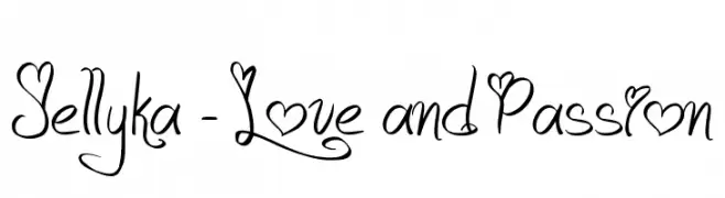
( Fonts are free for a personal use only - www.cuttyfruty.com )
A whimsical, romantic cursive font with heart embellishments.
![Jellyka - Love and Passion Frei Schriftart Herunterladen]() Herunterladen 20414 Downloads@WebFont
Herunterladen 20414 Downloads@WebFont -
![Bard Frei Schriftart Herunterladen]() Herunterladen 20398 Downloads@WebFont
Herunterladen 20398 Downloads@WebFont -
( Fonts by backpacker.gr )
A bold, rounded font with smooth curves and even spacing.
![BPreplay-Bold Frei Schriftart Herunterladen]() Herunterladen 20389 Downloads@WebFont
Herunterladen 20389 Downloads@WebFont -
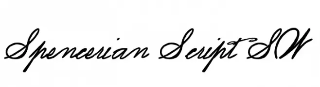
( Fonts by Art Designs by Sue - Personal-use only. For commercial use please contact owner. )
An elegant script font with flowing, interconnected letters and dynamic stroke contrast.
![Spencerian Script SW Frei Schriftart Herunterladen]() Herunterladen 20386 Downloads@WebFont
Herunterladen 20386 Downloads@WebFont -
( IRO Specialty Chemicals USA, LLC - www.irowater.com )
A versatile collection of brand icons with a clean and modern aesthetic.
![Font Awesome 5 Brands Regular Frei Schriftart Herunterladen]() Herunterladen 20377 Downloads@WebFont
Herunterladen 20377 Downloads@WebFont -
![Patrika Frei Schriftart Herunterladen]() Herunterladen 20371 Downloads@WebFont
Herunterladen 20371 Downloads@WebFont -
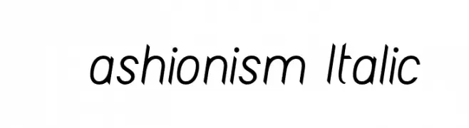
![Fashionism Italic Frei Schriftart Herunterladen]() Herunterladen 20351 Downloads@WebFont
Herunterladen 20351 Downloads@WebFont -
( A font by Jos Buivenga (exljbris) -> www.exljbris.com )
A bold, modern font with clean lines and a slightly condensed style.
![Diavlo Bold Regular Frei Schriftart Herunterladen]() Herunterladen 20343 Downloads@WebFont
Herunterladen 20343 Downloads@WebFont -
( Copyright 2014 The Nunito Project Authors (contact@sansoxygen.com) )
A modern, rounded, and bold font with smooth edges and high legibility.
![Nunito Black Frei Schriftart Herunterladen]() Herunterladen 20329 Downloads@WebFont
Herunterladen 20329 Downloads@WebFont -
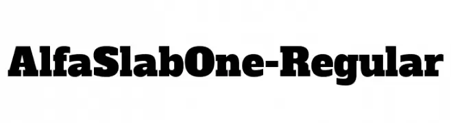
( Copyright (c) 2011, JM Sole (http://jmsole.cl|info@jmsole.cl) )
A bold and impactful slab serif typeface with strong, block-like serifs.
![AlfaSlabOne-Regular Frei Schriftart Herunterladen]() Herunterladen 20320 Downloads@WebFont
Herunterladen 20320 Downloads@WebFont


Welche Schriften sind gerade am populärsten?
Poppins, Roboto, Montserrat, Open Sans und Lato sind wegen ihrer klaren Formen und breiten Einsetzbarkeit sehr gefragt – von Markenauftritt über Landingpages bis hin zu Postern.
Welche Fonts eignen sich für Logos?
Geometrische Sans‑Serifs (z. B. Poppins, Familien im Gotham‑Stil) sind ein häufiger Griff für sauberes, skalierbares Branding. Für eine persönlichere Note bleiben Scripts und Handschrift‑Stile beliebt. Kombinieren Sie einen prägnanten Headline‑Font mit einer neutralen Brotschrift für Wiedererkennung und Harmonie.
Wie oft wird die Top‑Liste aktualisiert?
Regelmäßig – basierend auf realen Downloads und Interaktionen. Schauen Sie öfter vorbei, um aufstrebende Favoriten früh zu entdecken.
💡 Tipp: Seite bookmarken – Trends wechseln schnell, und heutige Top‑Schriften inspirieren morgen vielleicht das Rebranding.