Willkommen bei den Top‑Schriften – hier treffen Beliebtheit und Qualität aufeinander. Das sind die in diesem Jahr am häufigsten heruntergeladenen und genutzten Fonts. Wenn Sie sichere Optionen für Logo, Web oder Social suchen, starten Sie hier.
Jeder Top‑Font überzeugt durch Balance, Lesbarkeit und Vielseitigkeit. Sie finden moderne Sans‑Serifs, elegante Scripts, Vintage‑Serifs und minimalistische Displays.
-
( Fonts by Dibujado )
A bold, hand-drawn font with a rustic and artistic style.
 Herunterladen 245 Downloads@WebFont
 -
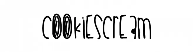
( Fonts by Des Gomez )
A playful, hand-drawn font with tall, narrow letters and a whimsical style.
![Cookiescream Frei Schriftart Herunterladen]() Herunterladen 245 Downloads@WebFont
Herunterladen 245 Downloads@WebFont -
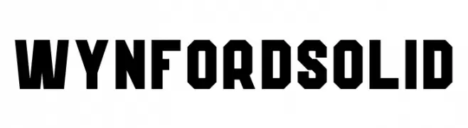
( Fonts by Kong Font - https://fontkong.com/ - Personal-use only. For commercial use please contact owner. )
A bold, geometric font with strong, angular lines and a solid, robust appearance.
![Wynford Solid Frei Schriftart Herunterladen]() Herunterladen 245 Downloads@WebFont
Herunterladen 245 Downloads@WebFont -
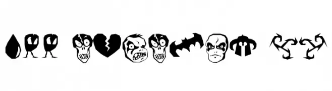
( Font by http://home.luna.nl/~xino/ )
Halloween-themed pictogram font with spooky illustrations.
![ILL oCtoBer 98 Frei Schriftart Herunterladen]() Herunterladen 245 Downloads@WebFont
Herunterladen 245 Downloads@WebFont -
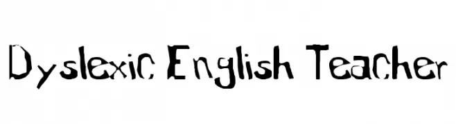
![Dyslexic English Teacher Frei Schriftart Herunterladen]() Herunterladen 245 Downloads@WebFont
Herunterladen 245 Downloads@WebFont -
-
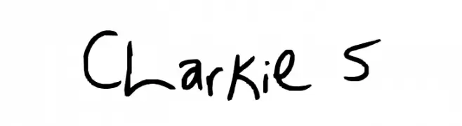
![Clarkie 5 Frei Schriftart Herunterladen]() Herunterladen 245 Downloads@WebFont
Herunterladen 245 Downloads@WebFont -
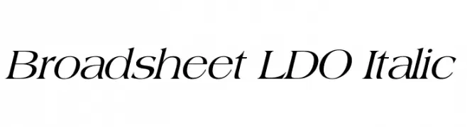
( Fonts by Luke Owens - Personal-use only. For commercial use please contact owner. )
An elegant serif italic font with moderate contrast and refined style.
![Broadsheet LDO Italic Frei Schriftart Herunterladen]() Herunterladen 245 Downloads@WebFont
Herunterladen 245 Downloads@WebFont -
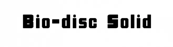
![Bio-disc Solid Frei Schriftart Herunterladen]() Herunterladen 245 Downloads
Herunterladen 245 Downloads -
![Teching Frei Schriftart Herunterladen]() Herunterladen 245 Downloads@WebFont
Herunterladen 245 Downloads@WebFont -
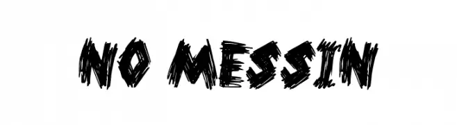
![No Messin Frei Schriftart Herunterladen]() Herunterladen 245 Downloads@WebFont
Herunterladen 245 Downloads@WebFont -
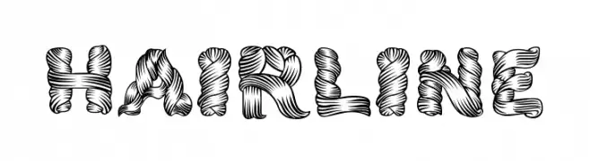
( Fonts by Thor Christopher Arisland )
A decorative font with a textured, intertwined ribbon-like design.
![Hairline Frei Schriftart Herunterladen]() Herunterladen 245 Downloads@WebFont
Herunterladen 245 Downloads@WebFont -
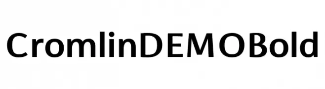
( Fonts by Font People - Personal-use only. For commercial use please contact owner. )
A bold, modern sans-serif font with excellent legibility and uniform stroke width.
![Cromlin DEMO Bold Frei Schriftart Herunterladen]() Herunterladen 245 Downloads@WebFont
Herunterladen 245 Downloads@WebFont -
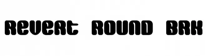
( Fonts by www.aenigmafonts.com )
A bold, rounded font with a retro and playful style.
![Revert Round BRK Frei Schriftart Herunterladen]() Herunterladen 245 Downloads@WebFont
Herunterladen 245 Downloads@WebFont -
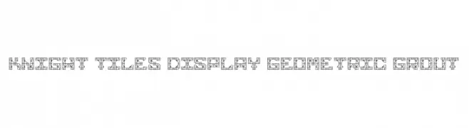
( Fonts by Jennifer Chocolate )
A geometric, tile-inspired font with a modern and decorative style.
![Knight Tiles Display Geometric Grout Frei Schriftart Herunterladen]() Herunterladen 245 Downloads@WebFont
Herunterladen 245 Downloads@WebFont -
( charmingcharlie.co.nr/ )
A playful, handwritten font with a casual and whimsical style.
![Emmis Frei Schriftart Herunterladen]() Herunterladen 245 Downloads@WebFont
Herunterladen 245 Downloads@WebFont -
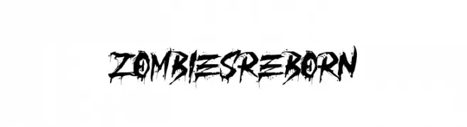
( Fonts by Yadhie Setiawan - typelinestudio.com - Personal-use only. For commercial use please contact owner. )
A bold, distressed font with a grungy, horror-themed aesthetic.
![ZOMBIES REBORN Frei Schriftart Herunterladen]() Herunterladen 245 Downloads@WebFont
Herunterladen 245 Downloads@WebFont -
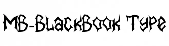
![MB-BlackBook Type Frei Schriftart Herunterladen]() Herunterladen 245 Downloads@WebFont
Herunterladen 245 Downloads@WebFont -
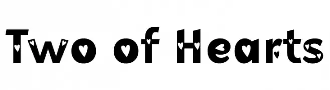
( Fonts by Misti Hammers - mistifonts.com - Personal-use only. For commercial use please contact owner. )
A bold, decorative font with heart-shaped cutouts in each character.
![Two of Hearts Frei Schriftart Herunterladen]() Herunterladen 245 Downloads@WebFont
Herunterladen 245 Downloads@WebFont -
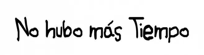
Schriftart von JuanCasco. For commercial use please contact the owner.
( Fonts by Juan Casco - www.juancasco.net )
A playful, handwritten font with uneven strokes and a casual, whimsical style.
![No hubo más Tiempo Frei Schriftart Herunterladen]() Herunterladen 245 Downloads@WebFont
Herunterladen 245 Downloads@WebFont -
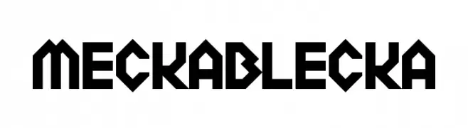
![Meckablecka Frei Schriftart Herunterladen]() Herunterladen 245 Downloads@WebFont
Herunterladen 245 Downloads@WebFont -
( Fonts by Paul Lloyd )
Ornate, medieval-style initials with intricate decorative detailing.
![Camelot_Initials Frei Schriftart Herunterladen]() Herunterladen 245 Downloads@WebFont
Herunterladen 245 Downloads@WebFont -
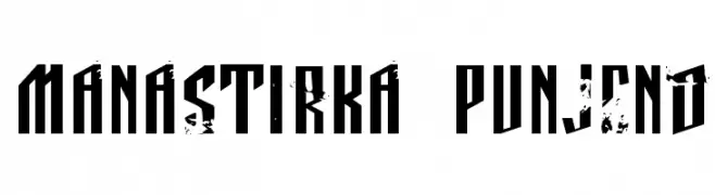
![Manastirka punjeno Frei Schriftart Herunterladen]() Herunterladen 245 Downloads@WebFont
Herunterladen 245 Downloads@WebFont -
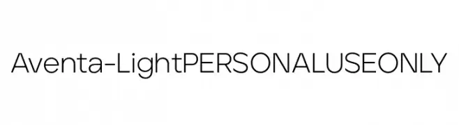
( Fonts by Ellen Luff - Personal-use only. For commercial use please contact owner. )
A modern, geometric sans-serif font with clean lines and uniform stroke width.
![Aventa-LightPERSONALUSEONLY Frei Schriftart Herunterladen]() Herunterladen 245 Downloads@WebFont
Herunterladen 245 Downloads@WebFont -
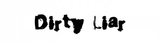
![Dirty Liar Frei Schriftart Herunterladen]() Herunterladen 245 Downloads@WebFont
Herunterladen 245 Downloads@WebFont -
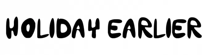
( holidayearlier.blogspot.com )
A playful, bold font with rounded, thick strokes and a whimsical touch.
![holiday earlier Frei Schriftart Herunterladen]() Herunterladen 245 Downloads@WebFont
Herunterladen 245 Downloads@WebFont -
( Fonts by Sai Aditya - Personal-use only. For commercial use please contact owner. )
A bold, geometric font with sharp angles and a futuristic style.
![cedge1 Regular Frei Schriftart Herunterladen]() Herunterladen 245 Downloads@WebFont
Herunterladen 245 Downloads@WebFont -
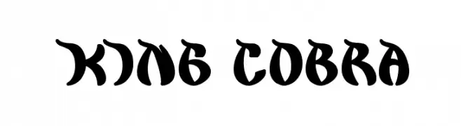
![king cobra Frei Schriftart Herunterladen]() Herunterladen 245 Downloads@WebFont
Herunterladen 245 Downloads@WebFont -
( Fonts by a Neale Davidson - www.pixelsagas.com. Personal-use only. For commercial use please contact owner. )
A bold, geometric font with strong, angular lines and a blocky appearance.
![Bidan Bold Frei Schriftart Herunterladen]() Herunterladen 245 Downloads@WebFont
Herunterladen 245 Downloads@WebFont -
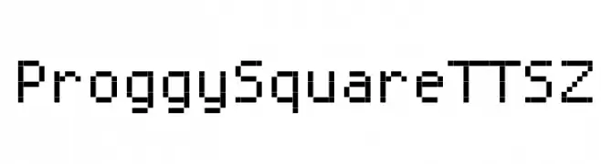
![ProggySquareTTSZ Frei Schriftart Herunterladen]() Herunterladen 245 Downloads@WebFont
Herunterladen 245 Downloads@WebFont -
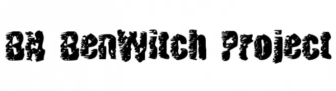
( Fonts by Ben Nathan )
A bold, distressed font with a rough, textured appearance ideal for grunge or horror themes.
![BN BenWitch Project Frei Schriftart Herunterladen]() Herunterladen 245 Downloads@WebFont
Herunterladen 245 Downloads@WebFont -
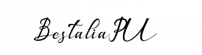
( Haksen Letters - Sarwo Edhi Prayitno )
A flowing, elegant script font with modern flair and graceful curves.
![Bestalia PU Frei Schriftart Herunterladen]() Herunterladen 245 Downloads@WebFont
Herunterladen 245 Downloads@WebFont -
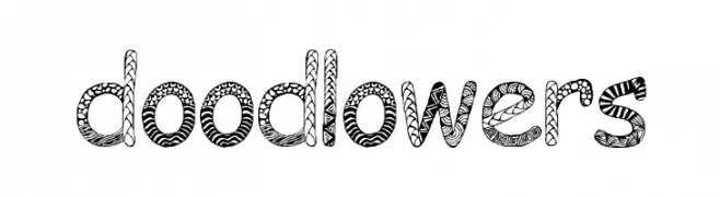
( Fonts by EvasUniqueFonts )
A whimsical, doodle-patterned decorative font perfect for playful designs.
![Doodlowers Frei Schriftart Herunterladen]() Herunterladen 245 Downloads@WebFont
Herunterladen 245 Downloads@WebFont -
![DingDong Signs o' the Times Frei Schriftart Herunterladen]() Herunterladen 245 Downloads@WebFont
Herunterladen 245 Downloads@WebFont -
( Font by Jayvee D. Enaguas - grandchaos9000.deviantart.com )
A bold, 3D cartoon-style font with thick outlines and playful design.
![Cartoonic Massive 3D Frei Schriftart Herunterladen]() Herunterladen 245 Downloads@WebFont
Herunterladen 245 Downloads@WebFont -
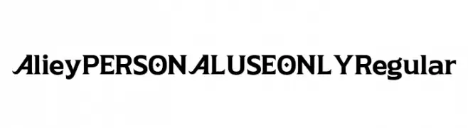
( Fonts by Mans Greback - Personal-use only. For commercial use please contact owner. )
A bold, modern font with unique geometric elements and strong character presence.
![Aliey PERSONAL USE ONLY Regular Frei Schriftart Herunterladen]() Herunterladen 245 Downloads@WebFont
Herunterladen 245 Downloads@WebFont


Welche Schriften sind gerade am populärsten?
Poppins, Roboto, Montserrat, Open Sans und Lato sind wegen ihrer klaren Formen und breiten Einsetzbarkeit sehr gefragt – von Markenauftritt über Landingpages bis hin zu Postern.
Welche Fonts eignen sich für Logos?
Geometrische Sans‑Serifs (z. B. Poppins, Familien im Gotham‑Stil) sind ein häufiger Griff für sauberes, skalierbares Branding. Für eine persönlichere Note bleiben Scripts und Handschrift‑Stile beliebt. Kombinieren Sie einen prägnanten Headline‑Font mit einer neutralen Brotschrift für Wiedererkennung und Harmonie.
Wie oft wird die Top‑Liste aktualisiert?
Regelmäßig – basierend auf realen Downloads und Interaktionen. Schauen Sie öfter vorbei, um aufstrebende Favoriten früh zu entdecken.
💡 Tipp: Seite bookmarken – Trends wechseln schnell, und heutige Top‑Schriften inspirieren morgen vielleicht das Rebranding.