Willkommen bei den Top‑Schriften – hier treffen Beliebtheit und Qualität aufeinander. Das sind die in diesem Jahr am häufigsten heruntergeladenen und genutzten Fonts. Wenn Sie sichere Optionen für Logo, Web oder Social suchen, starten Sie hier.
Jeder Top‑Font überzeugt durch Balance, Lesbarkeit und Vielseitigkeit. Sie finden moderne Sans‑Serifs, elegante Scripts, Vintage‑Serifs und minimalistische Displays.
-
( Thirtypath - www.thirtypath.com )
A bold, flowing script font with elegant, cursive letterforms.
 Herunterladen 256 Downloads@WebFont
 -
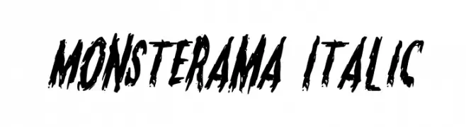
( Fonts by Daniel Zadorozny - www.iconian.com - Free for personal use )
A bold, jagged font with a horror-themed, scratched appearance.
![Monsterama Italic Frei Schriftart Herunterladen]() Herunterladen 256 Downloads@WebFont
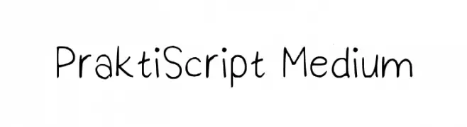
Herunterladen 256 Downloads@WebFont -
![PraktiScript Medium Frei Schriftart Herunterladen]() Herunterladen 256 Downloads@WebFont
Herunterladen 256 Downloads@WebFont -
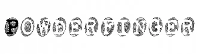
( Fonts by Apostrophic Lab )
A bold, textured font with intricate line patterns resembling fingerprints.
![Powderfinger Frei Schriftart Herunterladen]() Herunterladen 256 Downloads@WebFont
Herunterladen 256 Downloads@WebFont -
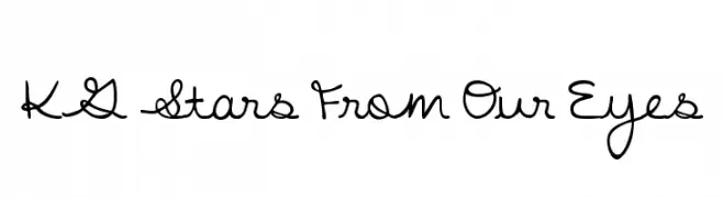
( Fonts by www.kimberlygeswein.com - Kimberly Geswein )
A playful, handwritten font with interconnected characters and a casual style.
![KG Stars From Our Eyes Frei Schriftart Herunterladen]() Herunterladen 256 Downloads@WebFont
Herunterladen 256 Downloads@WebFont -
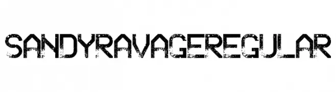
( www.chrisvile.com/ )
A bold, distressed font with a rugged, grunge style.
![Sandy Ravage Regular Frei Schriftart Herunterladen]() Herunterladen 256 Downloads@WebFont
Herunterladen 256 Downloads@WebFont -
( Fonts by wep - Wahyu Eka Prasetya - Personal-use only. For commercial use please contact owner. )
A playful, hand-drawn font with bold, irregular strokes.
![Semongko Frei Schriftart Herunterladen]() Herunterladen 256 Downloads@WebFont
Herunterladen 256 Downloads@WebFont -
( Fonts by InspiraType )
A bold, playful handwritten font with rounded edges and a casual style.
![CandleLightFREE Frei Schriftart Herunterladen]() Herunterladen 256 Downloads@WebFont
Herunterladen 256 Downloads@WebFont -
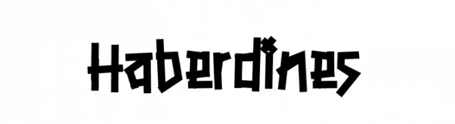
( Fonts by Gassstype )
A bold, angular font with a rugged, hand-drawn appearance.
![Haberdines Frei Schriftart Herunterladen]() Herunterladen 256 Downloads@WebFont
Herunterladen 256 Downloads@WebFont -
( Fonts by www.hindson.com.au )
A bold, high-contrast serif font with elegant, classic numerals.
![Tuplet Numbers [Petrucci] Frei Schriftart Herunterladen]() Herunterladen 256 Downloads@WebFont
Herunterladen 256 Downloads@WebFont -
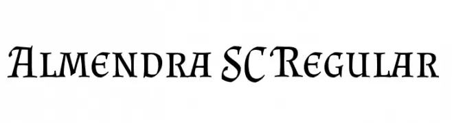
( Copyright (c) 2011-2012, Ana Sanfelippo (anasanfe@gmail.com), with Reserved Font Name 'Almendra' )
A classic serif font with elegant, calligraphic influences.
![Almendra SC Regular Frei Schriftart Herunterladen]() Herunterladen 256 Downloads@WebFont
Herunterladen 256 Downloads@WebFont -
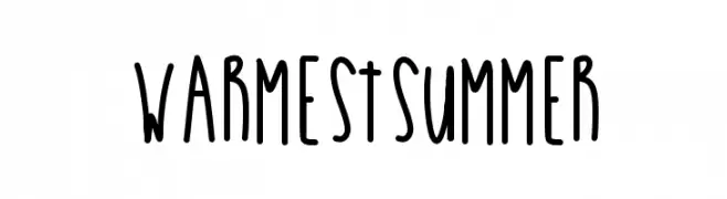
( Des )
A playful, handwritten font with tall, narrow letters and decorative symbols.
![WarmestSummer Frei Schriftart Herunterladen]() Herunterladen 256 Downloads@WebFont
Herunterladen 256 Downloads@WebFont -
( Fonts by Manfred Klein - manfred-klein.ina-mar.com )
A bold, ornate Blackletter font with intricate details and a dramatic style.
![SchmalfetteGotisch Frei Schriftart Herunterladen]() Herunterladen 256 Downloads@WebFont
Herunterladen 256 Downloads@WebFont -
![Engadi Frei Schriftart Herunterladen]() Herunterladen 256 Downloads@WebFont
Herunterladen 256 Downloads@WebFont -
( Fonts by Bluestype Studio )
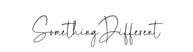
Casual, playful handwritten font.
![Something Different Frei Schriftart Herunterladen]() Herunterladen 256 Downloads@WebFont
Herunterladen 256 Downloads@WebFont -
![KitschLiebe Frei Schriftart Herunterladen]() Herunterladen 256 Downloads@WebFont
Herunterladen 256 Downloads@WebFont -
( Font by Jayvee D. Enaguas - grandchaos9000.deviantart.com )
A bold, playful font with a cartoon-like, hand-drawn style.
![Cartoonic Massive Frei Schriftart Herunterladen]() Herunterladen 256 Downloads@WebFont
Herunterladen 256 Downloads@WebFont -
( Fonts by ShyFonts )
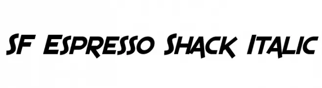
A bold, italic font with sharp, angular characters and a dynamic style.
![SF Espresso Shack Italic Frei Schriftart Herunterladen]() Herunterladen 256 Downloads@WebFont
Herunterladen 256 Downloads@WebFont -
( Fonts by Castcraft Software - opti.netii.net - check the website before use )
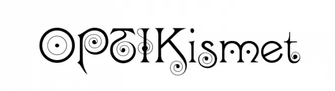
A whimsical and decorative font with intricate swirls and curls.
![OPTIKismet Frei Schriftart Herunterladen]() Herunterladen 256 Downloads@WebFont
Herunterladen 256 Downloads@WebFont -
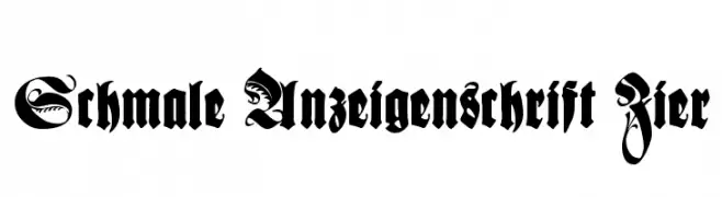
( Fonts by Dieter Steffmann )
A bold, ornate Blackletter font with intricate flourishes and a historical feel.
![Schmale Anzeigenschrift Zier Frei Schriftart Herunterladen]() Herunterladen 256 Downloads@WebFont
Herunterladen 256 Downloads@WebFont -
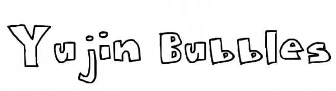
![Yujin Bubbles Frei Schriftart Herunterladen]() Herunterladen 256 Downloads@WebFont
Herunterladen 256 Downloads@WebFont -
( Please check the owner website: http://www.billie.grosse.is-a-geek.com )
A bold, decorative font with a double-line effect and artistic curves.
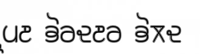
![Rupe Border Bold Frei Schriftart Herunterladen]() Herunterladen 256 Downloads@WebFont
Herunterladen 256 Downloads@WebFont -
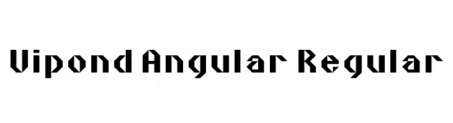
![Vipond Angular Regular Frei Schriftart Herunterladen]() Herunterladen 256 Downloads@WebFont
Herunterladen 256 Downloads@WebFont -
( Fonts by Perspectype Studio )
Playful handwritten font with a casual style.
![Weslingtone Frei Schriftart Herunterladen]() Herunterladen 256 Downloads@WebFont
Herunterladen 256 Downloads@WebFont -
![NeoBulletin College Frei Schriftart Herunterladen]() Herunterladen 256 Downloads@WebFont
Herunterladen 256 Downloads@WebFont -
![Rustproof Body Frei Schriftart Herunterladen]() Herunterladen 256 Downloads@WebFont
Herunterladen 256 Downloads@WebFont -
![Up In Flames Too Frei Schriftart Herunterladen]() Herunterladen 256 Downloads@WebFont
Herunterladen 256 Downloads@WebFont -
( Font Bureau - beinghairless.com )
A pixelated, retro-style font with a bold, digital aesthetic.
![28 Sys Regular Frei Schriftart Herunterladen]() Herunterladen 256 Downloads@WebFont
Herunterladen 256 Downloads@WebFont -
( Fonts by Situjuh Nazara - 7ntypes.com - Personal-use only. For commercial use please contact owner. )
A playful, handwritten font with smooth curves and a friendly appearance.
![Beelova Frei Schriftart Herunterladen]() Herunterladen 256 Downloads@WebFont
Herunterladen 256 Downloads@WebFont -
( Fonts by Kong Font )
A playful, bold font with thick, rounded letters and a whimsical style.
![Kids Swing PERSONAL USE ONLY! Frei Schriftart Herunterladen]() Herunterladen 256 Downloads@WebFont
Herunterladen 256 Downloads@WebFont -
( Ellen Luff - creativemarket.com/EllenLuff )
A modern, italic font with clean, geometric lines and a minimalist aesthetic.
![Kiona Itallic Frei Schriftart Herunterladen]() Herunterladen 256 Downloads@WebFont
Herunterladen 256 Downloads@WebFont -
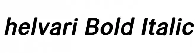
( loosydesign - Fabian Pfeifhofer - www.loosydesign.com )
A bold, italicized font with a modern and dynamic style.
![helvari Bold Italic Frei Schriftart Herunterladen]() Herunterladen 256 Downloads@WebFont
Herunterladen 256 Downloads@WebFont -
( Elo Marc - www.artshop.elodesigns.com/ )
A tall, narrow font with a modern, vertical emphasis.
![SkyHigh-Regular Frei Schriftart Herunterladen]() Herunterladen 256 Downloads@WebFont
Herunterladen 256 Downloads@WebFont -
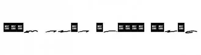
Schriftart von wisnu. For commercial use please contact the owner.
![WOLF GANG SCRIPT SWASH Frei Schriftart Herunterladen]() Herunterladen 256 Downloads@WebFont
Herunterladen 256 Downloads@WebFont -
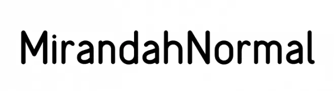
( Fonts by Arterfak Project - Ahmad Ramzi Fahruddin - Personal-use only. For commercial use please contact owner. )
A modern, rounded sans-serif font with clean lines and excellent readability.
![MirandahNormal Frei Schriftart Herunterladen]() Herunterladen 256 Downloads@WebFont
Herunterladen 256 Downloads@WebFont


![Tuplet Numbers [Petrucci] Frei Schriftart Herunterladen](https://d144mzi0q5mijx.cloudfront.net/img/T/U/Tuplet-Numbers-Petrucci.webp)


Welche Schriften sind gerade am populärsten?
Poppins, Roboto, Montserrat, Open Sans und Lato sind wegen ihrer klaren Formen und breiten Einsetzbarkeit sehr gefragt – von Markenauftritt über Landingpages bis hin zu Postern.
Welche Fonts eignen sich für Logos?
Geometrische Sans‑Serifs (z. B. Poppins, Familien im Gotham‑Stil) sind ein häufiger Griff für sauberes, skalierbares Branding. Für eine persönlichere Note bleiben Scripts und Handschrift‑Stile beliebt. Kombinieren Sie einen prägnanten Headline‑Font mit einer neutralen Brotschrift für Wiedererkennung und Harmonie.
Wie oft wird die Top‑Liste aktualisiert?
Regelmäßig – basierend auf realen Downloads und Interaktionen. Schauen Sie öfter vorbei, um aufstrebende Favoriten früh zu entdecken.
💡 Tipp: Seite bookmarken – Trends wechseln schnell, und heutige Top‑Schriften inspirieren morgen vielleicht das Rebranding.