Willkommen bei den Top‑Schriften – hier treffen Beliebtheit und Qualität aufeinander. Das sind die in diesem Jahr am häufigsten heruntergeladenen und genutzten Fonts. Wenn Sie sichere Optionen für Logo, Web oder Social suchen, starten Sie hier.
Jeder Top‑Font überzeugt durch Balance, Lesbarkeit und Vielseitigkeit. Sie finden moderne Sans‑Serifs, elegante Scripts, Vintage‑Serifs und minimalistische Displays.
-
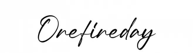
( Fonts by Integritype Studio )
Elegant cursive script with a handwritten style.
 Herunterladen 257 Downloads@WebFont
 -
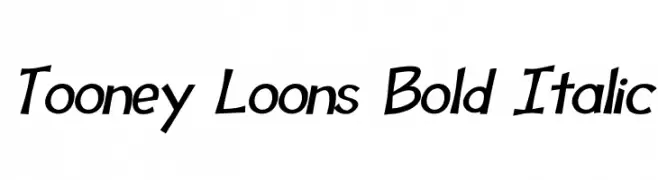
( Fonts by Jason Arthur - JibbaJabba Fonts - www.myspace.com/jasonarthurloaded )
A bold, italicized font with a playful and cartoonish style.
![Tooney Loons Bold Italic Frei Schriftart Herunterladen]() Herunterladen 257 Downloads@WebFont
Herunterladen 257 Downloads@WebFont -
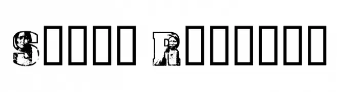
![Sioux Regular Frei Schriftart Herunterladen]() Herunterladen 257 Downloads@WebFont
Herunterladen 257 Downloads@WebFont -
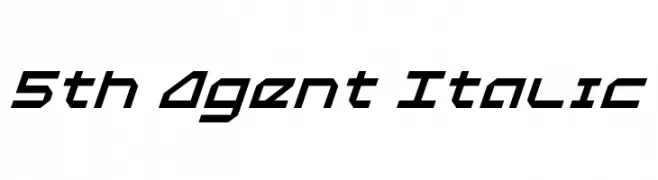
( Fonts by Daniel Zadorozny - www.iconian.com - Free for personal use )
A bold, italic, futuristic font with geometric and angular design.
![5th Agent Italic Frei Schriftart Herunterladen]() Herunterladen 257 Downloads@WebFont
Herunterladen 257 Downloads@WebFont -
( Fonts by Daniel Zadorozny - www.iconian.com - Personal-use only. For commercial use please contact owner. )
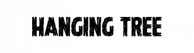
A bold, hand-drawn font with a rugged, textured style.
![Hanging Tree Frei Schriftart Herunterladen]() Herunterladen 257 Downloads@WebFont
Herunterladen 257 Downloads@WebFont -
( Abelardo Gonzalez - abbiecod.es )
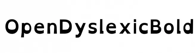
A bold, accessible font designed to improve readability for dyslexic readers.
![OpenDyslexic Bold Frei Schriftart Herunterladen]() Herunterladen 257 Downloads@WebFont
Herunterladen 257 Downloads@WebFont -
( Copyright (c) 2015, Cadson Demak (info@cadsondemak.com) )
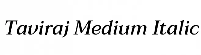
A refined, medium-weight italic serif font with elegant slant and subtle serifs.
![Taviraj Medium Italic Frei Schriftart Herunterladen]() Herunterladen 257 Downloads@WebFont
Herunterladen 257 Downloads@WebFont -
( Fonts by Weape Design - Personal-use only. For commercial use please contact owner. )
A graceful and sophisticated script font with a flowing, handwritten style.
![Adelliya Script Frei Schriftart Herunterladen]() Herunterladen 257 Downloads@WebFont
Herunterladen 257 Downloads@WebFont -
![Swiss Cheesed Frei Schriftart Herunterladen]() Herunterladen 257 Downloads@WebFont
Herunterladen 257 Downloads@WebFont -
( FadeLine Std. - creativemarket.com/fadeline )
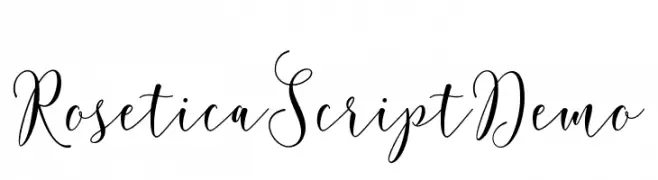
A graceful script font with elegant loops and modern calligraphic style.
![RoseticaScriptDemo Frei Schriftart Herunterladen]() Herunterladen 257 Downloads@WebFont
Herunterladen 257 Downloads@WebFont -
( Copyright (c) 2012, Impallari Type (www.impallari.com), with Reserved Font Name Encode Sans. )
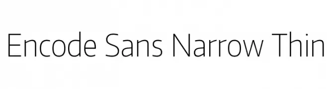
A modern, narrow, and thin sans-serif font with a minimalist design.
![Encode Sans Narrow Thin Frei Schriftart Herunterladen]() Herunterladen 257 Downloads@WebFont
Herunterladen 257 Downloads@WebFont -
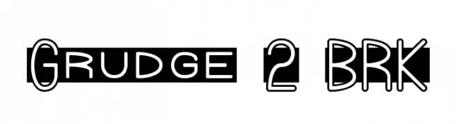
![Grudge 2 BRK Frei Schriftart Herunterladen]() Herunterladen 257 Downloads@WebFont
Herunterladen 257 Downloads@WebFont -
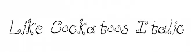
![Like Cockatoos Italic Frei Schriftart Herunterladen]() Herunterladen 257 Downloads@WebFont
Herunterladen 257 Downloads@WebFont -
( Fonts by Mikrojihad Inc - www.behance.net/mikrojihad - Personal-use only. For commercial use please contact owner. )
A bold, dynamic script font with high contrast and elegant cursive style.
![Khadija Spurs 1 Frei Schriftart Herunterladen]() Herunterladen 257 Downloads@WebFont
Herunterladen 257 Downloads@WebFont -
( Fonts by Wik Walker )
Ornamental geometric display font with bold, intricate motifs.
![Glypha Regular Frei Schriftart Herunterladen]() Herunterladen 257 Downloads@WebFont
Herunterladen 257 Downloads@WebFont -
( Fonts by Regalëy_21 )
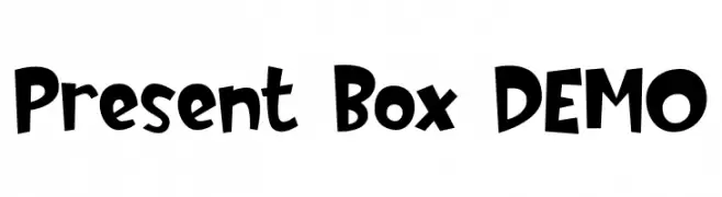
A playful and bold font with a whimsical, energetic style.
![Present Box DEMO Frei Schriftart Herunterladen]() Herunterladen 257 Downloads@WebFont
Herunterladen 257 Downloads@WebFont -
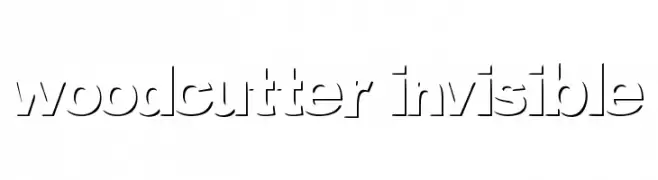
( Fonts by www.woodcutter.es - woodcutter Manero - Personal-use only. For commercial use please contact owner. )
A modern stencil font with geometric shapes and cut-out sections.
![woodcutter invisible Frei Schriftart Herunterladen]() Herunterladen 257 Downloads@WebFont
Herunterladen 257 Downloads@WebFont -
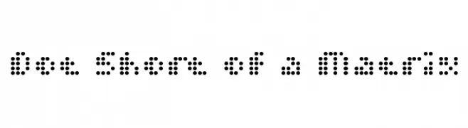
![Dot Short of a Matrix Frei Schriftart Herunterladen]() Herunterladen 256 Downloads@WebFont
Herunterladen 256 Downloads@WebFont -
( Fonts by MadeType - Personal-use only. For commercial use please contact owner. )
A bold, rounded outline font with a playful and modern style.
![MADETommySoftOutline-Black Frei Schriftart Herunterladen]() Herunterladen 256 Downloads@WebFont
Herunterladen 256 Downloads@WebFont -
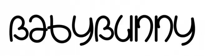
( Fonts by K_IN Studio )
A playful, rounded font with smooth curves and a friendly, approachable style.
![Baby Bunny Frei Schriftart Herunterladen]() Herunterladen 256 Downloads@WebFont
Herunterladen 256 Downloads@WebFont -
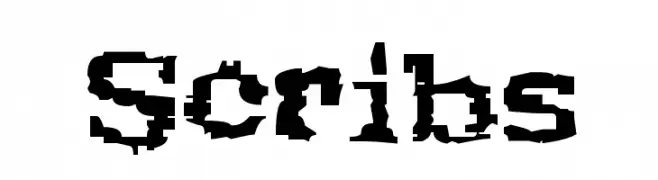
![Scribs Frei Schriftart Herunterladen]() Herunterladen 256 Downloads@WebFont
Herunterladen 256 Downloads@WebFont -
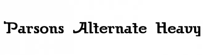
( Fonts by Dieter Steffmann )
A bold, vintage-style font with rounded and angular elements, perfect for impactful designs.
![Parsons Alternate Heavy Frei Schriftart Herunterladen]() Herunterladen 256 Downloads@WebFont
Herunterladen 256 Downloads@WebFont -
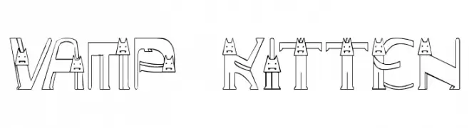
![Vamp Kitten Frei Schriftart Herunterladen]() Herunterladen 256 Downloads@WebFont
Herunterladen 256 Downloads@WebFont -
( Fonts by ShyFonts )
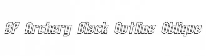
A bold, outlined, oblique font with sharp angles and a modern look.
![SF Archery Black Outline Oblique Frei Schriftart Herunterladen]() Herunterladen 256 Downloads@WebFont
Herunterladen 256 Downloads@WebFont -
( Fonts by Iconian Fonts )
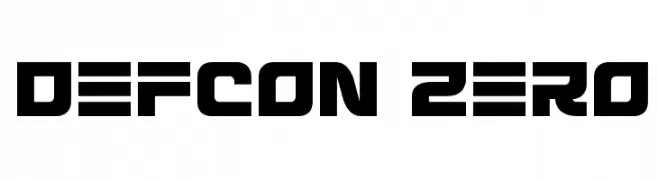
A bold, geometric font with a futuristic and industrial style.
![Defcon Zero Frei Schriftart Herunterladen]() Herunterladen 256 Downloads@WebFont
Herunterladen 256 Downloads@WebFont -
( Fanastudio )
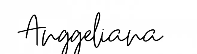
A casual, handwritten font with fluid strokes and a personal touch.
![Anggeliana Frei Schriftart Herunterladen]() Herunterladen 256 Downloads@WebFont
Herunterladen 256 Downloads@WebFont -
![yum Frei Schriftart Herunterladen]() Herunterladen 256 Downloads@WebFont
Herunterladen 256 Downloads@WebFont -
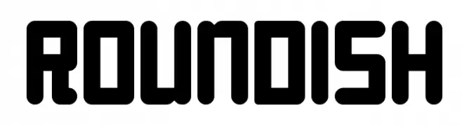
![Roundish Frei Schriftart Herunterladen]() Herunterladen 256 Downloads@WebFont
Herunterladen 256 Downloads@WebFont -
( Fonts by www.houseoflime.com )
An ornate font with intricate Chinese-inspired motifs and decorative elements.
![Dover Chinese Motif Design Frei Schriftart Herunterladen]() Herunterladen 256 Downloads@WebFont
Herunterladen 256 Downloads@WebFont -
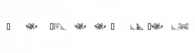
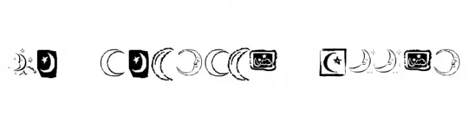
( Fonts by Kat`s Fun Fonts - Personal-use only. For commercial use please contact owner. )
A decorative dingbat font with moon and night sky icons.
![KR Crescent Moons Frei Schriftart Herunterladen]() Herunterladen 256 Downloads@WebFont
Herunterladen 256 Downloads@WebFont -
![Ziggy Strip Frei Schriftart Herunterladen]() Herunterladen 256 Downloads@WebFont
Herunterladen 256 Downloads@WebFont -
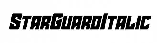
( Fonts by Daniel Zadorozny - www.iconian.com - Personal-use only. For commercial use please contact owner. )
A bold, italicized font with a futuristic and dynamic design.
![Star Guard Italic Frei Schriftart Herunterladen]() Herunterladen 256 Downloads@WebFont
Herunterladen 256 Downloads@WebFont -
Schriftart von HammerBro101. For commercial use please contact the owner.
![Press Start 2P [SMBTLL Version] Regular Frei Schriftart Herunterladen]() Herunterladen 256 Downloads@WebFont
Herunterladen 256 Downloads@WebFont -
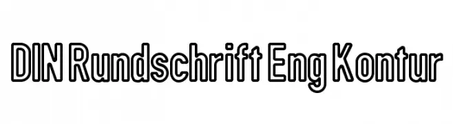
![DIN Rundschrift Eng Kontur Frei Schriftart Herunterladen]() Herunterladen 256 Downloads@WebFont
Herunterladen 256 Downloads@WebFont -
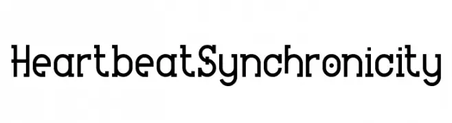
( Fonts by www.chequered.ink - Chequered Ink - Personal-use only. For commercial use please contact owner. )
A modern geometric font with bold, structured uppercase and harmonious lowercase letters.
![Heartbeat Synchronicity Frei Schriftart Herunterladen]() Herunterladen 256 Downloads@WebFont
Herunterladen 256 Downloads@WebFont


![Press Start 2P [SMBTLL Version] Regular Frei Schriftart Herunterladen](https://d144mzi0q5mijx.cloudfront.net/img/P/R/Press-Start-2P-SMBTLL-Version-Regular.webp)
Welche Schriften sind gerade am populärsten?
Poppins, Roboto, Montserrat, Open Sans und Lato sind wegen ihrer klaren Formen und breiten Einsetzbarkeit sehr gefragt – von Markenauftritt über Landingpages bis hin zu Postern.
Welche Fonts eignen sich für Logos?
Geometrische Sans‑Serifs (z. B. Poppins, Familien im Gotham‑Stil) sind ein häufiger Griff für sauberes, skalierbares Branding. Für eine persönlichere Note bleiben Scripts und Handschrift‑Stile beliebt. Kombinieren Sie einen prägnanten Headline‑Font mit einer neutralen Brotschrift für Wiedererkennung und Harmonie.
Wie oft wird die Top‑Liste aktualisiert?
Regelmäßig – basierend auf realen Downloads und Interaktionen. Schauen Sie öfter vorbei, um aufstrebende Favoriten früh zu entdecken.
💡 Tipp: Seite bookmarken – Trends wechseln schnell, und heutige Top‑Schriften inspirieren morgen vielleicht das Rebranding.