Willkommen bei den Top‑Schriften – hier treffen Beliebtheit und Qualität aufeinander. Das sind die in diesem Jahr am häufigsten heruntergeladenen und genutzten Fonts. Wenn Sie sichere Optionen für Logo, Web oder Social suchen, starten Sie hier.
Jeder Top‑Font überzeugt durch Balance, Lesbarkeit und Vielseitigkeit. Sie finden moderne Sans‑Serifs, elegante Scripts, Vintage‑Serifs und minimalistische Displays.
-
 Herunterladen 241 Downloads@WebFont
 -
( Fonts by Daniel Zadorozny - www.iconian.com - Free for personal use )
A modern, condensed italic font with a sleek and professional appearance.
![Federal Service Light Condensed Italic Frei Schriftart Herunterladen]() Herunterladen 241 Downloads@WebFont
Herunterladen 241 Downloads@WebFont -
( Fonts by James Greenwood )
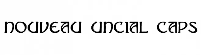
A modern uncial-style font with bold, rounded characters and a historical flair.
![Nouveau Uncial Caps Frei Schriftart Herunterladen]() Herunterladen 241 Downloads@WebFont
Herunterladen 241 Downloads@WebFont -
![chiwawa Hard Frei Schriftart Herunterladen]() Herunterladen 241 Downloads@WebFont
Herunterladen 241 Downloads@WebFont -
( Fonts by Arkandis Digital Foundry )
A sleek, modern sans-serif font with a light italic style.
![SwitzeraADF-LightItalic Frei Schriftart Herunterladen]() Herunterladen 241 Downloads@WebFont
Herunterladen 241 Downloads@WebFont -
-
( Creatype Studio - Rian Rahardi - creativemarket.com/creatype )
A lively, cursive font with a handwritten, elegant style.
![Jelytta Frei Schriftart Herunterladen]() Herunterladen 241 Downloads@WebFont
Herunterladen 241 Downloads@WebFont -
( Fonts by Marcin Leskow - www.martinleskow.pl )
A bold, condensed font with rounded edges and uniform strokes.
![Florentine Amber Frei Schriftart Herunterladen]() Herunterladen 241 Downloads@WebFont
Herunterladen 241 Downloads@WebFont -
( Fonts by Press Gang Studios. Personal-use only. For commercial use please contact owner. )
A raw, expressive hand-drawn font with dynamic, irregular strokes.
![Shank Frei Schriftart Herunterladen]() Herunterladen 241 Downloads@WebFont
Herunterladen 241 Downloads@WebFont -
![Rambat Campotype Frei Schriftart Herunterladen]() Herunterladen 241 Downloads@WebFont
Herunterladen 241 Downloads@WebFont -
( Fonts by Apostrophic Lab )
A bold, italic font with sharp, angular edges and a dynamic style.
![Chizz Italic Frei Schriftart Herunterladen]() Herunterladen 241 Downloads@WebFont
Herunterladen 241 Downloads@WebFont -
( Fonts by Zetafonts - Personal-use only. For commercial use please contact owner. )
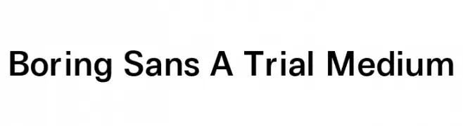
A clean and modern sans-serif font with consistent stroke width and balanced spacing.
![Boring Sans A Trial Medium Frei Schriftart Herunterladen]() Herunterladen 241 Downloads@WebFont
Herunterladen 241 Downloads@WebFont -
( Fonts by Tamasin Collins )
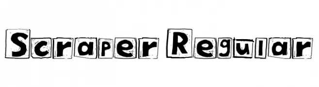
A bold, hand-drawn font with characters enclosed in rough squares, offering a playful and artistic style.
![Scraper Regular Frei Schriftart Herunterladen]() Herunterladen 241 Downloads@WebFont
Herunterladen 241 Downloads@WebFont -
![Smirnof Frei Schriftart Herunterladen]() Herunterladen 241 Downloads@WebFont
Herunterladen 241 Downloads@WebFont -
( Fonts by Apostrophic Lab )
A bold, modern font with a distinctive shadow effect for added depth.
![Street Shadow - Expanded Frei Schriftart Herunterladen]() Herunterladen 241 Downloads@WebFont
Herunterladen 241 Downloads@WebFont -
( Fonts by www.typodermicfonts.com - Ray Larabie )
A bold, angular font with a futuristic and dynamic style.
![Superheterodyne-Regular Frei Schriftart Herunterladen]() Herunterladen 241 Downloads@WebFont
Herunterladen 241 Downloads@WebFont -
( Fonts by Geronimo Fonts - Personal-use only. For commercial use please contact owner. )
A bold, geometric font with an industrial and mechanical style.
![Crank Regular Frei Schriftart Herunterladen]() Herunterladen 241 Downloads@WebFont
Herunterladen 241 Downloads@WebFont -
( Fonts by a Max Infeld - XEROGRAPHER FONTS - xerographer.blogspot.com . Personal-use only. For commercial use please contact owner. )
A playful, bold font with a shadow effect and hand-drawn style.
![HandShadow Frei Schriftart Herunterladen]() Herunterladen 241 Downloads@WebFont
Herunterladen 241 Downloads@WebFont -
( Fonts by Bumbayo Font Fabrik - bumbayo.blogspot.com )
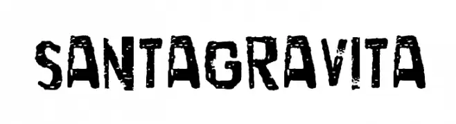
A bold, distressed font with a rugged, vintage feel.
![SantaGravita Frei Schriftart Herunterladen]() Herunterladen 241 Downloads@WebFont
Herunterladen 241 Downloads@WebFont -
![simple Frei Schriftart Herunterladen]() Herunterladen 241 Downloads@WebFont
Herunterladen 241 Downloads@WebFont -
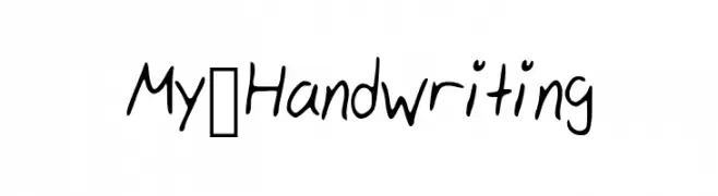
![My_Handwriting Frei Schriftart Herunterladen]() Herunterladen 241 Downloads@WebFont
Herunterladen 241 Downloads@WebFont -
( Fonts by Carrot Rope - typewhatyouloveandletitkillyou.tumblr.com. Personal-use only. For commercial use please contact owner. )
A decorative font with intricate line work and geometric shapes, offering a modern and artistic look.
![loveleaves Frei Schriftart Herunterladen]() Herunterladen 241 Downloads@WebFont
Herunterladen 241 Downloads@WebFont -
![mclovin Frei Schriftart Herunterladen]() Herunterladen 241 Downloads@WebFont
Herunterladen 241 Downloads@WebFont -
( Fonts by Scratchones )
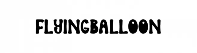
A playful, balloon-like font with rounded, bold characters and a whimsical style.
![Flying Balloon Frei Schriftart Herunterladen]() Herunterladen 241 Downloads@WebFont
Herunterladen 241 Downloads@WebFont -
( Fonts by Pinisiart )
A playful, bold typeface with rounded, bubbly characters and a whimsical style.
![Lucid-Dream Frei Schriftart Herunterladen]() Herunterladen 241 Downloads@WebFont
Herunterladen 241 Downloads@WebFont -
( Fonts by Peter Wiegel - www.peter-wiegel.de )
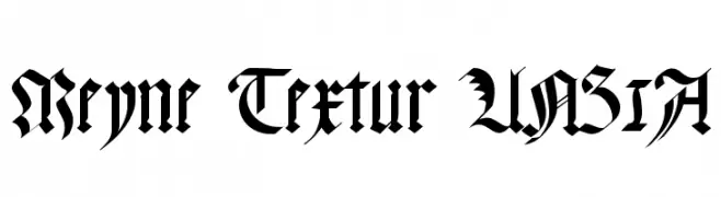
A bold Blackletter font with intricate, angular letterforms and a gothic aesthetic.
![Meyne Textur UNZ1A Frei Schriftart Herunterladen]() Herunterladen 241 Downloads@WebFont
Herunterladen 241 Downloads@WebFont -
![WHO AM I Frei Schriftart Herunterladen]() Herunterladen 241 Downloads@WebFont
Herunterladen 241 Downloads@WebFont -
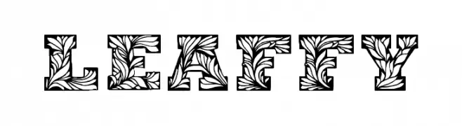
![Leaffy Frei Schriftart Herunterladen]() Herunterladen 241 Downloads@WebFont
Herunterladen 241 Downloads@WebFont -
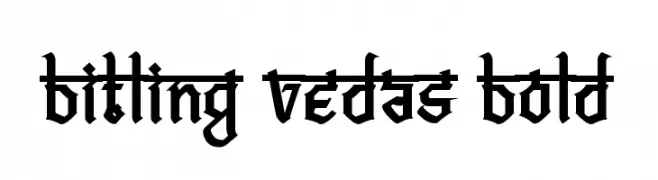
( Rajendra Bitling - www.rbitling.com )
A bold, blackletter font with sharp, angular lines and a medieval aesthetic.
![Bitling vedas Bold Frei Schriftart Herunterladen]() Herunterladen 241 Downloads@WebFont
Herunterladen 241 Downloads@WebFont -
( Fonts by Typodermic Fonts )
A classic serif font with modern elements, offering clarity and elegance.
![KingsbridgeCdBk-Regular Frei Schriftart Herunterladen]() Herunterladen 241 Downloads@WebFont
Herunterladen 241 Downloads@WebFont -
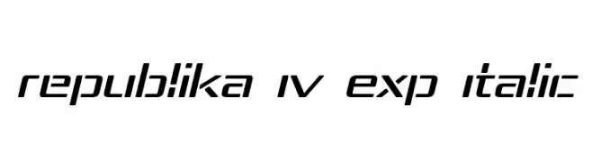
( Fonts by Apostrophic Lab )
A modern, italicized font with expanded, geometric shapes and clean lines.
![Republika IV Exp Italic Frei Schriftart Herunterladen]() Herunterladen 241 Downloads@WebFont
Herunterladen 241 Downloads@WebFont -
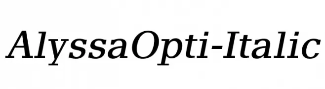
( Fonts by Castcraft Software - opti.netii.net - check the website before use )
An elegant serif font with a classic italic style and moderate contrast.
![AlyssaOpti-Italic Frei Schriftart Herunterladen]() Herunterladen 241 Downloads@WebFont
Herunterladen 241 Downloads@WebFont -
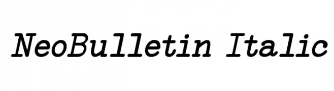
![NeoBulletin Italic Frei Schriftart Herunterladen]() Herunterladen 241 Downloads@WebFont
Herunterladen 241 Downloads@WebFont -
![Sushi High Frei Schriftart Herunterladen]() Herunterladen 241 Downloads@WebFont
Herunterladen 241 Downloads@WebFont -
![Ruhaniyat DEMO Regular Frei Schriftart Herunterladen]() Herunterladen 241 Downloads@WebFont
Herunterladen 241 Downloads@WebFont -
( Fonts by www.typodermicfonts.com - Ray Larabie )
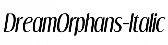
A modern, italic font with sleek, elongated characters and a dynamic style.
![DreamOrphans-Italic Frei Schriftart Herunterladen]() Herunterladen 241 Downloads@WebFont
Herunterladen 241 Downloads@WebFont


Welche Schriften sind gerade am populärsten?
Poppins, Roboto, Montserrat, Open Sans und Lato sind wegen ihrer klaren Formen und breiten Einsetzbarkeit sehr gefragt – von Markenauftritt über Landingpages bis hin zu Postern.
Welche Fonts eignen sich für Logos?
Geometrische Sans‑Serifs (z. B. Poppins, Familien im Gotham‑Stil) sind ein häufiger Griff für sauberes, skalierbares Branding. Für eine persönlichere Note bleiben Scripts und Handschrift‑Stile beliebt. Kombinieren Sie einen prägnanten Headline‑Font mit einer neutralen Brotschrift für Wiedererkennung und Harmonie.
Wie oft wird die Top‑Liste aktualisiert?
Regelmäßig – basierend auf realen Downloads und Interaktionen. Schauen Sie öfter vorbei, um aufstrebende Favoriten früh zu entdecken.
💡 Tipp: Seite bookmarken – Trends wechseln schnell, und heutige Top‑Schriften inspirieren morgen vielleicht das Rebranding.