Willkommen bei den Top‑Schriften – hier treffen Beliebtheit und Qualität aufeinander. Das sind die in diesem Jahr am häufigsten heruntergeladenen und genutzten Fonts. Wenn Sie sichere Optionen für Logo, Web oder Social suchen, starten Sie hier.
Jeder Top‑Font überzeugt durch Balance, Lesbarkeit und Vielseitigkeit. Sie finden moderne Sans‑Serifs, elegante Scripts, Vintage‑Serifs und minimalistische Displays.
-
( Fonts by Noah Type )
A playful, bold font with rounded edges and a casual, friendly style.
 Herunterladen 252 Downloads@WebFont
 -
![CERCA OF SKULLS Frei Schriftart Herunterladen]() Herunterladen 252 Downloads@WebFont
Herunterladen 252 Downloads@WebFont -
( Fonts by Chequered Ink )
A bold, textured font with a playful, hairy appearance.
![Hairy Beard Frei Schriftart Herunterladen]() Herunterladen 252 Downloads@WebFont
Herunterladen 252 Downloads@WebFont -
( Fonts by weknow - Wino S Kadir )
A modern, geometric font with clean lines and a futuristic aesthetic.
![lifeforfun Frei Schriftart Herunterladen]() Herunterladen 252 Downloads@WebFont
Herunterladen 252 Downloads@WebFont -
( Fonts by Eddy Goodboy )
A bold, expressive script font with flowing, cursive letterforms.
![Lovely Valenty Frei Schriftart Herunterladen]() Herunterladen 252 Downloads@WebFont
Herunterladen 252 Downloads@WebFont -
![ChileanBugs Frei Schriftart Herunterladen]() Herunterladen 252 Downloads@WebFont
Herunterladen 252 Downloads@WebFont -
![GeneticDefect Frei Schriftart Herunterladen]() Herunterladen 252 Downloads@WebFont
Herunterladen 252 Downloads@WebFont -
( Fonts by Aleksander Shevchuk - www.aleksandershevchuk.ru )
A modern, geometric sans-serif font with clean lines and uniform stroke width.
![AleksandraC Frei Schriftart Herunterladen]() Herunterladen 252 Downloads@WebFont
Herunterladen 252 Downloads@WebFont -
( Copyright (c) 2016 by Red Hat, Inc. All rights reserved. )
A sleek, modern sans-serif font with a light italic style.
![Overpass Light Italic Frei Schriftart Herunterladen]() Herunterladen 252 Downloads@WebFont
Herunterladen 252 Downloads@WebFont -
( Fonts by Rune Bjørnerås )
A bold, italicized monospaced font with a modern and dynamic style.
![Victor Mono Bold Italic Frei Schriftart Herunterladen]() Herunterladen 252 Downloads@WebFont
Herunterladen 252 Downloads@WebFont -
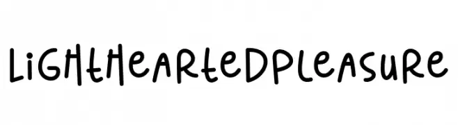
( Fonts by 7NTypes )
A playful, handwritten font with a casual and friendly vibe.
![Lighthearted Pleasure Frei Schriftart Herunterladen]() Herunterladen 252 Downloads@WebFont
Herunterladen 252 Downloads@WebFont -
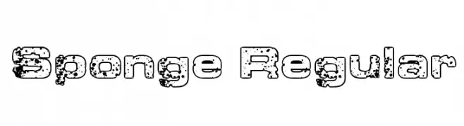
( Fonts by Steve Cloutier - www.cloutierfontes.ca )
A bold, distressed font with a rugged, textured appearance.
![Sponge Regular Frei Schriftart Herunterladen]() Herunterladen 252 Downloads@WebFont
Herunterladen 252 Downloads@WebFont -
![Oil Crisis A Frei Schriftart Herunterladen]() Herunterladen 252 Downloads@WebFont
Herunterladen 252 Downloads@WebFont -
( Fonts by Alphabet&Type® - Paolo Arfelli Vannucci - Personal-use only. For commercial use please contact owner. )
A bold, hand-drawn font with irregular, jagged edges and dynamic strokes.
![Notorious Frei Schriftart Herunterladen]() Herunterladen 252 Downloads@WebFont
Herunterladen 252 Downloads@WebFont -
( Fonts by weknow - Wino S Kadir )
A geometric, futuristic font with angular lines and a modern aesthetic.
![Respect Frei Schriftart Herunterladen]() Herunterladen 252 Downloads@WebFont
Herunterladen 252 Downloads@WebFont -
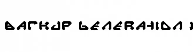
![Backup Generation 1 Frei Schriftart Herunterladen]() Herunterladen 252 Downloads@WebFont
Herunterladen 252 Downloads@WebFont -
( Fonts by Apostrophic Lab )
Grid-based, modular typeface mimicking punch card or Morse code patterns.
![Pica Hole - 1890 Morse Frei Schriftart Herunterladen]() Herunterladen 252 Downloads@WebFont
Herunterladen 252 Downloads@WebFont -
( Fonts by Miss Tiina at www.misstiina.com (please check the website before use) )
A bold, outlined font with a playful, three-dimensional effect.
![MTF Toast Frei Schriftart Herunterladen]() Herunterladen 252 Downloads@WebFont
Herunterladen 252 Downloads@WebFont -
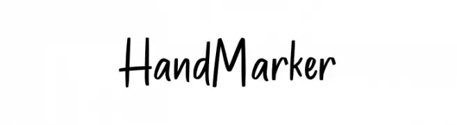
( Fonts by Font Bundles )
A playful, handwritten marker-style font with a casual and friendly vibe.
![HandMarker Frei Schriftart Herunterladen]() Herunterladen 252 Downloads@WebFont
Herunterladen 252 Downloads@WebFont -
( Fonts by Scratchones )
Handwritten cursive script font.
![Ramadan Signature Frei Schriftart Herunterladen]() Herunterladen 252 Downloads@WebFont
Herunterladen 252 Downloads@WebFont -
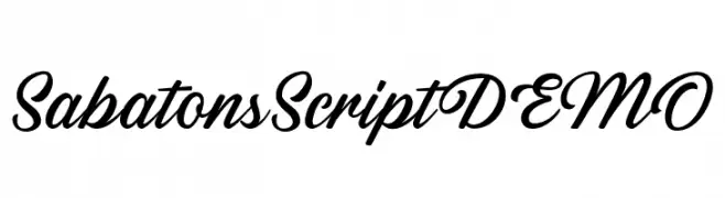
( Fonts by Letterhend Studio - Hendry Juanda - Personal-use only. For commercial use please contact owner. )
A graceful script font with flowing, connected strokes and a sophisticated style.
![SabatonsScriptDEMO Frei Schriftart Herunterladen]() Herunterladen 252 Downloads@WebFont
Herunterladen 252 Downloads@WebFont -
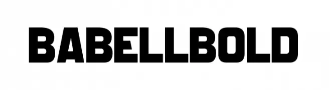
( Fonts by DumadiStyle - Toni Dzulham - Personal-use only. For commercial use please contact owner. )
A bold, modern font with thick, uniform strokes and high contrast, ideal for headlines.
![Babell Bold Frei Schriftart Herunterladen]() Herunterladen 252 Downloads@WebFont
Herunterladen 252 Downloads@WebFont -
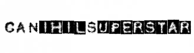
( Free for non-commercial use. For commercial use please buy a license. http://www.cape-arcona.com )
A distressed, grunge-style font with a textured, vintage appearance.
![CANihilSuperstar Frei Schriftart Herunterladen]() Herunterladen 252 Downloads@WebFont
Herunterladen 252 Downloads@WebFont -
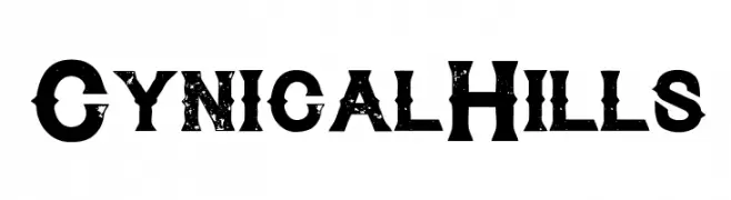
![CynicalHills Frei Schriftart Herunterladen]() Herunterladen 252 Downloads@WebFont
Herunterladen 252 Downloads@WebFont -
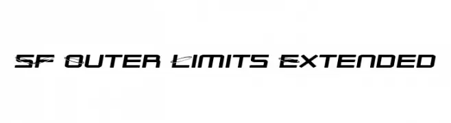
( Fonts by ShyFonts )
A futuristic, angular font with a dynamic and geometric style.
![SF Outer Limits Extended Frei Schriftart Herunterladen]() Herunterladen 252 Downloads@WebFont
Herunterladen 252 Downloads@WebFont -
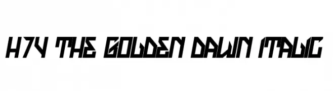
( Fonts by www.legacyofdefeat.com )
A bold, angular font with a futuristic and dynamic style.
![H74 The Golden Dawn Italic Frei Schriftart Herunterladen]() Herunterladen 252 Downloads@WebFont
Herunterladen 252 Downloads@WebFont -
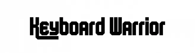
( Fonts by Andrew McCluskey - nalgames.com. Personal-use only. For commercial use please contact owner. )
A bold, geometric font with a modern, futuristic style.
![Keyboard Warrior Frei Schriftart Herunterladen]() Herunterladen 252 Downloads@WebFont
Herunterladen 252 Downloads@WebFont -
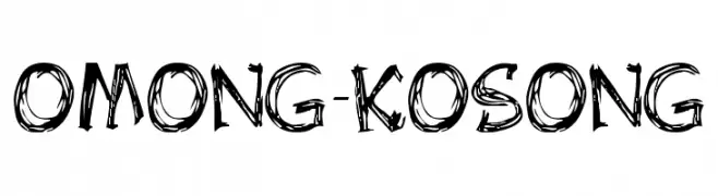
![OMONG-KOSONG Frei Schriftart Herunterladen]() Herunterladen 252 Downloads@WebFont
Herunterladen 252 Downloads@WebFont -
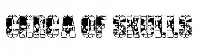
( Fonts by www.aenigmafonts.com )
A decorative font featuring unique skull designs for each character.
![Skull Capz BRK Frei Schriftart Herunterladen]() Herunterladen 251 Downloads@WebFont
Herunterladen 251 Downloads@WebFont -
( Fonts by www.fontdiner.com )
A bold, jagged font with sharp, angular edges for a dynamic look.
![Xerker Frei Schriftart Herunterladen]() Herunterladen 251 Downloads@WebFont
Herunterladen 251 Downloads@WebFont -
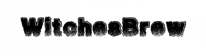
( Fonts by a Max Infeld - XEROGRAPHER FONTS - xerographer.blogspot.com . Personal-use only. For commercial use please contact owner. )
A bold, playful font with a textured, dotted pattern and rounded, irregular characters.
![WitchesBrew Frei Schriftart Herunterladen]() Herunterladen 251 Downloads@WebFont
Herunterladen 251 Downloads@WebFont -
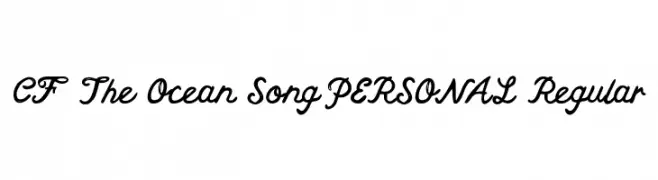
( CloutierFontes - Steve Cloutier - www.cloutierfontes.ca/ )
A flowing, cursive font with interconnected characters and a handwritten style.
![CF The Ocean Song PERSONAL Regular Frei Schriftart Herunterladen]() Herunterladen 251 Downloads@WebFont
Herunterladen 251 Downloads@WebFont -
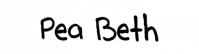
( Free for a personal use. For a commercial use please visit www.kevinandamanda.com )
A playful, handwritten font with a casual and informal style.
![Pea Beth Frei Schriftart Herunterladen]() Herunterladen 251 Downloads@WebFont
Herunterladen 251 Downloads@WebFont -
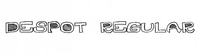
( Fonts by Alex Tomlinson - Skyhaven Fonts - shfonts.com )
A playful, hand-drawn font with bold outlines and textured patterns.
![DesPot-Regular Frei Schriftart Herunterladen]() Herunterladen 251 Downloads@WebFont
Herunterladen 251 Downloads@WebFont -
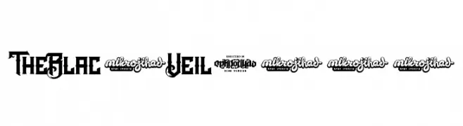
![TheBlackVeilDEMO Frei Schriftart Herunterladen]() Herunterladen 251 Downloads@WebFont
Herunterladen 251 Downloads@WebFont


Welche Schriften sind gerade am populärsten?
Poppins, Roboto, Montserrat, Open Sans und Lato sind wegen ihrer klaren Formen und breiten Einsetzbarkeit sehr gefragt – von Markenauftritt über Landingpages bis hin zu Postern.
Welche Fonts eignen sich für Logos?
Geometrische Sans‑Serifs (z. B. Poppins, Familien im Gotham‑Stil) sind ein häufiger Griff für sauberes, skalierbares Branding. Für eine persönlichere Note bleiben Scripts und Handschrift‑Stile beliebt. Kombinieren Sie einen prägnanten Headline‑Font mit einer neutralen Brotschrift für Wiedererkennung und Harmonie.
Wie oft wird die Top‑Liste aktualisiert?
Regelmäßig – basierend auf realen Downloads und Interaktionen. Schauen Sie öfter vorbei, um aufstrebende Favoriten früh zu entdecken.
💡 Tipp: Seite bookmarken – Trends wechseln schnell, und heutige Top‑Schriften inspirieren morgen vielleicht das Rebranding.