Willkommen bei den Top‑Schriften – hier treffen Beliebtheit und Qualität aufeinander. Das sind die in diesem Jahr am häufigsten heruntergeladenen und genutzten Fonts. Wenn Sie sichere Optionen für Logo, Web oder Social suchen, starten Sie hier.
Jeder Top‑Font überzeugt durch Balance, Lesbarkeit und Vielseitigkeit. Sie finden moderne Sans‑Serifs, elegante Scripts, Vintage‑Serifs und minimalistische Displays.
-
 Herunterladen 3389 Downloads@WebFont
 -
( wassimo.net )
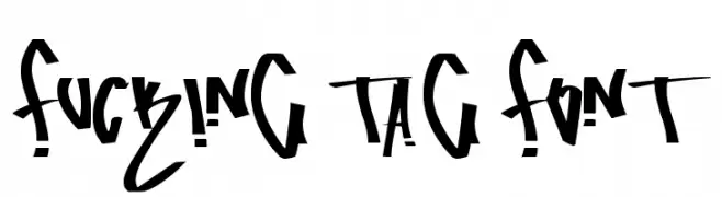
A bold, graffiti-inspired font with sharp, angular lines and dynamic flow.
![fucking tag font Frei Schriftart Herunterladen]() Herunterladen 3389 Downloads@WebFont
Herunterladen 3389 Downloads@WebFont -
( Fonts by Bree Gorton )
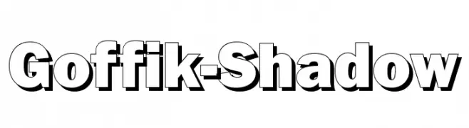
A bold, shadowed sans-serif font with a modern, three-dimensional look.
![Goffik-Shadow Frei Schriftart Herunterladen]() Herunterladen 3389 Downloads@WebFont
Herunterladen 3389 Downloads@WebFont -
( Fonts by Daniel Zadorozny - www.iconian.com )
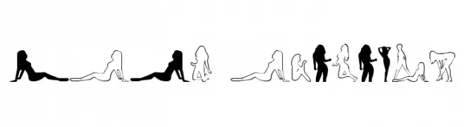
A decorative font featuring silhouette figures in various poses.
![Babe-alicious Frei Schriftart Herunterladen]() Herunterladen 3389 Downloads
Herunterladen 3389 Downloads -
![FTY SPEEDY CASUAL NCV Frei Schriftart Herunterladen]() Herunterladen 3388 Downloads@WebFont
Herunterladen 3388 Downloads@WebFont -
( Fonts by www.fontalicious.com )
A bold, decorative font with a playful, vintage flair.
![Malibu Frei Schriftart Herunterladen]() Herunterladen 3388 Downloads@WebFont
Herunterladen 3388 Downloads@WebFont -
( Copyright 2018 The Mali Project Authors (https://github.com/cadsondemak/Mali) )
A playful, rounded font with smooth curves and a friendly appearance.
![Mali Medium Frei Schriftart Herunterladen]() Herunterladen 3387 Downloads@WebFont
Herunterladen 3387 Downloads@WebFont -
![Super Mario 286 Frei Schriftart Herunterladen]() Herunterladen 3387 Downloads@WebFont
Herunterladen 3387 Downloads@WebFont -
( www.drawperfect.com/ )
A geometric, angular font with a modern, blocky style.
![FORCED SQUARE Frei Schriftart Herunterladen]() Herunterladen 3387 Downloads@WebFont
Herunterladen 3387 Downloads@WebFont -
![NBA SuperSonics Frei Schriftart Herunterladen]() Herunterladen 3387 Downloads@WebFont
Herunterladen 3387 Downloads@WebFont -
( Fonts by www.twopeasinabucket.com )
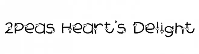
A playful, heart-adorned font with a hand-drawn, whimsical style.
![2Peas Heart's Delight Frei Schriftart Herunterladen]() Herunterladen 3387 Downloads@WebFont
Herunterladen 3387 Downloads@WebFont -
![Xilo Cordel Literature Frei Schriftart Herunterladen]() Herunterladen 3385 Downloads@WebFont
Herunterladen 3385 Downloads@WebFont -
Schriftart von NicholasJudy456. For commercial use please contact the owner.
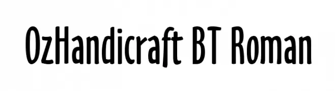
![OzHandicraft BT Roman Frei Schriftart Herunterladen]() Herunterladen 3384 Downloads@WebFont
Herunterladen 3384 Downloads@WebFont -
Schriftart von JuanCasco. For commercial use please contact the owner.
( Fonts by Juan Casco - www.juancasco.net )
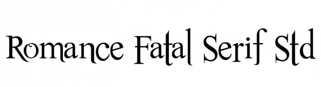
A classic serif font with elegant, elongated strokes and a sophisticated appearance.
![Romance Fatal Serif Std Frei Schriftart Herunterladen]() Herunterladen 3384 Downloads@WebFont
Herunterladen 3384 Downloads@WebFont -
( Fonts by Pelle Piano - hem.passagen.se/spsweet/index3.html )
A modern, geometric font with a futuristic style and clean lines.
![PP_Hip20s Frei Schriftart Herunterladen]() Herunterladen 3384 Downloads@WebFont
Herunterladen 3384 Downloads@WebFont -
( Fonts by Paul Lloyd )
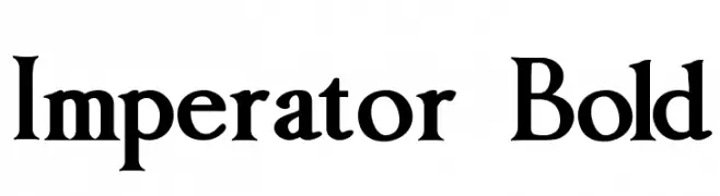
A bold serif font with high contrast and a classic, authoritative style.
![Imperator Bold Frei Schriftart Herunterladen]() Herunterladen 3384 Downloads@WebFont
Herunterladen 3384 Downloads@WebFont -
( Fonts by Dieter Steffmann )
A bold, geometric font with art deco influences, perfect for impactful designs.
![Tribeca Frei Schriftart Herunterladen]() Herunterladen 3383 Downloads@WebFont
Herunterladen 3383 Downloads@WebFont -
( Copyright 2019 The Big Shoulders Project Authors (https://github.com/xotypeco/big_shoulders) )
A bold, modern typeface with tall, narrow letterforms and strong vertical emphasis.
![Big Shoulders Display Bold Frei Schriftart Herunterladen]() Herunterladen 3382 Downloads@WebFont
Herunterladen 3382 Downloads@WebFont -
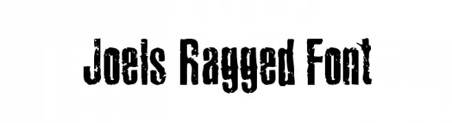
( Fonts by Joel Merritt )
A rugged, distressed font with a bold, impactful style and textured appearance.
![Joels Ragged Font Frei Schriftart Herunterladen]() Herunterladen 3382 Downloads@WebFont
Herunterladen 3382 Downloads@WebFont -
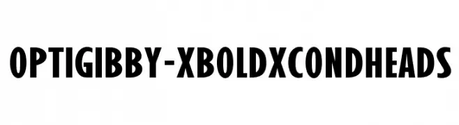
( Fonts by Castcraft Software - opti.netii.net - check the website before use )
A bold, condensed font with uniform strokes for strong visual impact.
![OPTIGibby-XBoldXCondHeads Frei Schriftart Herunterladen]() Herunterladen 3382 Downloads@WebFont
Herunterladen 3382 Downloads@WebFont -
![ER Kurier 1251 Frei Schriftart Herunterladen]() Herunterladen 3382 Downloads@WebFont
Herunterladen 3382 Downloads@WebFont -
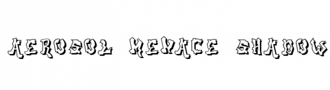
![aerosol menace shadow Frei Schriftart Herunterladen]() Herunterladen 3381 Downloads@WebFont
Herunterladen 3381 Downloads@WebFont -
( Fonts by ShyFonts )
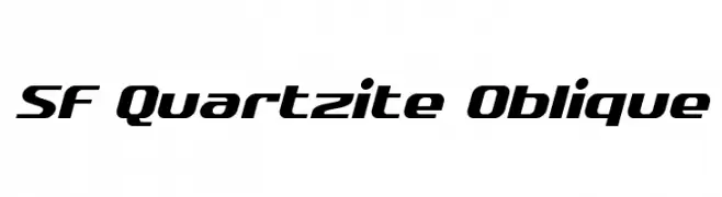
A modern, oblique font with bold, condensed characters and a sleek design.
![SF Quartzite Oblique Frei Schriftart Herunterladen]() Herunterladen 3381 Downloads@WebFont
Herunterladen 3381 Downloads@WebFont -
![1stGrade Frei Schriftart Herunterladen]() Herunterladen 3381 Downloads
Herunterladen 3381 Downloads -
( Fonts by Studio Floris Voorveld . Personal-use only. For commercial use please contact owner. )
A modern, rounded sans-serif font with uniform strokes and a friendly appearance.
![FV Almelo Frei Schriftart Herunterladen]() Herunterladen 3380 Downloads@WebFont
Herunterladen 3380 Downloads@WebFont -
( Fonts by Manfred Klein - manfred-klein.ina-mar.com )
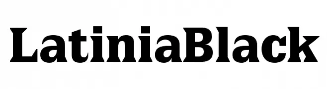
A bold, high-contrast serif font with strong, authoritative strokes.
![LatiniaBlack Frei Schriftart Herunterladen]() Herunterladen 3380 Downloads@WebFont
Herunterladen 3380 Downloads@WebFont -
( Fonts by Nick Curtis - www.nicksfonts.com )
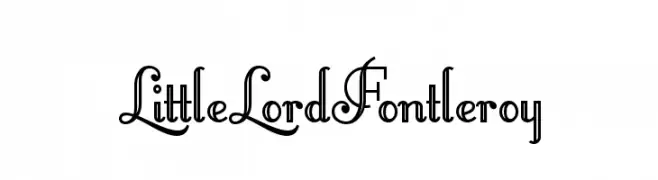
An ornate and decorative font with vintage-inspired flourishes.
![LittleLordFontleroy Frei Schriftart Herunterladen]() Herunterladen 3380 Downloads@WebFont
Herunterladen 3380 Downloads@WebFont -
( Fonts by Digital Graphics Labs - www.digitalgraphiclabs.com )
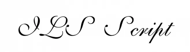
An elegant script font with flowing, cursive characters and intricate flourishes.
![ILS Script Frei Schriftart Herunterladen]() Herunterladen 3380 Downloads@WebFont
Herunterladen 3380 Downloads@WebFont -
![Arcade R Frei Schriftart Herunterladen]() Herunterladen 3380 Downloads@WebFont
Herunterladen 3380 Downloads@WebFont -
( Fonts by Manfred Klein. Free for private and charity use. Free for commercial with donation to organizations )
A classic serif font with elegant strokes and moderate contrast.
![Bamboo Frei Schriftart Herunterladen]() Herunterladen 3379 Downloads@WebFont
Herunterladen 3379 Downloads@WebFont -
( www.jennasuedesign.com )
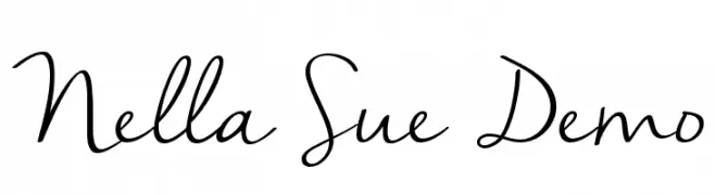
A flowing, cursive script font with elegant, handwritten characteristics.
![Nella Sue Demo Frei Schriftart Herunterladen]() Herunterladen 3378 Downloads@WebFont
Herunterladen 3378 Downloads@WebFont -
( Copyright (c) 2011-2012, Julieta Ulanovsky (julieta.ulanovsky@gmail.com), with Reserved Font Names 'Montserrat' )
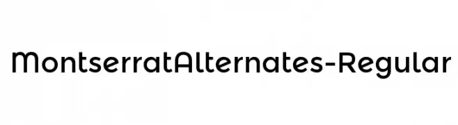
A modern, geometric font with clean lines and rounded edges.
![MontserratAlternates-Regular Frei Schriftart Herunterladen]() Herunterladen 3377 Downloads@WebFont
Herunterladen 3377 Downloads@WebFont -
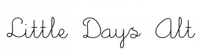
![Little Days Alt Frei Schriftart Herunterladen]() Herunterladen 3377 Downloads@WebFont
Herunterladen 3377 Downloads@WebFont -
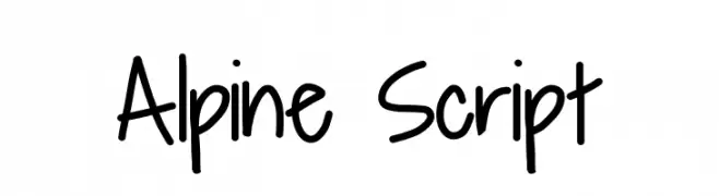
![Alpine Script Frei Schriftart Herunterladen]() Herunterladen 3375 Downloads@WebFont
Herunterladen 3375 Downloads@WebFont -
( Fonts by Ayelen Arpini )
A bold serif font with a modern twist, featuring elegant curves and strong vertical lines.
![bauserif Frei Schriftart Herunterladen]() Herunterladen 3374 Downloads@WebFont
Herunterladen 3374 Downloads@WebFont


Welche Schriften sind gerade am populärsten?
Poppins, Roboto, Montserrat, Open Sans und Lato sind wegen ihrer klaren Formen und breiten Einsetzbarkeit sehr gefragt – von Markenauftritt über Landingpages bis hin zu Postern.
Welche Fonts eignen sich für Logos?
Geometrische Sans‑Serifs (z. B. Poppins, Familien im Gotham‑Stil) sind ein häufiger Griff für sauberes, skalierbares Branding. Für eine persönlichere Note bleiben Scripts und Handschrift‑Stile beliebt. Kombinieren Sie einen prägnanten Headline‑Font mit einer neutralen Brotschrift für Wiedererkennung und Harmonie.
Wie oft wird die Top‑Liste aktualisiert?
Regelmäßig – basierend auf realen Downloads und Interaktionen. Schauen Sie öfter vorbei, um aufstrebende Favoriten früh zu entdecken.
💡 Tipp: Seite bookmarken – Trends wechseln schnell, und heutige Top‑Schriften inspirieren morgen vielleicht das Rebranding.