Willkommen bei den Top‑Schriften – hier treffen Beliebtheit und Qualität aufeinander. Das sind die in diesem Jahr am häufigsten heruntergeladenen und genutzten Fonts. Wenn Sie sichere Optionen für Logo, Web oder Social suchen, starten Sie hier.
Jeder Top‑Font überzeugt durch Balance, Lesbarkeit und Vielseitigkeit. Sie finden moderne Sans‑Serifs, elegante Scripts, Vintage‑Serifs und minimalistische Displays.
-
( Fonts by Woodcutter Manero - www.woodcutter.es - Personal-use only. For commercial use please contact owner. )
A textured, hand-drawn font with a playful and artistic style.
 Herunterladen 252 Downloads@WebFont
 -
( Fonts by Katelyn Heins )
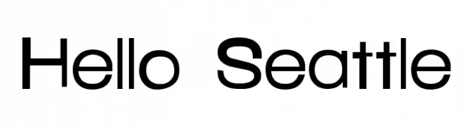
A modern, geometric sans-serif font with a clean and balanced appearance.
![Hello Seattle Frei Schriftart Herunterladen]() Herunterladen 252 Downloads@WebFont
Herunterladen 252 Downloads@WebFont -
( Fonts by www.feorag.com )
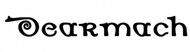
A whimsical and playful decorative font with curly and swirly elements.
![Dearmach Frei Schriftart Herunterladen]() Herunterladen 252 Downloads@WebFont
Herunterladen 252 Downloads@WebFont -
( Guiltype Studio - MIZAN - graphicriver.net/item/good-morning-purple/22116135 )
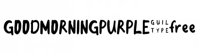
A playful, bold handwritten font with rounded edges and a whimsical style.
![GOODMORNINGPURPLE-free Frei Schriftart Herunterladen]() Herunterladen 252 Downloads@WebFont
Herunterladen 252 Downloads@WebFont -
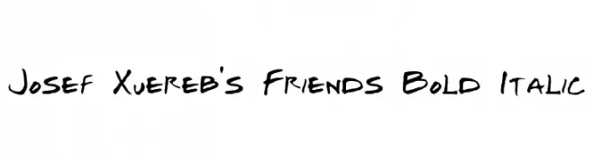
![Josef Xuereb's Friends Bold Italic Frei Schriftart Herunterladen]() Herunterladen 252 Downloads@WebFont
Herunterladen 252 Downloads@WebFont -
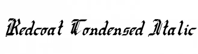
( Fonts by Daniel Zadorozny - www.iconian.com - Free for personal use )
A bold, condensed, and italicized font with high contrast and calligraphic elements.
![Redcoat Condensed Italic Frei Schriftart Herunterladen]() Herunterladen 252 Downloads@WebFont
Herunterladen 252 Downloads@WebFont -
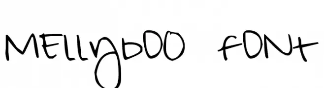
![MEllybO0 fONt Frei Schriftart Herunterladen]() Herunterladen 252 Downloads@WebFont
Herunterladen 252 Downloads@WebFont -
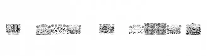
![My Font Quraan 1 Frei Schriftart Herunterladen]() Herunterladen 252 Downloads@WebFont
Herunterladen 252 Downloads@WebFont -
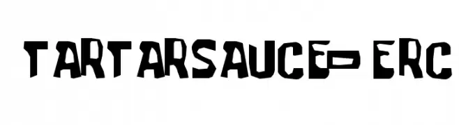
( Font by Eric Wirjanata. All of my font are donation based. You can support by buying something from here. http://society6.com/EricWirjanata )
A bold, cartoonish font with irregular, playful shapes and a hand-drawn feel.
![tartarsauce_erc Frei Schriftart Herunterladen]() Herunterladen 252 Downloads@WebFont
Herunterladen 252 Downloads@WebFont -
( Fonts by David Kerkhoff - www.hanodedphotography.com )
A medieval-inspired font with calligraphic, decorative elements.
![DKNorthumbria Frei Schriftart Herunterladen]() Herunterladen 252 Downloads@WebFont
Herunterladen 252 Downloads@WebFont -
( Fonts by Måns Grebäck )
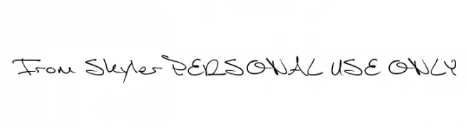
A dynamic, expressive handwritten font with fluid strokes and a casual flair.
![From Skyler PERSONAL USE ONLY Frei Schriftart Herunterladen]() Herunterladen 252 Downloads@WebFont
Herunterladen 252 Downloads@WebFont -
( Paul Lloyd Fonts )
A modern, clean font with small caps and uniform design.
![NewStyleSmallCaps Frei Schriftart Herunterladen]() Herunterladen 252 Downloads@WebFont
Herunterladen 252 Downloads@WebFont -
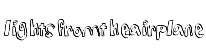
![lightsfromtheairplane Frei Schriftart Herunterladen]() Herunterladen 252 Downloads@WebFont
Herunterladen 252 Downloads@WebFont -
( Fonts by Wino S Kadir - weknow - www.revolge.com/shop/weknow/ - Personal-use only. For commercial use please contact owner. )
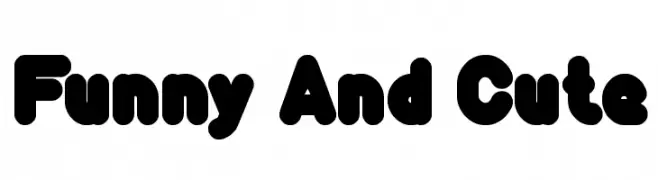
A playful, bold font with rounded, bubbly characters.
![Funny And Cute Frei Schriftart Herunterladen]() Herunterladen 252 Downloads@WebFont
Herunterladen 252 Downloads@WebFont -
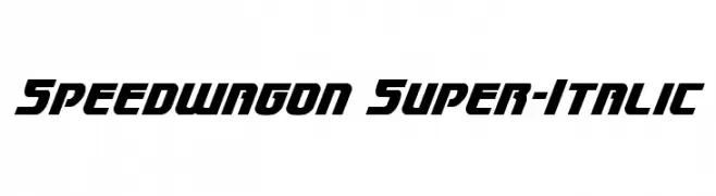
( Fonts by Daniel Zadorozny - www.iconian.com - Free for personal use )
A bold, italic font with a modern, dynamic style.
![Speedwagon Super-Italic Frei Schriftart Herunterladen]() Herunterladen 252 Downloads@WebFont
Herunterladen 252 Downloads@WebFont -
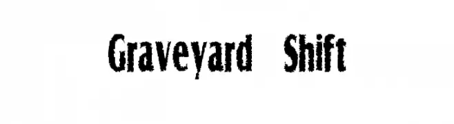
( Fonts by Peter Stanton )
A distressed, textured font with a rugged, vintage aesthetic.
![Graveyard Shift Frei Schriftart Herunterladen]() Herunterladen 252 Downloads@WebFont
Herunterladen 252 Downloads@WebFont -
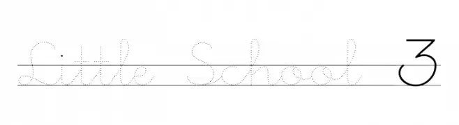
![Little School 3 Frei Schriftart Herunterladen]() Herunterladen 252 Downloads@WebFont
Herunterladen 252 Downloads@WebFont -
![Niere Frei Schriftart Herunterladen]() Herunterladen 252 Downloads@WebFont
Herunterladen 252 Downloads@WebFont -
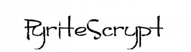
( Fonts by Andrew Hart - dirt2.com )
A rugged, hand-drawn font with textured strokes and an organic feel.
![PyriteScrypt Frei Schriftart Herunterladen]() Herunterladen 252 Downloads@WebFont
Herunterladen 252 Downloads@WebFont -
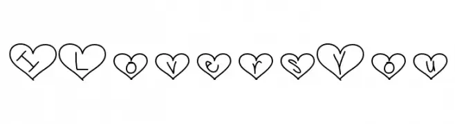
( Fonts by Vanessa Bays - bythebutterfly.com )
A romantic, heart-themed font with handwritten characters inside heart shapes.
![ILoversYou Frei Schriftart Herunterladen]() Herunterladen 252 Downloads@WebFont
Herunterladen 252 Downloads@WebFont -
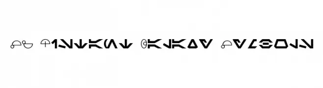
( Fonts by ShyFonts )
A decorative, futuristic font with bold, geometric symbols inspired by a distant galaxy theme.
![SF Distant Galaxy Symbols Frei Schriftart Herunterladen]() Herunterladen 252 Downloads@WebFont
Herunterladen 252 Downloads@WebFont -
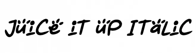
( Fonts by Darrell Flood )
A playful, handwritten font with bold, rounded strokes and a dynamic slant.
![Juice it up Italic Frei Schriftart Herunterladen]() Herunterladen 252 Downloads@WebFont
Herunterladen 252 Downloads@WebFont -
( Fonts by a Max Infeld - XEROGRAPHER FONTS - xerographer.blogspot.com . Personal-use only. For commercial use please contact owner. )
A bold, textured font with a distressed, stormy appearance.
![stormtime Frei Schriftart Herunterladen]() Herunterladen 252 Downloads@WebFont
Herunterladen 252 Downloads@WebFont -
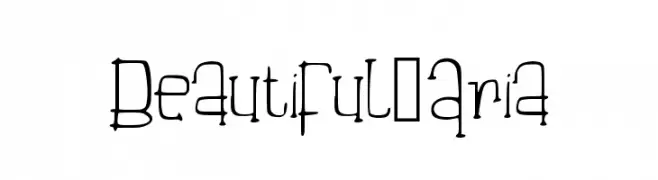
( [ )
An artistic, hand-drawn font with elongated, narrow letterforms and a whimsical style.
![Beautiful_Aria Frei Schriftart Herunterladen]() Herunterladen 252 Downloads@WebFont
Herunterladen 252 Downloads@WebFont -
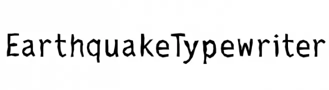
( Fonts by Manfred Klein. Free for private and charity use. Free for commercial with donation to organizations )
A rugged, hand-drawn typewriter-style font with a modern twist.
![EarthquakeTypewriter Frei Schriftart Herunterladen]() Herunterladen 252 Downloads@WebFont
Herunterladen 252 Downloads@WebFont -
![SF-Barbara Frei Schriftart Herunterladen]() Herunterladen 252 Downloads@WebFont
Herunterladen 252 Downloads@WebFont -
( Fonts by Alif Ryan Zulfikar )
Playful handwritten font with dynamic strokes.
![Yellow Black - Personal Use Frei Schriftart Herunterladen]() Herunterladen 252 Downloads@WebFont
Herunterladen 252 Downloads@WebFont -
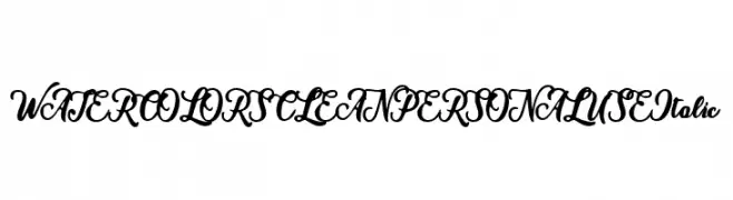
( Fonts by Billy Argel - Personal-use only. For commercial use please contact owner. )
An elegant, flowing script font with a bold, italic style.
![WATERCOLORS CLEAN PERSONAL USE Italic Frei Schriftart Herunterladen]() Herunterladen 252 Downloads@WebFont
Herunterladen 252 Downloads@WebFont -
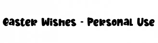
( Fonts by Stefani Letter )
A bold, playful font with rounded, hand-drawn style characters.
![Easter Wishes - Personal Use Frei Schriftart Herunterladen]() Herunterladen 252 Downloads@WebFont
Herunterladen 252 Downloads@WebFont -
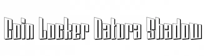
( Fonts by www.sweeep.fr - Damien Gosset )
A bold, three-dimensional shadow font with a modern, geometric style.
![Coin Locker Datura Shadow Frei Schriftart Herunterladen]() Herunterladen 252 Downloads@WebFont
Herunterladen 252 Downloads@WebFont -
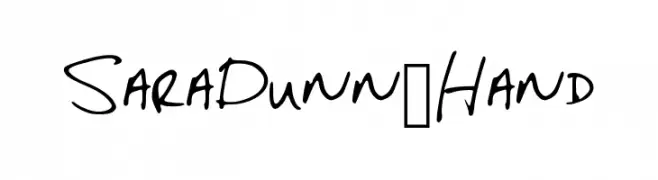
( Fonts by Sara Dunn )
A casual, handwritten font with a natural flow and personal touch.
![SaraDunn_Hand Frei Schriftart Herunterladen]() Herunterladen 252 Downloads@WebFont
Herunterladen 252 Downloads@WebFont -
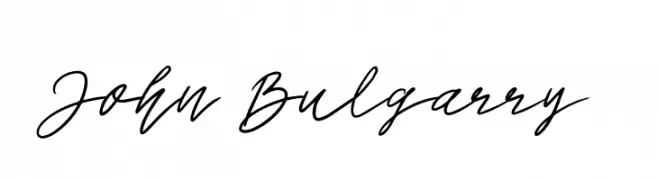
![John Bulgarry Frei Schriftart Herunterladen]() Herunterladen 252 Downloads@WebFont
Herunterladen 252 Downloads@WebFont -
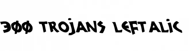
( Fonts by Daniel Zadorozny - www.iconian.com - Free for personal use )
A bold, italicized font with a playful and dynamic style.
![300 Trojans Leftalic Frei Schriftart Herunterladen]() Herunterladen 252 Downloads@WebFont
Herunterladen 252 Downloads@WebFont -
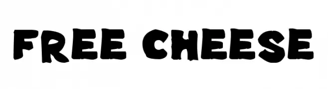
( Fonts by GGBotNet )
A bold, playful font with a hand-drawn, whimsical style.
![Free Cheese Frei Schriftart Herunterladen]() Herunterladen 252 Downloads@WebFont
Herunterladen 252 Downloads@WebFont -
![DingTrek Frei Schriftart Herunterladen]() Herunterladen 252 Downloads@WebFont
Herunterladen 252 Downloads@WebFont


Welche Schriften sind gerade am populärsten?
Poppins, Roboto, Montserrat, Open Sans und Lato sind wegen ihrer klaren Formen und breiten Einsetzbarkeit sehr gefragt – von Markenauftritt über Landingpages bis hin zu Postern.
Welche Fonts eignen sich für Logos?
Geometrische Sans‑Serifs (z. B. Poppins, Familien im Gotham‑Stil) sind ein häufiger Griff für sauberes, skalierbares Branding. Für eine persönlichere Note bleiben Scripts und Handschrift‑Stile beliebt. Kombinieren Sie einen prägnanten Headline‑Font mit einer neutralen Brotschrift für Wiedererkennung und Harmonie.
Wie oft wird die Top‑Liste aktualisiert?
Regelmäßig – basierend auf realen Downloads und Interaktionen. Schauen Sie öfter vorbei, um aufstrebende Favoriten früh zu entdecken.
💡 Tipp: Seite bookmarken – Trends wechseln schnell, und heutige Top‑Schriften inspirieren morgen vielleicht das Rebranding.