Willkommen bei den Top‑Schriften – hier treffen Beliebtheit und Qualität aufeinander. Das sind die in diesem Jahr am häufigsten heruntergeladenen und genutzten Fonts. Wenn Sie sichere Optionen für Logo, Web oder Social suchen, starten Sie hier.
Jeder Top‑Font überzeugt durch Balance, Lesbarkeit und Vielseitigkeit. Sie finden moderne Sans‑Serifs, elegante Scripts, Vintage‑Serifs und minimalistische Displays.
-
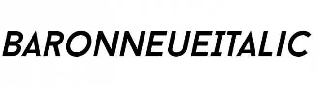
( Fonts by a www.fontfabric.com. Personal-use only. For commercial use please contact owner. )
A modern, italic font with a sleek, geometric design.
 Herunterladen 249 Downloads@WebFont
 -
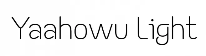
( Fonts by a Situjuh Nazara - c7n1.wordpress.com. Personal-use only. For commercial use please contact owner. )
A modern, rounded sans-serif font with clean lines and balanced proportions.
![Yaahowu Light Frei Schriftart Herunterladen]() Herunterladen 249 Downloads@WebFont
Herunterladen 249 Downloads@WebFont -
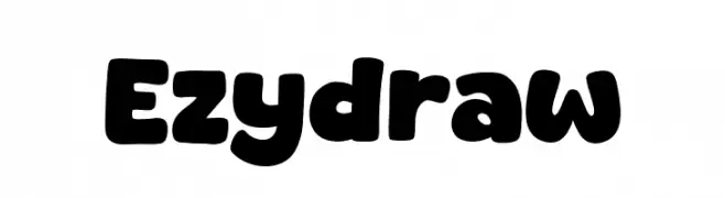
( Fonts by Khurasan )
A bold, rounded font with a playful and approachable style.
![Ezydraw Frei Schriftart Herunterladen]() Herunterladen 249 Downloads@WebFont
Herunterladen 249 Downloads@WebFont -
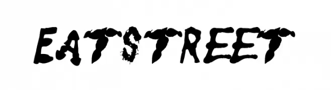
( Fonts by Chank Co. - www.chank.com )
A bold, grunge-style font with a distressed, brush-painted appearance.
![Eatstreet Frei Schriftart Herunterladen]() Herunterladen 249 Downloads@WebFont
Herunterladen 249 Downloads@WebFont -
![Inubozaki Gothic Frei Schriftart Herunterladen]() Herunterladen 249 Downloads@WebFont
Herunterladen 249 Downloads@WebFont -
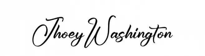
( Fonts by Letterena Studios )
A graceful script font with fluid, cursive strokes and elegant curves.
![Jhoey Washington Frei Schriftart Herunterladen]() Herunterladen 249 Downloads@WebFont
Herunterladen 249 Downloads@WebFont -
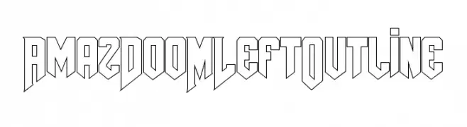
( Fonts by Amazingmax - Maxim Avdeev )
A bold, angular outlined font with a geometric, three-dimensional style.
![AmazDooMLeftOutline Frei Schriftart Herunterladen]() Herunterladen 249 Downloads@WebFont
Herunterladen 249 Downloads@WebFont -
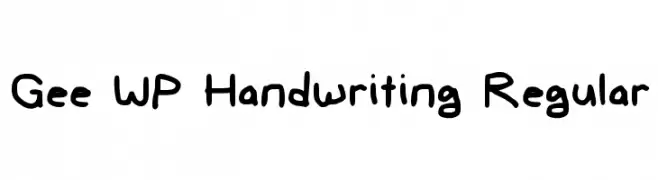
![Gee WP Handwriting Regular Frei Schriftart Herunterladen]() Herunterladen 249 Downloads@WebFont
Herunterladen 249 Downloads@WebFont -
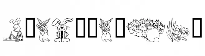
( Fonts by Kat`s Fun Fonts - Personal-use only. For commercial use please contact owner. )
A decorative Easter-themed font with playful illustrations in each character.
![KR Easter No 2 Frei Schriftart Herunterladen]() Herunterladen 249 Downloads@WebFont
Herunterladen 249 Downloads@WebFont -
![Aircraft1 Frei Schriftart Herunterladen]() Herunterladen 249 Downloads@WebFont
Herunterladen 249 Downloads@WebFont -
( Fonts by Steve Cloutier - www.cloutierfontes.ca )
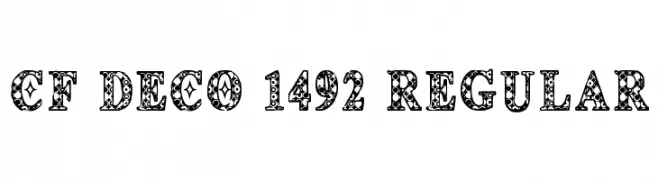
An ornate and decorative font with intricate patterns within each character.
![CF Deco 1492 Regular Frei Schriftart Herunterladen]() Herunterladen 249 Downloads@WebFont
Herunterladen 249 Downloads@WebFont -
( Please check the owner website: http://www.billie.grosse.is-a-geek.com )
A thin, elegant font with modern and traditional elements, featuring distinctive curves and balanced spacing.
![Gurvetica a1 Thin Frei Schriftart Herunterladen]() Herunterladen 249 Downloads@WebFont
Herunterladen 249 Downloads@WebFont -
( fontm.com/author/weknow/ )
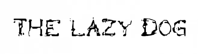
A distressed, grungy font with irregular edges and a bold, artistic style.
![the lazy dog Frei Schriftart Herunterladen]() Herunterladen 249 Downloads@WebFont
Herunterladen 249 Downloads@WebFont -
( Rafael Saldaña - ikarusmedia.deviantart.com/gallery/ https://www.dafont.com/es/dotgrid.font )
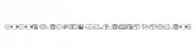
Intricate glyphs inspired by ancient Mayan art with bold outlines.
![mayan glyphs outline Regular Frei Schriftart Herunterladen]() Herunterladen 249 Downloads@WebFont
Herunterladen 249 Downloads@WebFont -
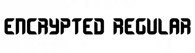
( Fonts by Geronimo Fonts - Personal-use only. For commercial use please contact owner. )
A bold, futuristic font with geometric and blocky characters.
![Encrypted Regular Frei Schriftart Herunterladen]() Herunterladen 249 Downloads@WebFont
Herunterladen 249 Downloads@WebFont -
( Fonts by Woodcutter Manero - http://www.woodcutter.es - Personal-use only. For commercial use please contact owner. )
A bold, distressed font with a vintage, artistic style.
![Trapeze Artist Frei Schriftart Herunterladen]() Herunterladen 249 Downloads@WebFont
Herunterladen 249 Downloads@WebFont -
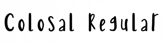
![Colosal Regular Frei Schriftart Herunterladen]() Herunterladen 249 Downloads@WebFont
Herunterladen 249 Downloads@WebFont -
( Free - https://www.facebook.com/KBKpictures )
A bold, monospaced font with a jagged, distressed uppercase style and geometric lowercase design.
![monolyth-Monospaced Frei Schriftart Herunterladen]() Herunterladen 249 Downloads@WebFont
Herunterladen 249 Downloads@WebFont -
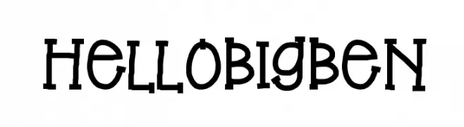
( Fonts by Jen Jones )
A playful, hand-drawn font with a whimsical and cartoonish style.
![HelloBigBen Frei Schriftart Herunterladen]() Herunterladen 249 Downloads@WebFont
Herunterladen 249 Downloads@WebFont -
![Gritten Frei Schriftart Herunterladen]() Herunterladen 249 Downloads@WebFont
Herunterladen 249 Downloads@WebFont -
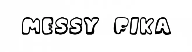
( Fonts by Viktor Örneland )
A playful, bold, and cartoonish font with rounded, hand-drawn characters.
![Messy Fika Frei Schriftart Herunterladen]() Herunterladen 249 Downloads@WebFont
Herunterladen 249 Downloads@WebFont -
( Fonts by Evad )
A bold, cracked texture font with a distressed, rugged appearance.
![iCrack Regular Frei Schriftart Herunterladen]() Herunterladen 249 Downloads@WebFont
Herunterladen 249 Downloads@WebFont -
( Fonts by Almarkhatype - Abdul Malik Wisnu - Personal-use only. For commercial use please contact owner. )
A bold, expressive script font with dynamic, flowing letterforms.
![Alibabe Frei Schriftart Herunterladen]() Herunterladen 249 Downloads@WebFont
Herunterladen 249 Downloads@WebFont -
( Noto is a trademark of Google Inc. Noto fonts are open source. All Noto fonts are published under the SIL Open Font License, Version 1.1 )
A bold, modern sans-serif font with clean lines and excellent readability.
![Noto Sans Malayalam UI Bold Frei Schriftart Herunterladen]() Herunterladen 249 Downloads@WebFont
Herunterladen 249 Downloads@WebFont -
![RvD_PRINTPLATE Frei Schriftart Herunterladen]() Herunterladen 249 Downloads@WebFont
Herunterladen 249 Downloads@WebFont -
![SF WADIM GIANT LINES Frei Schriftart Herunterladen]() Herunterladen 249 Downloads@WebFont
Herunterladen 249 Downloads@WebFont -
![Mutant Frei Schriftart Herunterladen]() Herunterladen 249 Downloads@WebFont
Herunterladen 249 Downloads@WebFont -
( Fonts by David Kerkhoff - www.hanodedphotography.com )
A bold, geometric font with a pixelated, digital aesthetic.
![Square One Frei Schriftart Herunterladen]() Herunterladen 249 Downloads@WebFont
Herunterladen 249 Downloads@WebFont -
( Fonts by Modestype Studio )
A bold, geometric font with an edgy and dynamic style.
![Rasic-Life Frei Schriftart Herunterladen]() Herunterladen 249 Downloads@WebFont
Herunterladen 249 Downloads@WebFont -
( Fonts by Daniel Zadorozny - www.iconian.com )
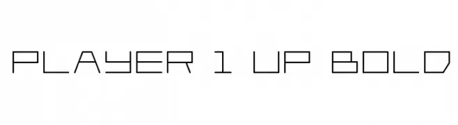
A geometric, futuristic font with a digital aesthetic and uniform stroke width.
![Player 1 Up Bold Frei Schriftart Herunterladen]() Herunterladen 249 Downloads@WebFont
Herunterladen 249 Downloads@WebFont -
( ingoFonts - Ingo Zimmermann - www.ingofonts.com )
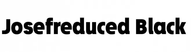
A bold, modern font with thick, uniform strokes and high legibility.
![Josefreduced-Black Frei Schriftart Herunterladen]() Herunterladen 249 Downloads@WebFont
Herunterladen 249 Downloads@WebFont -
( Southype - Rodrigo Gonzalez - www.southype.com )
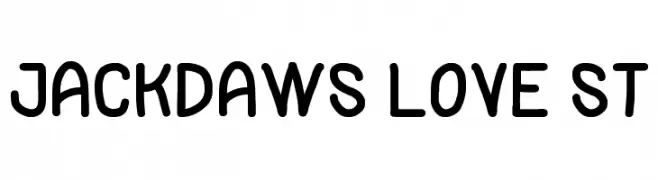
A playful, rounded font with a whimsical and friendly style.
![Jackdaws Love St Frei Schriftart Herunterladen]() Herunterladen 249 Downloads@WebFont
Herunterladen 249 Downloads@WebFont -
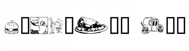
( Fonts by Graham Meade - GemFonts )
Food-themed dingbat font with detailed culinary illustrations.
![Culinary Art Frei Schriftart Herunterladen]() Herunterladen 249 Downloads@WebFont
Herunterladen 249 Downloads@WebFont -
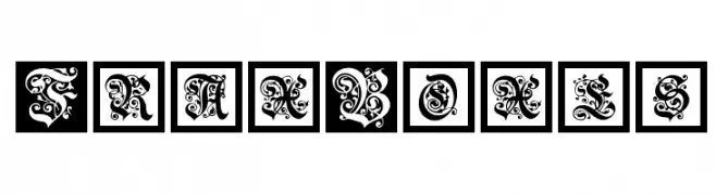
( Fonts by Manfred Klein. Free for private and charity use. Free for commercial with donation to organizations )
An ornate, boxed decorative font with intricate floral patterns.
![FraxBoxes Frei Schriftart Herunterladen]() Herunterladen 249 Downloads@WebFont
Herunterladen 249 Downloads@WebFont -
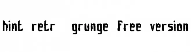
( Fonts by www.fontscafe.com )
A rugged, distressed font with a bold, hand-drawn appearance.
![hint-retrò-grunge_free-version Frei Schriftart Herunterladen]() Herunterladen 249 Downloads@WebFont
Herunterladen 249 Downloads@WebFont


Welche Schriften sind gerade am populärsten?
Poppins, Roboto, Montserrat, Open Sans und Lato sind wegen ihrer klaren Formen und breiten Einsetzbarkeit sehr gefragt – von Markenauftritt über Landingpages bis hin zu Postern.
Welche Fonts eignen sich für Logos?
Geometrische Sans‑Serifs (z. B. Poppins, Familien im Gotham‑Stil) sind ein häufiger Griff für sauberes, skalierbares Branding. Für eine persönlichere Note bleiben Scripts und Handschrift‑Stile beliebt. Kombinieren Sie einen prägnanten Headline‑Font mit einer neutralen Brotschrift für Wiedererkennung und Harmonie.
Wie oft wird die Top‑Liste aktualisiert?
Regelmäßig – basierend auf realen Downloads und Interaktionen. Schauen Sie öfter vorbei, um aufstrebende Favoriten früh zu entdecken.
💡 Tipp: Seite bookmarken – Trends wechseln schnell, und heutige Top‑Schriften inspirieren morgen vielleicht das Rebranding.