Willkommen bei den Top‑Schriften – hier treffen Beliebtheit und Qualität aufeinander. Das sind die in diesem Jahr am häufigsten heruntergeladenen und genutzten Fonts. Wenn Sie sichere Optionen für Logo, Web oder Social suchen, starten Sie hier.
Jeder Top‑Font überzeugt durch Balance, Lesbarkeit und Vielseitigkeit. Sie finden moderne Sans‑Serifs, elegante Scripts, Vintage‑Serifs und minimalistische Displays.
-
 Herunterladen 247 Downloads@WebFont
 -
![Greenman Frei Schriftart Herunterladen]() Herunterladen 247 Downloads@WebFont
Herunterladen 247 Downloads@WebFont -
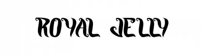
( Docallisme HAS Feat Dutsky - docallisme.blogspot.com )
A bold, playful font with exaggerated, cartoonish characters.
![GOING MERRY Frei Schriftart Herunterladen]() Herunterladen 247 Downloads@WebFont
Herunterladen 247 Downloads@WebFont -
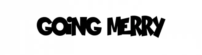
( Fonts by zamjump - Ahmad Zamzami - Personal-use only. For commercial use please contact owner. )
A playful, handwritten font with tall, narrow letters and a casual style.
![Melon Kundang Frei Schriftart Herunterladen]() Herunterladen 247 Downloads@WebFont
Herunterladen 247 Downloads@WebFont -
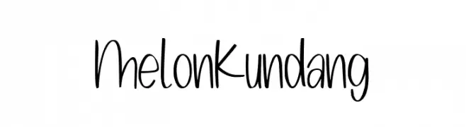
( Fonts by Punchcut )
A sleek, modern, light, and condensed italic font with tight spacing.
![Amble Light Condensed Italic Frei Schriftart Herunterladen]() Herunterladen 247 Downloads@WebFont
Herunterladen 247 Downloads@WebFont -
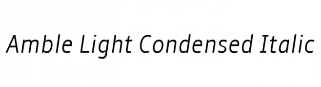
( Fonts by Situjuh Nazara - 7ntypes.com - Personal-use only. For commercial use please contact owner. )
A bold, italicized script font with a dynamic, hand-drawn style.
![Molleat Italic Frei Schriftart Herunterladen]() Herunterladen 247 Downloads@WebFont
Herunterladen 247 Downloads@WebFont -
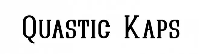
( Fonts by Apostrophic Lab )
A bold, structured serif font with a modern twist, ideal for impactful designs.
![Quastic Kaps Frei Schriftart Herunterladen]() Herunterladen 247 Downloads@WebFont
Herunterladen 247 Downloads@WebFont -
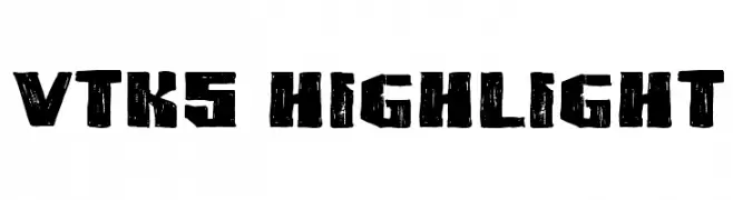
( Fonts by Douglas Vitkauskas - www.vtksdesign.com. Personal-use only. For commercial use please contact owner. )
A bold, distressed font with a grunge, urban aesthetic.
![VTKS HIGHLIGHT Frei Schriftart Herunterladen]() Herunterladen 247 Downloads@WebFont
Herunterladen 247 Downloads@WebFont -
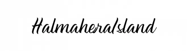
![Halmahera Island Frei Schriftart Herunterladen]() Herunterladen 247 Downloads@WebFont
Herunterladen 247 Downloads@WebFont -
![Twilight Express Frei Schriftart Herunterladen]() Herunterladen 247 Downloads@WebFont
Herunterladen 247 Downloads@WebFont -
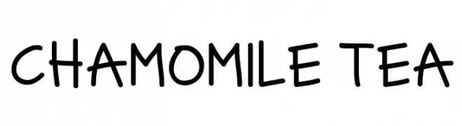
( Fonts by kokiri studio )
A playful, handwritten font with rounded, slightly irregular letterforms.
![CHAMOMILE TEA Frei Schriftart Herunterladen]() Herunterladen 247 Downloads@WebFont
Herunterladen 247 Downloads@WebFont -
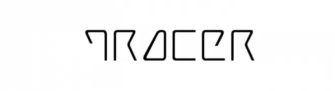
![Tracer Frei Schriftart Herunterladen]() Herunterladen 247 Downloads
Herunterladen 247 Downloads -
( Fonts by Hanoded )
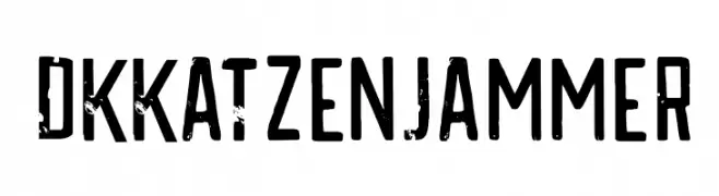
A bold, distressed font with a vintage, grunge aesthetic and playful cat icons.
![DKKatzenjammer Frei Schriftart Herunterladen]() Herunterladen 247 Downloads@WebFont
Herunterladen 247 Downloads@WebFont -
( Fonts by Dikas Studio )
A vintage, distressed font with decorative elements and a hand-crafted appearance.
![ChapterOneVintageFree Frei Schriftart Herunterladen]() Herunterladen 247 Downloads@WebFont
Herunterladen 247 Downloads@WebFont -
( Fonts by or from www.graffitifonts.net )
A chaotic, vine-like decorative font with an edgy, artistic flair.
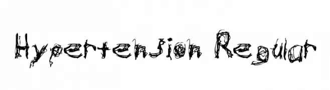
![Hypertension Regular Frei Schriftart Herunterladen]() Herunterladen 247 Downloads@WebFont
Herunterladen 247 Downloads@WebFont -
( Fonts by Mans Greback - Personal-use only. For commercial use please contact owner. )
A bold, modern script font with elegant, flowing strokes.
![Lil Johnny PERSONAL USE ONLY Regular Frei Schriftart Herunterladen]() Herunterladen 247 Downloads@WebFont
Herunterladen 247 Downloads@WebFont -
( Fonts by CannotIntoSpaceFonts - KineticPlasma Fonts - Personal-use only. For commercial use please contact owner. )
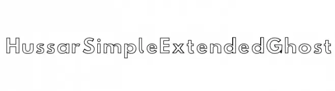
A modern, outlined font with geometric precision and a sleek, sophisticated style.
![Hussar Simple Extended Ghost Frei Schriftart Herunterladen]() Herunterladen 247 Downloads@WebFont
Herunterladen 247 Downloads@WebFont -
( Fonts by Daniel Zadorozny - www.iconian.com - Free for personal use )
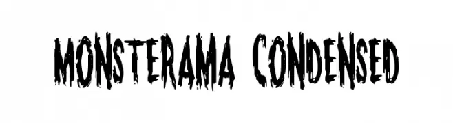
A bold, jagged, and distressed font ideal for horror-themed designs.
![Monsterama Condensed Frei Schriftart Herunterladen]() Herunterladen 247 Downloads@WebFont
Herunterladen 247 Downloads@WebFont -
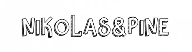
![Nikolas & Pine Frei Schriftart Herunterladen]() Herunterladen 247 Downloads@WebFont
Herunterladen 247 Downloads@WebFont -
( Fonts by JoannaVu - https://ioannaladopoulou.design - Personal-use only. For commercial use please contact owner. )
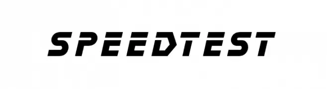
A bold, angular font with a modern, dynamic style.
![speedtest Frei Schriftart Herunterladen]() Herunterladen 247 Downloads@WebFont
Herunterladen 247 Downloads@WebFont -
![Fabullous Frei Schriftart Herunterladen]() Herunterladen 247 Downloads@WebFont
Herunterladen 247 Downloads@WebFont -
( Fonts by Mans Greback - www.mawns.com )
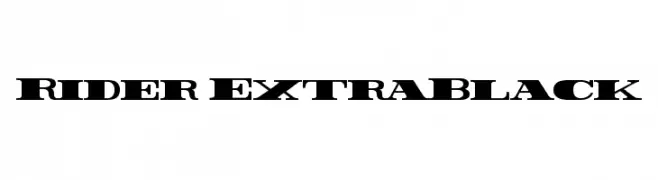
A bold, heavy serif font with strong horizontal emphasis and angular serifs.
![Rider ExtraBlack Frei Schriftart Herunterladen]() Herunterladen 247 Downloads@WebFont
Herunterladen 247 Downloads@WebFont -
![Dia de los Muertos Limited Free Version Frei Schriftart Herunterladen]() Herunterladen 247 Downloads@WebFont
Herunterladen 247 Downloads@WebFont -
![Annapolis Punch Italic Frei Schriftart Herunterladen]() Herunterladen 247 Downloads@WebFont
Herunterladen 247 Downloads@WebFont -
![Bigntall Frei Schriftart Herunterladen]() Herunterladen 247 Downloads@WebFont
Herunterladen 247 Downloads@WebFont -
( Fonts by Daniel Zadorozny - www.iconian.com )
A bold, geometric font with an expanded width and futuristic style.
![Stuntman Expanded Frei Schriftart Herunterladen]() Herunterladen 247 Downloads@WebFont
Herunterladen 247 Downloads@WebFont -
( Fonts by Ef Studio - Personal-use only. For commercial use please contact owner. )
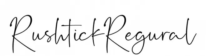
A fluid, handwritten cursive font with elegant, slender strokes.
![Rushtick Regural Frei Schriftart Herunterladen]() Herunterladen 247 Downloads@WebFont
Herunterladen 247 Downloads@WebFont -
( Fonts by Nick Curtis - www.nicksfonts.com )
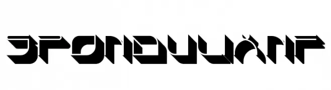
A bold, geometric font with a futuristic and angular design.
![SpondulixNF Frei Schriftart Herunterladen]() Herunterladen 247 Downloads@WebFont
Herunterladen 247 Downloads@WebFont -
( Fonts by Kreative Korporation - www.kreativekorp.com )
A casual, handwritten font with smooth, flowing lines and a relaxed style.
![Los Altos Frei Schriftart Herunterladen]() Herunterladen 247 Downloads@WebFont
Herunterladen 247 Downloads@WebFont -
Schriftart von typotopia. For commercial use please contact the owner.
( Fonts by Typotopia - Typotopia.co - Personal Use Only, for Commercial Use, please contact us )
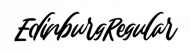
A bold, flowing script font with a dynamic, handwritten style.
![Edinburg Regular Frei Schriftart Herunterladen]() Herunterladen 247 Downloads@WebFont
Herunterladen 247 Downloads@WebFont -
![Kid Marker Frei Schriftart Herunterladen]() Herunterladen 247 Downloads@WebFont
Herunterladen 247 Downloads@WebFont -
( Fonts by Zetafonts - Personal-use only. For commercial use please contact owner. )
A bold slab serif font with strong, block-like serifs for impactful text.
![Amazing Slab Trial Extrabold Frei Schriftart Herunterladen]() Herunterladen 247 Downloads@WebFont
Herunterladen 247 Downloads@WebFont -
( ingoFonts - Ingo Zimmermann - www.ingofonts.com )
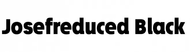
A bold, modern font with thick, uniform strokes and high legibility.
![Josefreduced-Black Frei Schriftart Herunterladen]() Herunterladen 247 Downloads@WebFont
Herunterladen 247 Downloads@WebFont -
( Fonts by Sumit Kumar )
Casual handwritten font with a playful style.
![Dimaag Frei Schriftart Herunterladen]() Herunterladen 247 Downloads@WebFont
Herunterladen 247 Downloads@WebFont -
![Bite Frei Schriftart Herunterladen]() Herunterladen 247 Downloads@WebFont
Herunterladen 247 Downloads@WebFont


Welche Schriften sind gerade am populärsten?
Poppins, Roboto, Montserrat, Open Sans und Lato sind wegen ihrer klaren Formen und breiten Einsetzbarkeit sehr gefragt – von Markenauftritt über Landingpages bis hin zu Postern.
Welche Fonts eignen sich für Logos?
Geometrische Sans‑Serifs (z. B. Poppins, Familien im Gotham‑Stil) sind ein häufiger Griff für sauberes, skalierbares Branding. Für eine persönlichere Note bleiben Scripts und Handschrift‑Stile beliebt. Kombinieren Sie einen prägnanten Headline‑Font mit einer neutralen Brotschrift für Wiedererkennung und Harmonie.
Wie oft wird die Top‑Liste aktualisiert?
Regelmäßig – basierend auf realen Downloads und Interaktionen. Schauen Sie öfter vorbei, um aufstrebende Favoriten früh zu entdecken.
💡 Tipp: Seite bookmarken – Trends wechseln schnell, und heutige Top‑Schriften inspirieren morgen vielleicht das Rebranding.