Willkommen bei den Top‑Schriften – hier treffen Beliebtheit und Qualität aufeinander. Das sind die in diesem Jahr am häufigsten heruntergeladenen und genutzten Fonts. Wenn Sie sichere Optionen für Logo, Web oder Social suchen, starten Sie hier.
Jeder Top‑Font überzeugt durch Balance, Lesbarkeit und Vielseitigkeit. Sie finden moderne Sans‑Serifs, elegante Scripts, Vintage‑Serifs und minimalistische Displays.
-
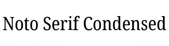
( Noto is a trademark of Google Inc. Noto fonts are open source. All Noto fonts are published under the SIL Open Font License, Version 1.1 )
A refined serif typeface with a condensed structure, offering elegance and readability.
 Herunterladen 247 Downloads@WebFont
 -
( www.flickr.com/kylesatori )
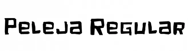
A bold, hand-drawn font with jagged edges and a rugged, artistic style.
![Peleja Regular Frei Schriftart Herunterladen]() Herunterladen 247 Downloads@WebFont
Herunterladen 247 Downloads@WebFont -
![vierzehn plain14px Frei Schriftart Herunterladen]() Herunterladen 247 Downloads@WebFont
Herunterladen 247 Downloads@WebFont -
( Fonts by Ahmad Muslimin )
A playful, whimsical font with bold, hand-drawn characters.
![Alaskia Frei Schriftart Herunterladen]() Herunterladen 247 Downloads@WebFont
Herunterladen 247 Downloads@WebFont -
( Fonts by Typhoon Type - Suthi Srisopha - www.typhoontype.net - Personal-use only. For commercial use please contact owner. )
A playful, festive font with a handwritten touch, ideal for holiday themes.
![Reindeer Christmas - Personal Use Frei Schriftart Herunterladen]() Herunterladen 247 Downloads@WebFont
Herunterladen 247 Downloads@WebFont -
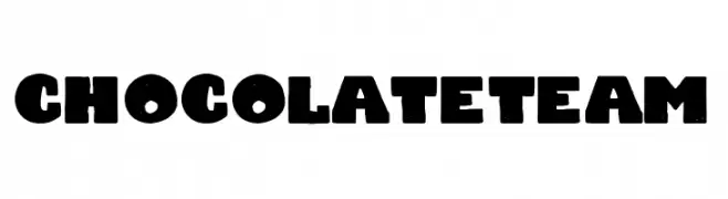
( Fonts by Woodcutter )
A bold, chunky font with a playful, vintage style.
![Chocolate Team Frei Schriftart Herunterladen]() Herunterladen 247 Downloads@WebFont
Herunterladen 247 Downloads@WebFont -
( Free for a personal use. For a commercial use please visit www.kevinandamanda.com )
A playful and dynamic script font with a handwritten appearance.
![Milktop Girl Frei Schriftart Herunterladen]() Herunterladen 247 Downloads@WebFont
Herunterladen 247 Downloads@WebFont -
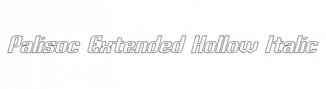
![Palisoc Extended Hollow Italic Frei Schriftart Herunterladen]() Herunterladen 247 Downloads@WebFont
Herunterladen 247 Downloads@WebFont -
( Sean Kleefeld - www.ffplaza.com/reccenter/fffont.shtml )
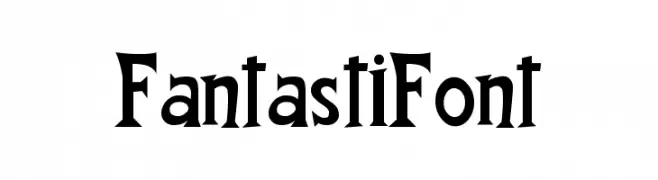
A bold, angular serif font with a medieval flair.
![FantastiFont Frei Schriftart Herunterladen]() Herunterladen 247 Downloads@WebFont
Herunterladen 247 Downloads@WebFont -
![TriacSeventyone Frei Schriftart Herunterladen]() Herunterladen 247 Downloads@WebFont
Herunterladen 247 Downloads@WebFont -
( Fonts by Astigmatic One Eye Typographic Institute - Brian J. Bonislawsky - astigmatic.com )
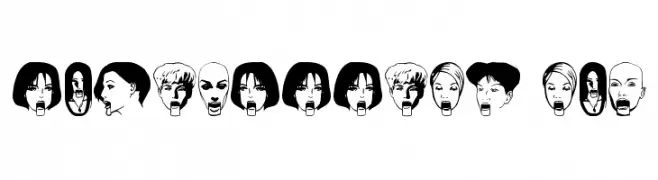
Expressive illustrated faces form each character in a bold, decorative style.
![TouristTrap AOE Frei Schriftart Herunterladen]() Herunterladen 247 Downloads@WebFont
Herunterladen 247 Downloads@WebFont -
![GAZA FONT Frei Schriftart Herunterladen]() Herunterladen 247 Downloads@WebFont
Herunterladen 247 Downloads@WebFont -
( Fonts by www.floodfonts.com )
A bold, pixelated font with a retro, digital aesthetic.
![AquariusBold Frei Schriftart Herunterladen]() Herunterladen 247 Downloads@WebFont
Herunterladen 247 Downloads@WebFont -
( Typodermic Fonts - Ray Larabie - www.typodermicfonts.com/ )
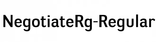
A modern sans-serif font with geometric letterforms and uniform stroke width.
![NegotiateRg-Regular Frei Schriftart Herunterladen]() Herunterladen 247 Downloads@WebFont
Herunterladen 247 Downloads@WebFont -
( Fonts by uatype.faithweb.com - UnAuthorized Type )
A playful and artistic font with elongated, curved lines and a modern look.
![Kelp Ban Frei Schriftart Herunterladen]() Herunterladen 247 Downloads@WebFont
Herunterladen 247 Downloads@WebFont -
( Fonts by Edric Studio - Personal-use only. For commercial use please contact owner. )
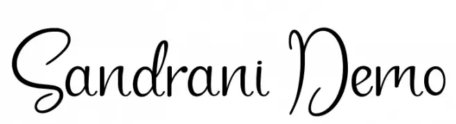
A playful and elegant script font with flowing, cursive letters.
![Sandrani Demo Frei Schriftart Herunterladen]() Herunterladen 247 Downloads@WebFont
Herunterladen 247 Downloads@WebFont -
( Fonts by Jetsmax Studio )
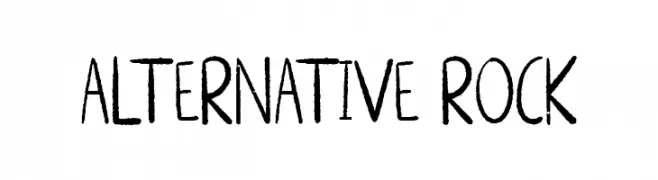
A hand-drawn, playful font with an artistic and casual style.
![ALTERNATIVE ROCK Frei Schriftart Herunterladen]() Herunterladen 247 Downloads@WebFont
Herunterladen 247 Downloads@WebFont -
( Fonts by Daniel Zadorozny - www.iconian.com )
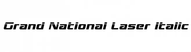
A dynamic, italicized font with angular, futuristic letterforms.
![Grand National Laser Italic Frei Schriftart Herunterladen]() Herunterladen 247 Downloads@WebFont
Herunterladen 247 Downloads@WebFont -
![NervouzReich Rank Frei Schriftart Herunterladen]() Herunterladen 247 Downloads@WebFont
Herunterladen 247 Downloads@WebFont -
( Fonts by Manfred Klein - manfred-klein.ina-mar.com )
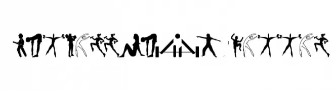
Energetic silhouette figures representing fitness and athletic activities.
![FitnessSilhouettes Frei Schriftart Herunterladen]() Herunterladen 247 Downloads@WebFont
Herunterladen 247 Downloads@WebFont -
( Fonts by Daniel Zadorozny - www.iconian.com )
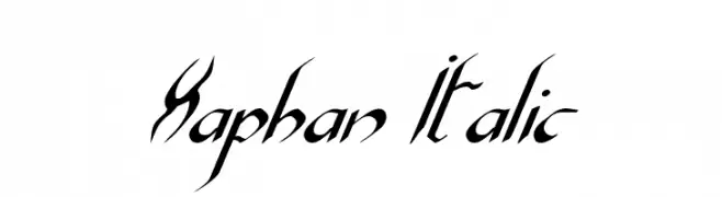
A dynamic, italicized font with sharp, angular strokes and high contrast.
![Xaphan Italic Frei Schriftart Herunterladen]() Herunterladen 247 Downloads@WebFont
Herunterladen 247 Downloads@WebFont -
( Fonts by David Kerkhoff - www.hanodedphotography.com )
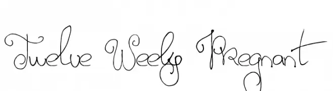
A whimsical, decorative font with looping, swirling strokes and calligraphic flair.
![Twelve Weeks Pregnant Frei Schriftart Herunterladen]() Herunterladen 247 Downloads@WebFont
Herunterladen 247 Downloads@WebFont -
( Fonts by twinletter - Rozikan - Personal-use only. For commercial use please contact owner. )
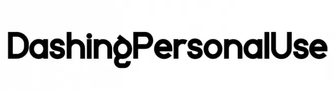
A bold, modern sans-serif font with clean lines and geometric structure.
![Dashing Personal Use Frei Schriftart Herunterladen]() Herunterladen 247 Downloads@WebFont
Herunterladen 247 Downloads@WebFont -
Schriftart von HammerBro101. For commercial use please contact the owner.
![LubalinGraphStd-ExtraLight Frei Schriftart Herunterladen]() Herunterladen 246 Downloads@WebFont
Herunterladen 246 Downloads@WebFont -
( Fonts by Billy Argel Fonts - www.billyargel.com - Personal-use only. For commercial use please contact owner. )
An elegant script font with flowing, decorative strokes.
![Flora Personal Use Frei Schriftart Herunterladen]() Herunterladen 246 Downloads@WebFont
Herunterladen 246 Downloads@WebFont -
![EC Dots Life Regular Frei Schriftart Herunterladen]() Herunterladen 246 Downloads@WebFont
Herunterladen 246 Downloads@WebFont -
( Fonts by www.blambot.com )
A bold, jagged font with a horror-inspired, distressed aesthetic.
![ElderGodsBB Frei Schriftart Herunterladen]() Herunterladen 246 Downloads@WebFont
Herunterladen 246 Downloads@WebFont -
( Fonts by Douglas Vitkauskas - www.vtksdesign.com. Personal-use only. For commercial use please contact owner. )
A bold, distressed font with a grunge style and rugged appearance.
![VTKS EXAME Frei Schriftart Herunterladen]() Herunterladen 246 Downloads@WebFont
Herunterladen 246 Downloads@WebFont -
( Fonts by www.chequered.ink - Chequered Ink - Personal-use only. For commercial use please contact owner. )
A futuristic, angular font with a bold and dynamic style.
![Robot Roc Frei Schriftart Herunterladen]() Herunterladen 246 Downloads@WebFont
Herunterladen 246 Downloads@WebFont -
( Fonts by Woodcutter )
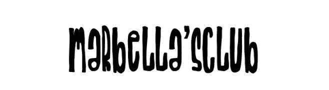
A bold, playful font with elongated, irregular letterforms and a whimsical, artistic style.
![Marbella's Club Frei Schriftart Herunterladen]() Herunterladen 246 Downloads@WebFont
Herunterladen 246 Downloads@WebFont -
( Fonts by vilogsign - Nur Kholis - Personal-use only. For commercial use please contact owner. )
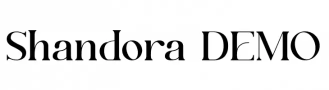
An elegant serif font with high contrast and sharp serifs, perfect for sophisticated designs.
![Shandora DEMO Frei Schriftart Herunterladen]() Herunterladen 246 Downloads@WebFont
Herunterladen 246 Downloads@WebFont -
( Fonts by Billy Argel - Personal-use only. For commercial use please contact owner. )
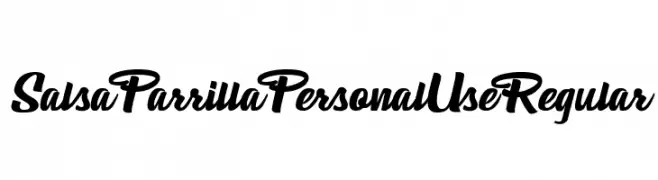
A bold, flowing script font with expressive strokes and elegant flourishes.
![Salsa Parrilla Personal Use Regular Frei Schriftart Herunterladen]() Herunterladen 246 Downloads@WebFont
Herunterladen 246 Downloads@WebFont -
( Fonts by Jen Jones )
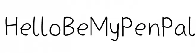
A playful, casual handwritten font with rounded, consistent strokes.
![HelloBeMyPenPal Frei Schriftart Herunterladen]() Herunterladen 246 Downloads@WebFont
Herunterladen 246 Downloads@WebFont -
![KeyTopZ Frei Schriftart Herunterladen]() Herunterladen 246 Downloads@WebFont
Herunterladen 246 Downloads@WebFont -
( Fonts by Caffeen Fonts - www.swank.ca/caffeen/fonts/ )
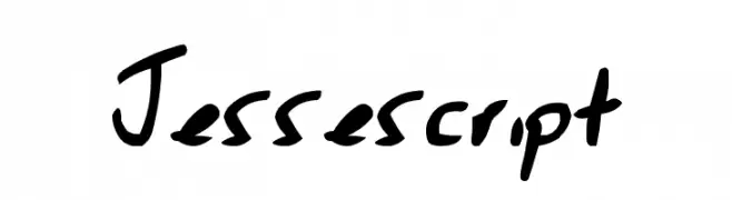
A bold, expressive handwritten font with fluid strokes and dynamic character.
![Jessescript Frei Schriftart Herunterladen]() Herunterladen 246 Downloads@WebFont
Herunterladen 246 Downloads@WebFont


Welche Schriften sind gerade am populärsten?
Poppins, Roboto, Montserrat, Open Sans und Lato sind wegen ihrer klaren Formen und breiten Einsetzbarkeit sehr gefragt – von Markenauftritt über Landingpages bis hin zu Postern.
Welche Fonts eignen sich für Logos?
Geometrische Sans‑Serifs (z. B. Poppins, Familien im Gotham‑Stil) sind ein häufiger Griff für sauberes, skalierbares Branding. Für eine persönlichere Note bleiben Scripts und Handschrift‑Stile beliebt. Kombinieren Sie einen prägnanten Headline‑Font mit einer neutralen Brotschrift für Wiedererkennung und Harmonie.
Wie oft wird die Top‑Liste aktualisiert?
Regelmäßig – basierend auf realen Downloads und Interaktionen. Schauen Sie öfter vorbei, um aufstrebende Favoriten früh zu entdecken.
💡 Tipp: Seite bookmarken – Trends wechseln schnell, und heutige Top‑Schriften inspirieren morgen vielleicht das Rebranding.