Willkommen bei den Top‑Schriften – hier treffen Beliebtheit und Qualität aufeinander. Das sind die in diesem Jahr am häufigsten heruntergeladenen und genutzten Fonts. Wenn Sie sichere Optionen für Logo, Web oder Social suchen, starten Sie hier.
Jeder Top‑Font überzeugt durch Balance, Lesbarkeit und Vielseitigkeit. Sie finden moderne Sans‑Serifs, elegante Scripts, Vintage‑Serifs und minimalistische Displays.
-
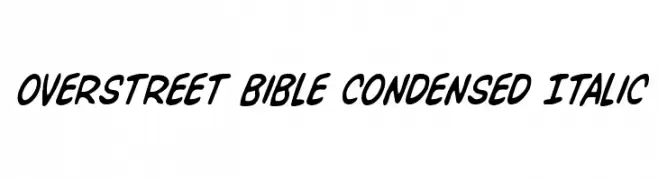
( Fonts by Daniel Zadorozny - www.iconian.com )
A bold, condensed, and italicized font with a dynamic and energetic style.
 Herunterladen 246 Downloads@WebFont
 -
( Fonts by Typhoon Type - Suthi Srisopha - Personal-use only. For commercial use please contact owner. )
An elegant, flowing script font with intricate loops and flourishes.
![Lovely Home Frei Schriftart Herunterladen]() Herunterladen 246 Downloads@WebFont
Herunterladen 246 Downloads@WebFont -
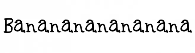
![Bananananananana Frei Schriftart Herunterladen]() Herunterladen 246 Downloads@WebFont
Herunterladen 246 Downloads@WebFont -
( Explogos - www.explogos.com )
A modern, geometric sans-serif font with clean lines and balanced spacing.
![Smiley Sans Regular Frei Schriftart Herunterladen]() Herunterladen 246 Downloads@WebFont
Herunterladen 246 Downloads@WebFont -
( Fonts by www.vicfieger.com )
A distressed, grunge-style font with rough, uneven edges and a bold presence.
![Ex Kata Damaged Frei Schriftart Herunterladen]() Herunterladen 246 Downloads@WebFont
Herunterladen 246 Downloads@WebFont -
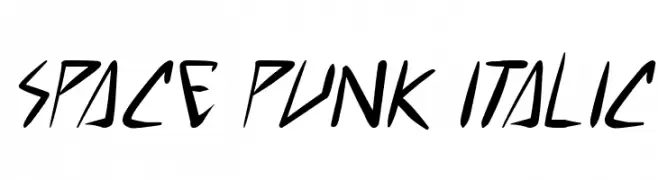
( Free for personal use - www.pressgang-studios.com )
A dynamic, angular italic font with a futuristic and edgy style.
![space punk Italic Frei Schriftart Herunterladen]() Herunterladen 246 Downloads@WebFont
Herunterladen 246 Downloads@WebFont -
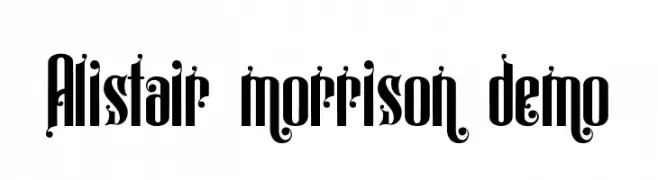
( Fonts by LetterStock )
A decorative and ornate font with intricate details and flourishes.
![Alistair morrison demo Frei Schriftart Herunterladen]() Herunterladen 246 Downloads@WebFont
Herunterladen 246 Downloads@WebFont -
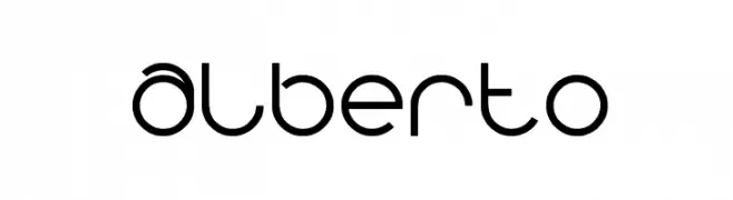
( Fonts by Wino S Kadir - weknow - www.revolge.com/shop/weknow/ - Personal-use only. For commercial use please contact owner. )
A modern, geometric font with clean, rounded edges and consistent stroke width.
![alberto Frei Schriftart Herunterladen]() Herunterladen 246 Downloads@WebFont
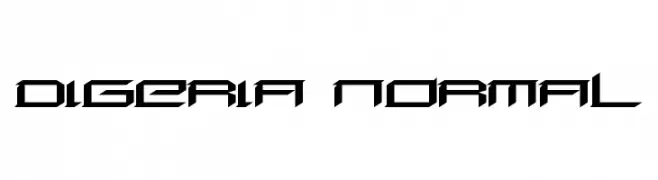
Herunterladen 246 Downloads@WebFont -
![Digeria Normal Frei Schriftart Herunterladen]() Herunterladen 246 Downloads@WebFont
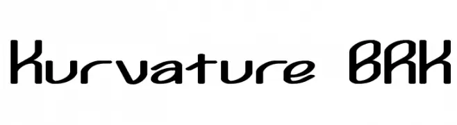
Herunterladen 246 Downloads@WebFont -
![Kurvature BRK Frei Schriftart Herunterladen]() Herunterladen 246 Downloads@WebFont
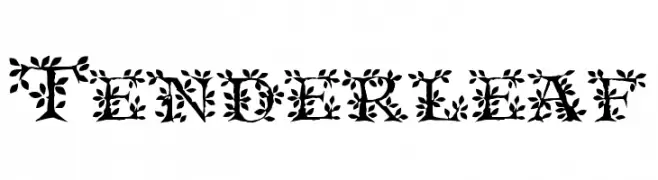
Herunterladen 246 Downloads@WebFont -
( Fonts by David Rakowski )
A decorative font with intricate leaf patterns adorning each character.
![Tenderleaf Frei Schriftart Herunterladen]() Herunterladen 246 Downloads@WebFont
Herunterladen 246 Downloads@WebFont -
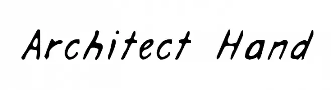
( Fonts by 97Designs )
A casual, handwritten-style font with a natural, flowing appearance.
![Architect Hand Frei Schriftart Herunterladen]() Herunterladen 246 Downloads@WebFont
Herunterladen 246 Downloads@WebFont -
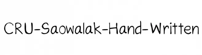
![CRU-Saowalak-Hand-Written Frei Schriftart Herunterladen]() Herunterladen 246 Downloads@WebFont
Herunterladen 246 Downloads@WebFont -
![Street Blues Trial Frei Schriftart Herunterladen]() Herunterladen 246 Downloads@WebFont
Herunterladen 246 Downloads@WebFont -
![PIxellium Frei Schriftart Herunterladen]() Herunterladen 246 Downloads@WebFont
Herunterladen 246 Downloads@WebFont -
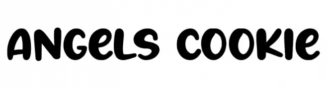
( Fonts by Balpirick Studio )
A playful, bold font with rounded, bubbly characters ideal for informal designs.
![Angels Cookie Frei Schriftart Herunterladen]() Herunterladen 246 Downloads@WebFont
Herunterladen 246 Downloads@WebFont -
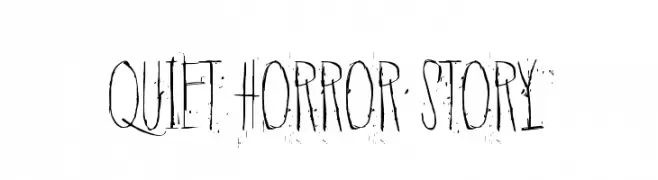
( Fonts by junkohanhero )
A tall, distressed font with jagged edges, perfect for horror themes.
![Quiet Horror Story Frei Schriftart Herunterladen]() Herunterladen 246 Downloads@WebFont
Herunterladen 246 Downloads@WebFont -
( Fonts by Figuree Studio )
A decorative font with a carved, elegant style and playful curves.
![Fontastique Carved Frei Schriftart Herunterladen]() Herunterladen 246 Downloads@WebFont
Herunterladen 246 Downloads@WebFont -
![Medinah Frei Schriftart Herunterladen]() Herunterladen 246 Downloads@WebFont
Herunterladen 246 Downloads@WebFont -
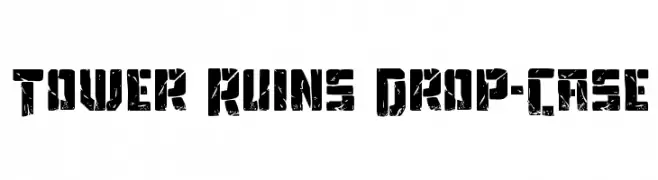
( Fonts by Daniel Zadorozny - www.iconian.com - Free for personal use )
A bold, distressed font with a rugged, weathered appearance.
![Tower Ruins Drop-Case Frei Schriftart Herunterladen]() Herunterladen 246 Downloads@WebFont
Herunterladen 246 Downloads@WebFont -
( Fonts by Karin McCombes. Personal-use only. For commercial use please contact owner. )
A tall, narrow font with a whimsical and modern style.
![LewisBlues Frei Schriftart Herunterladen]() Herunterladen 246 Downloads@WebFont
Herunterladen 246 Downloads@WebFont -
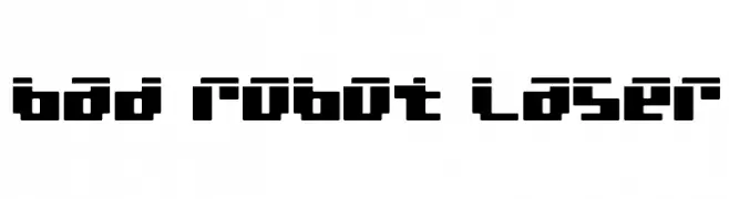
( Fonts by Daniel Zadorozny - www.iconian.com - Free for personal use )
A bold, geometric font with a futuristic, digital aesthetic.
![bad robot laser Frei Schriftart Herunterladen]() Herunterladen 246 Downloads@WebFont
Herunterladen 246 Downloads@WebFont -
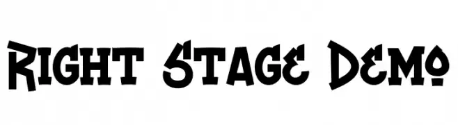
( Fonts by Noah Type - noahtype.com - Personal-use only. For commercial use please contact owner. )
A bold, modern font with sharp angles and a strong presence.
![Right Stage Demo Frei Schriftart Herunterladen]() Herunterladen 246 Downloads@WebFont
Herunterladen 246 Downloads@WebFont -
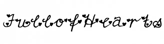
![FullofHearts Frei Schriftart Herunterladen]() Herunterladen 246 Downloads@WebFont
Herunterladen 246 Downloads@WebFont -
( Fonts by Apostrophic Lab )
A modern, futuristic font with rounded edges and consistent stroke thickness.
![Futurex Punched Frei Schriftart Herunterladen]() Herunterladen 246 Downloads@WebFont
Herunterladen 246 Downloads@WebFont -
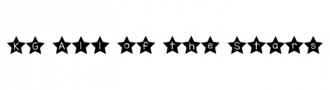
( Fonts by www.kimberlygeswein.com - Kimberly Geswein )
A decorative font with characters enclosed in bold star shapes, perfect for playful designs.
![KG All of the Stars Frei Schriftart Herunterladen]() Herunterladen 246 Downloads@WebFont
Herunterladen 246 Downloads@WebFont -
( Fonts by Fikry Alif - Fikryal studio - https://www.creativefabrica.com/designer/mfikryalif/ref/222304/ - Personal-use only. For commercial use please contact owner. )
A lively, expressive handwritten font with dynamic strokes and a modern artistic flair.
![olive Frei Schriftart Herunterladen]() Herunterladen 246 Downloads@WebFont
Herunterladen 246 Downloads@WebFont -
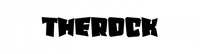
( Fonts by Erik Studio )
A bold, angular font with a rugged, dynamic design.
![The Rock Frei Schriftart Herunterladen]() Herunterladen 246 Downloads@WebFont
Herunterladen 246 Downloads@WebFont -
![TEMHOSS [By: HAsAN] Frei Schriftart Herunterladen]() Herunterladen 246 Downloads
Herunterladen 246 Downloads -
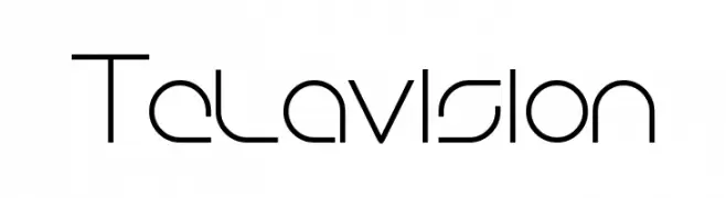
( Family Font Mart - www.h2o.or.jp/~orihikao/ )
A sleek, modern font with geometric and futuristic design elements.
![Telavision Frei Schriftart Herunterladen]() Herunterladen 246 Downloads@WebFont
Herunterladen 246 Downloads@WebFont -
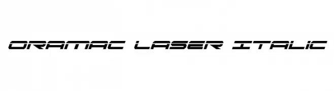
( Fonts by Daniel Zadorozny - www.iconian.com )
A futuristic, angular italic font with a sleek, modern design.
![Oramac Laser Italic Frei Schriftart Herunterladen]() Herunterladen 246 Downloads@WebFont
Herunterladen 246 Downloads@WebFont -
( Fonts by Muhammad Sirojuddin - lettersiro.com - Personal-use only. For commercial use please contact owner. )
A chaotic, textured font with jagged strokes, ideal for eerie or mysterious themes.
![Darkside Frei Schriftart Herunterladen]() Herunterladen 246 Downloads@WebFont
Herunterladen 246 Downloads@WebFont -
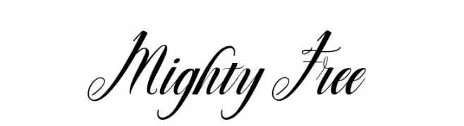
( Rahmat Hidayat )
An elegant, cursive font with intricate loops and swirls.
![Mighty Free Frei Schriftart Herunterladen]() Herunterladen 246 Downloads@WebFont
Herunterladen 246 Downloads@WebFont -
![FTF Geng Kapak Merah Frei Schriftart Herunterladen]() Herunterladen 246 Downloads@WebFont
Herunterladen 246 Downloads@WebFont -
( Roger White - web.archive.org/web/20120416090521/www.rogersfonts.org.uk/ )
A clean, elegant font with a modern yet timeless appeal.
![Lydian Frei Schriftart Herunterladen]() Herunterladen 246 Downloads@WebFont
Herunterladen 246 Downloads@WebFont


![TEMHOSS [By: HAsAN] Frei Schriftart Herunterladen](https://d144mzi0q5mijx.cloudfront.net/img/T/E/TEMHOSS-By-HAsAN.webp)


Welche Schriften sind gerade am populärsten?
Poppins, Roboto, Montserrat, Open Sans und Lato sind wegen ihrer klaren Formen und breiten Einsetzbarkeit sehr gefragt – von Markenauftritt über Landingpages bis hin zu Postern.
Welche Fonts eignen sich für Logos?
Geometrische Sans‑Serifs (z. B. Poppins, Familien im Gotham‑Stil) sind ein häufiger Griff für sauberes, skalierbares Branding. Für eine persönlichere Note bleiben Scripts und Handschrift‑Stile beliebt. Kombinieren Sie einen prägnanten Headline‑Font mit einer neutralen Brotschrift für Wiedererkennung und Harmonie.
Wie oft wird die Top‑Liste aktualisiert?
Regelmäßig – basierend auf realen Downloads und Interaktionen. Schauen Sie öfter vorbei, um aufstrebende Favoriten früh zu entdecken.
💡 Tipp: Seite bookmarken – Trends wechseln schnell, und heutige Top‑Schriften inspirieren morgen vielleicht das Rebranding.