Willkommen bei den Top‑Schriften – hier treffen Beliebtheit und Qualität aufeinander. Das sind die in diesem Jahr am häufigsten heruntergeladenen und genutzten Fonts. Wenn Sie sichere Optionen für Logo, Web oder Social suchen, starten Sie hier.
Jeder Top‑Font überzeugt durch Balance, Lesbarkeit und Vielseitigkeit. Sie finden moderne Sans‑Serifs, elegante Scripts, Vintage‑Serifs und minimalistische Displays.
-
 Herunterladen 243 Downloads@WebFont
 -
( Angst )
An elegant, calligraphic font with flowing curves and pointed serifs.
![Pimp Frei Schriftart Herunterladen]() Herunterladen 243 Downloads
Herunterladen 243 Downloads -
( Fonts by Prioritype Co - Prio Nurokhim Aji - Personal-use only. For commercial use please contact owner. )
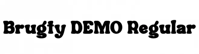
A bold, playful font with thick, rounded strokes and whimsical curves.
![Brugty DEMO Regular Frei Schriftart Herunterladen]() Herunterladen 243 Downloads@WebFont
Herunterladen 243 Downloads@WebFont -
( Fonts by Afkari Studio )
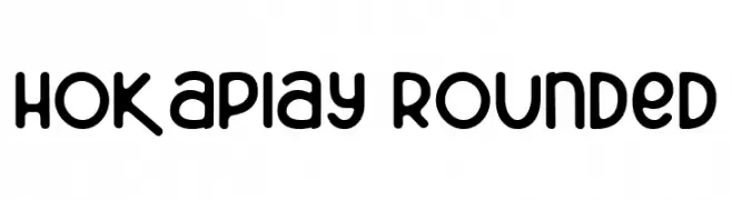
A playful, rounded font with smooth curves and a friendly appearance.
![Hokaplay Rounded Frei Schriftart Herunterladen]() Herunterladen 243 Downloads@WebFont
Herunterladen 243 Downloads@WebFont -
( Fonts by Manfred Klein. Free for private and charity use. Free for commercial with donation to organizations )
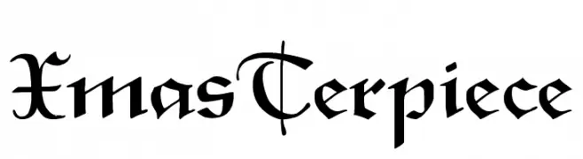
A decorative font with calligraphic elements and elegant flourishes.
![XmasTerpiece Frei Schriftart Herunterladen]() Herunterladen 243 Downloads@WebFont
Herunterladen 243 Downloads@WebFont -
( Fonts by Afkari Studio )
A playful and bold font with quirky, whimsical characters.
![Hokaplay Frei Schriftart Herunterladen]() Herunterladen 243 Downloads@WebFont
Herunterladen 243 Downloads@WebFont -
( Fonts by Khurasan )
A playful, hand-drawn font with bold, rounded characters and a whimsical style.
![Baby Eliot Frei Schriftart Herunterladen]() Herunterladen 243 Downloads@WebFont
Herunterladen 243 Downloads@WebFont -
( Fonts by Apostrophic Lab )
A sleek, modern font with elongated, italicized characters and a light, airy appearance.
![Lady Ice - Extra Light Italic Frei Schriftart Herunterladen]() Herunterladen 243 Downloads@WebFont
Herunterladen 243 Downloads@WebFont -
( Fonts by Daniel Zadorozny - www.iconian.com )
A bold, expanded, and italicized font with a futuristic and dynamic design.
![Drive Expanded Italic Frei Schriftart Herunterladen]() Herunterladen 243 Downloads@WebFont
Herunterladen 243 Downloads@WebFont -
( Fonts by Alifinart Studio - Personal-use only. For commercial use please contact owner. )
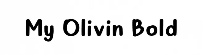
A bold, playful font with rounded edges and a friendly appearance.
![My Olivin Bold Frei Schriftart Herunterladen]() Herunterladen 243 Downloads@WebFont
Herunterladen 243 Downloads@WebFont -
( Fonts by bob istheowl http://luc.devroye.org/bobistheowl.html )
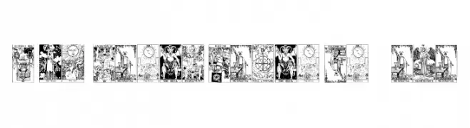
Bold, vintage serif font with high contrast and tight spacing.
![Gypsy Tarot-Major Arcana Frei Schriftart Herunterladen]() Herunterladen 243 Downloads@WebFont
Herunterladen 243 Downloads@WebFont -
( Fonts by Winter Design Studio - winty5.wixsite.com/noahtheawesome/ - Personal-use only. For commercial use please contact owner. )
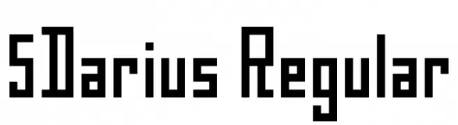
A bold, geometric font with a structured, monospaced appearance.
![5Darius Regular Frei Schriftart Herunterladen]() Herunterladen 243 Downloads@WebFont
Herunterladen 243 Downloads@WebFont -
( Fonts by Woodcutter Manero - www.woodcutter.es - Personal-use only. For commercial use please contact owner. )
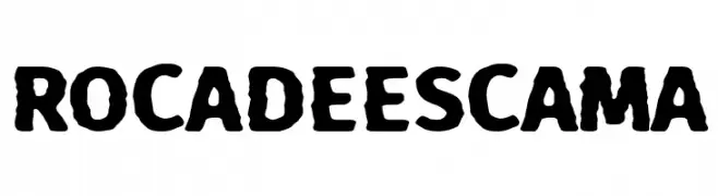
A bold, rugged, hand-drawn font with a textured appearance.
![Roca de Escama Frei Schriftart Herunterladen]() Herunterladen 243 Downloads@WebFont
Herunterladen 243 Downloads@WebFont -
( Fonts by Otto Maurer Design )
A bold, outlined font with a playful, collegiate style.
![RocknRollTypoCollege Frei Schriftart Herunterladen]() Herunterladen 243 Downloads@WebFont
Herunterladen 243 Downloads@WebFont -
( Fonts by Vladimir Nikolic )
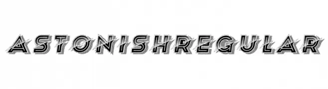
A bold, three-dimensional font with geometric and modern design elements.
![Astonish Regular Frei Schriftart Herunterladen]() Herunterladen 243 Downloads@WebFont
Herunterladen 243 Downloads@WebFont -
( Fonts by Yann Gall )
A modern, minimalist font with geometric shapes and a sleek appearance.
![Boisu Fill Frei Schriftart Herunterladen]() Herunterladen 243 Downloads@WebFont
Herunterladen 243 Downloads@WebFont -
( Fonts by Manfred Klein. Free for private and charity use. Free for commercial with donation to organizations )
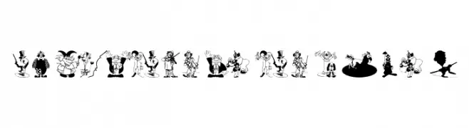
Cartoonish circus and clown illustrations form each character.
![CircusClownsCompany Frei Schriftart Herunterladen]() Herunterladen 243 Downloads@WebFont
Herunterladen 243 Downloads@WebFont -
( Fonts by Nick Curtis - www.nicksfonts.com )
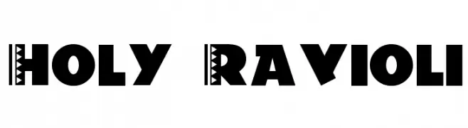
A bold, decorative font with tribal patterns and geometric details.
![Holy-Ravioli Frei Schriftart Herunterladen]() Herunterladen 243 Downloads
Herunterladen 243 Downloads -
( Fonts by Billy Argel Fonts - www.billyargel.com - Personal-use only. For commercial use please contact owner. )
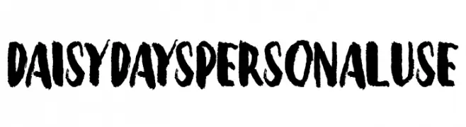
A bold, brush-style font with an artistic, hand-painted look.
![Daisy Days Personal Use Frei Schriftart Herunterladen]() Herunterladen 243 Downloads@WebFont
Herunterladen 243 Downloads@WebFont -
( Fonts by a Neale Davidson - www.pixelsagas.com. Personal-use only. For commercial use please contact owner. )
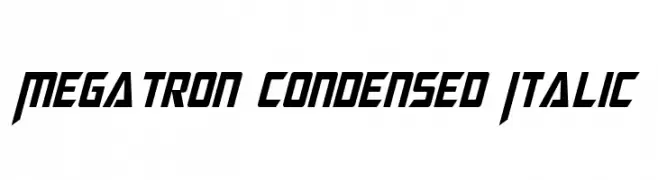
A bold, condensed, and italic font with a futuristic, angular design.
![Megatron Condensed Italic Frei Schriftart Herunterladen]() Herunterladen 243 Downloads@WebFont
Herunterladen 243 Downloads@WebFont -
( Fonts by Fontsera )
A bold, rounded font with a playful and friendly style.
![Kinderzone Frei Schriftart Herunterladen]() Herunterladen 243 Downloads@WebFont
Herunterladen 243 Downloads@WebFont -
( Fonts by Daniel Zadorozny - www.iconian.com )
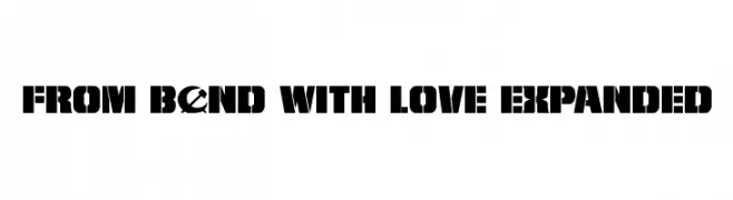
A bold, stencil-like font with geometric shapes and high contrast.
![From BOND With Love Expanded Frei Schriftart Herunterladen]() Herunterladen 243 Downloads@WebFont
Herunterladen 243 Downloads@WebFont -
( Fonts by Justin Biddle )
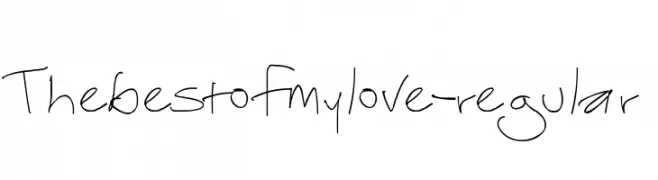
A playful, handwritten font with a casual and organic style.
![Thebestofmylove-regular Frei Schriftart Herunterladen]() Herunterladen 243 Downloads@WebFont
Herunterladen 243 Downloads@WebFont -
( Fonts by Aaiaa?e Ca?a?i?e / Henadij Zarechnjuk - Personal-use only. For commercial use please contact owner. )
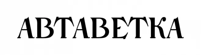
A bold, high-contrast serif font with sharp, angular serifs and a modern twist.
![NarbutAbetka Frei Schriftart Herunterladen]() Herunterladen 243 Downloads@WebFont
Herunterladen 243 Downloads@WebFont -
( Fonts by Daniel Zadorozny - www.iconian.com )
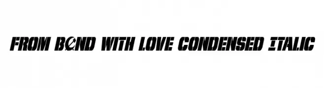
A bold, condensed italic font with high contrast and dynamic style.
![From BOND With Love Condensed Italic Frei Schriftart Herunterladen]() Herunterladen 243 Downloads@WebFont
Herunterladen 243 Downloads@WebFont -
( Indriyanti )
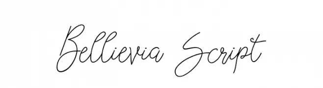
An elegant script font with flowing, cursive strokes and ornate uppercase letters.
![Bellievia Script Frei Schriftart Herunterladen]() Herunterladen 243 Downloads@WebFont
Herunterladen 243 Downloads@WebFont -
( Fonts by Billy Argel Fonts - www.billyargel.com - Personal-use only. For commercial use please contact owner. )
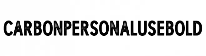
A bold, textured font with a rugged, industrial aesthetic.
![CARBON PERSONAL USE Bold Frei Schriftart Herunterladen]() Herunterladen 243 Downloads@WebFont
Herunterladen 243 Downloads@WebFont -
![ArmFixed Frei Schriftart Herunterladen]() Herunterladen 243 Downloads@WebFont
Herunterladen 243 Downloads@WebFont -
( Fonts by Ryoichi Tsunekawa - www.dharmatype.com )
A futuristic, monospaced font with geometric, mechanical design.
![Plamo Frei Schriftart Herunterladen]() Herunterladen 243 Downloads@WebFont
Herunterladen 243 Downloads@WebFont -
( Fonts by Ramiro Baldivieso )
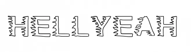
A bold, decorative font with jagged outlines and a dynamic, energetic style.
![HellYeah Frei Schriftart Herunterladen]() Herunterladen 243 Downloads@WebFont
Herunterladen 243 Downloads@WebFont -
( Fonts by Scratchones )
A playful and lively script font with consistent stroke width and whimsical character.
![Oneself Frei Schriftart Herunterladen]() Herunterladen 243 Downloads@WebFont
Herunterladen 243 Downloads@WebFont -
( Fonts by Chequered Ink )
A bold, textured font with a gritty, distressed style ideal for spooky themes.
![Halloween * Heresy Frei Schriftart Herunterladen]() Herunterladen 243 Downloads@WebFont
Herunterladen 243 Downloads@WebFont -
( Iconian Fonts - Daniel Zadorozny - www.iconian.com )
A bold, futuristic font with sharp, angular edges and a geometric structure.
![Outrider Semi-Bold Semi-Bold Frei Schriftart Herunterladen]() Herunterladen 243 Downloads@WebFont
Herunterladen 243 Downloads@WebFont -
( Fonts by TarmSaft Font Factory - http://www.aska.nu/tarmsaft/ )
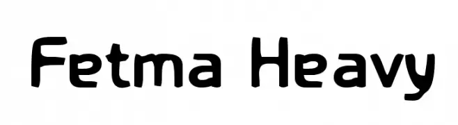
A bold, playful font with thick, rounded characters and a friendly appearance.
![Fetma Heavy Frei Schriftart Herunterladen]() Herunterladen 243 Downloads@WebFont
Herunterladen 243 Downloads@WebFont -
( Fonts by www.3r4u.de )
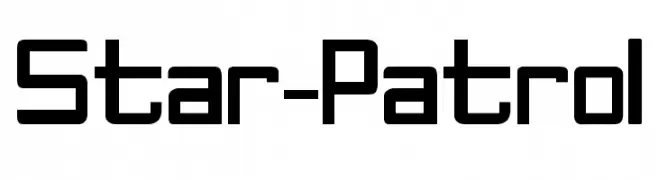
A futuristic, angular font with bold, geometric letterforms.
![Star-Patrol Frei Schriftart Herunterladen]() Herunterladen 243 Downloads@WebFont
Herunterladen 243 Downloads@WebFont


Welche Schriften sind gerade am populärsten?
Poppins, Roboto, Montserrat, Open Sans und Lato sind wegen ihrer klaren Formen und breiten Einsetzbarkeit sehr gefragt – von Markenauftritt über Landingpages bis hin zu Postern.
Welche Fonts eignen sich für Logos?
Geometrische Sans‑Serifs (z. B. Poppins, Familien im Gotham‑Stil) sind ein häufiger Griff für sauberes, skalierbares Branding. Für eine persönlichere Note bleiben Scripts und Handschrift‑Stile beliebt. Kombinieren Sie einen prägnanten Headline‑Font mit einer neutralen Brotschrift für Wiedererkennung und Harmonie.
Wie oft wird die Top‑Liste aktualisiert?
Regelmäßig – basierend auf realen Downloads und Interaktionen. Schauen Sie öfter vorbei, um aufstrebende Favoriten früh zu entdecken.
💡 Tipp: Seite bookmarken – Trends wechseln schnell, und heutige Top‑Schriften inspirieren morgen vielleicht das Rebranding.