Willkommen bei den Top‑Schriften – hier treffen Beliebtheit und Qualität aufeinander. Das sind die in diesem Jahr am häufigsten heruntergeladenen und genutzten Fonts. Wenn Sie sichere Optionen für Logo, Web oder Social suchen, starten Sie hier.
Jeder Top‑Font überzeugt durch Balance, Lesbarkeit und Vielseitigkeit. Sie finden moderne Sans‑Serifs, elegante Scripts, Vintage‑Serifs und minimalistische Displays.
-
( Fonts by dcoxy | Greg Medina )
A bold, distressed font with a rugged, grunge-like texture.
 Herunterladen 241 Downloads@WebFont
 -
( Rodrigo Araya - www.elflota.com )
A whimsical and decorative font with intricate, artistic letterforms.
![eleven Frei Schriftart Herunterladen]() Herunterladen 241 Downloads@WebFont
Herunterladen 241 Downloads@WebFont -
( Fonts by Des Gomez )
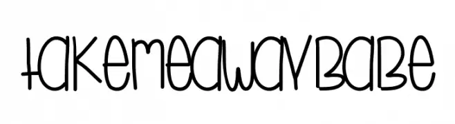
A playful, hand-drawn font with tall, narrow letters and a whimsical style.
![TakeMeAwayBabe Frei Schriftart Herunterladen]() Herunterladen 241 Downloads@WebFont
Herunterladen 241 Downloads@WebFont -
( Fonts by Woodcutter )
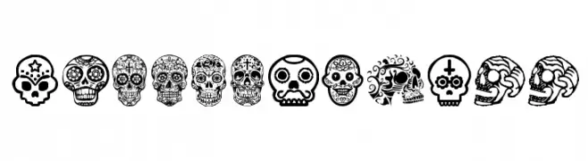
Ornate skull-themed decorative display font inspired by Mexican folk art.
![Mexican Skull Frei Schriftart Herunterladen]() Herunterladen 241 Downloads@WebFont
Herunterladen 241 Downloads@WebFont -
( Fonts by Graham Meade - GemFonts )
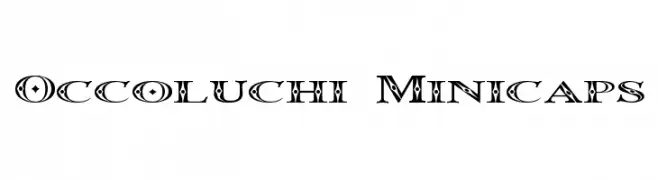
A bold, decorative font with intricate patterns and geometric shapes.
![Occoluchi Minicaps Frei Schriftart Herunterladen]() Herunterladen 241 Downloads@WebFont
Herunterladen 241 Downloads@WebFont -
( Fonts by Giga Typography - GigaType - www.deviantart.com/wolves-fonts - Personal-use only. For commercial use please contact owner. )
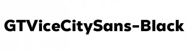
Bold, modern sans-serif font.
![GT Vice City Sans - Black Frei Schriftart Herunterladen]() Herunterladen 241 Downloads@WebFont
Herunterladen 241 Downloads@WebFont -
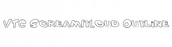
![VTC ScreamItLoud Outline Frei Schriftart Herunterladen]() Herunterladen 241 Downloads@WebFont
Herunterladen 241 Downloads@WebFont -
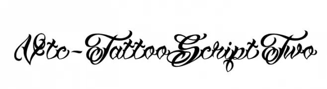
( Fonts by Vigilante Typeface Corporation Larry Yerkes. Personal-use only. For commercial use please contact owner. )
An ornate, tattoo-inspired script font with decorative flourishes.
![Vtc-TattooScriptTwo Frei Schriftart Herunterladen]() Herunterladen 241 Downloads@WebFont
Herunterladen 241 Downloads@WebFont -
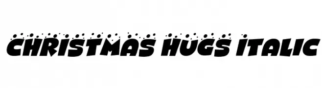
( Fonts by Darrell Flood )
A bold, italicized decorative font with a festive, dotted design.
![CHRISTMAS HUGS Italic Frei Schriftart Herunterladen]() Herunterladen 241 Downloads@WebFont
Herunterladen 241 Downloads@WebFont -
![Snowy Skies Frei Schriftart Herunterladen]() Herunterladen 241 Downloads@WebFont
Herunterladen 241 Downloads@WebFont -
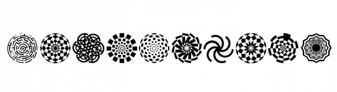
( Fonts by Fernando Haro - defharo.com )
Bold geometric and optical illusion symbols with high contrast and intricate patterns.
![WachOp-Art Frei Schriftart Herunterladen]() Herunterladen 241 Downloads@WebFont
Herunterladen 241 Downloads@WebFont -
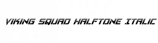
( Fonts by Daniel Zadorozny - www.iconian.com )
A bold, italicized font with a halftone effect and futuristic style.
![Viking Squad Halftone Italic Frei Schriftart Herunterladen]() Herunterladen 241 Downloads@WebFont
Herunterladen 241 Downloads@WebFont -
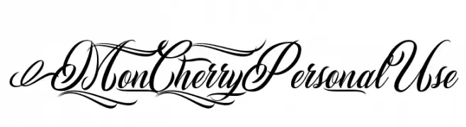
( Billy Argel - billyargel.com/ )
An elegant and flowing script font with intricate, decorative letterforms.
![Mon Cherry Personal Use Frei Schriftart Herunterladen]() Herunterladen 241 Downloads@WebFont
Herunterladen 241 Downloads@WebFont -
![Stocky Frei Schriftart Herunterladen]() Herunterladen 241 Downloads@WebFont
Herunterladen 241 Downloads@WebFont -
( Fonts by Matthew Napolitano / Full Time Artists - Personal-use only. For commercial use please contact owner. )
A playful, rounded font with smooth, flowing lines and consistent stroke width.
![PreCursive OFL Frei Schriftart Herunterladen]() Herunterladen 241 Downloads@WebFont
Herunterladen 241 Downloads@WebFont -
![Fedyral II Expanded Frei Schriftart Herunterladen]() Herunterladen 241 Downloads@WebFont
Herunterladen 241 Downloads@WebFont -
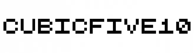
( Free for a personal use. For a commercial use please visit www.kevinandamanda.com )
A pixelated, geometric font with a retro digital vibe.
![CubicFive10 Frei Schriftart Herunterladen]() Herunterladen 241 Downloads@WebFont
Herunterladen 241 Downloads@WebFont -
![Boron Frei Schriftart Herunterladen]() Herunterladen 241 Downloads@WebFont
Herunterladen 241 Downloads@WebFont -
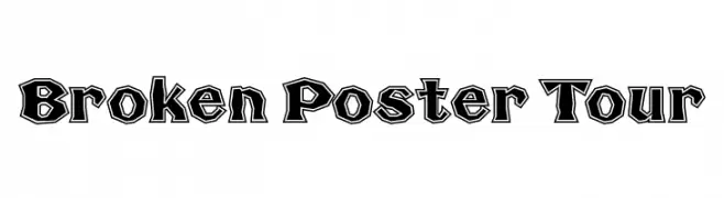
![Broken Poster Tour Frei Schriftart Herunterladen]() Herunterladen 241 Downloads@WebFont
Herunterladen 241 Downloads@WebFont -
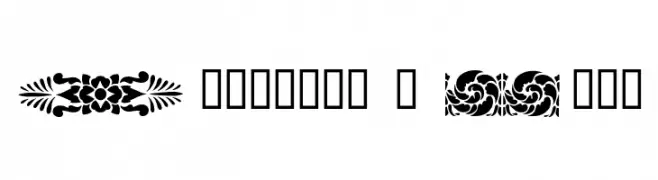
![Dividers & Misc Frei Schriftart Herunterladen]() Herunterladen 241 Downloads@WebFont
Herunterladen 241 Downloads@WebFont -
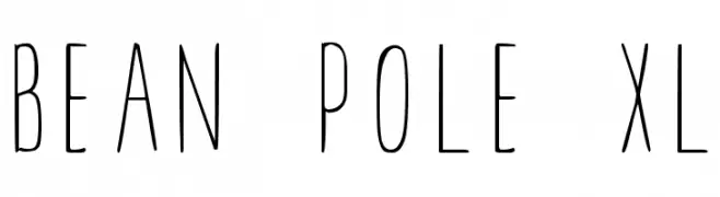
( Fonts by Darcy Baldwin - darcybaldwin.com. Free for personal use only )
A tall, slender, and modern font with consistent stroke width.
![BEAN POLE XL Frei Schriftart Herunterladen]() Herunterladen 241 Downloads@WebFont
Herunterladen 241 Downloads@WebFont -
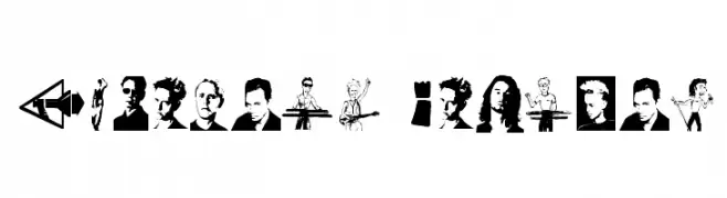
( Fonts by www.kiwi-media.com )
A decorative collection of pictograms and symbols with diverse imagery.
![Modebats Regular Frei Schriftart Herunterladen]() Herunterladen 241 Downloads@WebFont
Herunterladen 241 Downloads@WebFont -
![Pixel-Western Regular Frei Schriftart Herunterladen]() Herunterladen 241 Downloads@WebFont
Herunterladen 241 Downloads@WebFont -
( Fonts by Alex Slobzheninov - Personal-use only. For commercial use please contact owner. )
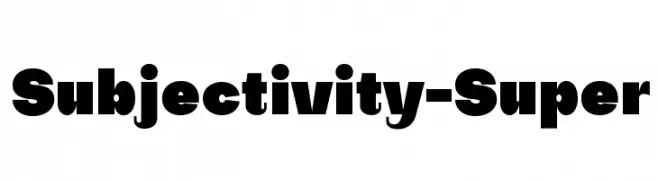
A bold, geometric font with strong visual impact and high contrast.
![Subjectivity-Super Frei Schriftart Herunterladen]() Herunterladen 241 Downloads@WebFont
Herunterladen 241 Downloads@WebFont -
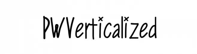
( Fonts by Peax Webdesign - www.peax-webdesign.com. Personal-use only. For commercial use please contact owner. )
A playful, handwritten font with tall, narrow characters and consistent stroke width.
![PWVerticalized Frei Schriftart Herunterladen]() Herunterladen 241 Downloads@WebFont
Herunterladen 241 Downloads@WebFont -
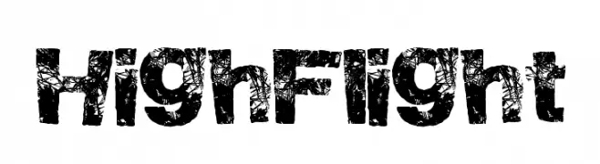
( Fonts by a Max Infeld - XEROGRAPHER FONTS - xerographer.blogspot.com . Personal-use only. For commercial use please contact owner. )
A bold, distressed font with a rugged, textured appearance.
![HighFlight Frei Schriftart Herunterladen]() Herunterladen 241 Downloads@WebFont
Herunterladen 241 Downloads@WebFont -
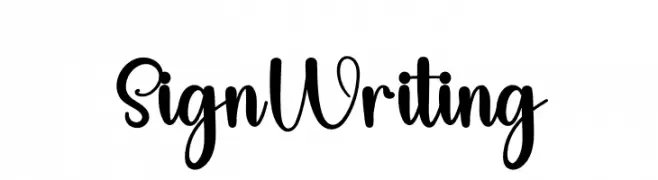
( Fonts by FreshtypeINK )
A playful, handwritten script font with bold, expressive characters.
![Sign Writing Frei Schriftart Herunterladen]() Herunterladen 241 Downloads@WebFont
Herunterladen 241 Downloads@WebFont -
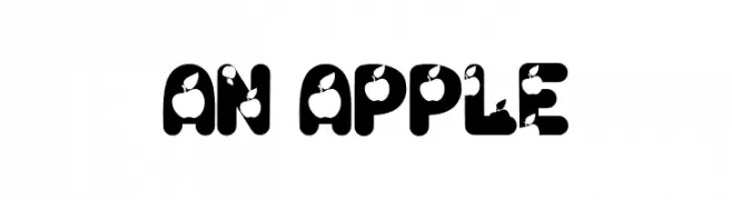
( Fonts by Alfareaniy )
A bold, playful font with bite-like cut-outs in each character.
![An Apple Frei Schriftart Herunterladen]() Herunterladen 241 Downloads@WebFont
Herunterladen 241 Downloads@WebFont -
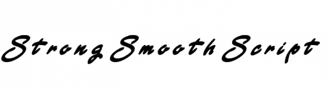
( Darrell Flood - hawtpixel.com )
A bold, smooth script font with flowing curves and strong strokes.
![Strong Smooth Script Frei Schriftart Herunterladen]() Herunterladen 241 Downloads@WebFont
Herunterladen 241 Downloads@WebFont -
( Fonts by Graphix Line Studio )
A playful, bold font with a whimsical, cartoon-like style and rounded edges.
![Dino And Friend Frei Schriftart Herunterladen]() Herunterladen 241 Downloads@WebFont
Herunterladen 241 Downloads@WebFont -
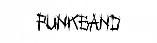
( Fonts by a Colm Clafferty - colmfonts.hol.es. Personal-use only. For commercial use please contact owner. )
A bold, jagged font with a punk rock, graffiti-inspired style.
![Punkband Frei Schriftart Herunterladen]() Herunterladen 241 Downloads@WebFont
Herunterladen 241 Downloads@WebFont -
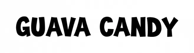
( Fonts by Tokokoo Studio )
A bold, playful font with a hand-drawn, whimsical style.
![Guava Candy Frei Schriftart Herunterladen]() Herunterladen 241 Downloads@WebFont
Herunterladen 241 Downloads@WebFont -
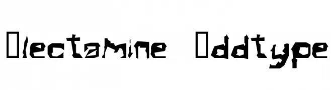
![Electamine Oddtype Frei Schriftart Herunterladen]() Herunterladen 241 Downloads@WebFont
Herunterladen 241 Downloads@WebFont -
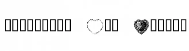
![Valentine Day Normal Frei Schriftart Herunterladen]() Herunterladen 241 Downloads@WebFont
Herunterladen 241 Downloads@WebFont -
![MiddleSchoolSucks Frei Schriftart Herunterladen]() Herunterladen 241 Downloads@WebFont
Herunterladen 241 Downloads@WebFont


Welche Schriften sind gerade am populärsten?
Poppins, Roboto, Montserrat, Open Sans und Lato sind wegen ihrer klaren Formen und breiten Einsetzbarkeit sehr gefragt – von Markenauftritt über Landingpages bis hin zu Postern.
Welche Fonts eignen sich für Logos?
Geometrische Sans‑Serifs (z. B. Poppins, Familien im Gotham‑Stil) sind ein häufiger Griff für sauberes, skalierbares Branding. Für eine persönlichere Note bleiben Scripts und Handschrift‑Stile beliebt. Kombinieren Sie einen prägnanten Headline‑Font mit einer neutralen Brotschrift für Wiedererkennung und Harmonie.
Wie oft wird die Top‑Liste aktualisiert?
Regelmäßig – basierend auf realen Downloads und Interaktionen. Schauen Sie öfter vorbei, um aufstrebende Favoriten früh zu entdecken.
💡 Tipp: Seite bookmarken – Trends wechseln schnell, und heutige Top‑Schriften inspirieren morgen vielleicht das Rebranding.