Willkommen bei den Top‑Schriften – hier treffen Beliebtheit und Qualität aufeinander. Das sind die in diesem Jahr am häufigsten heruntergeladenen und genutzten Fonts. Wenn Sie sichere Optionen für Logo, Web oder Social suchen, starten Sie hier.
Jeder Top‑Font überzeugt durch Balance, Lesbarkeit und Vielseitigkeit. Sie finden moderne Sans‑Serifs, elegante Scripts, Vintage‑Serifs und minimalistische Displays.
-
( Fonts by twinletter )
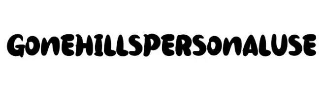
A bold, playful font with thick, rounded strokes and a whimsical, hand-drawn style.
 Herunterladen 237 Downloads@WebFont
 -
( Fonts by Fontfabric - Svetoslav Simov - Personal-use only. For commercial use please contact owner. )
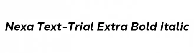
A modern, bold, and italicized font with a sleek and professional appearance.
![Nexa Text-Trial Extra Bold Italic Frei Schriftart Herunterladen]() Herunterladen 237 Downloads@WebFont
Herunterladen 237 Downloads@WebFont -
( Fonts by Apostrophic Lab )
A whimsical and elegant font with flowing strokes and playful serifs.
![Quixotte Frei Schriftart Herunterladen]() Herunterladen 237 Downloads@WebFont
Herunterladen 237 Downloads@WebFont -
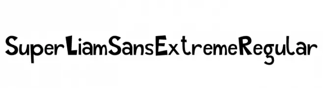
![Super Liam Sans Extreme Regular Frei Schriftart Herunterladen]() Herunterladen 237 Downloads@WebFont
Herunterladen 237 Downloads@WebFont -
( Fonts by Hanna Bie )
A playful, rounded font with a whimsical and friendly style.
![Fluffy Kitten Frei Schriftart Herunterladen]() Herunterladen 237 Downloads@WebFont
Herunterladen 237 Downloads@WebFont -
( Fonts by Bhadal Studio - Nasruddin Bhadal - Personal-use only. For commercial use please contact owner. )
A fluid and elegant script font with connected cursive strokes.
![Sangharia Frei Schriftart Herunterladen]() Herunterladen 237 Downloads@WebFont
Herunterladen 237 Downloads@WebFont -
( www.myfonts.com/foundry/AdultHumanMale/ )
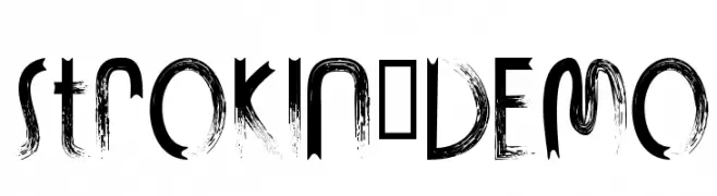
A bold, distressed brushstroke font with a dynamic and edgy style.
![STROKIN-DEMO Frei Schriftart Herunterladen]() Herunterladen 237 Downloads@WebFont
Herunterladen 237 Downloads@WebFont -
![CavePaintingDingbats Frei Schriftart Herunterladen]() Herunterladen 237 Downloads@WebFont
Herunterladen 237 Downloads@WebFont -
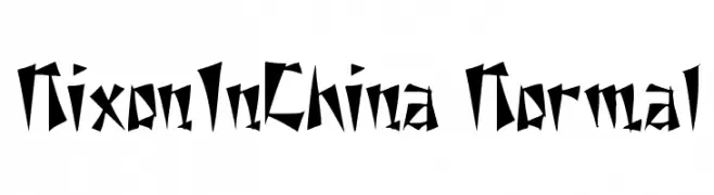
( Fonts by David Rakowski )
A bold, angular font with sharp, jagged edges and a dynamic, edgy style.
![NixonInChina Normal Frei Schriftart Herunterladen]() Herunterladen 237 Downloads
Herunterladen 237 Downloads -
![CF Christmas Shit Regular Frei Schriftart Herunterladen]() Herunterladen 237 Downloads@WebFont
Herunterladen 237 Downloads@WebFont -
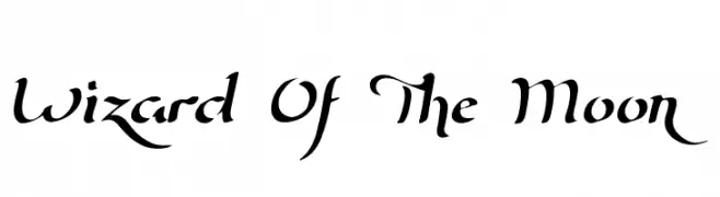
( Fonts by Roland Huse - rolandhuse.com )
A mystical, calligraphic font with elegant, flowing lines and sharp serifs.
![Wizard Of The Moon Frei Schriftart Herunterladen]() Herunterladen 237 Downloads@WebFont
Herunterladen 237 Downloads@WebFont -
( Fonts by Steve Gardner - www.explogos.com. Personal-use only. For commercial use please contact owner. )
A modern, semi-bold font with clean lines and a strong presence.
![Baqacents Semi Bold Frei Schriftart Herunterladen]() Herunterladen 237 Downloads@WebFont
Herunterladen 237 Downloads@WebFont -
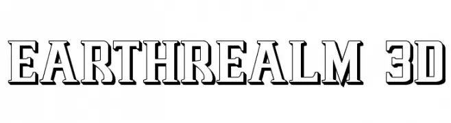
( Fonts by Daniel Zadorozny - www.iconian.com - Free for personal use )
A bold, three-dimensional font with outlined characters and a strong, impactful presence.
![Earthrealm 3D Frei Schriftart Herunterladen]() Herunterladen 237 Downloads@WebFont
Herunterladen 237 Downloads@WebFont -
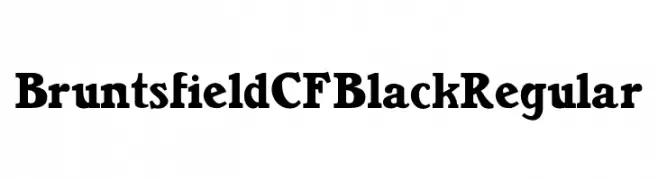
( Fonts by Chuck Mountain - Chuck`s Fonts - Personal-use only. For commercial use please contact owner. )
A bold serif font with strong strokes and pronounced serifs, offering a modern twist on traditional design.
![Bruntsfield CF Black Regular Frei Schriftart Herunterladen]() Herunterladen 237 Downloads@WebFont
Herunterladen 237 Downloads@WebFont -
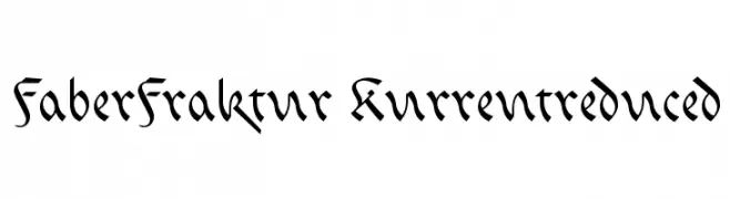
( Fonts by ingoFonts. http://www.ingofonts.de )
A classic blackletter font with intricate, angular strokes and a medieval appearance.
![FaberFraktur-Kurrentreduced Frei Schriftart Herunterladen]() Herunterladen 237 Downloads@WebFont
Herunterladen 237 Downloads@WebFont -
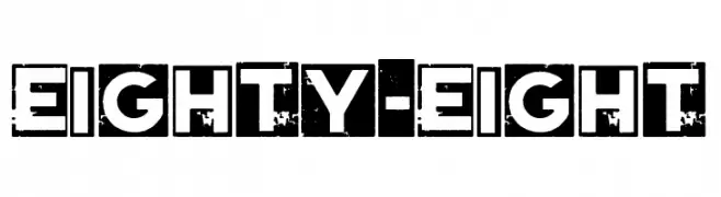
( Fonts by Woodcutter )
A bold, distressed block font with a rugged, vintage feel.
![Eighty-Eight Frei Schriftart Herunterladen]() Herunterladen 237 Downloads@WebFont
Herunterladen 237 Downloads@WebFont -
![Glaz Krak solid Frei Schriftart Herunterladen]() Herunterladen 237 Downloads@WebFont
Herunterladen 237 Downloads@WebFont -
( Fonts by Christian Robertson, Adam Twardoch, & Cristiano Sobral - Personal-use only. For commercial use please contact owner. )
A bold, italic sans-serif font with a modern and dynamic style.
![Bert Sans ExtraBold Italic Frei Schriftart Herunterladen]() Herunterladen 237 Downloads@WebFont
Herunterladen 237 Downloads@WebFont -
Schriftart von jlog3000. For commercial use please contact the owner.
( Fonts by John Ocasio. Free for personal use only )
A bold, angular, and italic font with a futuristic and dynamic style.
![J-LOG Cameron Edge Sans Small Caps Italic Frei Schriftart Herunterladen]() Herunterladen 237 Downloads@WebFont
Herunterladen 237 Downloads@WebFont -
( Fonts by Octotype - www.foundmyfont.com - Personal-use only. For commercial use please contact owner. )
An elegant script font with flowing, interconnected letterforms and ornate details.
![CongratulationFolding Frei Schriftart Herunterladen]() Herunterladen 237 Downloads@WebFont
Herunterladen 237 Downloads@WebFont -
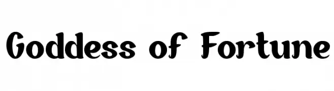
( Fonts by Wino S Kadir - weknow - www.revolge.com/shop/weknow/ - Personal-use only. For commercial use please contact owner. )
A bold, playful font with rounded characters and a whimsical flair.
![Goddess of Fortune Frei Schriftart Herunterladen]() Herunterladen 237 Downloads@WebFont
Herunterladen 237 Downloads@WebFont -
( Fonts by Fontfabric - Svetoslav Simov - Personal-use only. For commercial use please contact owner. )
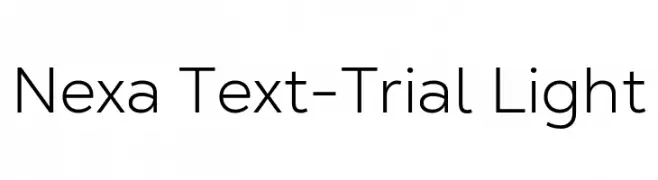
A modern, geometric sans-serif font with clean lines and balanced spacing.
![Nexa Text-Trial Light Frei Schriftart Herunterladen]() Herunterladen 237 Downloads@WebFont
Herunterladen 237 Downloads@WebFont -
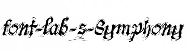
![font-lab's Symphony Frei Schriftart Herunterladen]() Herunterladen 237 Downloads@WebFont
Herunterladen 237 Downloads@WebFont -
( Fonts by ingoFonts. http://www.ingofonts.de )
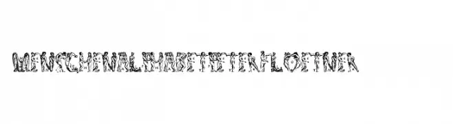
A decorative font made of human figures forming letters and numbers in a Renaissance style.
![MenschenalphabetPeterFloetner1534 Frei Schriftart Herunterladen]() Herunterladen 237 Downloads@WebFont
Herunterladen 237 Downloads@WebFont -
Schriftart von Naharstd. For commercial use please contact the owner.
( NOTE: This demo font is for PERSONAL USE ONLY! But any donation are very appreciated. Please contact me before any commercial use. My fonts for free use allowed only in personal project , non-profit and charity use. If you make money from using my fonts )
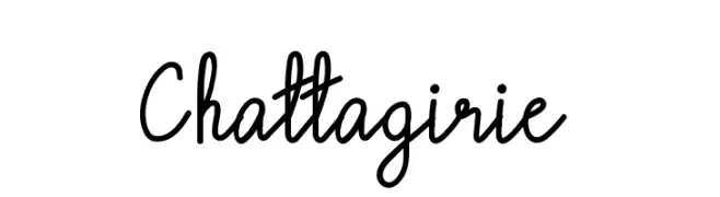
A playful, handwritten font with fluid, connected strokes and a casual style.
![Chattagirie Frei Schriftart Herunterladen]() Herunterladen 237 Downloads@WebFont
Herunterladen 237 Downloads@WebFont -
![Ags Frei Schriftart Herunterladen]() Herunterladen 237 Downloads@WebFont
Herunterladen 237 Downloads@WebFont -
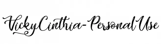
( Fonts by Typhoon Type - Suthi Srisopha - www.typhoontype.net - Personal-use only. For commercial use please contact owner. )
An elegant, flowing script font with ornate uppercase and smooth lowercase letters.
![Vicky Cinthia - Personal Use Frei Schriftart Herunterladen]() Herunterladen 237 Downloads@WebFont
Herunterladen 237 Downloads@WebFont -
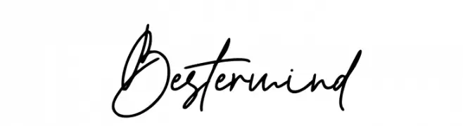
( Fonts by Thirtypath - Personal-use only. For commercial use please contact owner. )
A dynamic, expressive handwritten font with fluid cursive strokes.
![Bestermind Frei Schriftart Herunterladen]() Herunterladen 237 Downloads@WebFont
Herunterladen 237 Downloads@WebFont -
( Fonts by Adria Gomez - www.behance.net/adriagomez - Personal-use only. For commercial use please contact owner. )
A bold, modern stencil-style font with a futuristic and industrial aesthetic.
![Johanna Frei Schriftart Herunterladen]() Herunterladen 237 Downloads@WebFont
Herunterladen 237 Downloads@WebFont -
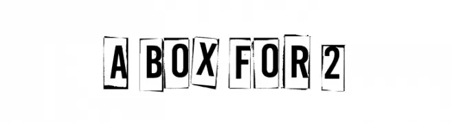
( Fonts by www.junkohanhero.com - Personal-use only. For commercial use please contact owner. )
Bold, distressed font with a boxed, cut-out style.
![A Box For 2 Frei Schriftart Herunterladen]() Herunterladen 237 Downloads@WebFont
Herunterladen 237 Downloads@WebFont -
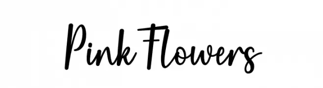
( Fonts by Wahyu Studio - Wahyu Setiyawan - Personal-use only. For commercial use please contact owner. )
A playful, modern script font with a handwritten feel.
![Pink Flowers Frei Schriftart Herunterladen]() Herunterladen 237 Downloads@WebFont
Herunterladen 237 Downloads@WebFont -
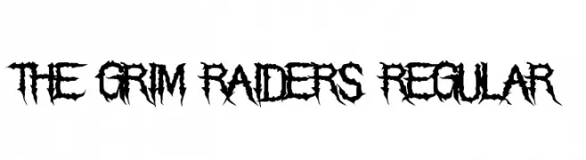
( Fonts by Chris Vile - fontmonger.com - Personal-use only. For commercial use please contact owner. )
A bold, jagged, and decorative font with a gothic, horror-inspired style.
![The Grim Raiders Regular Frei Schriftart Herunterladen]() Herunterladen 237 Downloads@WebFont
Herunterladen 237 Downloads@WebFont -
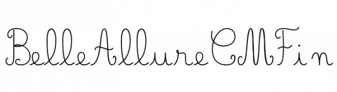
( JBFoundry - Jean Boyault - jean.boyault.pagesperso-orange.fr/ )
A whimsical, handwritten font with elegant swirls and loops.
![Belle Allure CM Fin Frei Schriftart Herunterladen]() Herunterladen 237 Downloads@WebFont
Herunterladen 237 Downloads@WebFont -
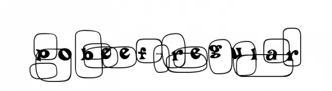
![PoBeef-Regular Frei Schriftart Herunterladen]() Herunterladen 237 Downloads@WebFont
Herunterladen 237 Downloads@WebFont -
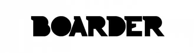
( Fonts by weknow - Wino S Kadir )
A bold, geometric font with thick strokes and a modern, angular design.
![BOARDER Frei Schriftart Herunterladen]() Herunterladen 237 Downloads@WebFont
Herunterladen 237 Downloads@WebFont


Welche Schriften sind gerade am populärsten?
Poppins, Roboto, Montserrat, Open Sans und Lato sind wegen ihrer klaren Formen und breiten Einsetzbarkeit sehr gefragt – von Markenauftritt über Landingpages bis hin zu Postern.
Welche Fonts eignen sich für Logos?
Geometrische Sans‑Serifs (z. B. Poppins, Familien im Gotham‑Stil) sind ein häufiger Griff für sauberes, skalierbares Branding. Für eine persönlichere Note bleiben Scripts und Handschrift‑Stile beliebt. Kombinieren Sie einen prägnanten Headline‑Font mit einer neutralen Brotschrift für Wiedererkennung und Harmonie.
Wie oft wird die Top‑Liste aktualisiert?
Regelmäßig – basierend auf realen Downloads und Interaktionen. Schauen Sie öfter vorbei, um aufstrebende Favoriten früh zu entdecken.
💡 Tipp: Seite bookmarken – Trends wechseln schnell, und heutige Top‑Schriften inspirieren morgen vielleicht das Rebranding.